When you're making your very first game, it can be quite difficult to know where to start and what to do. In 1996, ZZT was at a turning point. The early days of kids uploading games to AOL file archives or BBSes often in isolation from other ZZTers had passed, and the community was there with its own IRC channels and forums. The community was solidifying, and with it came standards and expectations of what makes a ZZT world "good" or "bad". Super Tool Kit was going from novelty to necessity, with special colors becoming the norm. Games without it were beginning to feel older and downloading STK or an early toolkit was essential to producing games that would get noticed. But there's more to a good ZZT game than purple ammo or dark brown caves. You didn't just need to know the available tools, but how to use them wisely.
Barjesse was here to tell the community how to do that, with ZZT Syndrome, which became a staple on any list of worlds to play for new ZZTers to learn the ropes of the engine just as much as Alexis Janson's STK. Playing it today, you have to wonder how game design advice that's more than 20 years old holds up today. It's easy to go in expecting a basic like list of dos and don'ts that are entirely the author's personal opinions, but Barjesse honestly does a pretty good job of identifying flaws that plagued many ZZT worlds, and by giving a vocabulary to describe them, made it that much easier for people to avoid them or call them out when they encountered these syndromes in other worlds.
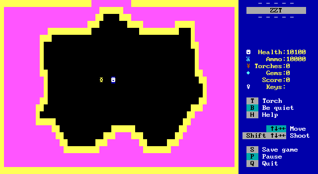
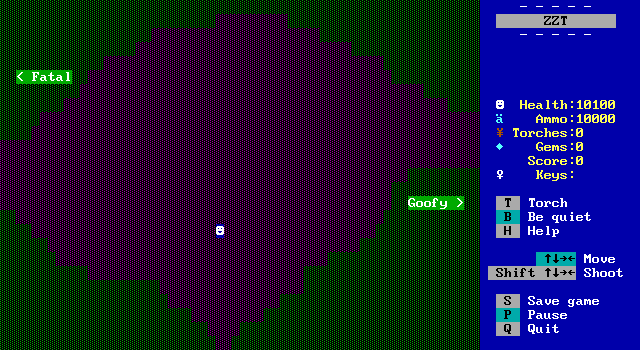
Getting off to a horrible start, the world opens on a board that looks like this. The solid walls flash colors like the title screen, but this time the effect is less flashy and more blinding. There's definitely an irony to this opening in a world meant to show you the errors of your ways.
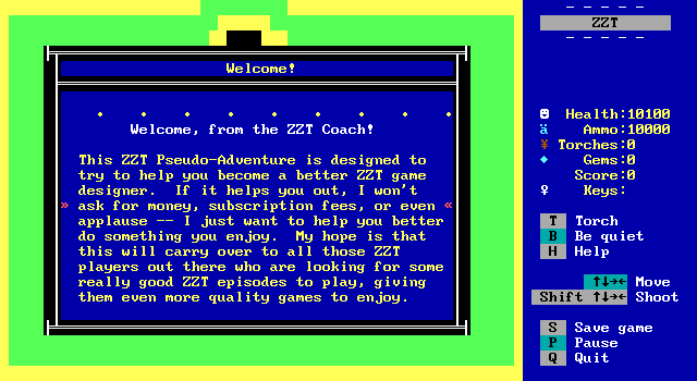
Barjesse describes himself as "the ZZT Coach" which still does feel a tad pretentious. The release dates for Barjesse's games are a bit fuzzy. File modification dates show Syndromes as the last release by Barjesse, with Nightmare arriving shortly after, though Syndromes specifically mentions Nightmare as an upcoming games. The order is actually somewhat important here for Barjesse's credibility in 1996. He admits that his first two titles are not very good and plagued by the very syndromes he warns about here. Not very solid ground for telling others how they should make their games. Nightmare, however, quickly gained a well deserved reputation as one of ZZT's best puzzle games. If the "upcoming" Nightmare is just a scroll that hadn't been changed then Barjesse's is a trustworthy name for somebody to seek guidance from. If Nightmare came later, then I can definitely imagine some reluctance to listen to what Barjesse has to say.
But, the good news is that whether or not the game was released before Nightmare, Barjesse doesn't have an overinflated ego. The world demonstrates a genuine interest in showing people that unfun mechanics can ruin not just a game, but interest in an author's future works. He wants ZZTers to improve so that we can all have better games to play.
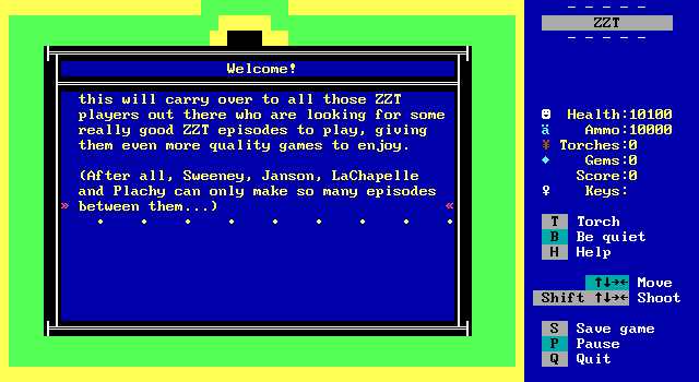
Barjesse references are few of ZZT's greats, which is a peculiar list containing Tim Sweeney, Alexis Janson, Adam LaChapelle, and Plachy as definitive ZZT authors. Sweeney is obvious, Janson (especially in 1996) was the biggest name around, but the others? LaChapelle has a single preserved game documented, the very much not funny or fun MST3K . Plachy, meanwhile is unknown. It's a shame to think that we've currently lost the works of people listed with Sweeney and Janson, but LaChapelle (as far as we know today) puts this other name into question as well honestly.
Follow the path north. I will demonstrate
some of the more common ZZT Syndromes that
plague ZZT games, gamers and players.
These Syndromes are conditions which, if
they persist through a large part of any
one adventure, become tedious. Or boring.
Or frustrating. Or unbearable.
In short, these are the things that may
cause someone to quit halfway through
your carefully constructed adventure.
I have given these conditions names, thus
coming up with the list of ZZT Syndromes.
• • • • • • • • •
There's a soft disclaimer here, and Barjesse leans into it harder later on. All these syndromes which can make a game unfun, can also be done well. They can be done sparingly, and having them show up doesn't negate any other positive qualities of a game. The goal here is to make sure that your games are fun, not to try and equate "no yellow borders" to an instant hit.
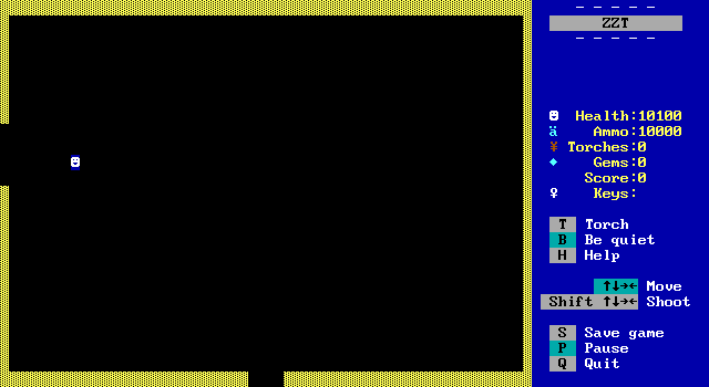
What makes Syndromes so powerful, is that it's not just "Don't use empty rooms with yellow borders. They're tedious." Barjesse makes you play them, and you can see firsthand why you wouldn't want to put up with a game full of syndromes.
That ZZT can do this is something that makes Syndromes so fascinating. The tutorial is written in the same medium as the subject matter. There's no best practices of programming where you run the executable and note that it was using global variables for everything, or Doom WAD where the author explains that it's not fun to fight a cyberdemon with no ammunition for the player.
To some degree the format is annoying, but I think it works out. It's annoying because it's showing you things that are annoying.
As I mentioned, this path demonstrates
Syndromes that are not necessarily fatal
to your adventure. Instead, they will
(at worst) annoy the player and (on
occasion) discourage them from downloading
any more of your creations.
another over there, then you're alright.
You will notice two major similarities
amongst the next few boards, and they
demonstrate the first two of our non-fatal
Syndromes...
• • • • • • • • •
And again, it's never framed as "this is always in all situations a bad idea". Barjesse lays down these rules, but readily admits that there are always exceptions.
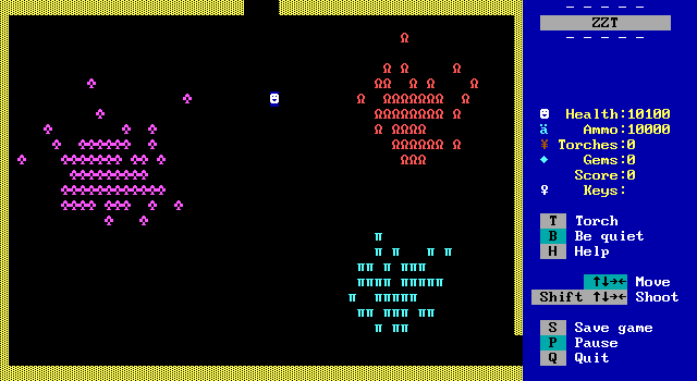
Does this look fun to you?
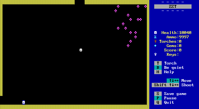
Or this?
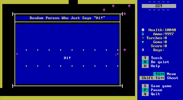
Evocative game design.
Two amateurish syndromes... We learn the names of these first syndromes. "Big-empty-room Syndrome" and "Yellow-border Syndrome".
Both of them are the most common in worlds by new developers, but empty rooms are particularly common in the earlier years of ZZT period. A board is 80x25 and a lot of authors were committed to making sure they used the whole board. Go back to the House Hunting article, and take a look at all the boards that take up the entire screen, and compare them to those that build a well furnished home in a third of the space.
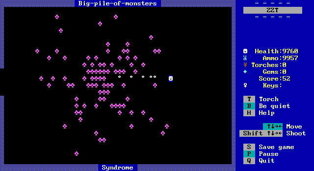
Next, "Big-pile-of-monsters Syndrome". This is ZZT action at its dullest, and I think games that use this are a strong reason why in the late 90s there was a rejection of using built-in creatures. The original ZZT worlds do an excellent job mixing monsters with board layouts to create fun challenges, but plenty of games think a challenge is a rectangle of ruffians.
Behold the Big-pile-of-monsters Syndrome.
It's often found combined with the Big-
empty-room Syndrome. This syndrome is
especially self-explanitory -- it is a
frequent reccurance of boards with a big
pile of monsters in the middle.
the adventure doesn't suffer from Not-
enough-ammo Syndrome. Finish off the
monsters. Go to the next board. Start
the routine all over again.
It can make action boring. Shooting fish
in a barrel isn't really fun -- even if
the fish are trying to kill you.
• • • • • • • • •
Barjesse makes these horrible boards at least playable by providing the player with thousands of health and ammo. You can dwell on the merits of this board as you fire in a straight line at all these ruffians that the player is made to defeat in order to proceed. It's bad.
Have you ever felt like you've just GOT to
put something in every part of the screen?
You've got to use all that space -- even
if just to be efficient or economical or
for no good reason at all?
Let me reassure you -- feel free to waste
space on any given screen: There's plenty
more where that came from. Use creative
contours to shape your screens and your
world, like those seen on the next screen.
• • • • • • • • •
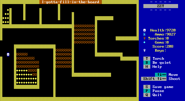
Again we get another warning about how boards don't need to be completely full. Here all the space is used, but the idea of getting those gems is so unappealing. Especially that long detour up top for just ten! They'd have to be a very precious resource to get me to want to bother.
This was fair advice in 1996, even more applicable in 2018 where DOSBox is the platform of choice for playing ZZT and the keyboard issues make the player handle like they're in mud.
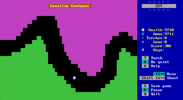
This board demonstrates Creative Contours,
a solution to Big-empty-room Syndrome and
I-gotta-fill-in-the-board Syndrome.
The idea is to give the board some shape.
A huge rectangle is mind-numbingly boring.
To see a marvel in creative contours,
download and wander around "Pirate Perils"
by DinoJosh.
• • • • • • • • •
One-way-board Syndrome is a condition in
which the designer of the adventure failed
to complete all the board connections.
Consequently, sometimes you can move from
screen A to screen B, but you CAN'T GET
BACK! This can range from extremely
frustrating to fatal. It becomes fatal
when it stops the player from winning the
game. (Talk about a structural flaw!)
To demonstrate, take a quick look at the
boards set up just north of this one.
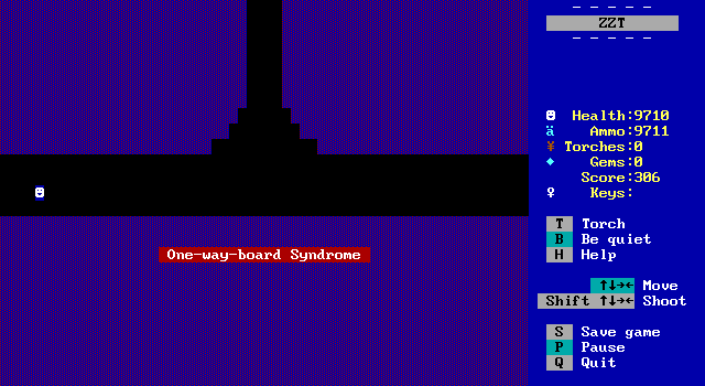
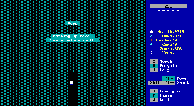
Sure enough, the board can't be exited by walking south. This one should likely be in the fatal section rather than "annoying" because it usually results in getting permanently stuck.
This one is also interesting because while empty boards or piles of monsters are a ZZTer's conscious decision, this one is unintentional, and it stems from design issues with ZZT itself. Because boards don't have to connect both ways, the author has to make sure to link both sides. KevEdit actually has a shortcut to do this when linking boards.
It also becomes a bit less likely to be noticed right away since ZZT always starts on the last board saved, so games that only receive testing as each board is developed as opposed to a proper playthrough when the game is complete may wind up not seeing these mistakes until they're released to the public.
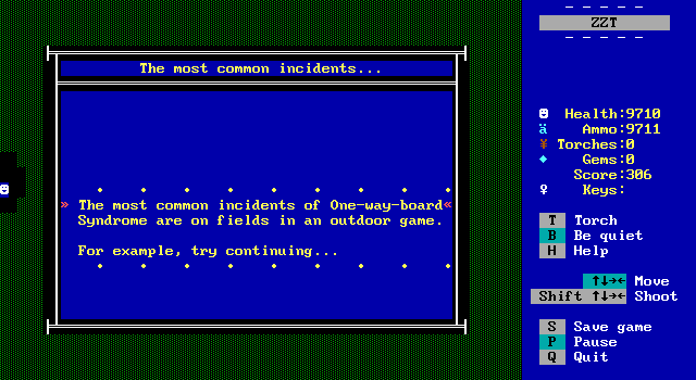
Barjesse brings up a common occurrence where this happens in large areas made up of several rooms that need to connect in multiple ways. Connecting A to B and B to A is one thing, connecting a 3x3 arrangement of boards involves setting 24 connections!
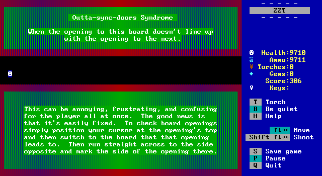
This one! "Outta-sync-doors Syndrome" bugs me to no end. I'm actually a bit surprised that KevEdit doesn't have a way to automatically verify connections line up, but I suppose there would be plenty of exceptions needed to make it all that practical. (Imagine a gate that you open later on in a game to backtrack to an earlier area.) So maybe I'm not surprised.
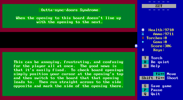
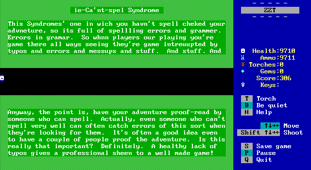
You can see how these two boards don't quite align. The linear nature of Syndromes here makes it a minor annoyance, but if this happens in a game where you're traversing boards several times, having to remember that you can't just trust an open edge can get very frustrating.

"ie-Ca'nt-spel Syndrome" is just some good general advice. It's important for a game to be understandable, and typos and strange sounding dialog can have a variety of effects, breaking immersion, confusing the player, or turning what should be something serious into more of a joke.
I've definitely pointed out spelling errors in previous Closer Looks and livestreams, and I try to be forgiving, as after all a lot of these games are made by a very young audience, ZZT has no spellcheck, and there are also plenty of games where the author wrote in English when the language isn't their first. Getting somebody else to help double-check your work is a good idea ZZT or not.
Beta testers for ZZT games were usually focused on finding programming errors, some general feedback on if a game is confusing, and searching for bigger issues like misaligned or unset connections, but spell checking was definitely a big part as well. I can remember MadTom telling me that when he beta tested Johnathan Wellington Wells' Evil Sorcerer's Party, that he brought up a typo in the ending where Wells had mistakenly placed the wrong accent mark on an e. MadTom was correct and the final version of this game fixes it. That's dedication.
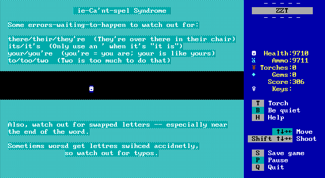
A few common mistakes are highlighted, and I think every English teacher would
agree that these ones happen alot a lot.
There is an irony here in ZZT itself having a typo in its own language with
#if alligned being used to detect when the player
is aligned with an object. ZZT was my introduction to the word, and probably
the same for a lot of kids. It was years before I learned aligned only has one
"l", and I still frequently type it with two before realizing my mistake.
Thanks Tim.
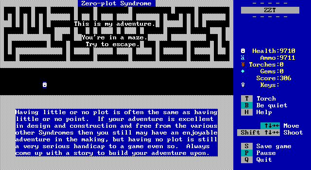
Next is "Zero-plot Syndrome", which is one I frankly outright disagree with. There's a lot of discussion to be had about the need (or lack thereof) to have a story in a game, and I don't believe it's fair to say that one is necessary or a detriment. It's an aspect of a game like sound effects, music, graphical fidelity, and whatever else GamePro magazine included in their review scores. They can all be used to make a game better or worse.

This one is more of Barjesse self-flagellating himself for his previous releases being lacking in the plot department, but even still he admits to them being enjoyable.
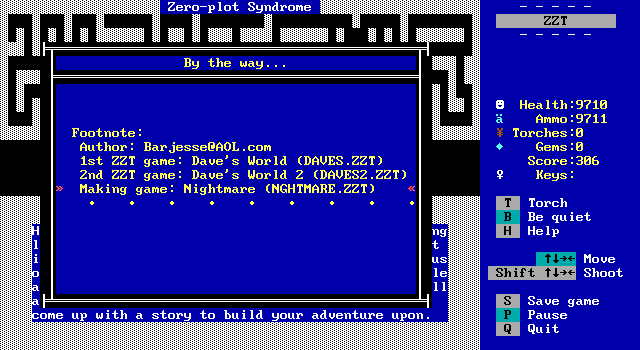
Mind you, his "in the works" game with a good plot is Nightmare, a game whose story is told on the introduction board and the ending, with nothing in between, so I'm not sure what standards Barjesse has. Nightmare is held up as the best puzzle game (or close to it) in ZZT's history, and it's not the plot that gives it this title.
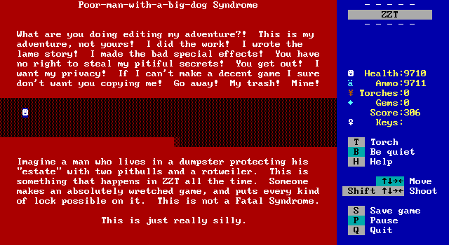
"Poor-man-with-a-big-dog Syndrome" is unique in that it's one that you won't really run across while playing any games. Even the most egotistical of ZZTers weren't really putting anything you'd run into during play to let you know how great they were.
It's also a good insight to ZZT's culture. Tools were available to lock and unlock games, and even then, it was possible to get around them just using ZZT itself. The general lack of secrets, is honestly one of ZZT's best features. It ensured that no matter what trick of programming was used, the player could open the game up and learn for themselves how it worked, building on what others did before.
And while some people did lock their games to keep people from spoiling them, the egotism implied here is still pretty rare. There's a hilarious board at the end of Sivion chastising the player for editing and telling them that the game has no bugs so they have no reason to be there. (Sivion has bugs.) The AKWare company toolkit includes their signature "Impromptu Quiz" object with a disclaimer in the code that it is only for members to use and that there will be a price to pay if non-members use it, but neither of these examples are "protecting a dumpster". They're overly dramatic attempts at protecting quality content from a perceived threat that really never mattered.
Barjesse is right though, it is really silly.
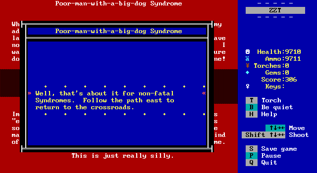
And that concludes the non-fatal Syndromes, the ones that remain are ones that aren't just moments of frustration, but ones that will make people call it a day and play something else.
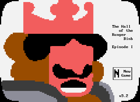
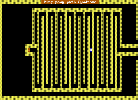
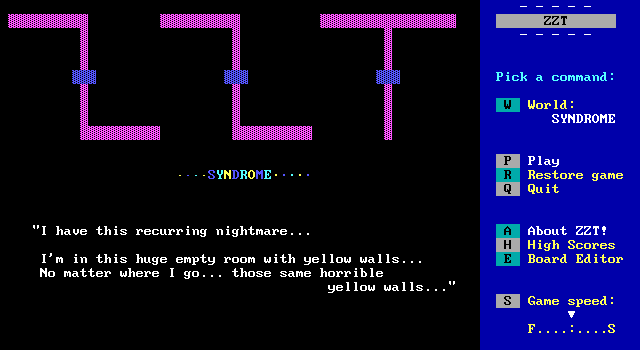
The game's title flashes with color while the "SYNDROME" text "scrolls" across some objects. An iconic quote warning about horrible yellow walls is there to let you know of the most grievous of errors a budding ZZTer can make, leaving the default border of yellow normal walls on your board.
With the Worlds of ZZT project, I've wondered for those who are new to ZZT if they have the same reaction to yellow borders as those who grew up with it. Town and City both feature rooms that have yellow borders and they stick out so much to me, even if they're fully detailed boards that just happen to be yellow. So let's see if Barjesse's advice is a reflection of ZZTer culture of the time, or is still something worth abiding by today.