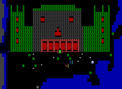
The Goblin's Den
The fortress and troll cave combo was my path through the game, but Rivera handles visiting the kingdoms in the opposite order as well, providing an alternative quest-line to prove your worth to the king of Xranth and then use his recommendation to convince Queen Liondellia of your cause.
I opted to play this quest manually, at the end of the game by just zapping down the door the king provides the key for. This does mean my ammo and health aren't quite representative of what the actual experience would be, but the nature of the goblin's den makes little difference as to what state David is in upon entering.
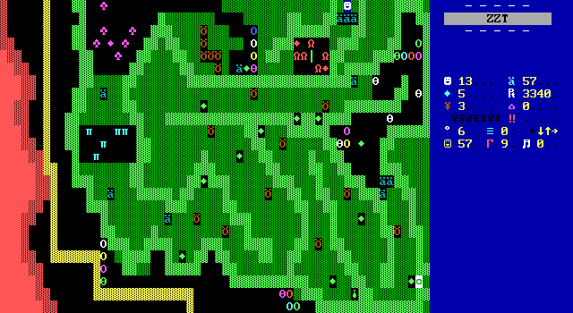
The quest is still to obtain the crown jewels, which in this timeline were taken by a goblin instead. Step one is to travel through the forest that gets skipped on the way to Liondellia. I'm already not a huge fan of this just because I very easily could have opted to head into this forest without being able to get through, only wasting early ammo and health on my way to Liondellia. That door would have been better placed at the entrance. Also it's another "door in a forest "scenario" regardless. Stop putting doors in forests!!!
As long as you're not wasting your time here however, then it's a bit better. Another action sequence using forest to divide the encounters into individual fights. The forest helps the player much more than it hinders them as basically every pocket of open space can be easily broken into before taking a few steps back and allowing the enemies to line up in the player's sights. Granted, the previous board has a few bears positioned in mean ways that require being quick / getting lucky to make it through unscathed so health likely will be a bit low by the time the second board shown here is reached.
The trend continues here as well with almost every one of the bears being positioned in a way to be a bother. You'll still be longing for more healing than the gems scattered around provide.
At least Rivera provides another potion towards the end, though it is positioned in a way that you might lose almost as much health as it restores.
To actually continue deeper into the forest, the key from the king of Xranth is needed. Players that wander in here without taking the quest will hopefully note the locked door before opting to clear the board. If you don't have the quest, it's not worth venturing in here at all.
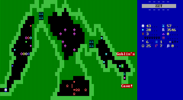
The final path to the cave is a lot more open with shapes that makes most of the creatures who are once again easy to deal with by using the forest to your advantage.
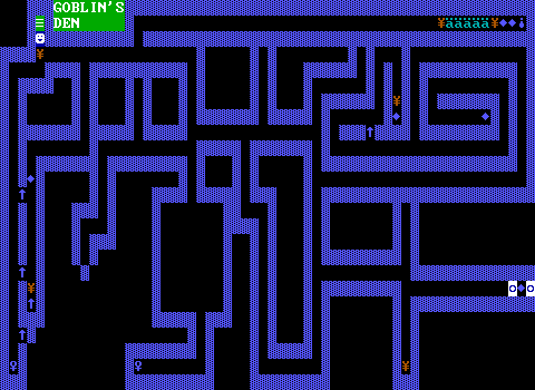
As for the den, it feels much weaker than the other dungeons seen throughout the game, making it a disappointing way for the game to end for me. It looks very uninteresting and plays poorly too. Had this been my introductory quest, I'd probably have been worried that Adventure Part 2 was going to be a miss.
The theme here is a dark underground maze until the proper den can be reached. Like in the troll cave, spinning guns are used to randomly hurt players, once more being more safe than dangerous to cross. The rest of the board is just devoid of anything, opting use the threat of running out of torches as its only real obstacle. Although there is a trapped room that shoots a few bullets upon entering before players can reach one of the keys. I guess that counts for something.
To escape, players need to pick up both keys. These keys are a matching color, which means running through the empty halls multiple times going key-door-key-door. A few dead-ends provide token rewards of torches to keep going and a gem or two as a consolation prize. It's just very dull.
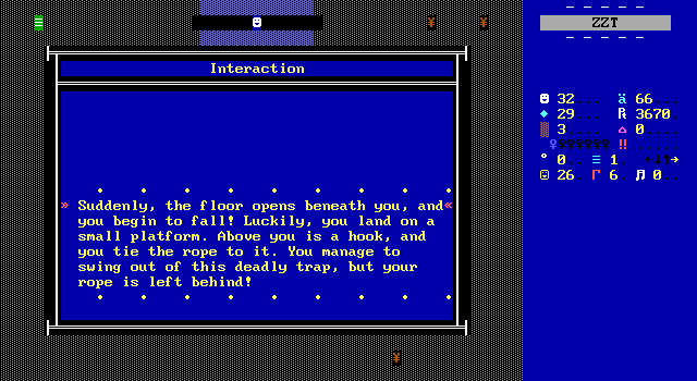
The only interesting feature of the maze a hidden floor trap that kills players instantly if they didn't buy a rope in Xranth. If you have the rope, you can safely swing across and get far more goodies than the rest of the board offers. This is nothing.
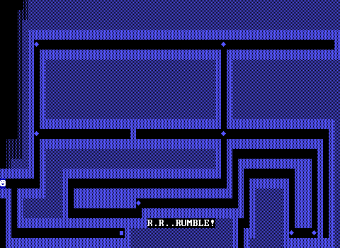
The second maze board at least tries to do something a little different. It just fails at being enjoyable.
As the "R.R..RUMBLE!" text might imply, a giant boulder gives chase to the player here. It rolls down the halls making arbitrary turns as it follows a pre-programmed path. Players get to race ahead of the boulder trying to keep from being crushed. Alas, the board is still a maze, and while ducking into a safe hall does let the boulder pass you by, it will keep rolling until it hits a gem and get stuck, forcing a reload. In order to actually complete the board properly players have to slowly learn the correct path that that boulder takes in order to pick up the gems with the boulder always close behind.
This sucks. It is undoubtedly the worst board of Adventure Part 2.
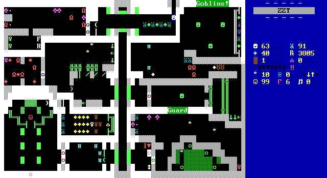
The proper den is far more elaborate. And probably looks really familiar to a lot of you. I'll get to that in the next article, sorry. But yes, you are right.
The final challenge is definitely a big improvement over what's come before. A variety of small rooms with different enemies has to be navigated to via a large elevator to obtain the necessary keys to make it to the goblin king and take back the crown.
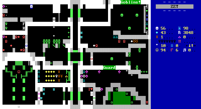
Play great games like "which key is the real one and which one shoots you".
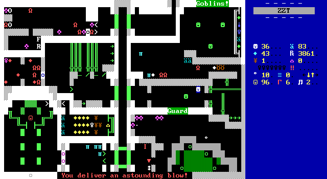
Beat up a goblin guard!
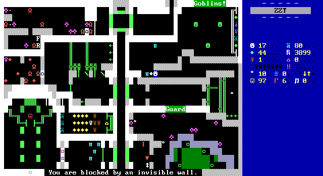
Suffer an invisible maze!
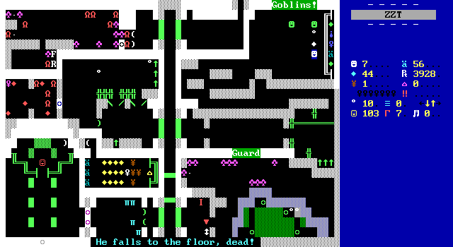
Beat up more goblins!
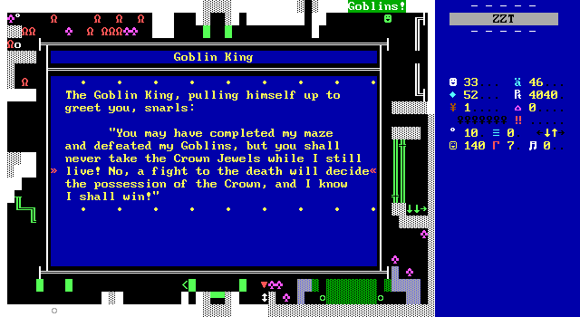
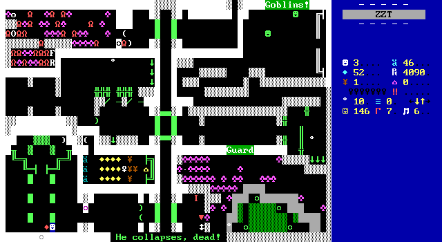
Finally, take on the king himself who's basically an easier version of the troll king. He moves the same way but never throws a star. He even shoots just one, as a counter-attack on a specific hit from the player.
In short, while the two quest-lines are a very cool idea to see in action, Rivera runs into the same issue with Adventure Part 2 that The Lost Pyramid had. You can choose from two paths, but one of them is significantly better than the other. With The Lost Pyramid, the weaker path wasn't all that bad, just not on the level of the superior path. It felt subjective enough that I could understand others enjoying the path I didn't care for. Here, I don't see it that way. You get a dull maze followed by an annoying one, leading into a reasonable enough action board that certainly feels like it's been done before. The instant death trap if you don't buy a rope isn't helping either.
The Liondellia first route means going through an enjoyable action board in the fortress and another reasonable dungeon with the swamp cave and troll king. These dungeons feel like cool places to do some sword and sorcery in, offering a much better experience to players. The two paths at the start of the game also are strangely lopsided. There are more dungeons to conquer in my first route than my second, and those dungeons just do a much better job representing what Adventure Part 2 does well. After enjoying this game from start to finish with the path I took through it, I really didn't expect the alternate route to be so much worse than anything else the game throws at you. It's to the point where Liondellia first is so much better than Xranth, that I'd honestly rather the non-linearity be removed and just make players play the enjoyable side of the game.
Still, like with The Lost Pyramid, what Rivera attempts to do is worth applause. Making an open-ended game in this style is really quite impressive to see. If only the gameplay could keep up with the ambition. The worst part being that it does everywhere else! It is specifically this quest and this quest alone that make Adventure unpleasant. Take the route that lets you skip it entirely, and you'll have a much better time with the game, getting to enjoy it at its best instead.
A World of Adventure
Where Part 2 truly excels in in creating a vast world to explore. At forty-some playable boards in total, the overworld isn't actually all that huge. Even so, the design of the world does a great job of feeling massive, easily rivaling that of Fred! Episode 2. Locations feel very distinct from one another, with mountains, forests, and swampland regions providing a real sense of exploration. The use of the exclusive quests means that players will also get glimpses at places which they won't even get to see on their first playthrough, really giving the world a sense of mystery to it, as you'll never know where you'll be going next.
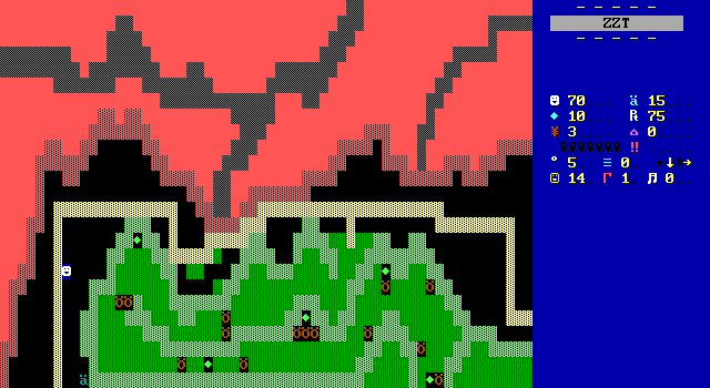
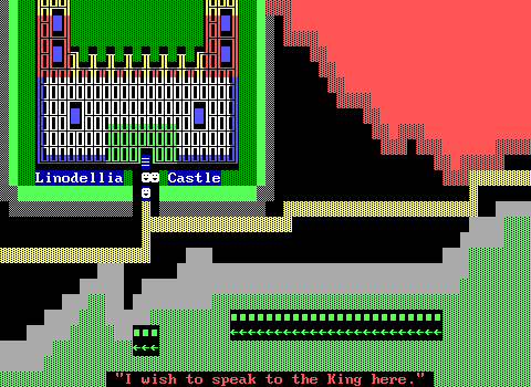
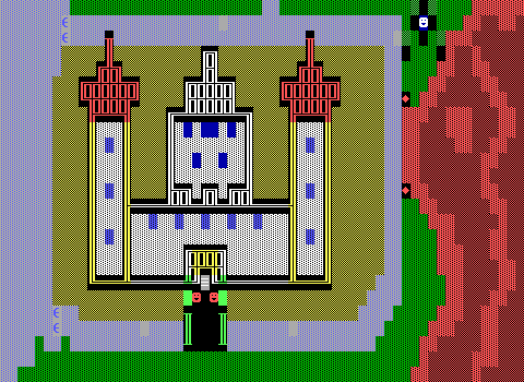
The road to Liondellia has players hug the edge of red mountains following an established path onward. Depending on the player's knowledge, they may come to a fork in the road and genuinely have no idea which way is the correct way to proceed.
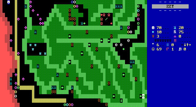
I was really impressed at how well the forest and mountains were divided like this. The way each path provides a glimpse at what players have decided to forego (for now, in the case of the road to Liondellia) while still keeping them busy with a set of enemies to fight. The world of Adventure remains a dangerous place, and Rivera has really mastered how to effectively use built-ins to create fights that are fun to get through without getting tedious.
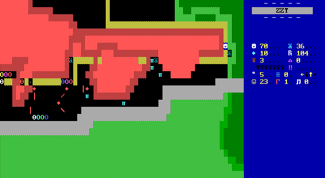
Rivera does great environmental work even without the use of Super Tool Kit's extended color palette. Here you can see rock slides have spilled earth onto the main road requiring players to stick to the river instead. Sure the path could have just been drawn along the water, but this makes the world feel that much more alive. It's really high quality stuff that's a welcome contrast to the original game relying so heavily on green grass and green forest for the bulk of its world.
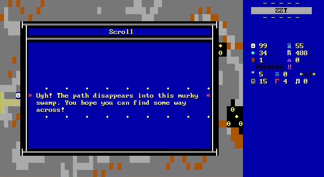
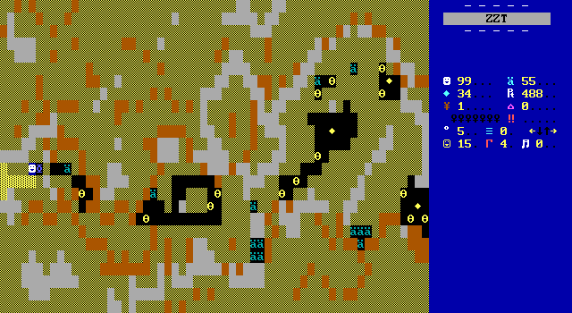
The swamp to Xranth gives up on being tamed entirely with the road to the kingdom stopping almost as quickly as it begins. A yucky blend of brown text, yellow breakables, and gray water are used just as they were in the previous game's swamp, except this one is far more substantial. It's also loaded up with spare ammo on the ground to make sure players can get through without too much trouble.
Again Rivera nails it with the design. I said it was ugly in a good way in the swamp from the previous game, and I'll still go with that. This time, Rivera's sprinkling of walls at diagonals are used to form a true path that ensures players aren't tunneling all over the place. At first glance it seems like players could dig out the entire board if ammo permitted, but when you look closely at the layout you'll see that the mix of text for solid walls and water form a natural border that keep players contained to a smaller area.
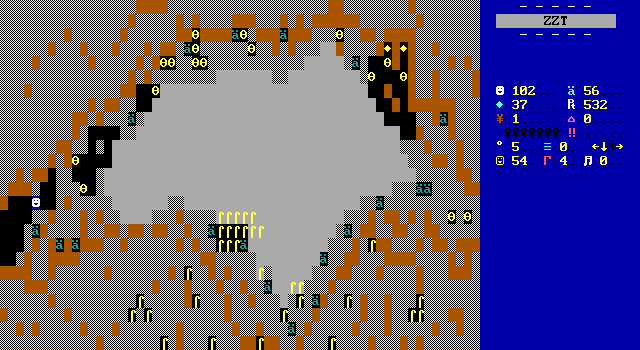
The subtle guidance for players is incorporated into the ammo placement as well. A large lake in the middle of the swamp makes the path forward obvious, but less obvious is that this board has an exit to the south to the troll's cave. Even with SolidHUD placing a nice yellow arrow for me, I still managed to not realize there was an alternate exit here until it was time to enter the cave.
And can we talk for a moment about the reeds? A frequently overlooked feature of ZZT's default editor is that it does allow you to place statted elements in water, used here to add some vegetation poking above the water and to just do a little decoration to give these boards something to make them more than messes of pure terrain.
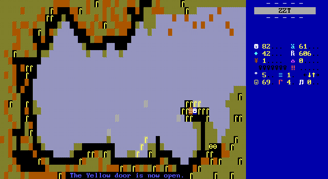
The man has even figured out how to use sharks well. When was the last time a shark in ZZT felt well implemented? The wide curve of the coast gives players opportunity to lure them away before making a quick dash along the coast without running the risk of getting bit for those times when the only way forward requires it. The placement of walls and reeds makes every coastal area a clear deliberate choice, with Rivera opting to make players stick to it as opposed to implementing lengthier ways forward that require more ammo in exchange to keep the player's health high.
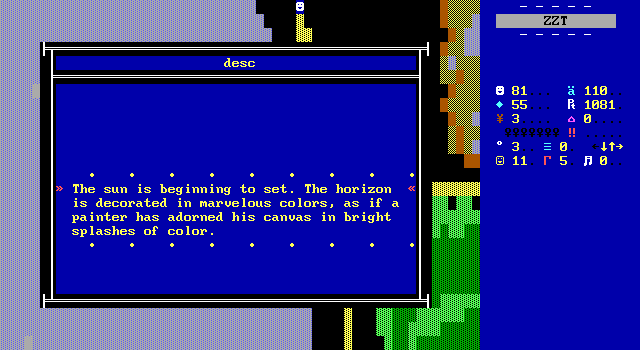
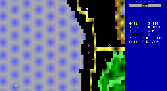
What may be the biggest surprise of Adventure Part 2 isn't the turnaround in quality from the original, nor is it a twist of the plot. The biggest shocked of the game is a graphical one. Just south of the gate that players can't get past until they've united the first two kingdoms of the game, a message describes the changing time of time with the sun setting immediately upon entering this board.
This board hardly says "sunset" to me, merely implementing the same lake, forest, and swamp styles of graphics on a fairly insignificant board. It's only when players continue south that time really advances and things really change.
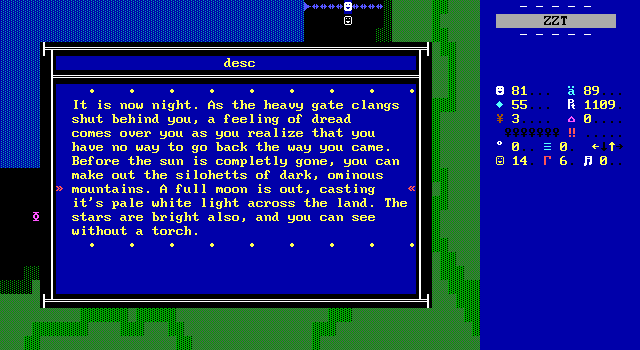
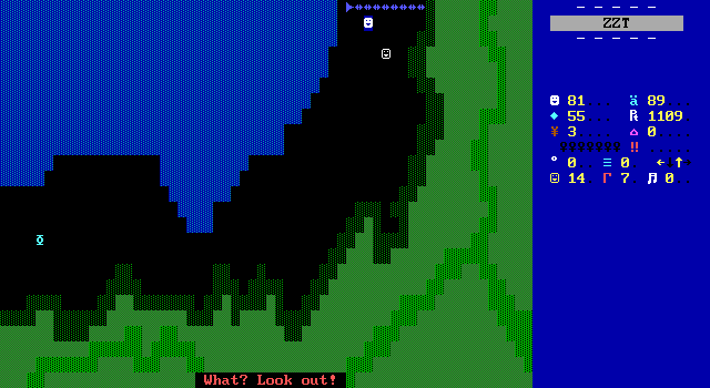
Suddenly, Rivera has discovered Super Tool Kit, and rather than do what every other game that discovered STK halfway through development did: just start using special colors and make no mention of it, Rivera finds a suitable explanation for the sudden shift in graphical fidelity via the sun going down! This blew me away when I saw it. This board looks like so many other early-STK worlds, but now it stands out because those dark colors aren't to make the game "realistic" or to show off what they know how to do with ZZT, but rather to differentiate the previous chapter from the next.
It is the perfect place to slice the game in two, and conveniently the perfect place to slice this article in two.
Next Time
- The three remaining kingdoms: Winchester, Arantinuel, and Angmar.
- How to win friends and influence kingdoms.
- The many bugs I've politely refrained from talking about up to this point.
- And some very on the nose references to a ZZT classic
To be continued...

