October
It began with a message on Discord offering me a formal invite to create a troll game.
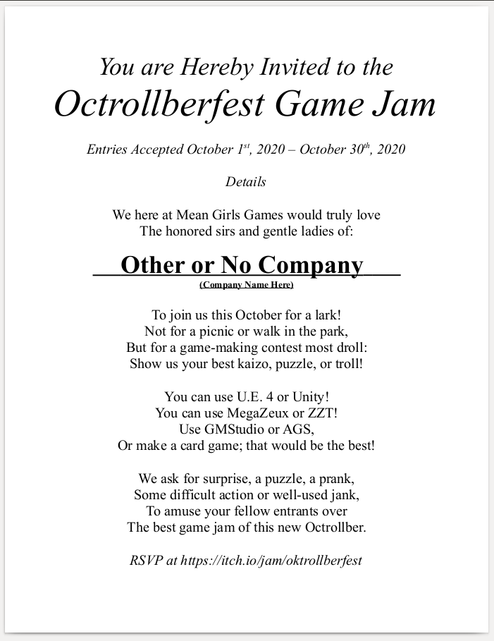
My first thought: "Oh no if this is a private affair I'm going to really feel obligated to make something.
Fortunately for me, within a few days of receiving my invite the jam was made public and I could play it a little more casual.
Less fortunate for me was that in October I had a week's vacation which was going to be mostly spent with a mutual friend of myself and my boyfriend. Then I also had a coworker start showing COVID-19 symptoms. My day job knows me as the guy to never call when somebody is out sick or even bother offering some extra hours. I've got more important things to do than retail, but I'm not about to let people suffer for a week or more and gladly took the extra days to help out. (I probably didn't have an actual choice in the matter, but if you say "yes" when asked, the illusion of choice still holds. This is called "management".) Then a second coworker got sick as well and also had to get tested. :) :) :)
Both of them came back negative, but by that time the damage to my schedule was done. Whatever! Let my coworkers live.
And then at the end of the month another coworker had a 104 fever and did test positive for COVID-19. :) :) :)
SO IT WAS A HECTIC MONTH WITH LITTLE TIME TO MAKE A TROLL GAME.
Also I was struggling immensely to make progress on the Closer Look for Z-Files, which made it difficult to justify working on a game that I had little hopes of completing in time when I should be working on an already long overdue article.
Troll Games
There was another slight problem. I wasn't all that interested in the concept behind the jam! I want to make games that entertain people or create weird art pieces far more than I want to make games that aim to frustrate. Things like Kaizo Mario levels or I Wanna Be The Guy clones have zero appeal to me, especially lesser ones which feel more like memorization of an arbitrary path more than demonstrating mastery of a game's mechanics.
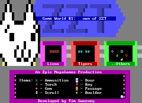
Granted, this lack of interest wasn't always the case. My last full ZZT game in the z2-era was Own of ZZT, inspired by Syobon Action. It was a purposely cruel challenge parody of Town whose changes included making the opening scroll causing a game over, adding a sixteen second time limit to the three lakes board, and having to solve the jazzman's puzzle by replaying his song not measure-by-measure but note-by-note.
That was more than a decade ago, and I now value my time far more than I did in my freshman year of college.
The Brainstorms
The invite was nagging me though. It would be a letdown to those who invited me to not submit anything, leading to me to try and come up with anything I could do quickly. Earlier in 2020 for "GAMES MADE QUICK??? FOUR+" I had written a script to turn ZZT boards upsidedown, resulting in Upsidetown. Could I do something like that again? Not the same idea, but taking an existing ZZT world and transforming it in some way. It would mean my work was cut out for me. I thought of possibilities with compiling up a modified ZZT executable. What if I shuffled element properties on every board transition or save/load? Something along those lines would result in very chaotic experiences and could technically work across all games, even other jam entries.
The problem there though is that I would not say I actually know Pascal in any meaningful way. I can fumble my way through the source and look up things here or there, but an in-depth understanding of Pascal and ZZT eludes me. I probably wouldn't have much time to play around and learn.
I also wanted my submission to still be enjoyable. I'd much rather players laugh at it instead of getting frustrated. I also didn't want a simple gag to be get old immediately. Sure I could make it so the player spawned stars when they tried to shoot, and that would get me some "haha I see what you did there" laughter, but there'd be no motivation to keep playing.
The ubeR Board
I had an epiphany at work one day where I could take Town's iconic "Rube Board" puzzle and begin finding more and more bizarre ways to change up how it's played. The first idea I had was to make basically everything but the walls themselves black. An invisible rube board would still be instantly recognizable. It could be both challenging, but understood to the audience of mostly ZZTers expected to play it. The puzzle itself has very few moves that need to be made to solve it, so the difficulty would increase, but not to an absurd level. I really liked the idea and decided I would try and come up with some other revisions.
Then I couldn't come up with any other ideas that I liked. It's really easy to come up with puzzles where the only way to realize what needs to be done is to edit the game and look it up. It's a lot more difficult to come up with concepts that would let the player actually figure things out and feel clever for doing so. I managed to eventually have concepts for two more levels, but adapting them to the form of the original puzzle just didn't make them a good fit. Maybe if I was 10 levels in, but coming up with a gradual increase in bullshit just wasn't working out.
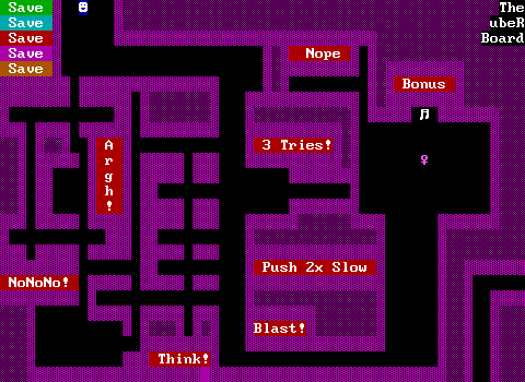
Still, I like those unused ideas enough to not reveal them here. Perhaps they'll find a home in another ZZT world in the future. Or perhaps I'll be beaten to the punch and somebody will come up with my stupid plan as well. I was beaten to the punch by the slider puzzle in Ramen Quest.
ZZM.EXE
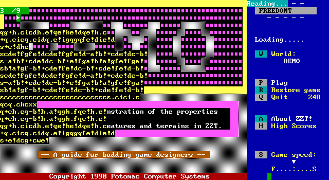
I mentioned dealing with the struggle of working on a jam entry without feeling like I was neglecting work to be done for the Museum as well. My next idea was going to kill two boards with one stone, and hardly be "trolling" in any way. An early patch of the reconstructed ZZT source code was to disable the editor for systems with limited memory. Asie's work on OpenZoo and a GBA port of ZZT would benefit from such a thing. Removing the editor is one thing, but what if I were to remove the gameplay?
If you look on the left sidebar of the Museum, you'll find a link to browse "ZZM Music". The ZZM format is a fan made way of basically dumping #play commands from ZZT worlds and creating players to allow folks to listen to soundtracks of games. This was done in an era where the level of knowledge of ZZT's internals was considerably less compared to today and as such the handful of players out there will all sound slightly different as they each try to recreate the frequencies used for ZZT's music notes and its "drum" sound effects. Making things worse is that all of these programs are MS-DOS based and really don't play nice with DOSBox for whatever reason. With there being plenty of quality music in modern ZZT worlds, there's no good way to listen to this music short of playing it within ZZT itself via Zeta, and possibly capturing that output to put it into a modern audio format.
Zeta runs in a browser, and if I could hack up ZZT to just play ZZM files, I'd have a tool that could let these old ZZM files be heard as well as make the format more relevant for modern games. In reality, the ZZM format isn't that standardized and a proper ZZT audio player would be best off creating a more strict format.
But for a jam, a proof-of-concept would be sufficient!
Of course, this is where the lack of Pascal knowledge comes in. After a surprisingly productive day off, I did in fact have ZZT bringing up a list of ZZM files in a directory when "Z" was pressed", and could move to the previous/next tracks as well as play the songs. But oh man was the code bad. It was way too hacky to serve as a suitable base for further development, and was doing things like reading the entire ZZM file to count how many songs were in it, and then if you tried to play track four, it would re-parse the entire file and basically count off how many times the ZZM file switched to lines starting with a semicolon which are used for metadata. It could certainly be improved, but even for a jam I felt it way too crude to be something worth pursuing. I don't know if you know this, but programming in the early 90s was REAL BAD. People just lived with static arrays? I cannot believe computers are still around. (I did eventually realize there had to be some kind of dynamic array system since ZZT lets you display arbitrary length text files and if I made my static arrays to hold each song on the original parsing of the file, I'd run out of memory and crash the program.)
Additionally, this was a time when asie was doing some solid work on a port of ZZT's source code to modern Free Pascal. If I was going to create a tool like this, I'd be far better off waiting for that as a base and having the luxury of things like "more than 640 KB of memory".
Wake Up and Save the World
By this point the month was more than halfway over and I was considering just submitting the ubeR board and calling it a day, until I finally came up with something that could be done in a short time-frame and was a far better idea than either of my previous ones. "Wake up and save the world" is not a phrase coined by me, but an older one used to describe games like Code Red and Coolness where an unassuming teenager wakes up on a perfectly normal day, and the events throughout that day lead to the world being in peril and the teenager saving it.
A rather old idea I had was for a game that would take place in real time across a small number of boards with no obvious goal. When the time limit passed, everything would be destroyed, with the way to win being to perform various inconsequential actions to avert an accidental nuclear detonation (a 99 red balloons scenario). For WUASTW, I could be cheekier and just outright have victory be impossible. The question was what should the player do in this game. The initial plan was just to load the house up with interactable objects, keeping the player busy. There would be a timer in some way which itself had some thought put into how to best handle the situation. An invisible timer would mean that the first playthrough would be a surprise with the game ending abruptly. I could go as far as to not even have the player know what was going on if I wanted. At the same time though, there was benefit to having a visible timer. I quickly decided that if the timer was going to be visible, that it would count up rather than down. For a troll game, there was an advantage in having a timer increment as the player could see this timer and react to it, but have no idea on that first attempt at what point the timer would actually expire.
Having a visible timer also provided some fun in letting other things arbitrarily affect it. The hidden tile in the lawn has a mysterious remote with two buttons, one of which causes some graphical effects and the other just adds a bunch of torches (the counter used for the timer). Even better, I put some regular ZZT torches in the garage (colored bright cyan in reference to the recent Z-Files article). Even if the player has the timer running before they enter the garage, it's a difficult habit to break collecting all of them, and at least one has to be collected to get the watering can.
Memory limits became a tremendous issue as the game progressed, and one cut feature was going to be to actually roll up a timer duration at the start of the game, so on any given attempt you still wouldn't know how much time you had. I would have liked to incorporate more RNG as well to things like where the dishes need to be put away.
An alternative timing system that I also considered was to instead have interactions pass time instead of incrementing at a fixed rate. This would work best with an invisible timer as the player would learn to avoid looking at books or other decorative objects. This idea was one late enough into development that I knew there'd be no way to add #give commands to every object and have enough space, but I think it could have worked out decently had there been the memory to do so. (A hybrid approach was also considered punishing the player for performing unneeded actions as well as for being idle.)
The Home
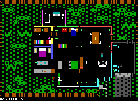
There have been just so many homes in ZZT, in all shapes and sized containing levels of detail both minimalist and hyper detailed. For WUASTW, the obvious inspiration was the home from Code Red, which is two-stories and is full of things to interact with. Before I even came up with the idea of any specific chores, I needed a house that had things to work on in the first place. My requirements were for there to be three bedrooms (as I wanted the player to have a sibling), a living room, dining room, kitchen, and bathroom. Somebody pointed out to me the frustration that must exist living in a three bed one bath home, and I thought nothing of it because that was the setup of the home I grew up in. The only other room I was able to cram in was a garage, and even that was a tight squeeze. The home was drawn in its entirety before furnishing it, so I really had to organically place furniture as necessary. My only other real requirement was to make the layout of the home not be too rigid. I wanted to avoid every room being a perfect rectangle even if they mostly wound up that way.
My plan during development was to not worry about the memory limitations and to trim the fat later. Ultimately this wasn't a smart approach. The bedrooms are way more full of things to examine than the rest of the home as I very quickly realized that the game wasn't going to be a tight fit so much as it was a fight for every byte. It got bad enough that the grass in the lawn was frequently rearranged to have more continuous horizontal strips of grass to be mowed just to shave a few bytes by letting the board compress more easily.
The first room was the player's own bedroom. For all the cuts the game received, in the end Tim's bedroom was almost entirely spared. As a parallel to the Super Nintendo in Code Red, I wanted this household to be a Sega family. There's a vastly larger number of ZZT games that reference or are outright based on Nintendo properties, while Sega's offerings in ZZT are very limited to pretty much a handful of Sonic ZZT worlds. When it came time to scale things back for memory, the Game Gear remained for a bit, was then removed, and finally squeezed in once more at the end when I realized I had some lingering code elsewhere for a scrapped detail that had been removed and would thus never be executed.
I also chose a Game Gear because that same week I listened to an episode of the Retronauts podcast about the Streets of Rage series which spent a few minutes talking about how it had some half-decent 8-bit ports to the Master System and Game Gear. I also had one as a child (along with a Game Boy). Originally, the description was much longer, talking about how it was plugged into a wall and that your parents wouldn't buy you batteries anymore. (Based on a true story, both mine, and probably 90% of kids who had a Game Gear.) This lost detail is still referenced in the dresser where one of the drawers has a portable CD player whose batteries have been removed. I had hoped for this to be a theme with something like a TV remote missing batteries as well.
One thing I decided to do early on that I don't think I've seen done before was to have the player's under-tile set to be text so that the game could begin with the player on a pillow. I also quickly decided it would be fun to restrict the player from leaving the bed until an alarm clock object went off. I realize I also did a beeping alarm in The Mars Rover, so I guess that's my thing now.
Because of the original plan to make interactions waste time, I made sure to overdo it with lamps that could be toggled and drawers that could be opened. A weirdly common thing in ZZT worlds is to force the player to get dressed before they can leave their room, so I was happy to include the requirement as well. Dressing in a white shirt and blue jeans also comes up a lot as that combination of clothing matches the player element's colors. I also added a requirement that the player find the hidden drawer and get their gun before leaving as a way to encourage foolish players to waste their time checking things multiple times.
These days, the "kid who just has a rifle in their dresser and begins carrying it around the house" has gone from "I wish I was as cool as this ZZT game protagonist" to "uhhhh..."

Bookshelves are perhaps the biggest staple item in ZZT homes. The books were chosen pretty haphazardly. I've never actually read "The Outsiders" (or "War and Peace" for that matter). "The Secret to Success" resulting in the player getting some money is another hook to make you waste your time. Lastly, "Space Duck" is me screwing up a reference to "Speeduck" from Nadir's Frost 1; Power. I don't know how I didn't just look it up considering the numerous other things I looked up for this game's creation!
When the decision was made to just use a global timer, I prevented the other doors of the home from opening before looking at the front door. Even in a game played completely straight, the player is going to want to explore their surroundings, not immediately run out the door. By blocking them off I could make it more likely that even when the clock was ticking that the player would take a moment to check out the house.

The second room I made was the bedroom of the player's sister, "Alice". There's a joke that often gets made about bad media, where it's not a good sign if the fictional media within its universe that gets introduced sounds more interesting the the actual story. Alice absolutely fails at this. Tim's a dork, but his sister is the coolest. I wanted to try and paint her personality entirely through the items in her room and I think I wound up with somebody rad enough that I definitely want to make a non-troll game starring her.
Alice also has a red herring in her room, albeit one that even I completely forgot about. Touching the stuffed rabbit plush twice reveals a sheet of paper with four symbols. These symbols match the characters used for watered/un-watered plants and the living room has a set of four where the player can replicate the pattern on the paper by watering specific plants and leaving the others dry. Doing so will do absolutely nothing.
I think the only thing I had to cut from her room (because I was so adamant to not let any part of her personality vanish) was that originally the computer was blocked by a chair that had to be pushed aside. Changing it to a piece of static text was an easy memory saver. There was a scrapped chore related to her that I'll get into later, but it offered no real insight into her character in the way that removing her copy of "A People's History of the United States" would. She's canonically a punk lesbian antifascist that dabbles in anarchy, marijuana, and arcade games. She's a busy lady.

Moving on to yet another bedroom, the one belonging to the parents. At this point I wanted to avoid having yet another bookcase. They're easy to make and certainly common enough to have one in every bedroom, but I wanted some variety. Unlike Alice, mom and dad don't really have too much personality to them. Mom at least has her note on the door where she vents some of her frustrations at young Tim, but dad is basically an enigma. Every dresser in the house has a hidden drawer. I wanted to be a little classier than having dad's stash consist of porno mags and opted for something a little more bizarre with a specific issue of "TV Guide". I found a site that had all the covers throughout the years and just started browsing somewhere in the 80s trying to figure out what would be a good fit. The moment I saw the cover on Aug. 13, 1988, I knew I had found the correct one.

The bathroom was of course handled with care. For the sake of shaking things up and because one time I had a realization that you almost always see bath tubs rather than showers in ZZT games, I opted to go with a shower. It looks rather strange, but I'm happy with how it came out! Originally it was made of yellow objects but had to be downgraded to text to save memory.
The bathroom is also a little cramped, and I know I rearranged it a few times during development, hoping to put a mirror with the old ZZT mirror trick where it shows a smiley face when you're lined up with it or an empty character when you aren't. I wasn't really doing anything with the concept, and I think that sort of effect came into fashion a bit later than the era of ZZT games I was riffing anyway.
I wasn't sure what to do with the toilet. They're somehow a ZZT staple and I wanted to hype it up as the most amazing thing in the game before realizing it would be far funnier to just refuse to let the player flush it.

The living room is where I quickly realized that memory was going to be an issue even early on. Really, the rest of the home is far more sparse than I would have liked it to be compared to the numerous drawers and books of the bedrooms. The living room consists of little more than a couch, a television, and a table. I would have liked to do more here like another gaming system (definitely a Genesis/Mega Drive), or even continue the bookcase trend but with VHS tapes instead. I never even bothered to code anything along these lines so nothing was cut here.

The dining room doesn't have much going for it. It has a candle and chairs. The candle needs to be lit for a chore, and upon doing so plays the classic Alexis Janson candle animation that's been lifted for a ton of ZZT worlds. I did try to vary my furniture design a little bit from the usual, which is where I got the idea of using the letters "b" and "d" as chairs seen from the side rather than the more traditional parenthesis and brackets.

The kitchen is the room that had the most compromises, without anything really being removed. Originally the kitchen counters were white on gray and used underscores to delineate the countertops from the cabinets below. Since white text in ZZT means having a black background I had to use objects even for a purely decorative part of the home. It didn't last long before I had to change to using text to save stats and space, sacrificing the aesthetic for a far inferior looking white underscore. It looked a lot nicer, but maybe "ugly kitchen" is fitting for the 90s.
Had this room been done earlier in the process, I'm sure the fridge and freezer would've had a whole bunch of options to explore, but by the time I started working on them it was reduced to some barebones descriptions. There was a cut chore related to the freezer that I'll detail later on, but it wasn't really adding much, especially compared to the "empty the dishwasher" chore which came out great.

The final proper room of the house was the garage. Originally I was going to include a car in there and debated on whether or not it should even be an accessible room. By the end it was. The garage exists solely as a place to put the watering can. I also played around with the doors leading to the backyard and garage. I half-coded one of the doors to getting stuck, forcing the player to loop around on a longer path to go from the dining room, to the yard, to the garage, and back to the living room where there was going to be a second door. I wound up scrapping this as there wasn't any reason to make the trip multiple times. If I could have turned this annoyance into something the player would have been stuck doing repeatedly, I would have.
Because the garage was inaccessible for most of the game's development, the garage door was actually made of dark gray on light gray breakables since it looked a little nicer. I think I went as far as submitting the game to Itch before noticing that you could use the ammo given at the start of the game to shoot the garage door and just leave the house. Sadly this happened so late into the competition that I had to fix the bug when it would have made for an excellent hidden ending.

Lastly, while not really a "room", the yard itself still had to have some thought put into it. It was going to have some more red herrings with mysterious holes in the fence that were just slightly too small for the protagonist to fit through, and a flower bed to very explicitly not mow. Again memory constraints led to this being scaled back, but as these were just gags rather than gameplay it wasn't missed much.
The Chores
In the final game, the player is safe to explore the house at their leisure. The timer doesn't begin until three chores are done, which helps push the game from unwinnable troll to a fairly simple puzzle. Since the player can take as much time as needed on the first few chores, they can pick up on the fact that by starting with the longer chores and holding off on the faster ones, that they can in fact beat the clock and leave the house with time to spare.
Limited memory necessitated the format of the chores being a note on the door. I had hoped to include the player's family at home and have them stop the player from leaving until their various tasks were done. Having to go with a note meant revealing all the chores at once. They were purposely arranged so that a player going down the list from top to bottom will almost certainly run out of time. I didn't test too extensively just how fast each chore could be completed, and sort of lucked out that the timing felt fairly tight if the chores weren't being min-maxed.
The first chore is to take a shower. The most easy way to make a game un-fun in my eyes is to not value the player's time, so of course showering involves standing next to an object and letting a meter very slowly fill up. Originally the meter would stall at 70% before quickly filling, but I was worried people would think that you couldn't actually finish the shower. My boyfriend suggested having it freeze on 69%, making for something that's more obviously a joke (hopefully).
The second chore was scrapped! Tim's sister left her backpack by the front door and the player simply had to pick it up and place it on her bed. I later had to add a plant to water in her room as after this chore was cut, you could ignore her room entirely.
The third was to light the candle. My commitment to there being a Janson candle was likely why this one didn't get cut versus the backpack.
The fourth chore was also scrapped. It was another simple task of just taking some food out of the freezer and placing it on the counter to thaw. I had to actually rewrite mom's note to change the promise from "pizza for dinner" to "going to the video store" for completing all the chores. It might have been a better gag to keep this and the pizza actually.
Fifth was to empty the dishwasher. This one is my personal favorite for how it turned out. Unlike the shower, this one wastes the player's time while they work. Every misplaced dish (where each one goes was arbitrary other than trying to avoid using the same cabinet twice in a row) results in a pop up window that needs to be closed before trying the next dish. I feel like this one as the final chore and watching the timer tick away has to be the most stressful of all as the player has no indication how many dishes there are, or where each one should be placed. I should've made the chore not get marked as done without closing the dishwasher actually.
Number six was mowing the lawn. I can't decide how satisfied I am with this one. It has plenty of jabs against the player, forcing them to walk all the way around the house to get the mower, and then doing so again to put it back. I'm very happy with my horrible lawn mower sound effect, but fear it's a bit too much. (Yet I still considered a "only cowards press B" message.) This chore leads to the discovery of the remote in the yard and the player's interpretation of what purpose it may serve can change wildly depending on how many attempts they've made, and the status of the timer when they discover it.I did run into one issue though where I didn't stop the player from re-entering the house with the mower going. This was a very funny mental image and combined with the sound, I suspected that nobody would actually bother to do this.
Lastly, just water the plants. This is similar in concept to the dishwasher in that the player has to travel back and forth, but this time instead of confining it into one room of the house, it meant having to constantly move around and detouring back to the bathroom sink over and over.
One dirty trick I didn't have the space to implement was going to be to make the doors move more slowly with every chore completed. I'm a monster.
The Endings
Originally I was going to just have two identical endings: one for the timer expiring, and one for actually making it outside of the house and passing a kill-point. I numbered them three and six to add more false mysteries to the game. One big worry of mine was that none of the more advanced endings would be found without me saying "Hey there are a bunch of endings please find them". I hoped everything could be discovered organically, and was pretty happy when I started asking folks what endings they had gotten. I think the concept of a "troll game" meant that people were more likely to try things that were a little more obtuse. In the end the endings are as follows:
Ending I
On the main menu, move through a fake wall on the right to explore the darkened house. Head to the lawn mower and touch it. It will turn into a passage which leads to the title screen. On the title screen touch the house that is isolated on its own little island making it turn into a board edge. (The other edges are blocked by invisible walls.) This leads to my old color kit. (I did work on this during the Z-Files article after all.)
Ending II
This one is the ubeR board. On the main menu, move through a fake wall on the left, and head towards the bathroom where there's an invisible passage. Complete the ubeR board.
Ending III
Run out of time.
Ending IV
Run out of time, but be inside the shower. This was just me goofing around with the fact that the conveyor used as falling water survives the annihilation. I was quite happy when somebody told me they got this one.
Ending V
On the main menu, move through a fake wall on the right and leave the house and try to head south.
Ending VI
Complete all the chores and reach the edge of the board. An object that acts as a kill screen will trigger immediate annihilation.
Ending VII
Leave the house, but instead of hitting the kill screen, touch the leftmost portion of the mailbox which is actually a board edge. Arrive in the darkness and wait for approximately five minutes in real time. Originally I wasn't too happy with this one just because there's not even the slightest hint that there's something there. Luckily once I streamed the game and was sitting on a game over with a standard annihilation, I noticed that one of the few elements that doesn't get changed to an empty is the board edge, so there's something indicating that it's unusual in some way.
Ending VIII
Leave the house, but instead of hitting the kill screen, touch the flag on the mailbox and learn your last name. Contemplate its meaning.
Ending IX
The one "good" ending. Of course, the whole conceit of the game's trolling is that you can't save the world, but I thought this one would be silly enough, and make the game a little less dark by having there be some technique to actually save the world, even if it's just a one board game. The most reliable way to achieve this ending is to get some chores in an almost finished state so that when the timer begins you have time to work with. Once the final chore is complete, grab the lawnmower and reach the kill screen with it still running. You are rewarded for running a lawnmower through the house.
Ending Zero
By mentioning this exists, somebody will now find it, but don't play the game thinking you'll come across it.
Lessons Learned
Ultimately, I'm satisfied with the finished project. Despite heavily constraining myself with the time-frame given, I don't feel like the game feels too short or limited. While other games released for the jam were longer, none of them were so much so to make mine feel underdeveloped (except possibly Bubbas Bubbles whose longevity comes from challenging puzzles). I wish I could've kept all the chores, and perhaps crammed in even more endings, but given the memory limitations I was faced with, I think the game makes the best of them.
My biggest regret was that I severely underestimated how fast that memory would fill up. I assumed I could fairly safely code the game like any other ZZT world and then trim the fat with some optimizations later. During development, I hit the limit before even having all the chores implemented, and it's far more difficult to go back and find space saving techniques rather than develop with them from the start. The practice of making the game up as I went along versus planning things out better also made it difficult to optimize while developing. Early on I was adamant about avoiding flags as I wanted there to be a ton of interactions and be able to work on multiple chores at once. Combining this with a lack of pre-optimization meant that I was doing a lot of sending messages to other objects to #zap labels when flags or the use of remote #zaps made for longer code in a lot of places.
The best technique for shaving off precious bytes is one credited to Lancer-X in For Elise. It's not uncommon when using KevEdit to save space by pre-#binding or pre-#blocking objects to spare the use of these commands at the start of code execution. Lancer's realization that you can manually set the code position of an object to -1 in order to pre-#end code execution. This was used in many objects by the end of the project and definitely added up.
The Reception
People liked my game :)
No, really. Out of a dozen submissions, Wake Up and Save the World placed second with a final score of 4.7 out of 5.0! This makes it the highest ranking game I've made for a jam or competition before, as well as the top rated ZZT world created for Oktrollberfest. At the awards ceremony it crushed the "Indy's Hat" category for the entry submitted closest to the deadline, using 99.83% of the competition's time. It was not used efficiently. The judges pointed out that there was one category which made the overall score suffer, before playing the lawnmower sound...
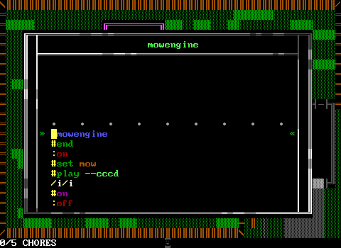
That lawn mower is definitely the game's legacy, and I've already immortalized it with a fake ZZT company splash screen (the sort of thing that's en vogue right now):
It was also a runner up for "S**T WAS SO CASH", being the game that asked for the most money. While Toucanchevsky's Starling embraced it, I never intended my game to play up that aspect, only including "UNREGISTERED" on the title screen to match the sort of games WUASTW was inspired by, only mentioning money in the text file.
It was great seeing people discuss the endings they got and the realization of just how many there were in all. During its creation, I didn't have a ton of faith in it, so seeing it get second place was a treat.
