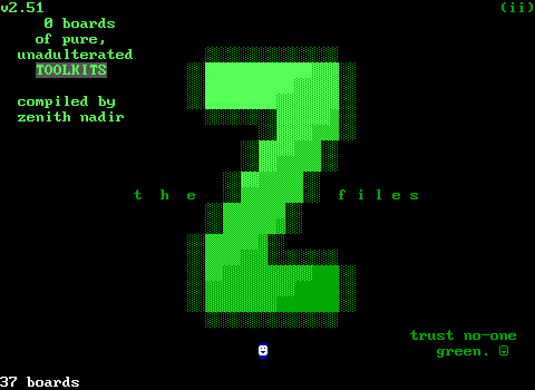
For all the strange things an outside might come across in ZZT, there is probably nothing more unusual than the tool kit. Our recent poll winner was Z-Files, an unofficial collection of tool kits that were compiled by Zenith Nadir throughout the years. Nadir describes them as "a minor artform", and I think that holds up. Tool kits often get attention when the Worlds of ZZT Twitter posts one as they can be very striking visually.
What even is a "tool kit"
In short, a tool kit is a board (on rare occasions several) which organizes various ZZT elements in colors not accessible in the default editor. In practice there's a little more to them than that, as they can contain pre-made objects, elements with normal colors but modified stats, and frequently specific arrangements of colored tiles to produce "blends" (sometimes called "shades", "fades", "schemes", or a dozen other interchangeable terms). These boards are imported into ZZT games being developed and are used to quickly access special elements without having constantly load a different world and grab each element needed one-by-one from it.
Tool kits are frequently very personal creations. However, the ZZT community's openness to sharing its content means that they're almost all intended to be used by others who choose to do so. It's not uncommon to find an author's early worlds using an existing tool kit and for them to later go on and make their own. Every ZZTer had their own unique ideas on what was best to include and exclude, and you'll quickly find when flipping through tool kits that they're frequently the most visually busy looking boards you'll come across in any ZZT worlds. A minor artform indeed.
The Origin of Tool Kits
The common assumption is that Alexis Janson released Super Tool Kit (STK) in 1994 and the term was taken from there. This isn't actually the case however! The first known tool kit and what I'm far more confident coined the term was released all the way back in 1992 with Tim Gallagher's Tim's Toolkit. (Whether or not there's a space in tool kit or not is very inconsistent. I'll be putting a space in it and I bet I'll miss at least one instance where I forget to.)
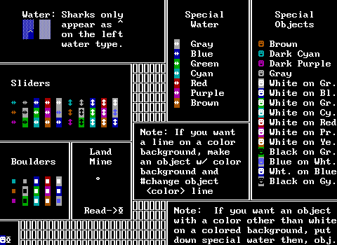
Since this tool kit isn't born from STK, it's significantly more limited in what it offers. You get sliders, boulders, and objects in what appears to be a very strange set of colors. Those more experienced with ZZT's mechanics can quickly deduce where these unusual colors came from. By using #change, on things like ammo, torches, forests, and doors, it's possible to create elements like these in the special colors used by these elements. If you do this on the title screen and open the editor afterwards, the world will load in its current state and you'll be able to save a world with these special colors.
This is pretty much the full extent of special colors you can produce in ZZT. Tim's Toolkit is the only known tool kit released prior to STK, though Z-Files does include one more which is also very likely also pre-STK.
The Colors Duke. The Colors.
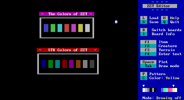
ZZT's editor restricts the author to a mere seven colors. Many elements respect the selected color, but a few have their own rules. If you're working with ZZT's default editor, lions are going to be red, and ammo is going to be dark cyan. These colors are immutable properties defined in ZZT's code. Other elements like walls or gems can be any of those seven colors. For the full details, it might not hurt to look at "640x350x16 A History of ZZT's Graphics".
STK essentially cheats in the other colors. The editor is still restricted, and if you want a dark green lion or purple ammo, the only way to do so for many years was to grab it from STK or another tool kit and copy it from there. In the earlier days, folks would frequently just import several boards from STK, but as time went on, they began to combine them into these tool kits allowing for faster access to elements with special colors. The challenge then became what to include and what to disregard in order to best use the space provided on a tool kit board.
Eventually, in the early 2000s CyQ's ZZTAE and Kev Vance's KevEdit allowed for direct access to whatever colors the user wished to use. Today, the tool kit is a relic that's mostly superfluous.
So just how much can you fit on a tool kit?
Well, a ZZT board is 60x25, which comes out to 1500 tiles. With STK allowing for every color combination, that means you're looking at 256 possible colors for everything. If you really want a complete set of combinations, you're only going to be able to include five elements per board. That's doable for elements that don't use stats, but for elements like objects or passages, you also have to deal with the stat limit of 150 elements (plus the mandatory player). Being truly comprehensive is a fool's game. STK itself deals with this by breaking up boards with stat elements into two boards, one for non-blinking and one for blinking.
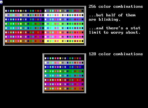
But you don't have to include every combination! Blinking colors are very rarely used, so it's a lot more common to ignore them and quickly trim that down to 128 combinations. For many elements, that's still way more than you'll likely use which is why you'll run across far smaller "sets" of color combinations.
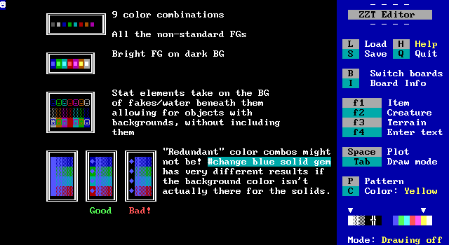
Again this is all highly subjective, which is why there are so many tool kits out there. Everybody was trying to best balance their needs with the space remaining on the board. As we explore these tool kits, we'll come across a few tricks to save space or stats and fit just a little bit more onto each board.
Fraudulent Elements
One thing that is interesting about a lot of these kits, is that sometimes they employ shortcuts that can be misleading. Perhaps the most common one is using ZZT's text element to get what appears to be dark solid walls, when it's really just a space character. Visually, they're the same, but text can't be referenced in ZZT-OOP. You'll also find this with solid walls that should have background colors but don't. Normally the background color is invisible, but if you #change a solid wall into another element, that background is preserved. In practice, these false elements are rarely detected as one rarely finds themselves using #change on a solid wall, but I respect those who went the extra mile and did make sure everything in a tool kit is what it's claiming to be.

A Note on Rendering
Normally images Closer Looks are taken during gameplay using ZZT. Z-Files can't be played, with each of its three worlds starting on a board with some text and an object that instantly ends the game. I could of course have just used the editor, but even that would have some issues. Plenty of tool kits include blinking elements, and it would be quite a bit of effort to make animated gifs of any board which has something blinking on it, so instead I opted to use the Museum's file viewer with the rendering method set to show elements with high intensity backgrounds. This means you'll see a lot of elements which are meant to be invisible, as well as bright background colors. I decided to go with this since it better shows what's actually included, and prevents there from being questions about elements that look like they're being repeated when they're actually two different colors with one of them being a blinking combination.
The Tool Kits
 2z + t
By: Teacon7
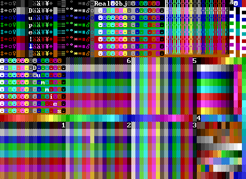
We begin with what's actually a pretty comprehensive tool kit. Z-Files is arranged in alphabetical order which makes it easy to find a kit you're after, but unfortunately doesn't help us watch how tool kits evolve throughout the years. Still, this one helps establish a lot of conventions and has a few tricks up its sleeve as well.
Firstly, it is a very packed board. What makes a tool kit good is pretty subjective. On the one hand, the more crammed a kit is, the more it offers the user. On the other hand, this can come at the expense of readability. A lot of the more dense kits use these 16x8 grids of elements like the ones here which is a straightforward way of sorting by color, typically going with the same arrangement seen in STK itself. The problem though is that the lack of labels here can lead to ambiguities. If you look at 1 and 6, you need to memorize which block is water and which block is forest. The same goes for the normals and fakes that make up 3 and 5.
Sometimes there are clever workarounds. The dummies and objects are clearly labeled. Objects simply use the space that would be taken by the regular colors ZZT lets you make objects to begin with. For the dummies, which are statless players typically used to make crowds, the combinations that would have a matching foreground and background color are replaced with text. This does mean it's not a complete non-blinking set, but its going out of its way to focus on including color combinations that are more likely to be used.
In the top left you'll find several non-terrain elements with far more limited colors. This is a nice compromise that tries to include combinations that might be useful without having to dedicate large amounts of space. Do most ZZT words need bright cyan torches? No, but I bet cyan torches are more useful to have quick access to than say, dark cyan on brown. The most common compromise is probably to just include 16 colors and not worry about backgrounds.
Sometimes the element choices may be even pickier. Duplicators are a frequently used element, and can normally only be white. This first kit opts to only include one extra color, a black one, rendering it invisible and allowing it to be hidden on a board. Invisible elements frequently get cut, or specific sections dedicated to them.
Another aspect worth mentioning is that Alexis Janson's Super Tool Kit didn't have everything in it. It took three years before Chronos released More STK which covered both more esoteric variations like pre-activated bombs as well as full boards for some elements where Alexis didn't include a full set for some reason. This gets reflected in a lot of earlier tool kits where you'll see the limited subsets of things like ammo and forest. This also makes some things a little more rare to find in tool kits even when they may be useful. Teacon7's kit has a row of what appears to be solids between the gems and passages, but are in fact board edges. They're useful, but you won't be seeing them nearly as often as fake walls or objects.
Over in the top right you'll come across two objects as well which serve as animated water/lava. Since stats are frequently at a premium, including special objects like these doesn't happen very often. (Though you'll be amazed at some of the stuff people thought was worth including in some later kits.) The use of half-block character text below those objects is another uncommon find in earlier kits, but more prevalent in later ones where having text that can be used to avoid wasting a stat becomes more and more important when making a quality ZZT world.
Lastly, the lower right area consists of blends. You'll find these in pretty much all but the most basic or most thorough tool kits. They serve as a sort of template for specific types of shading. In this kit, Teacon lets them just run into each other to save space, but they'll be more readable later on.
 A.I.Z.I Advanced with ZOP
By: Unknown
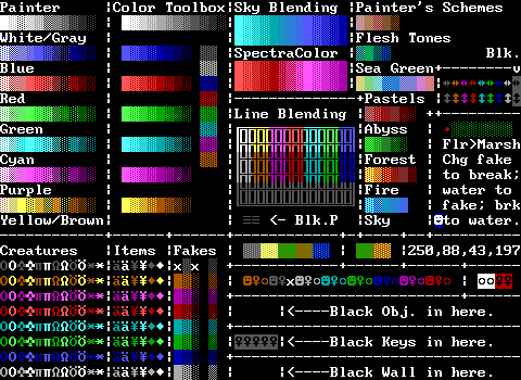
This tool kit was pretty popular as an early one and shows up in quite a few worlds. It's fairly straight to the point with dark objects, fakes, and built-ins plus some very early fades which you'll see in tons of other tool kits, especially the two sky blends and flesh tones, a thing that ZZT didn't really have prior to STK.
The strange series of numbers is actually a character reference for a twinkling effect ( , , ). It's admittedly helpful, yet the room has stats to spare so it may have been easier to just make an object that does loop the animation.
Notably, the "black wall" is just white text with a space. Visually that's identical, but #change solid won't affect this. This is incredibly common in a lot of kits and I will shame those who have lied about their elements whenever I catch them. Bad.
I believe that this kit is also the source of the "Marsh Down" object. This is a button that when pressed changes fakes to water and vice-versa (using breakables as an in-between step). You'll sometimes run across puzzle boards with these buttons, and I suspect what popularity they had was because of this kit.
 ALL v1.0 for ZZT
By: Unknown
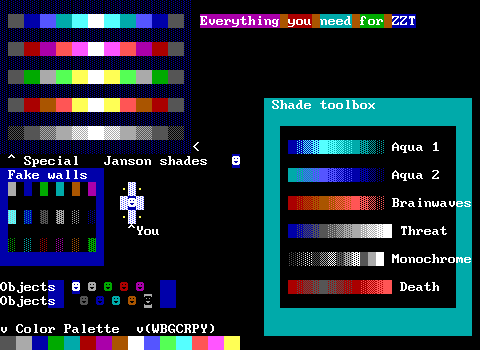
"Everything you need for ZZT". This is only the third tool kit and I trust that already you know this is very much incorrect.
There are some blends here, referred to as shades. I do enjoy when the blends are given unusual names. "Brainwaves" and "Threat" are kind of wild.
The objects here actually have code in them already which is terrible. It's just names like "DarthVader" for the black on gray and "PlayerGuy" for the white on dark blue.
The non-gray dark solid walls along the bottom are actually text. Shame.
 AKWare Tool-Kit V2.0
By: AKNeutron and Dunkinean
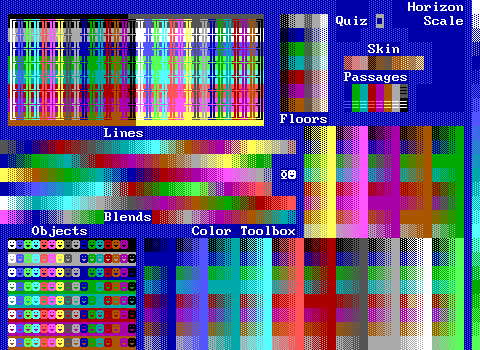
The AKWare tool kit has a surprisingly big focus on line walls, including both standard and blinking varieties, offering up the complete 256 possible combinations.
The horizon scale is nice, and you'll come across not only this blend in a lot of tool kits, but also used in a lot of games. It's an extremely quick and easy way to make an outdoor scene.
The "Color Toolbox" is a fairly common sight in a lot of kits for those willing to dedicate the space to it. It's an arrangement of solids, normals, breakables, and water in all color combinations. Far, far later we'll come across what I think the origin of this, known as "Shades Toolbox". Shades Toolbox also includes fake walls which are found here in far fewer numbers as "Floors".
Lastly, this kit includes the "AKWare Impromptu Quiz", an object found in many of the company's releases that ask the player trivia. Frequently nonsensical-trivia. Frequently instant-game-over-if-you-answer-wrong-trivia. It's got a reputation.
• • • • • • • • •
'This is a trademark of AKware, and so
'is the muzak. Therefore, if you use it
'in the game, and you are not in AKware,
'then we will find out somehow and you
'will pay.
• • • • • • • • •
I am being threatened by a ZZT tool kit.
 Barrel o' Fun Kit
By: breakout
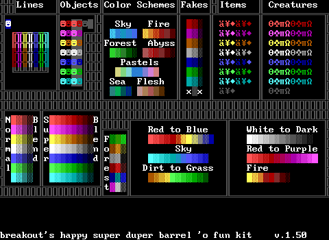
Barrel o' Fun is a bit more lightweight than the kits seen so far, but not quite as patronizing as to say "this is everything you'd ever need". It's a pretty simple set, but it does offer up the basics.
The forest sections odd choices match up with the ones from the original Super Tool Kit release.
 Beef's ultra funky tool kit
By: roastbeef
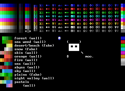
This tool kit has a cow.
Aside from that it feels like a slightly more comprehensive "Barrel o' fun". Flipping between the two you can also get an idea of how even though a lot of tool kits will share elements, the presentation can vary wildly. Here the items are split up into columns as opposed to the previous one where they were sorted by color first. I find this layout easier to read, and it offers up a bit more variety in its blends.
This one also points out if the blends are made of walls or fakes, which obviously changes the way they'd be used in games
 BenKit
By: Ben W.
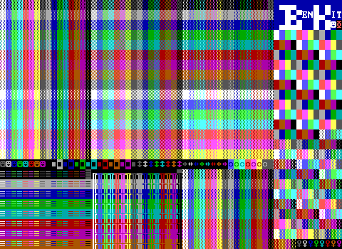
Another kit that's more comprehensive. There's a complete set of normals, breakables, and water. A huge focus on passage combinations to burn through stats, and then that chaotic garbled mess on the right. This is where the cracks start to show in these kits that really want to use every possible space. Here you get all your solids and fakes, but without being able to stick to the nice grid of colors things quickly become very difficult to find.
 BQKit
BQKitBy: WiL
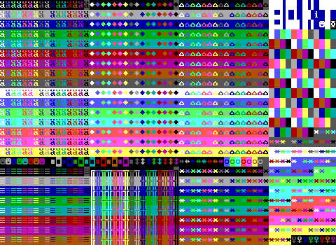
An interesting one! This is explicitly built from BenKit, just with new arrangements of items. It might seem like a companion piece to give access to ammo, gems, energizers, and ricochets, but in fact it's designed for WiL's Banana Quest where these characters are replaced with diagonal walls for more detailed art.
With the font applied, the kit actually looks like this:
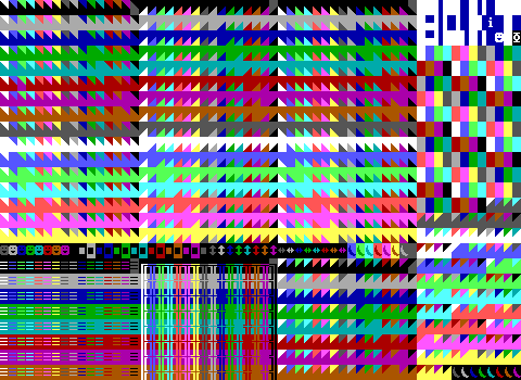
It's very powerful.
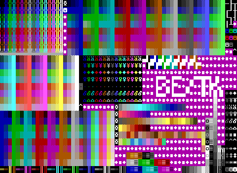 BesTK
BesTKBy: Iie
This one lists KevEdit as being a great tool to make a tool kit with. I love it. This is particularly weird since it has so few fades. Making the actual content contained in this tool kit using KevEdit is very easy to do which makes it seem pretty pointless. (Admittedly, very early versions of KevEdit weren't yet fully formed so with an early enough version it's very much possible that it would be worthwhile to make a tool kit as most ZZT editing would still be preferable in the default editor.)
BesTK includes some useful text characters in the top-right, thin lines in white text are very useful as an alternative line wall, plus those half blocks towards the logo in every color for stat saving.
An issue a lot of tool kit authors run into when they aren't planning on filling the entire board is how to handle unused space. This one opts for a simple repeating pattern. Using purple text for it though makes it really stick out.
 Blend Box
By: Dunkinbean
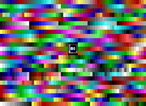
Oh I like this one. This one has a wild look as it just fills the screen with as many fades as the author was able to cram in. Thanks to KevEdit and other external editors, most tool kits are of little value these days, but having blends to reference can still be useful making this one surprisingly useful today. Now if only there was any way to actually find something on here...
 Bocco11's ZZToolkit
By: Bocco11
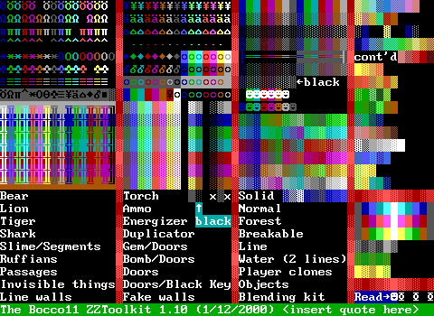
This one seems a bit more squished in terms of representation. The key being listed along the bottom is actually kind of clever, but of course means a lot of wasted space.
The blending kit area seems really arbitrary with what tiles can be found there. I 'm not sure what Bocco was going for with it.
This kit does so another fairly common stat saving trick where it erases stat elements that aren't actually a special color. You'll notice gaps in the creatures in the corner where you'd find a brown bear, purple ruffian, cyan tiger, red lion, or gray shark. The stat limit is still maxed out though! However having those extra five stats meant being able to offer more passages or something. I guess the savings aren't huge since there are multiple scrolls in the total that could have been combined into just one easily enough.
 COLOR TOOLBOX
By: Spectrum12
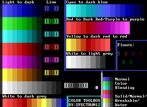
Another pioneering tool kit. This one is definitely an earlier one, and focuses entirely on colored walls.
What's really surprising is the huge lack of fakes. "Floors" of that type are probably the most commonly used, but there's plenty of room to offer up more than just these few.
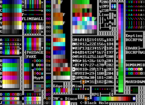 Colors R' Us
By: Dr. Dos
I made this!
Now, 17 years later I am asked to explain myself. It really has been so long that I couldn't really tell you much. I used to use S.N.A.C.K. 3 and didn't like S.N.A.C.K. 4 so I decided I'd make my own. (We'll get to S.N.A.C.K. 4 in this collection much later.)
For the most part, I think it holds up honestly. Basic walls, blinking and non-blinking objects. A good selection of passages. An odd focus on ammo? I mean it had the room for it. Honestly the majority of this probably is taken from S.N.A.C.K. Its one actual notable feature is the included ASCII chart. I'm pretty sure it's possible to insert characters whose value is 32 or more in a scroll so I'm not sure why there are so many other characters included on the board and not within the scroll itself.
I suppose this kit must be one of the later ones as I can find this specific version in a game of mine from 2003. The same world also has a ZZTAE watermark so I'm unsure what made me keep updating it. The blends would still be useful even with an external editor, but those never really got expanded on and aren't really a core focus of the kit. Still, if I ever had to use a tool kit again, I bet I'd feel right at home with this one.
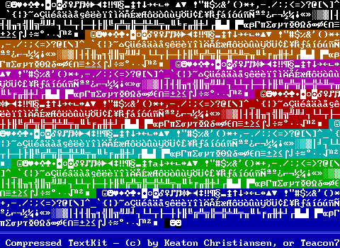 Compressed Textkit
By: Teacon7
Now here we have something a bit more unusual that I'm kind of surprised I didn't see in more worlds. The original STK didn't include all possible characters for text, but MoreSTK does so across two boards. This kit crams everything onto a single board by eliminating the characters that you can just type in text mode. Very clever!
What you're more likely to find, are outright ASCII chart boards, but these are limited to just one color to fit every character and its number on a board. Unless you're cool like me and include most of an ASCII chart within a scroll on your tool kit...
Actually wait, even this is more extensive than it needs to be. There's like, punctuation here. It looks like we've got everything except letters and numbers. It all fits so no complaints for adding in the extras, but it might have been possible to cleanly fit things on three lines and make the characters line up consistently.
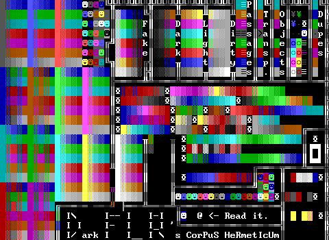 CorPuS HeRmetIcUm
By: DarkFLR
What a name. I like the categorization of basic color fades with "dark", "light", and "dirty". It's actually a really good way to identify fading to black, a dark color, or light gray. We've got a more vertically arranged Shades Toolbox style of walls taking up the bulk of the left which doesn't actually line up properly so there are color combinations missing.
A lot of tool kits include line walls, but this one just quietly inserts them as part of the walls that are used as a border for various sections. This isn't the best from a usability standpoint, however it definitely saves space. Alas, we're working with a kit here that has lot of space to spare for that small assortment of linewalls.
If you manage to avoid being burned by wanting walls that are arbitrarily missing, this one's pretty decent. It has some odd decisions like the miscellaneous section towards the top right that has a handful of passages, doors, duplicators, and three torches. I imagine those just happened to be needed when making something with this kit and wound up in the Z-Files snapshot.
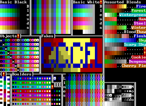 Creemy Chock n' Cheez Froot Lumps
By: Qwil man
What. A. Name.
This one seems very focused on branding.
Some smart stat saving by blanking out objects with matching colors. These get skipped with a lot of elements, but since objects can change to either a fully solid or fully invisible character, these are pretty much free to be ignored if you're willing to sacrifice the presentation a little.
There's a very strong focus on boulders and linewalls as well. You don't usually see these large arrangements of them without there also being something equivalent for other walls and fakes usually.
One of the side effects of tool kits being made by taking things from other tool kits is that there's a note in the corner where Qwil man states they don't know what the half-block text characters actually are, just that they're not objects and don't count towards the stat limit. You'll come across a few interesting labels for kits that include just these characters of text.
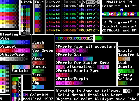 DarkMage Colorkit
By: Nivek, ZZTBooth, and DarkMage
This tool kit has an incredibly strong focus on purple. No arguments from me. I'm also a fan of the more creative names of the blends included here. "Dreary Valley" sounds way cooler than something like "Swamp".
This one is pretty straightforward, being a kit originating from prior to 1997 and being modified by Nivek. You can see the forest section is just the original STK forests which even without the date definitely provides a good hint as to when it would have been made.
Here I also like the choice to sort items and creatures by color first. Normally, I think this makes things harder to read, but there's no real "correct" order for these things. Arguably, "ammo, torches, gems" since those are arranged in that order on the sidebar, but the creatures are pretty much a wildcard where the best you can do is "Lions, tigers, and bears".
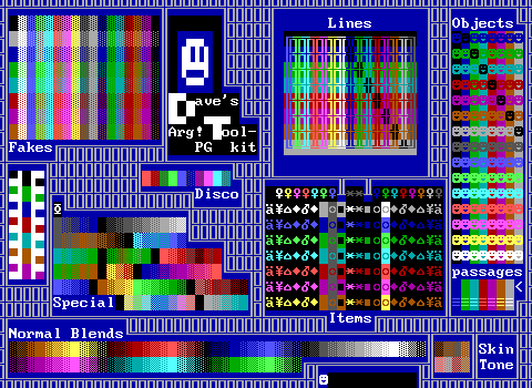 Dave's ARG! PG Tool-kit
By: Dave. I guess.
I don't know what makes this tool kit necessitate a PG rating, but this one handles the typical lack of needing objects with matching foreground/background colors perhaps the smartest of all by using those spaces for black objects with background colors instead!
Otherwise it's barely average.
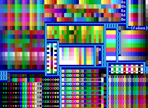 dexkit
By: Dexter
The first of many. Dexkit does a pretty impressive amount of cramming into this board. Lots of built-ins too. This one opts to skip having all the varieties of solid walls, which given the amount of stuff here, I can agree with.
There's an unusual choice of text characters above the linewalls as well. Perfect if you want to create a fake ZZT door, but more likely meant to make weird background patterns.
Lastly, it's worth mentioning that those stripes of solid walls are actually blinking solid, normal, breakable, and water tiles. That one's just a casualty of the rendering used to better identify blinking elements.
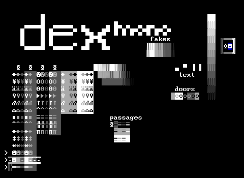 dexmono vthe fly
By: Dexter
Now here's a fun one. Although this kit is pretty limited, it has a specific goal of using only shades of gray. By this standard, it's pretty decently comprehensive. It's not even meant to be a tongue in cheek thing, as you can find it in Dexter's revenge of the zombie, a game entirely done almost entirely in black and white.
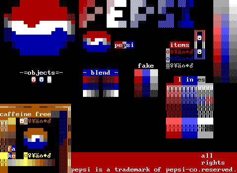 dexter's pepsi-kit
By: Dexter
This has to be a joke, but it's incredible. Use this tool kit for TV game.
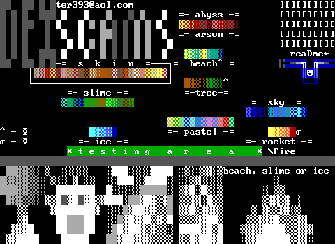 Dexscam
By: Dexter
Dexter is still going and I think ends up having the record for the most distinct tool kits. There really isn't a lot to this and honestly were it not for the title and readme included I'd honestly believe this was more of a scratch-pad than an actual tool kit.
I really like the little testing area on the bottom of this one for messing around with various ideas. This is also the most wild set of skin tones I've ever seen in ZZT, easily twice the size of most. Lots of these specific color combinations are only really functional when you're applying shading to skin or making Simpsons fan games instead.
The extended shading is carried on in general as well. That "slime" is huge and the pastels also seems a bit longer than it normally is. Dexter was going the extra mile here to turn something pretty standard and make it his own by stretching it out.
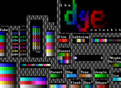 digital glass color kit
By: Chuck
I don't understand where the "e" comes from in DGE when the scroll provides the full name, but here we are.
I think this one puts in too much effort into alternating linewall colors, and not enough effort into arranging elements.
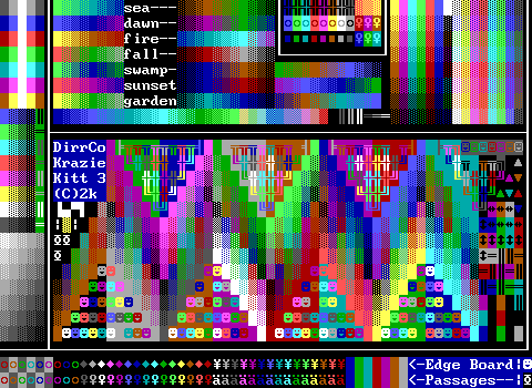 DirrCo Krazie Kitt 3
By: Mrs. Claus
This one absolutely lives up to its name with its very unusual angular layout. I feel like if I was given a specific tile to find it would take twice as long in that mess than your average tool kit. I dig the rainbow color order on the bottom though. If you're going to break away from BGCRPYW, this is probably the way to go.
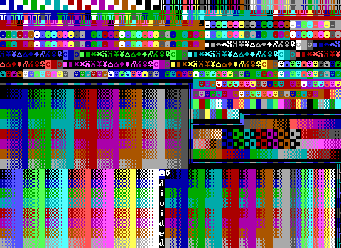 Divided
By: Unknown
This one seems pretty legit. It's very well divided, and its patterns are pretty to look at. Definitely one of the cleaner kits out there and it provides quite a lot. I'd use it.
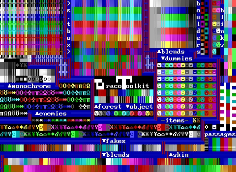 The Draco Toolkit
By: Draco
It's pretty packed together, and offers a lot. Sorting items and creatures by color first rather than type gives that portion of the board a distinct look to it. Also I don't think any of Draco's games even used default creatures so it's an odd choice to include so many in a personal tool kit.
It's also very smartly packed! I noticed the Shades Toolbox area was a little squished but a lot of what's missing is in the next section over with the pre-made fades from gray to a bright color. I feel like there's still things missing in the lower half which looks visually off and is even shorter vertically, but so many kits do a lot of duplication of elements that Draco seems to avoid better than most.
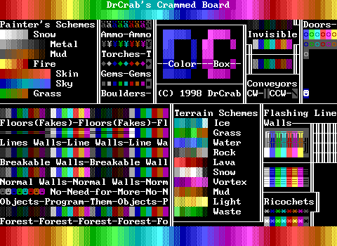 DrCrab's Crammed Board
By: DrCrab
Well, it's not really that crammed. I feel like you have to actually grab things from the background in this one to get any walls that aren't just bright-color on dark-same-color. It is at least pretty quick to find what you're after in it, provided that it has it in the first place.
This one also uses special text characters to divide up various regions, but doesn't have those characters placed anywhere where it's easy for somebody to grab them and make their own text borders. You kind of have to stumble around looking for the character you're after.
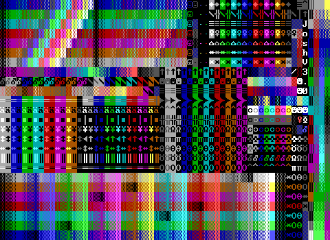 Dude Scott This is Josh V3.0
By: Viovis
It's been years and I'm still wondering who Scott and Josh are. My childhood theory was this tool kit was named to convince Scott that Josh was making his own video games with ZZT. The credits scroll reveals it to be by Viovis and explains quite a lot of the things the kit includes. This one was immensely popular and can be found in a ton of worlds.
You can probably guess why it found so much success. It's absolutely loaded with stuff while still being nice to look at. At first glance, the lower area looks like it might be wrong on some way with the clear visual artifacts where the main pattern breaks, but if you look closely you'll see that all of these troublesome spots are in fact replacing areas where the foreground and background colors would match and placing the regular dark colors on black instead to save space.
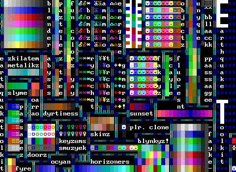 Earthquake Toolkit
By: Moonpie (probably)
I love the weird labeling on this one with the weird alternative spellings. The included selection of objects and dummies (fakeys here) is really bizarre. You get six colors of backgrounds with dark cyan gone mysteriously missing. Then for the objects only dark gray and brown are available for special foreground colors.
And then the way there's a passage and area for the player in the corner seem to indicate that this was distributed in a magazine or something where the world would be played and the player could pass through this board.
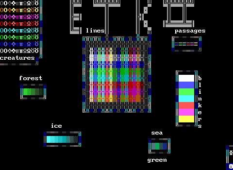 ETK 2
ETK 2By: Moonpie and Xacar
Oh my apologies. This is actually a 2nd board for Earthquake Toolkit which is almost entirely empty. I'm not going to talk about multi-board tool kits for this one. We can wait until we get something a little more polished.
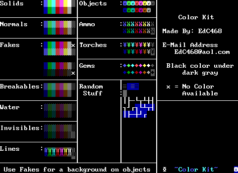 Ed's Colorkit
By: EdC468
This is rather basic, but very cleanly organized. It's very clinical looking, but I think that comes at the expense of there being a very limited amount of options available.
Interesting choice with the "random stuff" having thing lines made of text in both white and blue. Blue is a somewhat common second choice along with cyan for included limited sets of text as thin lines like these are a very easy way to draw windows on buildings. Blue gets the benefit of also working great if you want to draw some blueprints.
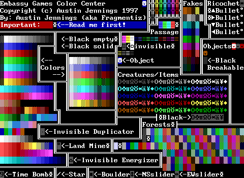 Embassy Games Color Center
By: Fragmentiz
Another strange one. The scroll explains that the kit isn't designed to have everything, just the most commonly needed elements, and then suggests STK and MoreSTK for more thorough options if needed.
I want to know in what world you would include a mere four specially colored objects and for those colors to be dark gray, dark red, brown, and... white on dark red. Oh, and a white on dark blue one towards the middle that looks like a player.
Also the swapped green water and dark green normal in the colors section in the center is killing me.
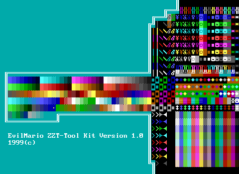 EvilMario ZZT-Tool Kit Version 1.0
By: EvilMario
If Ed's Colorkit was clinical, this one is organic. It feels incomplete with how one portion of the board is a densely packed cluster of all kinds of elements (which are often even repeated) while the left half is nothing save for the chunk of fades. I'd definitely believe EvilMario got bored and declared this 1.0.
I suspect were there an update to it, you'd quickly find the non-STK colored bombs, transporters, conveyors, blink walls, and sliders quickly removed as they're a huge waste of stats.
And man, what a bizarre set of gems to include.
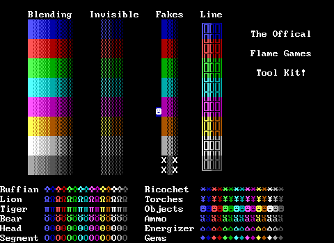 Flame, Inc. Color Kit
By: Unknown
I kind of like this one. It definitely feels more like an older tool kit, but by that standard it includes the essentials decently enough. You could totally create a ZZT world that feels like it's from 1995 using just the tiles in this kit.
Outside of that context though, it's really lacking, but it's very straightforward and easy on the eyes.
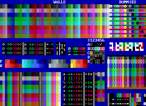 Friday Night Fever
By: Donut
This one is pretty comprehensive and does a pretty comprehensive job of including walls and fakes. Donut mentions in his scroll that he chose to not include pre-made shades because they should be "obvious" and the ones that were included were ones easier to forget the details of. I'm not sure how much I agree honestly. Sure "steel" is easy enough to memorize as it's just fading from light to dark gray, but there are plenty more that have more nuance. Shoot, just try and actually name any color combination used in a flesh tone palette off the top of your head.
What really stands out here is "The grid of death" where those A-E and 1-6 coordinates are located. This is where all the oddball elements are tossed including a dark red empty for creating blood effects, a black hole (empty with stats), and some very imprecise stars which die off after 12.8 and 7.6 seconds.
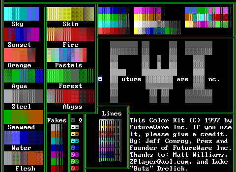 FutureWare Blending Kit
By: Jeff Conroy
Taking the opposite approach from Donut's Friday Night Fever, FutureWare's kit is almost entirely fades and in large sizes. Your basic assortment of objects and fakes are included as well, though no bright-color on same-but-dark-color fakes are represented. By now you can probably guess that I feel like objects and fakes are the most critical elements to include.
 GameMstr1's MegaShades Board
By: GameMstr1
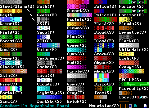
Now this one I like. There's enough spacing that each of these shades can be picked out but it still includes a large number of them. This one would make a fantastic reference in the era of making ZZT games with external editors. Each blend is conveniently marked with an "(S)" or an "(F)" to identify if the blend is solid or made of fake walls instead, with several fades having two versions to cover the potential need for both.
It also includes a small handful of objects to handle color changing as well as some pre-made door objects which can be quite useful to have readily available. (Modern editors have object libraries if you really want to have quick access to these things.)
Lastly, it has the AKWare quiz! It keeps the disclaimer about how if a non-AKWare member uses it that they will pay. GameMstr1, be careful! You don't know just what you're dealing with!!
 grey-line toolkit
By: tboT
The last kit of the first file. (Yes there are a lot of these things.)
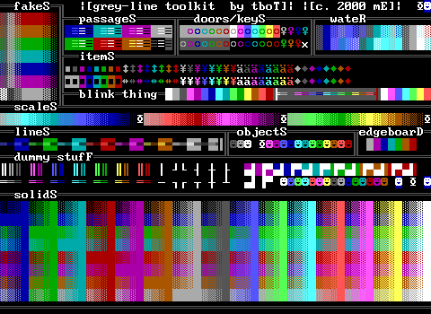
It's a nice one to end the file on one that feels well-designed. There's a lot to love for those who don't really go for pre-made blends. I can't help but applaud the thin white walls being arranged in a way where that seems to prioritize keeping them from connecting with each other. I think that makes it a lot easier to find the specific pieces you're looking for than the usual method of just squishing them together to save space.
