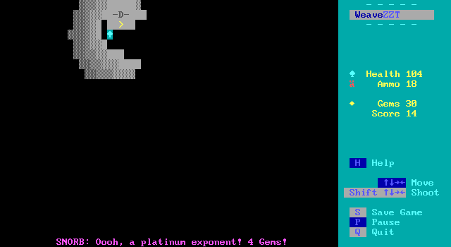
Today's article comes courtesy of a Patron poll. We'll be checking out a fairly recent release, from just this past autumn, Snorb's Dungeon Crawl. The game is a dungeon crawler (...obviously), that differs from the typical ZZT dungeon crawler by simultaneously being of a very modern design while also looking back towards ZZT past for its gameplay. It's a game built with Weave which potentially means that anything goes, but kept grounded by its reliance on ZZT's built in creatures as the basis for all enemies. The bulk of Weave's contributions to the game are in allowing classic ZZT enemies to be replicated with startling accuracy, the usual cosmetic changes for things like the player's color and character, and the ability to simply give the player an ever-burning torch instead of forcing them to constantly light dozens throughout the entire adventure.
The game is no shocking display of weaving in action, opting to deliver an experience more aligned with some of ZZT's earliest action titles where all that matters is fighting your way through the monsters, and reaching the exit to the next screen. It's simple premise, but an effective one. Snorb did an excellent job overall with this one creating something that builds on the iconic ZZT bestiary while building on to it, learning the ways of Weave with a game that feels like it was made as a learning exercise. Despite this, the game experience remains firmly designed with its players in mind. Snorb offers a fun experience where everything feels like it was included with the thought of how it would benefit the game rather than a kitchen sink of anything he could come up with for the sake of learning what Weave can do.
For the game's premise, players guide none other than Snorb himself on a fun romp through the Catacombs of ZZT after being told that there's a great treasure to be claimed at the very bottom. Along the way he'll have to deal with enemies that mimic ZZT's originals before the roster expands to include tougher "STK" variants that attack more aggressively, take more damage, or move faster than their standard versions. In order to afford health restoring items after combat, he'll have to keep his eyes peeled for treasures to claim from the catacombs. These treasures are given a value which players receive in the form of gems that they can then spend at a 7-11 style convenience store, gorging on snack foods both real and imagined. Rather than have lengthy marches to the surface for shopping treks, multiple entrances are scattered to the store are scattered throughout the dungeon's depths to ideally prevent strategic retreats from needing to be an option with exits to drop players off where they left off.
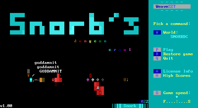
The structure feels like that of ZZT dungeon exploration games from the late 90s, with a significantly more light-hearted atmosphere rather than the usual doom and gloom. The action is the standard run and gun style, as lovingly depicted on the game's title screen, with the game's humor deriving from some of the unique treasures as well as the various items available for purchase (and not) at the game's shop. The majority of boards in the game each represent a single level of the dungeon, which are lettered from A-Z, with a few of those floors being special dungeon levels that offer up new enemies and even a non-euclidean labyrinth.
Put it all together, and you've got yourself a rather enjoyable game to explore. Snorb's Dungeon Crawl is simply a well-made game. It's one where you really have to struggle to come up with any real complaints, most of which boil down to small differences in personal preferences rather than anything more universally annoying. Going more in depth, there's plenty to discuss, and many small surprises to discover throughout the game. So let's get right to it, and see how Snorb manages to modernize a staple genre of ZZT without cutting ties to its roots.
Lions, and Tigers, and Bears
Snorb takes a straightforward approach to enemy design. Given the amount of freedom suddenly afforded by Weave, it's easy to be overwhelmed by the new possibilities.
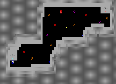
Enemies in SDC fall into three main categories. The first are those that are emulated. There's no shortage of lions, tigers, bears, and ruffians to shoot here. Rather than use the standard ZZT enemies, Snorb does his best to reproduce them via Weave's enhanced capabilities. It may sound redundant, but it's a perfect way to carefully explore what Weave offers. Through vanilla ZZT-OOP, most enemies can be approximated to some degree, though the more complex ones like tigers that roll a random number to decide if they should shoot or bears who are capable of telling when players are within a few rows/columns of their own position are basically impossible to get right.
Why someone would recreate what ZZT already has? Why code a lion-object to be as lion-like as possible when the genuine article is easier to improve? Historically, there were a few reasons to do so, some flimsier than others. Newcomers would be chided for using built-in enemies rather than demonstrate their coding abilities with objects. That would be the flimsy reasoning, one that today nobody thinks twice about.
More legitimate reasons would be to get alternate colors in pre-STK worlds, or different characters to represent the same basic enemy type, though often this had a hint of "I can't just call the lions guards, they need to be smiley faces to look realistic in my game". Creatures are also subject to a few inflexible rules which might not mesh well with more complex games. A lion's bite takes away ten health. Games that want to implement defensive upgrades would find themselves unable to reduce that damage. A ruffian provides two points when defeated, but what if the player's score is used as their magic points for an RPG engine that appears later? Perhaps a game allows players to attack enemies directly by touching them, but also intends for enemies to be shot with projectiles. Suddenly authors need to come with a justification for why tigers cannot be harmed with the player's broadsword.
In this case, I suspect the real reasoning comes down to the fact that the game is a learning exercise. If the Weave-enemies are indistinguishable from the real deal, then that's a success for the author, regardless of whether or not the player catches on to the switch.
The second set of enemies are enhanced versions of the originals. Snorb categorizes them as "STK" variants, giving them the darker shade of their classic colors. There are STK lions that move far faster, becoming challenging targets to hit. The STK tigers that shoot in short bursts requiring the player to either time their shot or just fire back with a larger barrage to destroy the enemy bullets and still have one homing in on the target. STK bears receive a health buff, with the first shot merely staggering them and causing them to stumble backwards before they continue their charge at the player. While staggered they are immune to further damage forcing players to wait a moment before shooting again.
These are all logical improvements and do quite a bit to adding some needed variety compared to the earliest levels that stick with the emulated originals in sparse numbers. Once the STK fiends arrive the game becomes much more compelling.
The change made to STK-ify ruffians though really stood out to me as being such a brilliant way of making a contender for ZZT's toughest creature even more challenging. While the other enemies still abide by the ZZT rule that creatures that harm the player are then destroyed, the STK ruffian is built different, bouncing off players after a successful strike and living to tell the tale. This is a great way to shift priorities in combat as having the health to take a few hits is usually enough to survive a rough encounter. Now the threat doesn't go away.
The third set of enemies are emulated creatures from Super ZZT. Again, Snorb is hardly the first to do this with worlds like Adventure Part 2 including their own take on rotons as well as the ZZT Encyclopedia Online providing a loose reinterpretation of spiders that can produce fake wall webbing to slow players as an alternative to Super ZZT's spiders that can walk only on webs. These creatures, as opposed to those in ZZT, have to be emulated so the reasons for doing so comes down to wanting to see them in a game as opposed to needing to tweak them to better fit the world's design.
This is where Weave gets to shine. Webs are actually sliders modified in the game's configuration file to appears as , be walkable, and be unable to be pushed. The spiders in turn use Weave's #if detect command to ensure a slider is in the direction they want to move before they do so, and if not, picking a new direction.
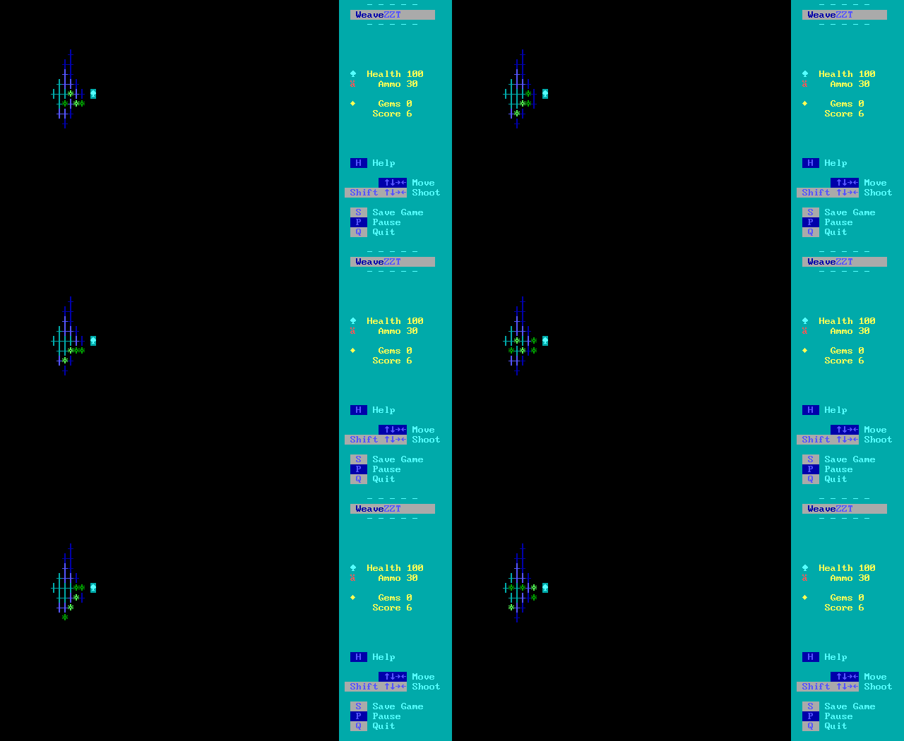
The results are great.
A fourth type of enemy exists, those that are completely original enemy designs. There's the scary sounding "Night Reapers" that live on a single floor designed around their presence. Agitate them and you'll have your head swiftly removed. The final boss also summons a unique "Unknown Element" enemy, whose appearance changes constantly in both color in character. They're fine enemies, though both feel firmly in the realm of objects-as-enemies rather than objects-as-creatures, a minor distinction to be sure, but for a game so focused on enhancement it's readily apparently which is which.
Kwik-Key Mart
In order to survive against all these creatures, the player needs some method of obtaining ammo and restoring their health. The dungeon floor has its share of unquestioned boxes of deer slugs for your shotgun as well as several flavors of health restoring healing potions, but these alone aren't adequate to get through the entire game.
The game's fifth level (and roughly every fifth level onward) has an alternate exit players are guided to via purple coloring on the walls. This leads to "Keygan Eleven Mart", a convenience store where the gems earned from collecting treasures can be spent to better refill your health and ammo.
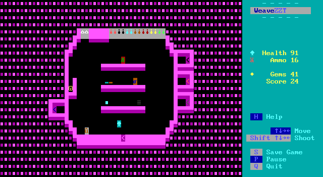
Snorb leans in on the recent trend of fleshing out ZZT shops to be more than bland menus of "10 ammo - 2 gems" to create more flavor-blasted spaces where the transactions are ultimately no different, but with the fun of having a variety of objects to touch for the sake of seeing an interaction with the bonus anticipation of discovering what an ASCII character is representing. It's a style of game design the community lovingly refers to as "Fuck around and find out". I really do like this take on shops as it encourages players to sample everything at least once, while still being upfront about the benefits of each purchase.
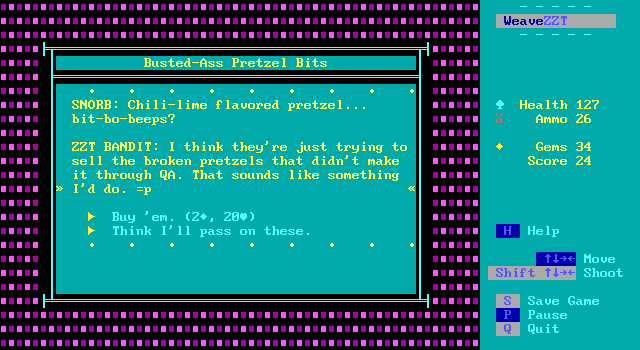
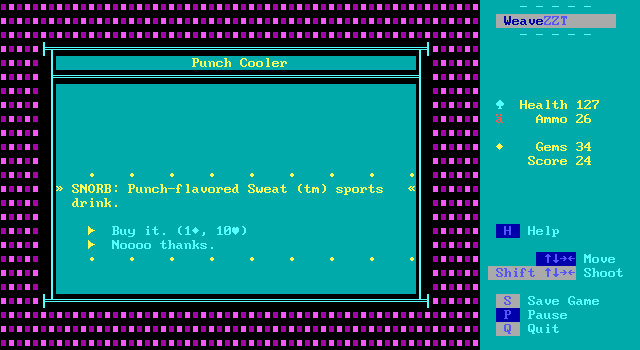
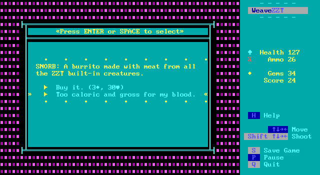
From a clinical view, your options boil down to three kinds of healing items priced from one to three gems that all restore ten to thirty health with the amount restored directly corresponding to the price. Players that want to sample all the flavor text for cosmic brownies, ZZT cola, and burritos in NyQuil sauce will have ample opportunity to buy everything once. After seeing all the descriptions, or for those in too much of a hurry to be interested in finding out what "Korean BBQ Pairer-jerky" tastes like, it's easy to just buy a dozen of whatever you need. This is even encouraged to some degree as the shelves are loosely arranged by the amount of health restored making it easy to know exactly what item to head for when your concern is solely on how much health is restored.
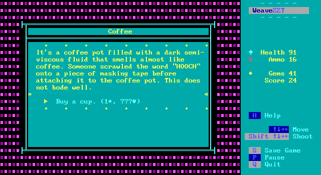
For those who don't mind taking a risk, a few special items use Weave's random number generation to determine how health is adjusted. The coffee pot with a piece of tape with "HOOCH" written on it only costs a single gem, and can restore twenty health at maximum, making it more cost efficient than any of the fixed healing items. Of course, in actuality the amount of health it restores can be any number from twenty down to just one. Meanwhile there's some spicy tuna sushi rolls that have been sitting on the shelf for at least a day. You can get twenty health for just one gem if the sushi agrees with your stomach. If it doesn't... you'll actually lose twenty health instead, having to sheepishly scarf down some pretzel bits to wind up back where you began.
These little gambles are handled well. The cost is small enough that players won't feel burned for bad rolls, and money is in ample enough supply that you're unlikely to bother with the process of savescumming away bad coffee rolls when you could just buy a bunch of brownies instead. The cost associated is less for that of the health restored and more so you can see how Snorb the character reacts to consuming the item in question. This is especially true when I found myself wandering into the store on the verge of death, and had to see what bad tuna would do if the health loss was fatal. A duller ZZT game might just activate the #endgame, perhaps with a one-liner about how you shouldn't have had the tuna. Players that make it to even the first entrance to the store will be pre-dispositioned to expect something more, and that is indeed what they'll get.
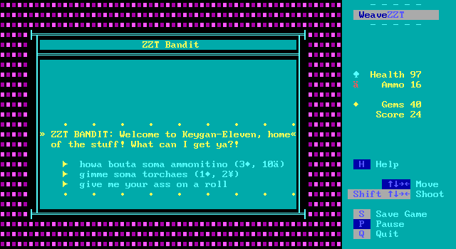
Your other purchases are handled by speaking with Snorb's pretty much community-canonized ZZT Bandit character. She's certainly a more welcome sight than the infamous Keygan. Her job, beyond explaining how the fast-travel works later on is to sell ammo and torches, in true Aceland fashion. The fact that your torchlight is infinite already just makes buying torches another "find out" moment. Unlike health which has plenty of options available, ammo comes down to a simple ten for three transaction. I get the limited options for the purposes of referencing Aceland, but still wouldn't have minded some options to buy ammo in larger quantities.
That being said, there are still a few opportunities here that left me wanting some tweaks. The shop board is the same on every visit, with special passages to quickly return to deeper floors when you arrive from there. There are a grand total of fourteen unique items to purchase on the shelves and cooler and it's going to take more than one purchase of each item to get through the game, so seeing all the text associated with each item is easily attainable.
I had hoped that the stock might rotate in some way between visits, especially later on in the game when you'll need to buy a lot more health restoring items. Adding some more items as the game progresses would give players more of those fun descriptions and could be used to provide pricier items that restore more health. It could also open up the opportunity for some items to be more limited in number, perhaps an item on sale for a single gem that restores twenty health for the ZZT Bandit to warn players that another shipment won't be coming in anytime soon here on Level P of the catacombs.
There's also a small issue in that there's no reason to save your money for later other than the fear of having too little ammo or health down the line. There's no cap on your maximum health or ammo (which to be clear, I feel is a good thing for this game) so a skilled player that hardly needs to resupply doesn't benefit down the line, they ought to just buy a bunch of sport drinks now as that's what they'll end up doing later.
My biggest gripe is that I constantly found myself leaving through the front door on subsequent trips instead of using the proper fast travel exit. Save for one item fairly deep in the dungeon that is necessary to exit, there's really no reason to even return to a previous level unless you're really in a rough spot and would rather walk through (mostly) empty floors to return to the shop when you're unable to fight your way to the next entrance. Weave provides the ability to change boards via ZZT-OOP, and the game uses this extensively throughout. Setting a flag or counter or whatever else Weave lets you do to track where you came from and having the front door return you to that floor would avoid the issue and let the interior of the building look a little cleaner.
Lastly, while I'm speaking about having to return to previous floors to reach the shop, I certainly wouldn't have minded some kind of special item that could be purchased to instantly return you to the shop. I did find myself running low on supplies a few times as I was deliberately trying to hold on to my gems (considering them to be part of my treasure haul), and backtracking upward is no fun. Depending on the floor, you may be exploring pacified ground which no longer has any enemies to threaten players, or having your guard down and stumbling into a lion you missed before on a floor you thought was pacified. It's unlikely that a player will need to backtrack if they're actually spending the majority of their money in one place as I wasn't, but having the ability to return without any downtime comes with no disadvantage to the experience that I can see. And besides, you'd still have to march back downward, so those lingering enemies would still have the opportunity to be a threat.
Plot And/Or Gameplay
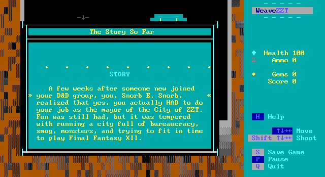
The story takes a backseat here. As with most ZZT dungeons crawlers there's not a whole lot of development here. You get your initial few paragraphs to set up why Snorb has ventured out to these old catacombs, how he got there, and what he hopes to find. 90% of the game happens, and then on the final level the story shows up again to create a very 2022 nightmare scenario which Snorb dutifully puts an end to.
The game does remain set in the La Vie world, which I didn't see coming. I had assumed the "Snorb" in Snorb's Dungeon Crawl was going to be closer to the "Sid Meier" in Sid Meier's Pirates!. This is despite the title screen making it clear that Snorb is author as well as protagonist here. It's as if you played as a pirate named Sid Meier in that game.
Authors showing up in their own work when it comes to ZZT is nothing unusual, with probably every other game released in the latter half of the 1990s featuring a self-insert, usually to poke fun at any of the game's shortcomings, or to make the author a demigod
Rarer is the game in which the author is a major character or as is the case here the protagonist outright. There was definitely a time when this sort of thing would have been frowned upon I'm sure, but we're so long since past that that it almost feels silly to even point out.
The connection between the Oktrollberfest entries and this were much more of a surprise to me, but it provides Snorb the ability to focus on what's important for this game, the dungeon crawling itself. Having a few references made to the events of the La Vie games and including one of its most popular characters is an easy way to make the game feel like it's a part of something bigger. At the same time, as all that story stuff is really just an excuse to get players into the dungeon and to give them a proper finale at the bottom of it, so playing the previous games isn't necessary to enjoy the game by any means.
Snorb, protagonist and mayor of the City of ZZT, has found himself in a bit of a pickle. He is bored of managing a city and may have committed a teensy little bit of embezzlement of city funds, converting the cash into credit for the Steam store and Nintendo eShop. So when some stranger calling himself Pennsey shows up at his office to inform Snorb about a great treasure at the bottom of the Catacombs of ZZT it seems like the perfect chance to alleviate boredom and prevent impeachment.
ZZT's dungeon crawlers tend to be pretty gloomy, and depending on the era perhaps overflowing with teen angst as well. Snorb sets the much more comical tone from the very start, with the game beginning with Snorb having smashed has car through a wall to reach the catacombs's entrance. This is not going to be a game of bloody sacrifices to dark gods, or a rescue mission into a world of the occult. You're here to kill the monsters and steal the treasure. Steve Jackson would be proud.
To aid Snorb's quest, he needs to look no further than the contents of his car's trunk to find his trusty shotgun and forty deer slugs to shoot from it, grab some loose change from the cupholder next to the driver's seat, and snag his flashlight to be able to see underground. What more could you need?
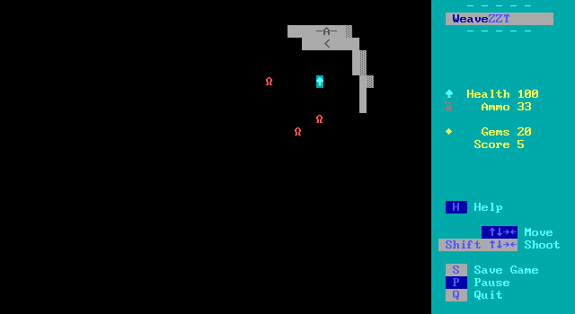
Snorb's Dungeon Crawl is a game about descending. The ruins are divided up with each board representing one floor, with twenty-six floors to survive, followed by a multi-board labyrinth, and then of course the obligatory final boss fight. It's a perfectly sized game, long enough to feel substantial, but short enough to not get repetitive.
The earliest floors are, admittedly, a bit too bland for my tastes. They consist of extremely open floorplans with no more than five lion enemies apiece. These lions, though objects, are intended to act just as ZZT's lions do, prowling the board with little interest in actually attacking the player. They're easy to dodge and easy to shoot, offering no real threat. A gentle introduction can be nice, but three floors is a bit much to me.
The gameplay improves as the game goes on. Ruffians are introduced next, which just by the virtue of floors having ten enemies on a level rather than five is enough to make players feels like they have something to do beyond walk through the darkness until they find an exit. While the danger still remains light, there's at least the potential of a ruffian rushing in from the flank while you're busy shooting at other enemies in a different direction.
By level G tigers make their first appearance and the game's initially slow acceleration finally brings itself up to a reasonable speed. Tigers mean enemy projectiles, and there's nothing stopping them from shooting at the player from across the entire screen through darkness. Until you're sure a floor has been cleared of all enemies, you always have to be ready for an unexpected bullet to enter your field of vision.
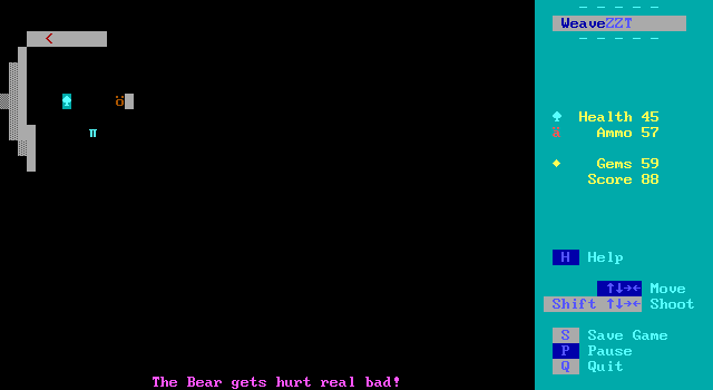
The tigers also showcase another unique option to Weave that has tremendous implications for any action game: the ability to make objects shoot enemy-bullets rather than player-bullets. Time after time after time I've run into ZZT games where what should be an intense shootout ends up turning into the player hiding off in a corner somewhere and the object shooting each other until their numbers are thinned significantly. By no longer having object's bullets behave as the player's bullets do, this prevents friendly-fire from occurring, forcing the player to do their own dirty work for a change. Never will you randomly see a message about an enemy being defeated that didn't come from your own shots.
All the while as you search for the exit, you also need to keep your eyes peeled for supplies or treasures that have been carelessly left lying on the ground. Boxes of slugs for your shotgun are a welcome sight, as are several tiers of healing potions whose exact amount of health restored is randomized with fancier potions yielding appropriately fancier gains.
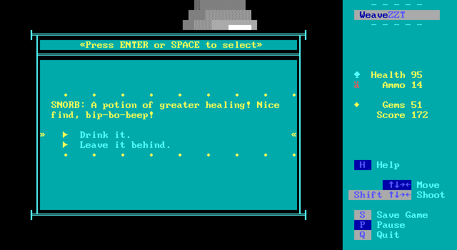
The potions are a bit of a nit-pick for me however as rather than be collected immediately upon grabbing them, they present a pop-up window with a prompt as to whether or not Snorb should drink it. There's never a gotcha moment where a potion is secretly poison or cursed or something, unless I managed to somehow miss them all. Even if that was the case, if they're that rare, why bother in the first place? There's also no cap on Snorb's maximum health making it pointless to try and save a potion for later. There's just no reason to ever not drink a potion when you find it, barring some extreme edge case like accidentally bumping into one and while the window is open noticing that a stray bullet is about to hit the potion, which will instead hit you if you consume it.
The pop-up does also have the slightly off-feeling effect where collected items use Weave's #die item command to automatically move the player on top of where the object previously stood. Normally this is a nice smooth transition, behaving exactly as ZZT does when you pick up its stock elements for gems or ammo. With the pop-up caused by the longer potion message and prompt to drink, the player can be seen snapping into place after the window is closed.
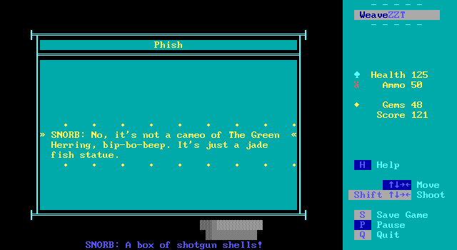
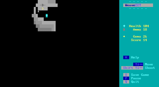
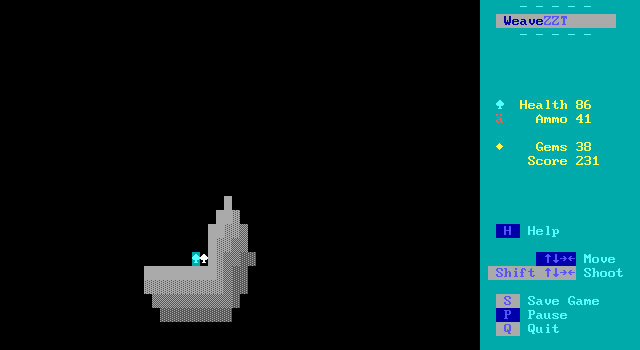
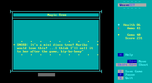
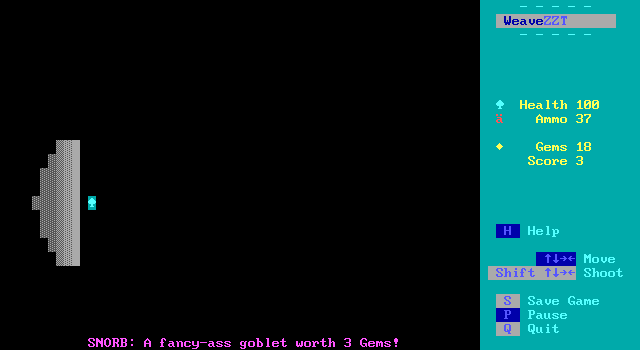
Most enticing are the treasures to be found. While they function no different than just handing the player some gems, Snorb uses the opportunity to inject some creativity here with every such collectible having a unique appearance and description. Players can uncover all sorts of trinkets ranging from statues to crowns to musical instruments to a few nods to iconic ZZT treasures of the olden days. These are all typically made from some sort of precious metal to make their value obvious. All of this is just good flavoring as items don't need to be sold off to be converted into the game's gems that are used as currency. Though this presents a missed opportunity where Snorb buys a cosmic brownie and hands the cashier a jade figurine of a fish. "Keep the change."
Jokes aside, even with the treasure instantly transforming into gems I found myself helping there was a real treasure collection aspect to the game rather than all of it being used to fund snack runs. The treasures give the game a bit of a "Great Cave Offensive" vibe, encouraging players to hunt them down more for the novelty of seeing what they're grabbing than for the monetary value. However, they really are just gem replacements, with no impact on the ending or even the high score table for collecting more/all of them. For a game whose entire conceit is that you're trying to amass a fortune with this treasure, only the motherlode at the end is of any importance.
The player doesn't really know that either, which led to me spending my money conservatively at first. I was expecting the game's ending to tally up my remaining gems and determine Snorb's fate from there which meant always wanting to buy the minimum ammo and healing when shopping that I felt would get me to the next entrance for the store. I thought there was a nice system in place where good play would translate into having more cash on hand which in turn would translate to a better ending. No such luck.
Weave Changes
Weave has been a gamechanger for ZZT. It's allowed games which wouldn't have a snowball's chance of happening in the original to be made (ZOZ). It's allowed enhancements to games that could have been done with some level of compromise. It's given authors the ability to focus more on creating their game than dealing with ZZT's weird rules and design-patterns. (I've never #zapped a label in any other programming language, that's for sure.)
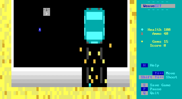
Prying oneself free from a thirty year lineage of games all of which had to obey the same fundamental rules is certainly freeing. For players with a long ZZT history such as myself though, it can lead to its share of hang-ups as I continue to take things for granted that I no longer can. Case in point, the very first time I played this game was to see if it might be a good fit for a stream. (Heavily dark games are a tough sell for me.) I started up, read the intro, left the car, and walked directly into the dungeon, without grabbing any supplies. There I dodged some enemies for a floor before realizing something seemed amiss.
The large design of the car to me reads as decoration rather than something that can be interacted with. I realize this is more likely me being foolish rather than an actual issue with the game though. After all, I had just touched a car door to exit the vehicle in the first place. With how large the vehicle is, the objects appear more in place for detail than something the player should be doing, especially if Snorb was in such a hurry to get to the catacombs that he slammed through a wall to get there faster.
Weave does allow creators to get away from the arbitrary rules of ZZT in many cases, but that can come at the expense of long timer ZZT players that quickly intuit what can be interacted with and what cannot when these rules no longer apply. The good news is that this sort of thing can only really happen right there at the start of the game. Once you've entered the catacombs, the the game establishes its rules rather quickly and clearly, preventing any re-occurrence of not knowing what can be touched in a given room.
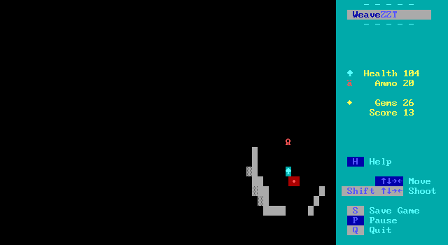
Within the dungeons themselves, players are truly left to themselves when it comes to navigating the dungeon floors. In non-modified forms of ZZT, dark rooms obscure everything save for the player, torches, and passages. Torches and passages thus frequently serve as beacons for the player, guiding them to try to find a way to those particular locations so they are able to navigate in the darkness for longer by collecting the torches or to hopefully find a way out via reaching a passage.
There are no torches to be found here. Weave makes it easy to give the player a permanent light source in darkness, which is a genuine relief for action-focused games like this. No matter how many thousands of torches a non-Weave ZZT game bestows the player with, they're going to be stuck having to press "T" to light a new one every ~22 seconds[2]. This can heighten the tension when you notice your torch is about to burn out and you've got a bunch of enemies closing in on you that you're going to lose track of for a moment, but more often than not I think most authors would rather this not be a mandatory feature, and players hardly enjoy having to constantly recommit that yes, they would like to be able to see right now. (And the "T" key is so dang far away from shift and the arrow keys!)
As for passages, there aren't any of them either. Instead Snorb takes advantage of Weave's #board command to change boards at any time from code. This is the kind of dream feature ZZTers would have killed for back in the day, as opposed to spending years and years relying on quirks of duplicators and player clones that came with their own share of side effects and were never really "immediate" so much as they were "when the duplicator duplicates", which could sync up and be immediate, or could be upwards of a few seconds of downtime.
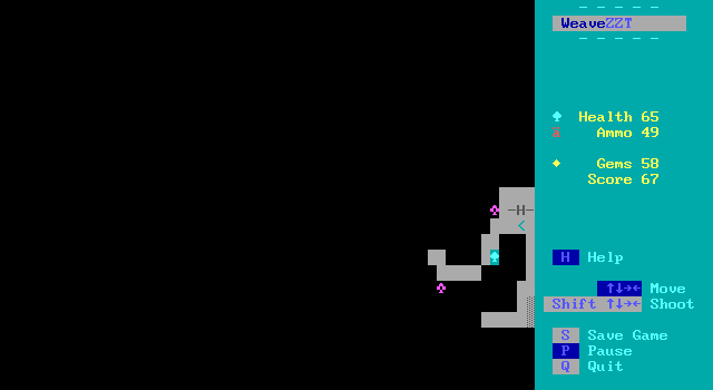
In dark rooms though, this means that when you arrive on a floor, you'll see nothing but what's in range of your flashlight. While you goal is to find the stairs to the next level, players have no idea where the stairs are until they find them. I'm not completely sold on whether or not this was the right call versus just relying on passages, as the dungeon stairs gain no benefit from being objects other than getting to use and characters you'd expect of an ASCII roguelike. Still, I think for Snorb the invisible exit was a conscious choice where the lack of guidance is an intended feature, as this is a rare instance where using the Weave approach is actually more involved than that of vanilla ZZT.
Now that I think about it, the game relies almost exclusively on objects for everything in it. It takes until level P before something has stats and isn't the player or an object, where a floor is broken up into small chambers and uses transporters to navigate between each one.
The navigability isn't all that much of an issue. Snorb's designs favor wide-open spaces or more narrow but very linear paths when it comes to the dungeon floors. The main dungeon only has two floors which can be remotely described as "mazey", and even then both of them are set on very clear grids where it's never all that difficult to find your way to an adjacent section of the maze. Though players can't immediately tell where they should be headed, huge swaths of each level can be covered rather quickly compared to the more tedious exploration of say, Darkseekr
Then there's the change of "darkness" itself. For things not visible in darkness, ZZT normally draws the unseen tiles with a character. Weave allows this graphic to be redefined, with Snorb opting to change it to literal darkness: . On first impression, this seemed to be a positive change, though I couldn't really come up with a reason for Snorb to have done so beyond being able to. As mentioned earlier, when it comes to streaming ZZT, worlds that rely heavily on dark boards always leave me apprehensive. The obvious issue is that dark boards means any viewers are spending the entire stream focusing on a relatively tiny portion of the screen with the rest of it going to waste.
But then there's the matter of what a dark board looks like when encoded on stream. It's a very checkerboard-y pattern where anybody attempting to watch the stream downscaled is going to get a foggy soup of gray as the player's light cuts through it as they move. It's not something you want to look at for too long.
Snorb's change uses the much more compression-friendly empty character which removes the issue entirely, but it introduces a quirk of its own, perhaps deliberately. The original darkness makes it very clear where your light ends and the darkness begins. In Snorb's Dungeon Crawl, the line where your vision ends and darkness actually begins is obscured. It's easy to look a little too far ahead only for an enemy that enters the torch's radius to be closer than you were expecting it.
At the same time though, perhaps that's a good thing? Players are kept on their toes and will "look" further into the board than they otherwise would. Additionally, it encourages players to avoid uncaringly cutting through the darkness, urging them to cautiously keep a wall in sight as an anchor point when possible. Having a wall on one side makes for one fewer direction enemies can reach the player from at all.
The game's classic ZZT shooter gameplay also takes from its design from ZZT's early days, opting to let the floor of a room be composed of empties and not shaded and decorated with fake walls. (Fake walls are instead saved for rare instances where they appear as actual fake walls to find.) This decision gives the game its early ZZT feel rather than drawing comparisons to the dirt and blood stained dungeons you'd see a decade later in games like Castlevania 827: Oh God not Again or Dungeon Master's Gallery.
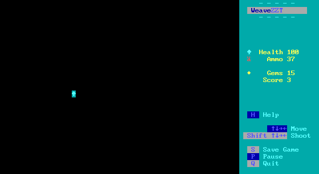
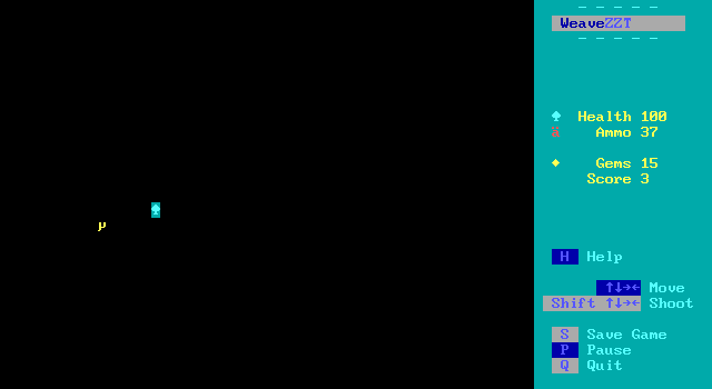
It also means a lot of lonely screenshots where the only thing visible on the board is Snorb himself. How existential.
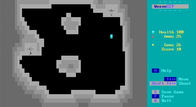
The graphics of the game are also one of the weaker aspects. With such limited visibility, it's not an easy problem to solve. The vast majority of levels in the dungeon fade from light gray to dark, making the catacombs feel very generic, with little personality to speak of. The treasures are your only real visual surprises with their strange colorful squiggles popping into view as you approach them. This is one part of the game where sticking to the early 90s roots might have been a more visually interesting choice with that era being associated with bright and varied colors that don't care how common neon-green caves or soft blue city halls actually are.
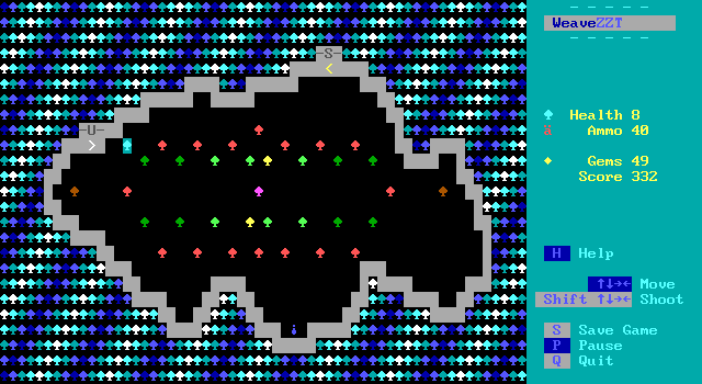
A handful of floors do defy the convention. One level features pillars with cryptic writing as a hint for a unique enemy on the floor that follows. One embraces the dark motif, doing away with visible walls almost entirely, leaving just a few speckles of cool colors and giving the level an otherworldly vibe that I appreciated. The unique tree level brings in some of the more abstract backgrounds found in the La Vie games and looks all the better for it. Though to be clear, all these boards are dark, so players never actually to get to take in the full view of these nicer looking boards.
The catacombs themselves really are that bare bones. Everything placed on a given level exists entirely to further the gameplay. There are no dusty skeletons, pools of stagnant water, nor pottery waiting to be smashed (or pre-smashed). If you aren't on one of the small handfuls of special floors, there are only the enemies, the treasures, the ammo, and the healing potions.
Though not custom tailored to my personal preferences, even I have to admit that this does make the game extremely free of distraction. By the time you finish the first floor you understand exactly what you're in for, with few surprises to break up what is still a solid core gameplay experience. And from the angle of the game being a way to experiment with what Weave offers, it makes sense to not invest a lot of time into decoration that's really no different whether it's made with Weave or otherwise beyond if detailed set-pieces need to use a ton of codeless objects or Weave's various tricks to spare these codeless-stats from going to waste.
I like when authors allow themselves to get weird with ZZT's offerings rather than stick to the logical colors. A fellow Weave game with a heavy focus on exploring in the dark, Jennifer Janowski is Doomed, found opportunities to work all sorts of colors into its dank caverns below the Sallow house. Snorb's is pretty much just gray, reminding me of the aesthetic all teenaged ZZT projects obsessed with realism ended up with even if it is devoid of the morose storyline to match.
Though a bit drab, the lack samey-ness is hardly anything players are likely to notice as they play. The action that lies at the heart of the game carries it a long way toward success. Don't let the need for an interior decorator keep you from delving into these depths.
Final Thoughts
Really what it all comes down to is whether or not the game feels like a fun way to spend your time, and the answer to that is an undisputed yes. Snorb's Dungeon Crawl doesn't usher in a new benchmark for ZZT dungeon crawlers the way games like For Elise or Psychic Solar War Adventure did. It strives instead to adapt ZZT's earliest action scenarios of rooms full of escaped zoo animals and thugs in puffy purple jackets (presumably) and integrate that into the more established dungeon-crawlers full of dark rooms with a focus on exploring the space. It's definitely lighter than those style games usually are, which can make this one a nice entrypoint for those who never really meshed with that style of gameplay. For those who do prefer their ZZT dungeons to be a little more tightly packed and perhaps a bit gorier the overall short length and easy difficulty still makes this one worth checking out.
By far the most impressive part of the experience is seeing the tougher STK variants of ZZT's classic baddies. ZZT really lacks "medium" difficulty enemies, with all of them going down in one hit, requiring authors to fill the space with creations of their own. It's easy to throw something together that moves and shoots randomly and just takes another shot or two to knock it off, but Snorb's designs feel much more organic than that, even had he opted to give them all original names rather than specify them as upgrades to the originals. You could quietly stuff them into the Creatures menu of ZZT's editor and nothing would be amiss. They are worthy next-level foes that I could see being slotted into all sorts of games beyond this one, with the luxury of being easily reskinnable if lions and tigers don't fit into the design of a world.
If you haven't tried this one out yet, it's definitely worth your time.
- [1] Super ZZT offers some more unique enemies, namely dragon pups and pairers, but the incomplete nature of the engine means that these creatures sit and do nothing, only able to hurt players if they are stepped on.
- [2] An alternative approach is to use a third-party editor to give the player a max 32,767 cycles worth of torch ticks, preventing the need to light another one, but effectively giving the game a time limit that's a little shy of an hour. This limit would tick down on every board just as lit torches still burn out on bright rooms so it's still a hefty compromise.
