Showoff
While the ZZT Encyclopedia was a community project with submissions open to all, those that actually play it will notice a large amount of the boards are credited to Chronos who had earned a reputation as one of the more skilled programmers of the era, regularly pushing ZZT in new directions with the various tricks he discovered or at least helped popularize with releases of the Encyclopedia.
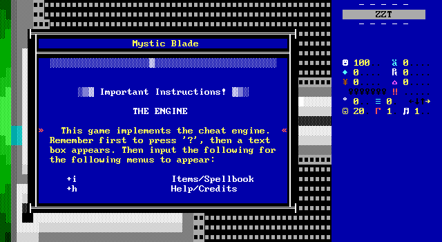
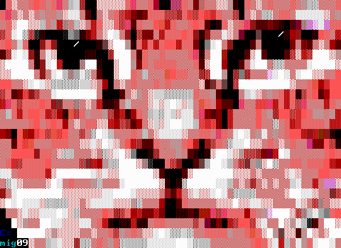
Upon starting the game, the player is immediately greeted with a squished reinterpretation of the title screen that scrolls down to provide special instructions on the unique gameplay mechanic used here, simply referred to as "the cheat engine". Today it would be referred to as an inventory engine. By using the cheat prompt to let players manually set the flags "I" or "H" (entering ?+I or ?+H specifically), and having an object detect the flag being set, Chronos allows the player to bring up a list of their items, spells, and other information.
This kind of engine found most success with adventure titles such as Pop and The ZZT Dizzy Games. I was quite surprised seeing it here. It quickly got me interested in what this game might be. As this kind of engine is usually used for puzzle solving, I wondered what I'd be in for with Mystic Blade.
Chronos is quick to point out that this isn't the full game. The engine isn't entirely implemented, specifying that on boards where there's no actual reason to use spells or items, the object that handles their implementation isn't actually there. This means players attempting to access the menu and being unable to, may inadvertently find it opening the moment they switch to a board that does support the feature. That could get annoying, though not once did it happen to me. Whenever William does have an item to use or spell to cast, it's pretty clear when and where it should be used.
There is one exception to this: William can purchase a health jar item that gets stored in his inventory to be consumed whenever he likes. So in theory, you might find yourself unable to restore your health. Again something that could be a critical issue ...but actually looking at the boards via the file viewer, it seems like the inventory object is actually on every board save for the final one that ends the game, and the game's one RPG battle which uses a different health system entirely. (Though I would argue it should be usable there with that health as well.)
The engine ends up feeling underutilized overall, suffering from the same problem seen in ZZT adventure games where it's simply a more cumbersome way of touching an object with a prompt to use supported items. With adventure games, they at least have the benefit of the doubt that "use amulet on statue" is a deduction the player should make rather than one the game should make the player aware of just by interacting with an object. With Mystic Blade the engine is here more to impress players than to benefit the gameplay. I found myself trying to "show" items to NPCs to no effect, only to have them react to having the item when touching them as if the system was bolted on later to give the game something special. The inconsistent usage of touching versus menuing is a little awkward. Since it's so infrequently used, it doesn't really drag the game down all that much.
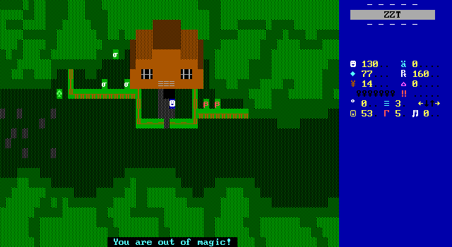
The spells aren't really any different. William only obtains two over the course of the game, getting both of them simultaneously. Healing magic can restore health, and fire can burn things. Obviously. As mention before, when William finally does get these spells he doesn't get any mana to actually cast them, keeping the system locked away from players even longer.
Since these spells do require mana (ammo) to cast, rationing your mana is essential. If you don't the game will simply trap the player without recourse in several situations. Mana cannot be purchased in the game's one store, or replenished in any other way you might expect for a quasi-RPG like resting at an inn or just replenishing naturally over time. It's a bit of a let down. I feel like Chronos has a genuinely good idea for a game mechanic here. Some creative use of spells could make for memorable puzzles. They might work as get out of jail free cards to skip over more mundane solutions. They could create some amusing scenarios if William uses them unprompted. They could simply encourage more unique puzzles as unlike most adventure games where the object used to solve something is removed from the inventory, the spells remains. What's actually here is just too limited to take advantage of them. The awesome magical ability to create fire out of nowhere is rarely used for anything that a match couldn't do.
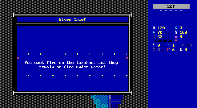
In the rare instance where it used for some more fancy purposes, it's just to apply a sense of logic to an otherwise impossible situation. At one point when William is chasing down Erik the thief, upon diving into the moat's waters William automatically casts the spell (without consuming mana) to allow his torches to burn underwater as a helpful message window explains. I guess that's sufficient to keep the pedants at bay, yet it doesn't actually feel like its adding anything to the experience.
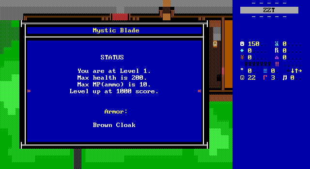
That's just the ?+I portion of things though! There's also ?+H for help. This opens with some very pointless instructions on how to enter cheats, something players literally did if they're seeing the screen. Afterwards it gets a little more useful displaying William's current level, maximum health and mana, how many experience points are needed to level up, and his current armor and weapon.
This is another instance where the idea is sound while the execution just isn't there. A few games have done leveling systems like this over the years with caps on max health/ammo, with Mystic Blade this appearing to be one of the earlier examples. I went out of my way to fight every creature since there weren't that many and they also provided gems to purchase items with. Prior to the final RPG battle I had a mere 160/1000 experience points. The RPG battle provides 1000 experience points for completing, making the system have no real purpose. The limits increased just in time for the game to end.
It might have worked out a little better if Chronos had continued work on the game for ZZT. A full game with more content would provide players more opportunities to gain experience and actually have dangers that would be made easier with increased stats.
The weapon and armor system also continues the theme of being half-baked. A list of equipment can be found in the library of the barracks with three sets of armor and three weapons to obtain. Only the first of each is available here. Since there's no other items to compare equipment to, I can't even explain what purpose these items serve beyond instances where players that skip there are instantly killed for being unable to defend themselves. I'd imagine armor would reduce damage taken and weapons would increase damage dealt, but other games have done more creative things. Perhaps armor could have special properties to let the player resist certain types of magic. Maybe a better weapon would have allowed players to choose additional attacks in the RPG battles. I don't know, and Chronos isn't telling. Beyond the library book, only the inventory object acknowledges the idea of other items, looking for flags for the alternate weapons and armor that don't exist.
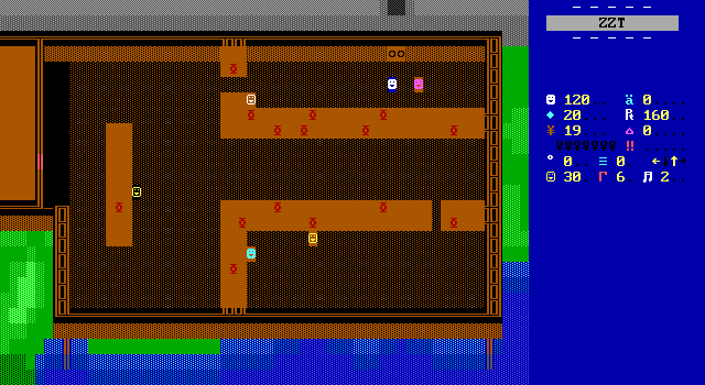
Not everything is a miss. While much of the more exciting ideas you'd expect to see mentioned in a preview for the game don't live up to the hype, Chronos knows his stuff when it comes to ZZT-OOP, and I can think of no better example than something as mundane as leaving the barracks kitchen to enter the basement.
The basement is attached via direct board connection, but the player is blocked from actually heading off the top of the screen. Touching the doors causes two objects in the top row to place player clones over the breakables and allow the player to take another step north to continue to the next screen. Then, should the player choose to turn back, ZZT will see a player already exists on the tile it would move them to and does nothing, allowing the real player to remain in the kitchen where they entered the door from in the first place. For 1998 this is just casually using some player clone tricks that really wouldn't be utilized for quite some time.
In fact, the only earlier instance I'm aware of that takes advantage of how player clones on borders act comes from yllek's Random Battlefield tech demo, dated barely a month prior. In both cases, neither world emphasizes what's going on here, despite the trick allowing authors to make some previously impossible board transitions a reality.
It's a shame that Chronos arranged the objects to move out of the way and then place player clones to the east and west after moving. This adds an extra cycle requiring an extra input from the player to actually go through the door. Had the objects been placed in the lower row of the gray walls and immediately placed clones to the north and with the proper stat order the transition would have actually been seamless, causing touching the doors to spawn a clone, and then that clone to tick and use the player's current input direction for the cycle. Even so, doing this in two cycles is still going far beyond what most games from 1998 would've done in this situation. Doing it in one would've been a triumph of ZZT-OOP.
Ultimately, Chronos is telling players about all the great programming more than he's actually implementing any of it. The combat is par for the era, utilizing melee where enemies just need to be touched before they detect themselves as next to the player. The weapons and armor that the game dedicates an entire library book to are non-existent. The inventory system continues the ZZT tradition of just being more complicated than touching objects but still requiring players to be next to them regardless. The spells have the potential to make the game stand out from its peers, but the only thing you can really do with the system is ignite bombs.
As a first chapter, there's nothing wrong with introducing concepts to the player that aren't yet relevant. It can get them excited for the next part, and of course they won't know how little there is in the way of sword and sorcery in this introduction until they've played through it. With plans to move to MegaZeux, I have to question what the extra power would have been used for. Chronos already seems to be in a rut with what uses the fire spell can have. I guess it would mean having a dedicated key to open these menus instead of relying on ZZT's cheat prompt.
For a smaller name in the community having these systems not actually implemented would likely be treated with scorn. Promising everything and delivering nothing would make a second chapter a tough sell. By this point, Chronos already had a solid reputation for Chrono Wars. Part 9 of which has its character switching engine and own RPG engine that can be pointed to in order to shut up critics that might not believe Chronos could deliver. Chronos's actually capabilities may not be in doubt, but that doesn't change the fact that those capabilities aren't on display here. When your coding wizardry is your claim to fame, it's not a good look for the highlight of your new game to be an elaborate door.
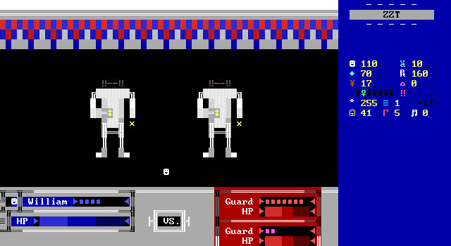
The almost mandatory inclusion of an RPG battle seems like an inescapable staple of late 90s ZZT worlds. Mystic Blade is no exception with the game's final battle sequence against the regicidal guards serving as the game's grand finale. Like most late 90s RPG engines, it doesn't impress today. Players wait for a Final Fantasy-esque meter to fill before selecting an attack.
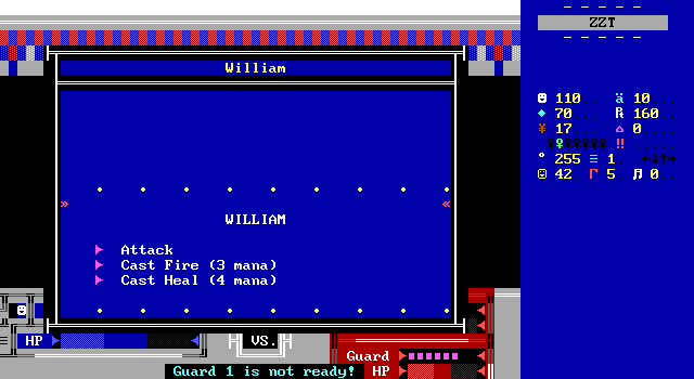
It's not even as varied as the cliché "high accuracy low damage", "low accuracy high damage" systems seen in many similar engines. William has a basic attack and the ability to use his spells if he has the mana to spare.
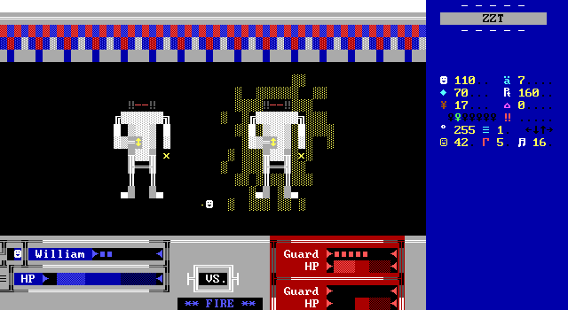
There are some basic animations and spell effects, and the artwork on the guards, while looking incredibly robotic to me, do attempt to have some detail at least. It's a step up from a few smiley faces staring each other down. I've seen better, and I've seen worse. This comes at the tail end of Williams' journey and while it doesn't end the game at a low point, it really isn't going to capture the player's attention.
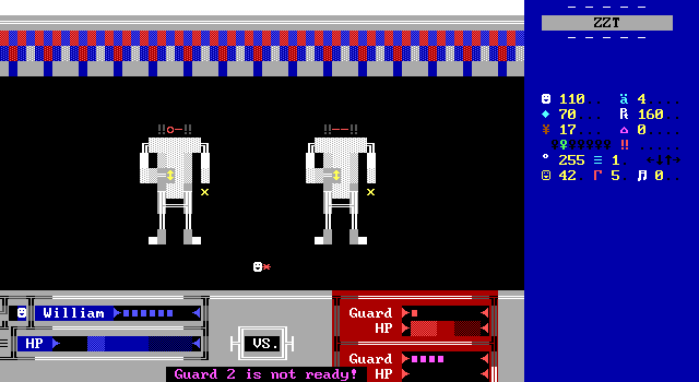
It errs on the side of being too easy rather than too hard, which is always the superior choice with these engines that put far more importance on the dice rolls than any actual strategy. Guards will sometimes simply waste their turns like this, not even rolling a missed attack, but I guess just stumbling around. I suppose that's a reasonable reaction to being set on fire multiple times in a row.
Since the battle is so biased in William's favor, I only bothered casting heal to see how much health it would restore, which is three tiles worth of damage, probably a little less than half of the total damage taken during the fight.

For more softball praise, the meters fill quickly enough that the player won't be kept waiting, but slow enough that you can watch the action before a big message window pops up to obscure everything. The defeated enemies having their eyes become "xX" is a cute touch as well.
What's here would be perfectly acceptable for the time, though this still feels less impressive than the RPG engine seen in Chronos's earlier Chrono Wars X which featured three player controlled characters, and the ability to pick from several characters. (Admittedly, those characters only differed in their color and character, all having identical attacks and health.) It took a very very long time for RPG battles in ZZT to feel like more than theatrics, so while the two engines truthfully aren't all that different in how they play out, Chrono Wars X had much better presentation. Sure these are just random spies from the Dark Order and not the megalomaniac your party's been in pursuit of for like six worlds, but the limitations of the Chrono Wars fight don't need to apply here. Please don't name your attack "attack" if you aren't stuck sharing code for a dozen possible characters. Let William chop, slice, dice, stab, thrust, swing, or anything. These engines are supposed to simulate (or at least spoof) a battle between opposing forces. This is just another instance of an RPG battle that turns into hitting the same button until all the breakables go away. There are no surprises here, and nothing to remember afterwards.
Scenery
The medieval fantasy setting of Mystic Blade really is nothing that hasn't been seen across dozens of ZZT worlds by the time it was released, so a good presentation goes a long way towards being the difference between the forest boards of Legend of Brandonia and the forest boards of Ned The Knight.
I don't really recall being too wowed by Chrono Wars's graphics. The early games in that series were often rather ugly, with the later ones improving though still not impressing. After finishing Mystic Blade I thought the game's art was definitely one of the more impressive aspects. It's only when I began flipping through my screenshots that I started having doubts.
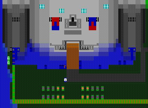
Not that this game is ugly. Far from it. It just happens to be short enough that having a few moments where I was impressed was enough to get me thinking the whole game was that way. There are a few really impressive looking buildings. The castle being the most obvious.
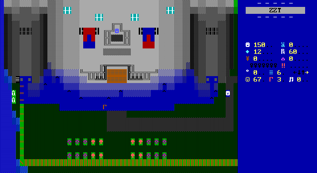
It has a rather good sense of shape to it with everything appearing significantly more curved than architecture in ZZT usually is. You can tell how the castle is even recessed into its moat with the stonework acquiring a blue tint once underwater. Given how strange "the moat connects to the dungeon" sounds, the fact is, that whether or not it makes sense realistically, it is accurate to what the player is shown.
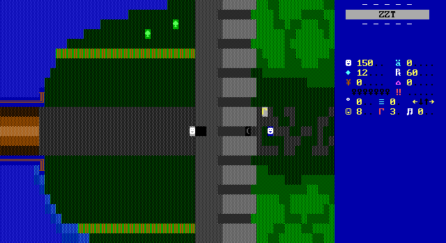
If you do like your structures to not have curves, the wall that divides the castle grounds from the rest of the world has you covered. Plenty of other games would have settled for a simple vertical line in gray to represent a stone wall. Chrono adds embrasures seen from above making the wall seem more imposing and not look like it could topple over. This thing is chunky.
Thanks to the backtracking done throughout the game, these two boards are seen multiple times, perhaps explaining why they stuck out in my mind after the fact.
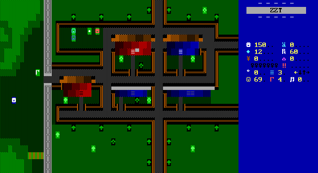
Conveniently, the town of Hampton has its own dinky little wall. What is this, a wall to deter enemy forces of ants???
The wall isn't why I wanted to focus on this board though. The way Chronos arranges this town looks fantastic to me. It's got to be that line wall outline that divides the space up so cleanly. In a game taking place in a more modern setting, a board like this might feel like an abstraction to represent the player navigating a town filled with people. Here the narrow streets feel like they're meant to be taken literally.
Credit to the flow of the town as well. Well, excluding that first brown roof that immediately gets in the player's way. After that though, it's very easy to walk from any building to another, even though all the buildings are enclosed save for one entrance point. The variety is structure sizes and landscaping give each home a personal touch. It's a nice change from the often cookie-cutter repetition of one house design used everywhere in a town.
If you look at the SolidHUD sidebar, you can see that none of the streets actually connect with another board. It feels like this isn't an abstraction of the entirety of Hampton, merely just the first few homes and shops one would come across upon passing the town's gates. Chronos even plays with the idea here in a way that SolidHUD accidentally ruins. The small extra bit of road that encroaches on the larger houses below their roofs is used as an ambush spot for another mugger. Unlike the others, William has to either immediately defend himself or be killed. It's a rough neighborhood.
Chronos is able to take advantage of the fact that players normally don't have knowledge of board exits. This forces players to try all the exits, priming them to let their guard down when the enemy suddenly shows up behind them. I missed out this wonderful aspect of the game since I knew none of the other streets were real. This actually got me stuck as defeating the mugger nets William a valuable gem that's required to be able to afford to buy a key.
I do worry though that in the more planned scenario, there's still a good chance for players to not activate the mugging sequence. There are two "exits" to the east, and if a player checks the bottom and sees it goes nowhere, they likely won't think the top one will work. It's hard to say how this would play out.
Some more visual language is used in the passage color choices which are a good effort that doesn't quite work how it should have. There are five buildings here and three of them can be entered. Without the use of special graphics, ZZT's passages always have a white foreground and so it's assumed that when using the same character for real and faux passages, that the white ones will be authentic. The lower row of buildings uses black and blue foregrounds and it's not as obvious which of these is real. Obviously the easiest way to get around this is to just use a different character entirely, but the small scale of the homes here works quite well with the passages-are-doors interpretation of the graphic.
I'm just of the opinion that if white indicates an active passage, then black should mean inactive.
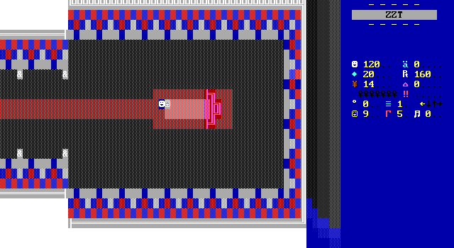
Other boards might not lookers, but still demonstrate Chronos's efforts to creating visually interesting spaces. The thought process is usually that stones are gray and so the castle interior should be gray to match. White is a popular fallback for older games that are unable to utilize gray walls or to signify the space as being good and pure. Yet these walls are much more colorful. Rather than the same stark white walls you'd expect in a Chronos designed time machine, the rooms pop thanks to the kingdom's colors being draped pretty much everywhere.
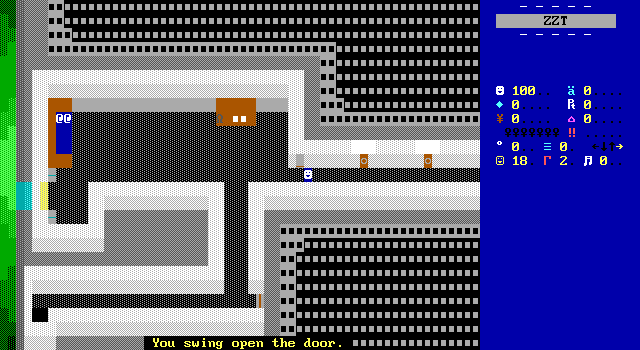
You can contrast this with the barracks where the game begins. Here the decor is far more spartan, with the location existing for solely for functional purposes. The castle also needs to serve as a symbol of the kingdom. It needs to demonstrate its pride, its power, and of course its wealth.

A few other boards have just a smidge of extra effort that nobody would have noticed were it not there, but I'm glad to see it. The bridge being built over one of two tiny islands in the river keep the board from just being a solid wave of blue. Plus there's a subtle hint of depth to the landmasses when you look at the water's shading along the coast.
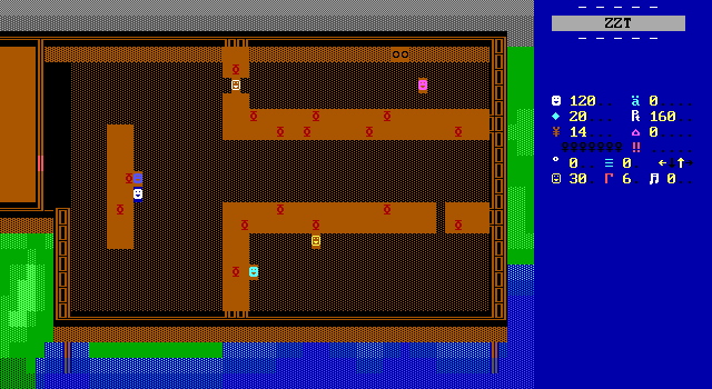
The kitchen in the barracks isn't much to look at, and is probably one of the more drab boards in the game, being almost entirely made of brown and with countless identical bits of food being prepared all over the counters.

But look along the bottom and see the way that the building is partially placed over water, requiring small stilts to suspend it that rest on the bottom of the riverbed! The water even continues to indicate the shape of the actual land the structure is set over thanks to the same type of shading from the bridge board.
Final Thoughts
So no, Mystic Blade isn't anything actually brilliant, but to me it shows Chronos has some interesting ideas that were worth developing. There's just too much that isn't here, or feels the same as any other game of this genre to really make it feel special. It feels like a rough draft, setting up a world and introducing players to the people and their conflicts, but lacking in anything to really make it a classic. Knightt bestowing the game with a Classic Game of the Month award may be a little generous. Yet given the time of that review, these types of games had fallen out of favor in the ZZT community which was pivoting hard towards darker stories and more realistic settings (in the eyes of teenagers) rather than the more light-hearted adventures of the past. Finding this one, even knowing that it would never be finished, could still give fans of these sort of games something to enjoy.
The thing is, if you're not already a fan of ZZT medieval fantasies, the flaws seen throughout Mystic Blade make it a bit too messy and unfinished feeling to really leave a strong lasting impression. I enjoyed it as I was playing it (aside from missing that one mugger in Hampton), and was really excited for where the story might go, hoping that I'd at least get a glimpse at some answers before the game would cut me off and lock its fancy player-clone powered doors. If a knight in training getting caught in a war that's greater than anyone realizes doesn't immediately make you want to download such a game, then yeah, you'd be forgiven for missing out on this one. If that appeals to you, what's here is a cute little attempt at seeing Chronos pivot from sci-fi to fantasy. He's definitely got something up his sleeve here.
Beyond that, it's just yet another medieval fantasy for ZZT, and one that remains unfinished to boot. You can appreciate some of the finer details, and the nicer looking structures seen throughout the game. The story is definitely the strongest aspect, but it too is only delivered in bits and pieces, with no real interaction between William and the people he meets. The attempt at an inventory engine feels dated here with how little it contributes to the experience, trying to be flashy without offering anything new. I suspect at the time it was a bit more impressive to see. The puzzles the game contains are pretty rough as well. Chrono Wars has shown us that Chronos is first and foremost a storyteller, which is still true here. Without the chance for that story to really develop beyond chapter one, Mystic Blade has the markings of a good game, but has yet to actually implement those ideas in a compelling way. I liked it, but at the same time I have a suspicion that I'm going to quickly forget about this one when there are so many similar feeling worlds that do manage to excel in the ways Chronos promises this one eventually will.

