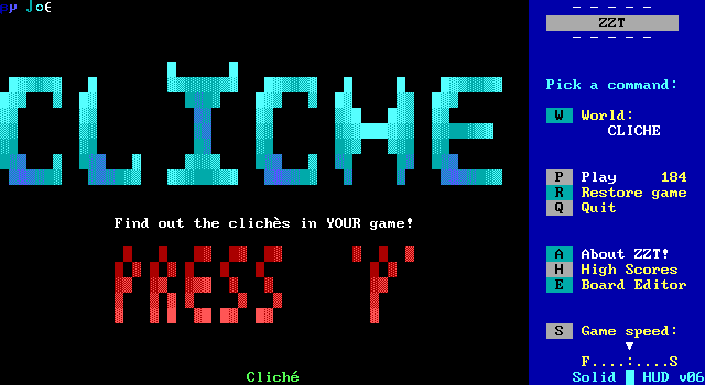
After a recent focus on trying to create some guides for new ZZTers, the Closer Look poll decided to get in the spirit of things, with a relatively recent nomination snagging a victory with Cliche: a Guide for the Advanced ZZTer.
It's been a long time since we've had an opportunity to look at a self-help world. The last time was way back in 2018, with the gold standard of such worlds, Barjesse's ZZT Syndromes. Despite Barjesse being relatively new to the ZZT community at the time, Syndromes developed an enduring legacy offering (mostly) solid advice on the kinds of mistakes seen in ZZT worlds that will make players lose interest and quit playing. The concept of a "syndrome" became a ZZT mainstay. "Big empty boards", "too many stars", Try Me-Traps, and most famous of all Ping-Pong-Paths became readily nameable woes critics could cite and authors could learn to avoid.
As the years wore on, Syndromes, while still actively recommended for newcomers, felt less relevant to those that had stuck around. These issues were for beginners to worry about, not those with a solid grasp of how to make an entertaining ZZT game. So by the year 2000 there was a need for an update. What mistakes were being made by people who weren't filling rooms with piles of tigers and leaving the yellow borders on? Depending on who you were to ask, there might be quite a bit.
Cliche hopes to answer this question by providing advice for those who has mastered the basics. You have to be an advanced ZZTer to need to start worrying about these new syndromes.
It's not the only such world to try on the role of "Syndromes 2". Around the same time, ZZT Crime debuted as well, attempting to pick up where Barjesse left off. While ZZT Crime had some debate to its merits, as plenty of its content was repeating what was already in Syndromes, along with some of the newer additions getting into far more subjective territory, ZZT Crime would still show up often enough as a complementary world for newbies to play and learn from alongside Syndromes.
Cliche meanwhile, seems to have been promptly forgotten. Why? Is this still more repetition of what Barjesse said in Syndromes? What new ideas does JoE have for us? Is it advice relevant to ZZTers in the year 2000, and how does that advice feel to hear in 2022?
Like with Syndromes, JoE here is another author with little prior success documented before the release of a world telling people what they should and should not be doing. JoE only has one other title preserved on the Museum, and that's TicTacToe. A competent conversion of a game nobody was asking for. Still, it is competent, and I didn't want to dismiss JoE's credentials before even starting, so let's see what JoE thinks we should keep in mind during ZZT game development.
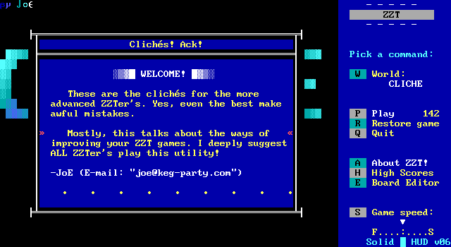
The title screen offers us an explanation here, and JoE's email address which I am immensely jealous of.
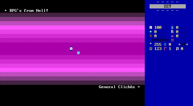
Starting the game puts the player in a very purple hallway with two paths to take, mimicking the design seen in Syndromes which split its list of complaints into "goofy" and "fatal". JoE opts for "general" and "RPG" focused. That's definitely a product of the times, with so many games of that era including RPG combat engines.
Having played many a bad ZZT RPG battles over the years now, I could definitely see a lot genuinely good advice needing to be shared here, but at the same time I've also played many a bad ZZT game in general. This kind of big empty board is arguably a syndrome already! There's no need to make the player cross the entire board here to get from one set of clichés to the next. Though Syndromes also taught via example, with nothing to go on yet, it's unclear if this is a deliberately poor choice or just an unintentionally comical way for a guide to making good ZZT games to begin.
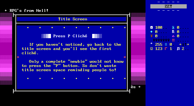
Our true first cliché is telling the player to press "P" to play. Already I'm conflicted. It is true, the option is right there on the sidebar at the title screen of every ZZT world so you don't need to tell players this. Anybody who's had somebody test their game for the first time though, is usually pretty horrified at just how blatant you need to be to get players to actually notice things. That sidebar is loaded with a whole lot of commands that are rarely relevant. I definitely played Town as a child plenty of times before realizing ZZT had an editor.
In this case, giant red lettering probably is more excessive than needed. I would argue though that by 2000, animated title screen introductions were very well established, and in that instance "Press 'P' to play" is less trying to communicate how to start a game to the player and more trying to say that whatever just played out on the title screen is over and done with, so there's no need to keep delaying. It's not an instruction, it's a demarcation that you've seen everything you need to see.
JoE feels a bit aggressive here in his presentation too. Every ZZT game has the potential to be somebody's first. In 2000, it's a safe assumption that ZZT games were being made for other ZZTers more than for those outside of the mainstream community, yet even so, it was a community that was still regularly getting newcomers. So the advice isn't awful, but I don't think it should be presented as such an absolute as it is here, especially when it's the introduction to the kind of clichés JoE is going to be sharing with us.
General Clichés

I decided heading to the right would be a better start. Let's get the more general issues out of the way before focusing on a specific genre. Unlike the dedicated boards of Syndromes, JoE scales things down and fits almost everything on a single board. Needless to say, this is going to be a short article. (Thank you patrons.)
@Author Incorperation
funny, but after the years it's gotten
VERY tedious! These are always put at the
BEINGING of a game.
Exsample:
Please calm down JoE.
Is it cliché to do this? Yes. It is a ZZT crime? Not so much. The lack of cited examples ruins this one. JoE won't name names and so I can't be sure what he's been playing that does this in this era of ZZT.
It's pretty easy to find games in which the author makes an appearance in some form. The Creator tags along with your party in End Of The World, Tseng is yelled at and/or in the presence of his characters in games like Gem Hunter 2, and Death Gate is entirely focused around authors including themselves. Yet these examples don't have nearly the same level of hostility. The way these two go at one another in this example is far more off-putting to me than the fact that one of the characters is the game's author. Tseng and Knightt are both good examples of authors who loved having their characters call out their creators sure, but this comes off as deliberately exaggerated to make the behavior really come off as unappealing.
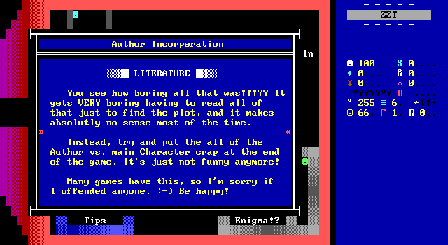
JoE quickly backs down from his argument not wanting to upset anybody who has done such a thing in their games, and suggests putting it at the end of the game? I don't think it would be any better there.
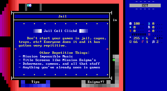
Finally, JoE and I have something we can agree on. No, not the jail cell opening. That is indeed a cliché, though I don't think there's anything wrong with it. I'm talking about the use of Mission Impossible music. I have seen dark on dark blue objects during livestreams and correctly identified them as using the Mission Impossible music object from ZZT Help Kit. This music really does show up a lot, yet once again, it's something seen in the mid 90s more than 2000 and onward, and I don't think this game calling it out is why you don't see it show up nearly as often as the years went on.
The title screen for Mission: Enigma, meanwhile, is famous for being the most copied title screen in ZZT. IN THE MID 90S. This game is a good four years or more late.
The "dobermans" and cameos to me implies a rejection of ZZT community "catchphrases" as it were. At the very least, Tseng was still saying "Agh. More dobermans" in his games when this was released so there's something here that's relatively timely.
Not being a fan of community in-jokes I can understand. Outsiders are going to be more confused than anything, and these kind of lines can really date a game. (Of course, give it another decade and it becomes amusingly charming.)
Cameos though, are a lot more divisive. Sometimes you get games that star ZZTers who do not act like those ZZTers like The Search for the Magic Flamingo. In those kind of games, yeah, they feel like stretches to gain brownie points from the included for being included. Then you've got your cameo boards such as the ZZT Festival in Quest for Glory, which probably still isn't super accurate to the actual people being represented, but at least here the inclusion of other ZZTers feels more like a respectful nod since their appearances are so brief. Lastly, Tseng shows up again here thanks to November Eve, an RPG that fulfills its promise that every member of Interactive Fantasies will die. The commitment is admirable, and the deaths replace generic NPC deaths so nothing feels forced.
This is another case where saying to get rid of the idea wholesale seems way too harsh. Cameos are still another tool to be utilized, and just because they can be done poorly doesn't mean they shouldn't be done at all.
And then it ends with "anything you've already seen". Good luck buddy.

Cliche isn't the first time in ZZT's history that clichés have been compiled. In fact, z2's old cliché page is still up and running. This world almost certainly predates that page, but believe me when I say this is not the first time somebody noticed that there are a lot of crowbars in ZZT games.
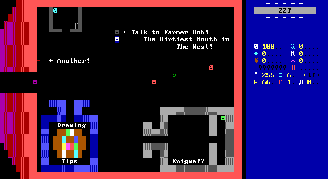
At least I could be excited to talk to Farmer Bob. As soon as I saw this label I couldn't wait to see what he had to say.
abstract cursing in the games. What are
you trying to prove by doing it?
Exsample:
bitch from hell!
try to only use it at certain times. Not
ALL of the time, like some ZZTer's do!
Some classic 2000s-era cussin'.
ZZT Crime also includes excessive swearing, followed by the author showing up to clarify things a bit more (which is included in version 2 onward, with the original version currently MIA so I can't say if it was an addition based on feedback.
This is a game from the time when swearing in ZZT was cool as heck actually, and any attempts of criticizing the excessiveness got treated as calls for censorship and puritanism in ZZT games. In a post-Teen Priest 2 world though, there was no escape. As ZZT games shifted towards being more "mature" from teenagers' perspectives, this kind of writing wasn't all that far off.
Today this dialog comes off as comically over the top more than anything, and while it's the tone of your game that determines whether swearing feels excessive or fitting, there have been repercussions in modern times because of it. There's a reason I rarely get to stream anything from the 2000s, and while it's less "fuck" and more "casual racism/homophobia", a lot of games really didn't benefit from including this kind of dialog then or now.
Still though, the "like some ZZTer's do", to me implies that this is aimed at some specific people which would be more likely to start some community drama than get people to think about if their writing benefits in any way from Dirty Bobs.
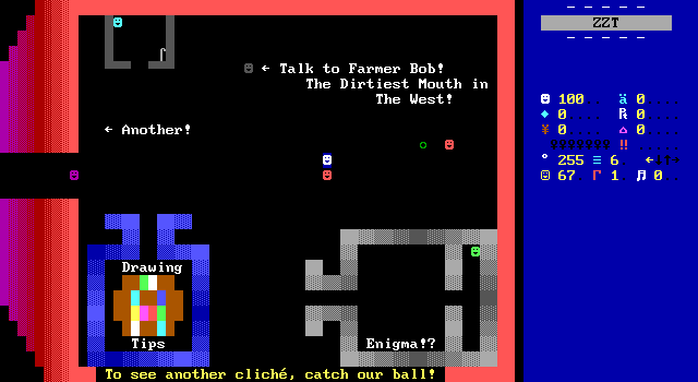
These two people throwing a ball back and forth are used to demonstrate the next cliché, and they fail miserably at it.
it was probably a pain in the butt! This
cliché happens, when important objects
wizz around.
fast, randomly all over the place. Either
way, if you have one of these objects,
make sure it's NOT important that the
player touches it.
is EXTREMELY annoying for the Player. You
should run these kinds of objects at
about "#cycle 3".
• • • • • • • • •
This one can be some genuinely good advice. Erratically moving objects that move at the same speed as the player can indeed be quite annoying to have to catch. There is a real lesson to be learned here and I respect that.
That being said, the ball being thrown follows a set path with lengthy horizontal movement on each end. Just getting in the way of one of the objects that catches the ball makes it fairly trivial to do yourself, though you do have to actually touch it still as the ball will bounce off the player's face.
So we get the unusual instance of good advice without a good example to match. At least it's something I and probably others can get behind. This is probably more true in the modern era where you can set an object to #cycle 1 in advance without actually having to code the command. It's easy to forget how fast that is when you make it the new default.

The lower right offers up a small empty room and "Enigma!?" which if you are familiar with Mission: Enigma then you already know exactly what this is going to be.
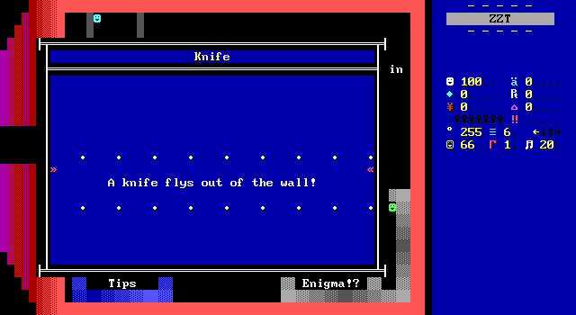
As expected, a few steps in, a knife launches from the wall at the player, who has little time to react to it. Politely, it cannot harm the player, and believe me, there are plenty of pointy-thing launchers in ZZT games that will result in instant death if you're hit.
The player is also unable to grab it out of the air, as one can in Mission Enigma, which although "instant death knife" is probably a more common and negative cliché, the grabbing is what JoE wants to focus on.
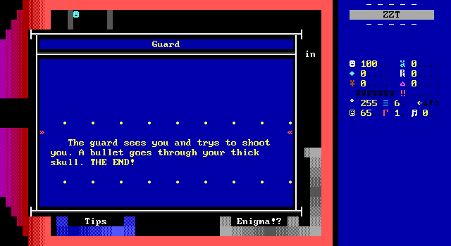
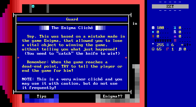
Once the knife is gone, a guard shows up to kill the player instead. At least in theory. This is just a demonstration and the player remains safe from any actual harm.
Alexis Janson's Mission: Enigma has one hell of a reputation in the ZZT community. It is frequently considered to be Janson's best ZZT game, and whether or not one agrees with that statement, its legacy is indisputatable. The title screen cinematics, the strategy mini-game played against a computer opponent, the many puzzles with creative solutions, and crammed in just a handful of boards.
"Later, I felt I needed to make up for unleashing this travesty [Code Red] upon the world. Mission: Enigma was an attempt to do exactly the opposite and fit as much content as I could into as few boards as possible."
— Alexis Janson in ZZT by Anna Anthropy
But if you were to ask anybody* what they remembered most about their experience playing Mission: Enigma and what you will most likely here is "That damned knife". What seems like one of the game's countless ways to get your secret agent killed requires you to actually catch the knife out of the air before it breaks against a wall. Fail to do so, and you'll find yourself in an unwinnable position.
* I did not actually ask anybody.
JoE sees a problem with this, and so do I, but if one of us sees two people kissing, the other sees a vase. JoE suggests that when the player has found themselves in an unwinnable state like this, they need to be informed in some way, possibly ending the game as well. In general, he's not wrong. I think that's the correct approach for 99% of otherwise dead-man walking scenarios. Enigma's is a bit different than most though. If the player is struck by the knife, the game ends. If the player avoids the knife, the game should also end? That doesn't feel right to me. Obviously "don't include it at all" is a contender too, but I want to better handle the puzzle, not destroy it entirely.
I'm not sure what a better approach would be here. Perhaps the guard discovering the player could bring up a prompt of what weapon to use to deal with him? A prompt with only one option available implies additional options have yet to be found. I do not know.
Nevertheless, JoE loves him some Mission: Enigma and hates him some games that do anything seen in Mission: Enigma and backs down again. The fear of being harassed for criticizing a popular game has only gotten more real since Cliche was released after all. Here though, this is not exactly a controversial opinion. Nobody will defend that knife. Enigma is a wonderful game, despite the knife puzzle.
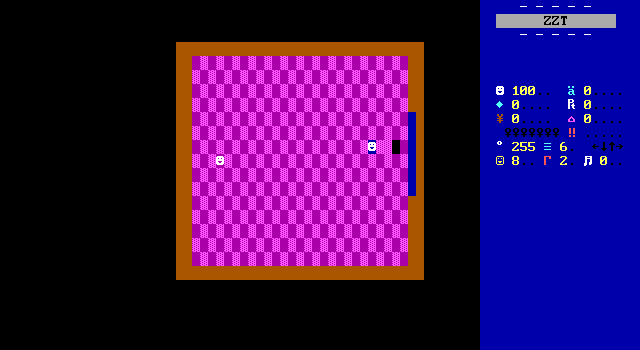
There's not a whole lot on the general clichés board. A passage leads to "another", which I had hoped would be another set. Instead it's just using a passage to show off a single cliché. Fake walls were intended to hide secret paths for the player to discover, but wound up being used as floors for interior spaces almost immediately. The passage code isn't robust enough to handle players standing fake walls when it repositions the player which leads to both the tile the player began on being turned into an empty, as well as the player dragging any floor with them when they first move.
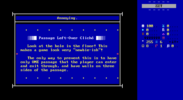
The "solution" here to avoiding these unsightly holes in the carpet doesn't seem quite right as the player's position on a board when it is not the active board will be replaced with an empty upon arriving on that board. If the player was on a fake wall to begin with, it will be moved across the board with the player as the stat tracks what it's on top of.
It does look bad though, and I do at least agree that when it can be worked around by replacing a fake when one is removed or by keeping the tiles around passages empty is an effort worth undertaking. When I take screenshots for these articles, I make a habit of trying to cover up these gaps by standing on them when possible.
So, I think the only complaint I've got with this is the incorrect way of solving it.
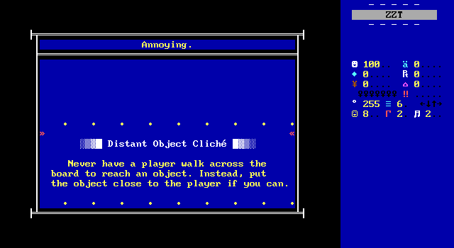
The lone object in this purple checkerboard room is here to demonstrate the tedium of long walks for no gain. Again, legit. Now if only this game would follow its own advice here.
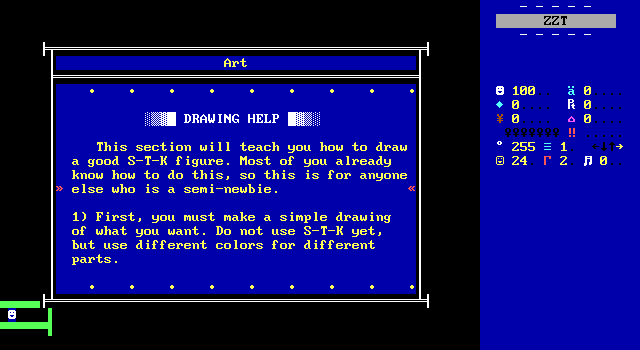
The general cliché board offers one other passage to help players learn how to create some art in ZZT with nice lighting.
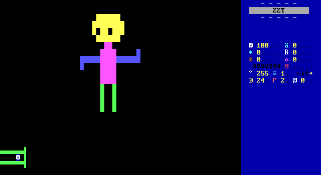
They're perfect already though.
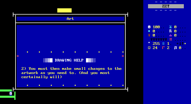
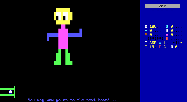
JoE identifies a flaw with this stick man: a lack of beefy legs.
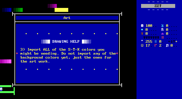
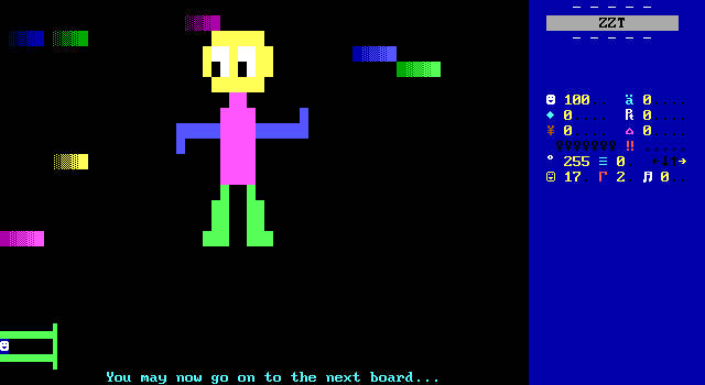
This advice was sound enough at the time. Back when getting these special colors meant switching to toolkit boards, putting them in the single customizable spot in the editor's pattern buffer, and bringing them into the board where they were needed.
The alternative is to just grab the color as needed, and start shading those arms blue immediately. A young me had enough mistakes where I'd flood fill something to see if it looked better and then realize I had to go back to grab the tile I just replaced again when it didn't. My verdict here is that this is all sound advice back when ZZT's built in editor was the only one available.
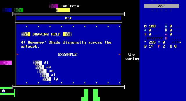
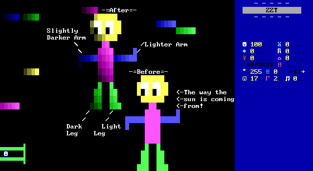
Directional shading like this is not a perfect solution for any and all things. Here the simple design of the character clashes with the far more complex coloration. You see a lot of ZZT art like this, and it rarely looks good when it's being used on what amount to small areas of the board. The intensity of going from bright blue solids to dark blue water represents some rather extreme lighting.
Compare it to some well-made ZZT art of the era such as Garlash the orc here from A Dwarvish-Mead Dream. The fade from light to dark there isn't exclusively focused on how he looks with a flashlight shined on him. The character's muscles are defined through the shading. There's shadow around his neck where his head would block out some light.
I am not somebody who is particularly capable of communicating this sort of thing. Perfectly smooth lighting implies a perfectly smooth subject perhaps? Basically for this little dude, the level of shading feels excessive, and while the original unshaded design does indeed look simplistic, this is going overboard.
Here let me try to color a dinosaur.
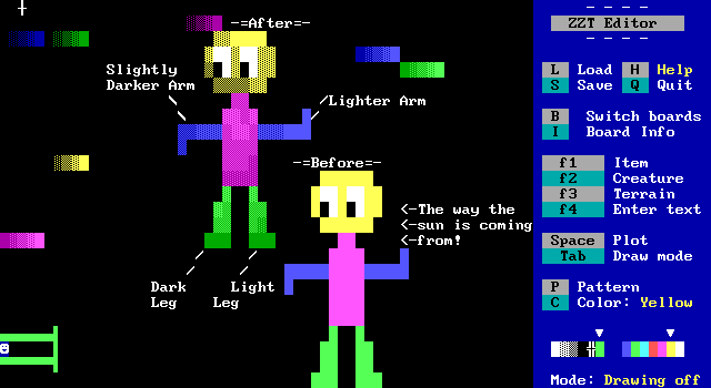
I am not one for ZZT graphics, and this was the part of the game where I realized I definitely played this as a child and took the art lessons in it to heart. I'm working with a dude who looks like he belongs in a Gumby cartoon, but I think the narrower gradient of color is an improvement?
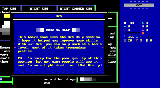
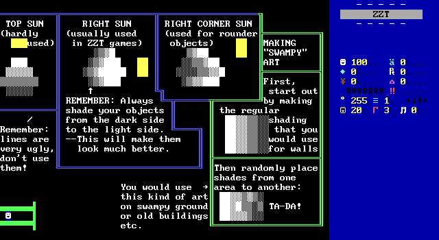
That's all the drawing advice. I'll vouch for "right corner sun" and "swampy". Anything that isn't perfectly rigid will look far more natural than top/right sun here. Save that sort of thing for title screen letters.
But what is with this sudden attack on line walls? Line walls are great! Even the irregularly shaped regions look alright to me. Out of all the opinions presented here, I feel like this is the one that will find the least support. Perhaps an argument can be made for filling a board with them, or putting them around the edges where they connect to the outer border of the board, but plain old line walls are a perfect and clean way to divide things up, and I will read no libelous remarks about them.
The green pipe looking thing in the corner used to keep the player in a small area? That's ugly. F u.
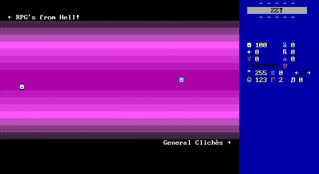
As I walk across an entire board with nothing of interest, I contemplate the cliché from earlier about distant objects.
RPGs from Hell!
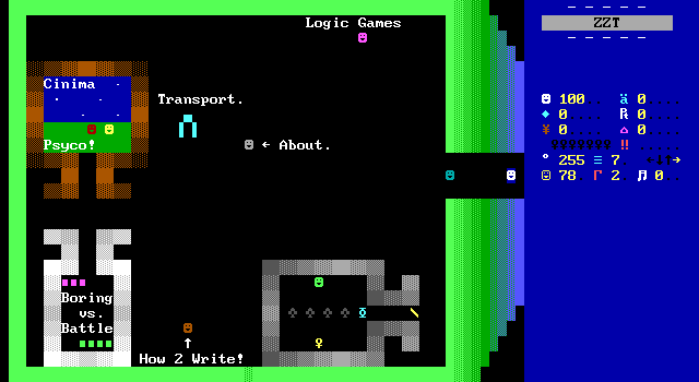
This continues to be lacking. At least I already agree with whatever "Boring vs. Battle" has to say.
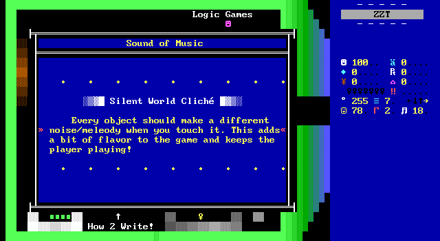
Strangely, the very first object on the board gives advice that has nothing to do with RPGs.
I don't know about every object, but some sound effects to add a surprising amount of enjoyment to games that make good use of them. This world is no exception. JoE makes his objects play some short drum effects when touched that are a welcome addition. I respect that he was at least consistent with this one, though they are absolutely not all different, which seems quite excessive to me.
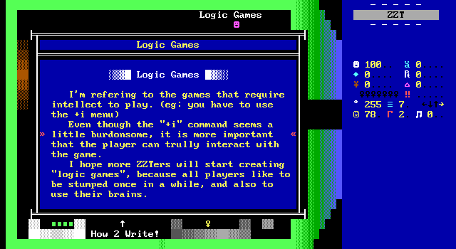
Oh this is fun.
I love describing ZZT inventory based adventure games as "Logic" games. Obviously this sort of thing is personal taste, but dang, if I was making my own little set of Syndromes it would be to complain about how these sort of games usually don't benefit from the interface at all. Having to open a cheat prompt and enter text every time you want use an item is my go-to example of how ZZTers' insistence that what works for far more advanced games seen on consoles will work just as well when crudely mimicked in ZZT.
Now, I love these kind of ZZT adventure games. Pop, The ZZT Dizzy Games, Evil Sorcerers' Party, these are some of my all time favorites, and all three would function just as well with using the spacebar to open an inventory instead. More often than not, there's nothing offered by these inventory systems that couldn't be done with just opening the inventory after you touch an object.
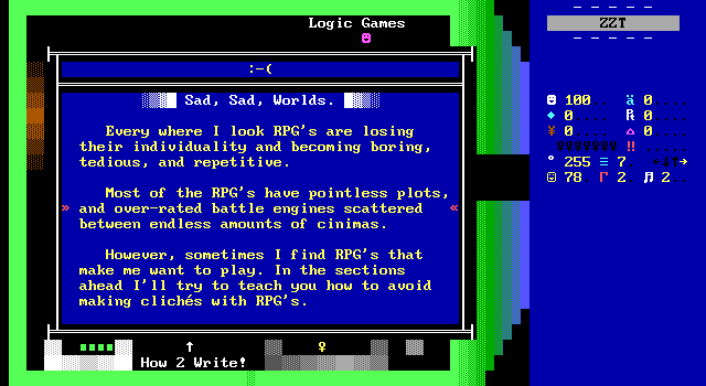
It took me a moment to actually read the "About" object. JoE has complaints about the glut of RPGs for ZZT in this era, a pretty valid concern. Most of these games think they have far more compelling stories and engines for 16/32-bit Final Fantasy-styled combat systems than they really do. There's a lot of advice that can be given to authors interested in making ZZT RPGs. JoE has a very real possibility to raise some valid points here.

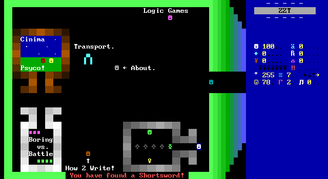
The lower right section is intriguing, beginning with the player collecting a sword, before a scroll explains that to demonstrate what it needs to demonstrate, that you're to touch the first two gray objects, then pick up the item before touching the other two. This is a clunky solution to ensure compliance that would be better handled by just dividing the room into two different rooms.
A world with a larger scale than these tiny sections of boards like Syndromes could do a better job demonstrating the point here by just having two boards. But here I am talking about "objects" before stating what they're for.
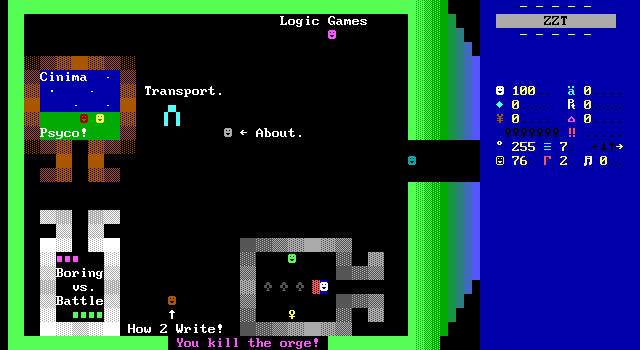
These immobile foes are ogres, which I'm only now noticing are incorrectly written as "orge". I get that them not moving or attacking is for the purposes of hurrying things along, but I feel like a better scenario could have been engineered for this.
The yellow key item is actually a new sword and I object to the character used for it though I can see it as a sword pointing downward. It dispatches the remaining ogres just as quickly.
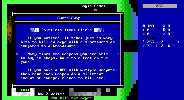
Straightforward, reasonable advice. A lot of ZZT requires playing pretend, but useless items that require payment or putting the player in danger to acquire are a real pain when something softer like getting a new sword after a mandatory boss fight can be more acceptable.
At first I thought this being consider a pervasive issue in ZZT was overblown, but the more I think about it, the more I realize that's not entirely the case. I recently had to play through Smash or be Smashed which was loaded with unimplemented items. Some, like the Flame Frost Blade Demo get a pass for being clearly still in development. Then I remembered that November Eve has an unobtainable weapon due to bugs, and special ammo only available in a second playthrough after getting a secret code to enter. Said ammo, despite being available in basically every fight, only works in a single battle.
So you know what? Yeah. Please listen to this ZZT community in the year 2000.
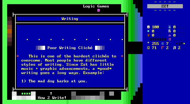
"Write good". Well, I agree with that. Good writing can work wonders on ZZT worlds, putting the player in the right head space for the more abstract gameplay to feel more welcome. JoE is here to show us how to punch up an encounter with a barking dog.
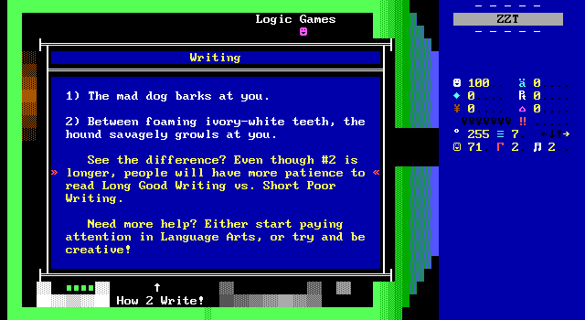
*Chef's kiss*
This is the other thing I remember of this world from when I was a child, and I was so excited to find it again. Savage hound with clean teeth.
Yet again though, this is another example where a lack of any nuance gets in the way. Detail needs to go to what's important. The barking dog example could just be a dog behind a fence the player walks past, or a dangerous foe to overcome in a cat-based platformer. The shorter sentence that JoE considered lesser isn't bad, it's just not going to get the player to dedicate their focus as much, which may sometimes be the author's intent to begin with.
Generally it's a novelty for ZZT worlds to tell you when a tree is oak, elm, cedar, or maple. Appreciated, but more often than not that tree is just a decoration to add some visual variety to the board. If one of those trees talks about how the bark is peeling and the leaves are shriveled, the extra focus tells the player that there's something to this particular tree. Do this for every single one, and the player is going to get exhausted.
Luckily, keeping your grades up will get you where you need to be when writing ZZT games.
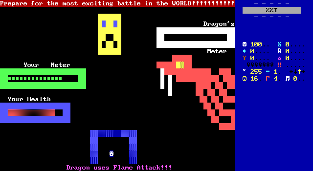
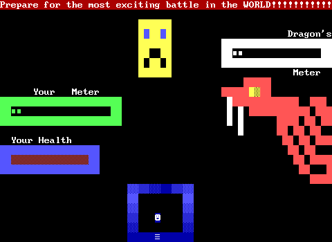
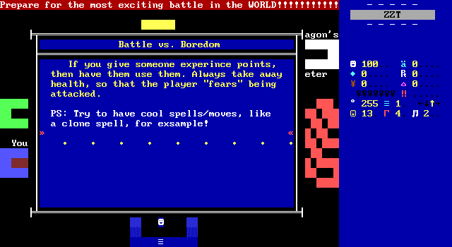
The boring versus battle room is no disappointment. Some agonizingly slow turn meters fill up for the player and the dragon and everything just crawls. It's a little exaggerated, but for once I truly get where JoE is coming from. ZZT has so many bad RPG battles like this, with these awful needless long pauses between commands.
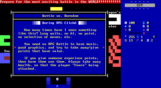
The opening paragraph is all true. Most ZZT RPGs battles are significantly more luck based than skill, with very limited opportunities to turn the tide of battle. Almost as if realizing this, authors love to instead stack the deck in the player's favor which solves the tedium, but further demonstrates the lack of impact the player actually has on a fight. If you're just going to win, there's no interest. If you're just going to reload a save after every miss, then you're not going to have a fun time.
JoE offers up the interesting idea of using the player's actual health for these fights, which while not the norm, isn't too uncommon. Games that do this run the risk of becoming unwinnable however compared to the more common health meters made of breakable walls which will always be full at the start of each fight. At least, unwinnable without cheating, but if cheating is a fix for the problem, so is zapping your way to the passage out of the fight. I think which style of health mechanics in RPG battles comes down to taste taste along with the knowledge of what kind of combat exists outside of these kind of fights.
The health counter method also brings about its own restrictions. Games that have multiple party members rarely can dedicate extra counters to a second character's health. This gets more extreme if there are action sequences outside of RPG combat as well. Counters are a very previous resource for ZZT games and developers really need to figure out what they'll include or discard for ZZT RPGs. Still, having the player feel any sense of danger is something that is essential, even if using numeric health isn't an always applicable solution. Unfortunately, most ZZT RPGs really do miss the mark on this. I would go so far as to say that prior to Commodore's Psychic Solar War Adventure, RPG battles were ultimately a gimmick, and at best something like a pro wrestling match, where the outcome was pre-determined, but perhaps you could suspend disbelief enough to get excited about the match.
Today, ZZT RPG developers are much more aware of the actual work involved in crafting something that really works. Around this time, a fancy RPG engine was more of a display of mastering ZZT-OOP that said little about how well the author understood how to design a good engine.
What?
I mean, what does make the more "look what I can do!" style RPG engines tolerable is how much effort is put into the cool spells/moves. Things like little swinging swords, flashy invisible walls, or characters that move around a bit can make these fights more interesting to get through. At very least, they give the player a reason to try out every attack even if one ends up being the clear winner.
I have not seen a ZZT game with a "clone spell".
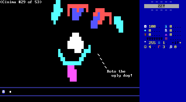
The final cliché deals with cinemas. Once again, this really is much more of a general issue than one specifically related to RPGs. From just this, there's a few things we could be dealing with here. Firstly there's the text speed. Nobody wants text that changes too quickly for the player to read it, nor do they want it lingering long after they've finished reading. Some may say the lack of animation on the board means there's no reason to not just use a message window instead. Perhaps the complaint is that the scene can't be skipped, something that may ire players revisiting a game, or just the impatient. Maybe the issue is that this mad dog doesn't have ivory-white teeth.
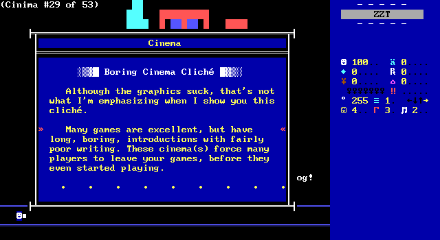
According to JoE, the problem is that games open with lengthy cinemas that take too long before the player gets to do anything. JoE and I are in perfect alignment here. Of course, I'm not really thinking of this as a ZZT problem specifically.
Instead, have your cinemas in the middle
of the game, after the player is absorbed
in game-play.
S-T-K boards the player goes through,
without having to read as much text. This
will keep the player interested in the
new graphics as they appear.
that's actually reasonable. Test your
games to see how fast the text should
scroll.
For a change of pace however, JoE has some suggestions on what to do instead, which make this come off as actual advice rather than just another one JoE's ZZT pet peeves. He suggests waiting for the player to be a little more invested in the characters of your game to make cinemas land better. I can respect that.
Lots of ZZT sequels in particular like to incorrectly assume the player has necessarily played the author's previous games, and will just throw in characters with nothing for newcomers to get attached to. Granted, with ZZT the odds are good that any previous games are a free download ready to be played and better introduce the characters, but if somebody's loaded up NextGame 33 because it was marked as a Featured World, who's to say they've played Madguy's previous releases to understand the portion of the game that revisits gameplay from Madguy's earlier works?
Suggestion two is one you rarely actually see. The typical ZZT cinematic is watching a handful of characters run around a room and rarely lengthy enough to need to be broken up. JoE's idea remains a decent one when it can be applied. The protagonist finally finding some mystic artifact that will allow them to defeat the villain could certainly benefit from a dedicated art board showing off the item rather than it just being a simple object.
I would argue that ZZT cinematics are typically done to break up the text rather than break up the visuals. Instead of reading a lengthy conversation, cinemas allow dedicated pauses, and reduce narration required to set up a scene. You can see characters enter or exit, props can appear or disappear (though you may need to communicate what they actually are), and visual effects can be performed rather than described. Perhaps you won't see the ivory-white teeth, but you can see a window smash in a more satisfying way than writing "*CRASH*".
Multi-board scenes can also be a tougher sell. There's an expectation that cinemas serve as a prelude to the action. With each additional board, the player is more and more going to start wondering how much of the game is cutscene and how much is actually interactive in any way. November Eve, my go to for excessive cinemas (that I love anyway) is a prime example. The linked board is the first in a series of three board of cinema, a single board boss fight, three more boards of cinema, a board dedicated solely to saying "Next chapter", and then one more cinema.
As for the third suggestion of ensuring a readable text speed, well I did guess that one. It is interesting though that at this time the idea of not using flashing text for these kind of boards isn't even considered a potential option. By definition, (at the time,) a ZZT cinema uses flashing text in order to be able to synchronize dialog and character movement as well as to let the player really drink in the scene rather than daring to let it be covered up for a moment.
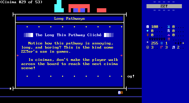
Reaching the far end of the board makes another object appear to talk about how miserable these long walks are. Agreed JoE, but I already agreed back when this was "Distant Object Cliché"!
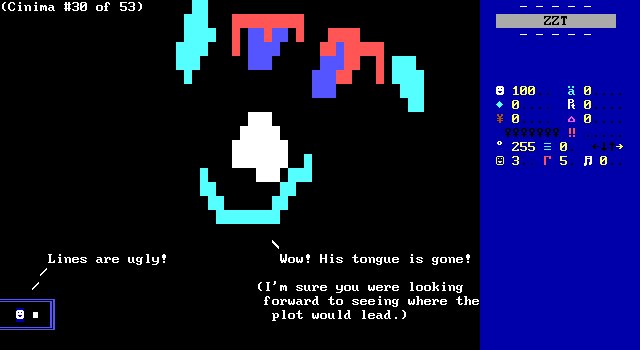
JoE! I already yelled at your bad take on line walls earlier! You don't need to repeat yourself!
@Cinema
make RPG's that are ONLY cinimas. If you
make a game that only has cinimas, then
it's simply not fun.
meant to be PLAYED, not WATCHED! If you
are going to make a RPG, then try to make
a decent plot!
Another instance of names not being named. Don't worry, I can scroll up a few lines and copy/paste the link to November Eve again if you want an example. Kidding aside, not even November Eve is actually entirely cinema. Once again JoE predicts common complaints about modern industry produced games. Cinematic heavy games are certainly out there, but those are games that have stories to tell. Everybody who watched the streams of the Chrono Wars series (all thirteen parts) did a lot of reading in the process, but the storyline was the appeal then and it's the appeal now. The Rhygar trilogy is another iconic ZZT RPG of the late 90's loaded with text, yet that's what people loved about them. Around this time especially, RPGs were the genre of choice for people who wanted games with complex characters and stories. The average ZZT game has never been this, and that's okay, but given the struggles of creating meaningful RPG mechanics, I'd wager that the success of most ZZT RPGs has always been in the story.
JoE frames this as venting, which let's be honest, is what the vast majority of this world has been. I too would much rather my games get right into the action, hopefully with a fun story attached, but I'm not here to discard experiences that are slower or less interested in more traditional ZZT gameplay. There is certainly room for both, with both styles offering games that succeed as well as fail. JoE you just need to check out the Interactive Fantasies catalog. I'm pretty sure zippy fantasy adventures with lighter RPG mechanics are what you're after, and that's far from a niche style at the turn of the century.
The End
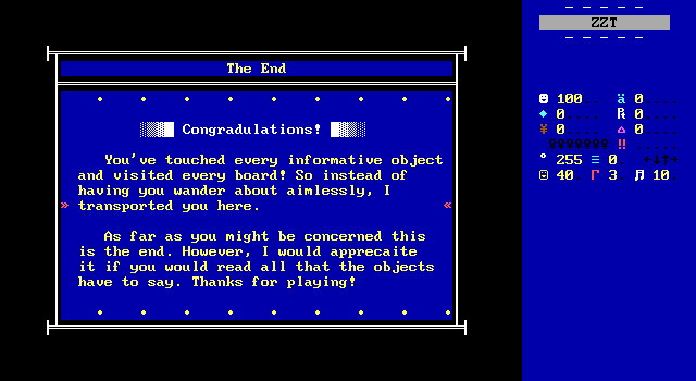
There's a joke to be made about how predictable a lot of Cliche was. Yet I was not expecting the game to have actually been tracking the fact that I've touched every object and seen everything. Once you finish the general, art, and RPG boards you're then warped to the super special bonus room.
I'm excited. JoE wasn't exactly prolific, so getting a chance to see the author talk about himself plus see if he had any other titles out there offers us a very convenient glimpse into who exactly made this world, and why they made the decisions they did.
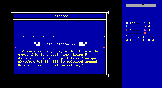
Sure enough, JoE instantly delivers. ZZT has had its limited share of sports games, with a handful of skateboarding games out there actually! This is unfortunately not one of them. Looking at Skate and its sequel Skate 2, I imagine this would have been similar. An automatically moving board with the ability to press and shoot while in mid-air to perform tricks. The seven skateboards meanwhile is almost certain to match up with the seven colors ZZT-OOP permits.
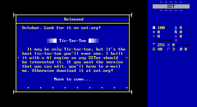
The only other release is the previously mentioned TicTacToe, which is at least enough to give me confidence that JoE could have handled making a ZZT skateboarding game, if not a groundbreaking one. I don't think JoE is bad with ZZT or anything, just a bit too confident that his opinions are actually gospel.
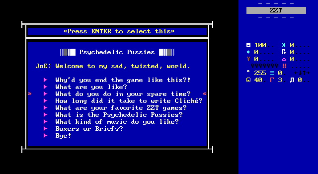
Now for the real reward, JoE welcomes us to his TwiStEd MiNd, and immediately steers the conversation to demanding to know what the "Psychedelic Pussies" are.
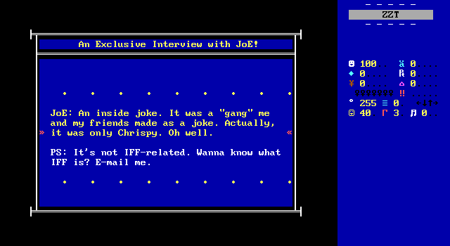
The mysteries never end!
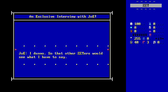
Tracks.
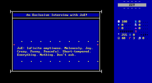
Tracks.
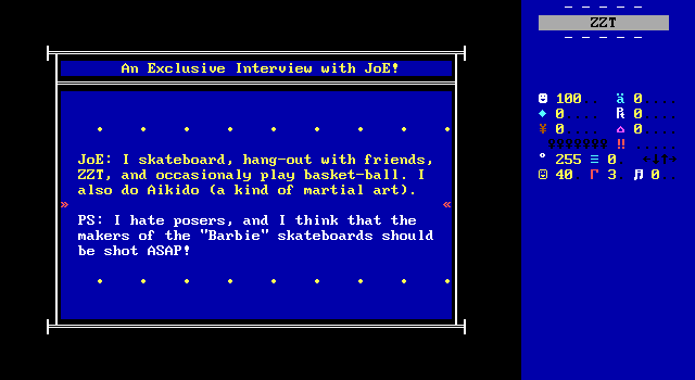
Trac- whoa calm down there buddy.
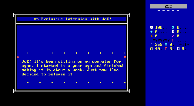
A revelation! This implies that this is really a world created in 1999. As far as the clichés matching the times, I don't think going from 1999 to 2000 is that radical of a shift in ZZT's trends to change how I feel about these clichés. What makes it far more interesting is that JoE could have showed up and had his very first release be a world telling other people how they should be making games. TicTacToe isn't exactly an impressive resumé, but it demonstrates proficiency with ZZT. I hope for JoE's sake that he was active on ZZT IRC channels or forums at the time as I cannot imagine what kind of reception this would have got if the man literally showed up out of nowhere with this. Maybe this is why the game avoids naming names so much.
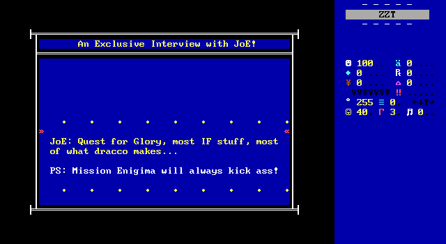
This is another thing I was after. JoE clearly knows what he doesn't want in ZZT games, so what is he after? Interactive Fantasies as I was suggesting (but again in this era being a fan of IF's games a pretty universal trait. You might say liking IF's games is... a bit cliché.), and a namedrop for Draco who would have been a ZZTing super star thanks to the success (and controversy) of the Teen Priest series at the time. Along with Mission: Enigma, which is no surprise either, this is a pretty expected list of faves. Perhaps it really is a case of IF's brisker fantasy games landing better than those with grand ambitions like Rhygar?
At the same time, being into Draco's ZZT works and being tired of games with excessive swearing is a pretty amusing combination. Draco definitely taught myself and others quite a few new words.
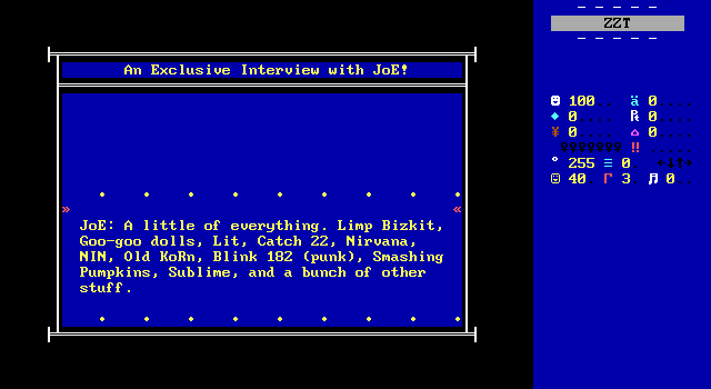
Old Korn! What a time to be alive.
Tracks.
so damn cool!
me post on their phat site.
get ZZT started.
me cope with life.
The credits end up being a little unique. Aside from naming yourself, ZZT credits are usually just shoutouts of names that aren't particularly revealing, but with an interest in trying to figure out JoE's level of interaction within the ZZT community of the time, this can be helpful stuff. Especially when it's accompanied by specifics as to why these names were included. While some of these are just shoutouts, others indicate that JoE and the named have actually interacted. Leamas being listed for testing and WiL for offering musical advice is at least a good sign that JoE was active and polite enough for more well known names to being willing to help. What's great is the idea of this person with very picky taste in ZZT RPGs discovering ZZT because of Nivek of all people. I suppose Nivek's RPGs do avoid the complaints here at least with minimal cinematics and some fair attempts at engines with meaningful combat choices. (Let's also not forget the use of the health counter for player health.) Then again, Nivek's own Daemon Riff is one of the few ZZT worlds outright tagged as being a cinema. Oh man, was JoE inspired to create this world to dunk on his buddy for making a game without any gameplay?
What an amusing hypothetical to end this on.
Final Thoughts Syndrome
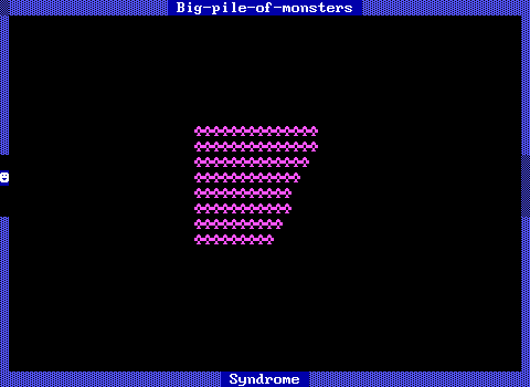
Behold the Big-pile-of-monsters Syndrome.
It's often found combined with the Big-
empty-room Syndrome. This syndrome is
especially self-explanitory -- it is a
frequent reccurance of boards with a big
pile of monsters in the middle.
the adventure doesn't suffer from Not-
enough-ammo Syndrome. Finish off the
monsters. Go to the next board. Start
the routine all over again.
It can make action boring. Shooting fish
in a barrel isn't really fun -- even if
the fish are trying to kill you.
• • • • • • • • •
Actually, one more thing. I want a comparison between the style of Syndromes and that of Cliche. Look at how Barjesse explains what it is, how it plays out, and discusses the consequences of the syndrome. No carve-outs for exceptions to avoid stepping on toes or finding fault with a classic. He even points out that even though the board has a sense of danger to it as the enemies can kill the player, that getting through things won't be fun.
And then of course you have to actually sit down and shoot all those ruffians. Perhaps it's a bold choice, but it's a choice that really re-enforces the issue. There's a difference between saying that something sucks, and making the player see for themselves. JoE's examples rarely go all the way. His long boring cinema is three lines and his terrible RPG battle doesn't have to be completed. Plenty of the clichés are just words, and with just words it's far easier to imagine scenarios where what's being said isn't be true.
Making the player go through these things makes it far harder to defend them. Perhaps there's a way one can use a big pile of monsters effectively. You could argue that. You'll have a far harder time convincing anybody that the experience of having to chase down more than 100 ruffians was joyful in any way.
JoE tries to deflect this with the use of "cliché" rather than syndrome. The former isn't an inherently bad thing. It's merely something seen a little too often. The latter meanwhile is clearly intended to be perceived as a mistake to be avoided at all costs. There's a pretty reasonable chance this game taught me the word "syndrome", bringing a level of intensity to game design I hadn't previously seen. (Meanwhile I am confident I learned about clichés from I Am Weasel.)
The weaker confidence, lack of specifics, and admissions of personal opinion mean that Cliche can't have nearly the impact that Syndromes does. JoE tells us that cinematic sequences can go on for too long with too little happening, but his example is three lines of text of deliberately uninteresting text. There's nothing for a ZZTer going into this wanting to learn to actually grasp onto. You don't leave Cliche knowing whether he's talking about November Eve's board-after-board of cutscene, Daemon Riff's outright abandonment of player interactivity, or just "sometimes I finish reading the line of text and have to wait too long for the next". I've suspected that JoE didn't want to name any specific games that commit these errors he's warning against to avoid potentially upsetting well-respected community members, but just the same he could have instead opted to cite ZZT games he played that avoid these clichés.
Meanwhile back in Syndromes, Barjesse is finding anchor points to better communicate his thoughts, most notably when discussing how many stars are too many stars:
For a good example of how many stars is plenty, play Tim Sweeney's "Town of ZZT" and observe how many stars you see. — Barjesse
This instantly frames the conversation. Town is ZZT's most universal reference point, and this will get players thinking of how infrequently they showed up there. Even if you personally disagree, it facilitates actual discussion. ZZT Pro, another help world from 2005 disagrees with the Town rule, and is able to properly argue the case against it. They can't both be "right", but they can both be worth considering.
In the end, JoE's world doesn't offer enough practical advice and feels more like a collection of gripes. There are instances where he does identify common troubling spots with ZZT worlds that aren't covered by Syndromes. Slow flashing text is tedious. Missing the knife in Mission Enigma and being effectively dead adds unneeded frustration to a classic. RPG battles frequently do have lengthy waits between turns and frequently end up with you spamming a basic attack endlessly. Busted item implementations can make a game feel samey. While there are things here for a newcomer to learn the advice in Cliche all too often stops short of guiding the player towards any concrete actions they can take to actually improve their creations.
Today the context in which people find ZZT is radically different than that of the year 2000. Newcomers are generally much older than the teenagers showing up in the 90s and 2000s, often if not already experienced with programming elsewhere than with a healthy interest in how games are made. For those people, Cliche offers very little. It would be better served as a short bulleted list of mistakes. Some, like the broken floors around passages don't require convincing people that they looks ugly, but should instead work on explaining the cause of the issue and how to work around it.
In 2000, these lessons were still more likely to reach an audience that needed to learn them, yet the lack of answers, the clear focus on the author's personal preferences, and the half-effort demonstrations can't drive the points home. Cliche wound up overlooked compared to Syndromes and ZZT Crime, and it's no surprise why. There's plenty of good advice out there to share with new ZZTers, but that advice doesn't include "Make sure you check out Cliche: a Guide for the Advanced ZZTer".
