Agent Orange's Boards
ZZTech Star Lab
Original: Path to Castle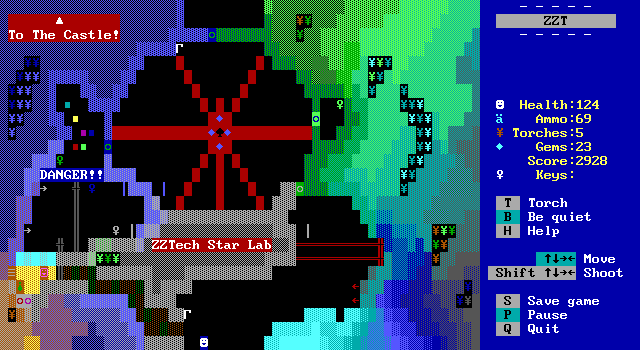
Agent Orange opens with this board just off the starting hub that heavily changes the source material, leaving just a few small nods to its origins. A few blinkwalls and spinning guns survive, but now they feel almost vestigial, no longer intermingling. They would make for a more straightforward path through the board overall, yet the new additions of the lab and its handful of keys ensure that the player won't cautiously walk from the bottom of the board to the top.
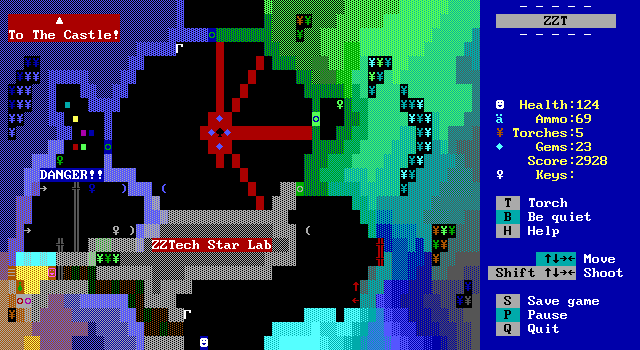
The big set-piece here is the blinkwall wheel which spins in a circle using diagonal blinkwalls. As imposing as it may look, the duration of each spoke is plenty lengthy to make crossing straightforward. The rays are also an unusual combination of matching foreground and background color to give them a solid appearance in order to hide ZZT not having actual diagonal blinkwall ray elements, and instead defaulting to horizontal rays that look quite silly when laid out in non-horizontal fashion.
It's another case of showing off some the new tech discovered over the years for what ZZT can do when unrestricted. So I suppose it's only fitting that the theme of this board is in experimentation.
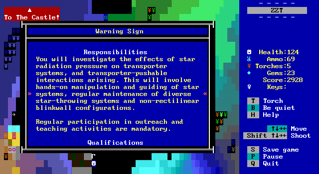
A sign at the beginning of the board explains that the lab here is conducting dangerous research, along with a supplementary job posting listed below that really adds some seriousness to the work being done here by Dr. Bob (from City of ZZT). It also doubles as a bit of a hint as this board has gone from pure action to a light puzzle. Dr. Bob is indeed conducting some experiments here with a sealed off chamber full of quite deadly star-throwing spinning guns. The keys necessary to proceed can be found inside, but the transporters are designed so that entering the room is originally impossible.
The player has to work with Bob's devices and use the properties of stars to get them to push the keys out of the room rather than going inside. Some blinkwalls on the inside along with Bob's occasional resetting of the room to erase all stars means a bit of finagling is required to get the stars to do the necessary pushing.
One big complaint is that this board does make some rough choices with its door colors which makes it easy to mix them up as they really mix and match their blues and greens. Dodging the big blinkwheel is easy enough that it doesn't particularly matter all that much in practice, but it is annoying to have to make extra passes to get everywhere.
Eventually the player will get access to some boulders and can then make the poor decision to step inside the room with the spinning guns. A far smarter user of them is to block some of the wheel's spokes so that movement is both faster and safer.
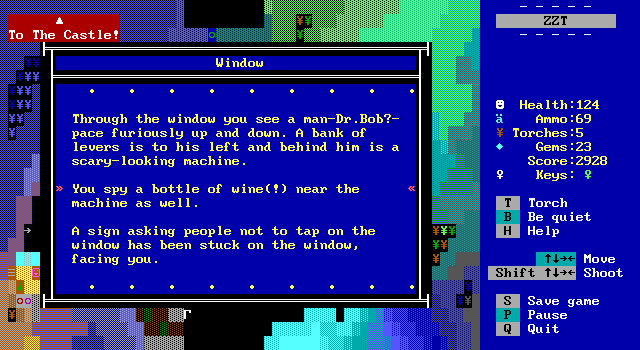
There's no reason to actually go in, other than to look directly at Dr. Bob who doesn't care that somebody is risking their life and he opts to continue his experiments.
This board is pretty neat. The puzzle mechanic is a fun one, and I love the wild colors of the walls. This kind of coloring is common throughout Agent Orange's boards which makes it readily clear when he worked on a board. It's a solid start, and there are quite a few more to go.
Agent Orange's Commentary
"The idea of the blinkwall wheel was Zinfandel's and I took over the ZZTech Star Lab board from him with his permission because of time issues."
Outside Castle
Original: Outside Castle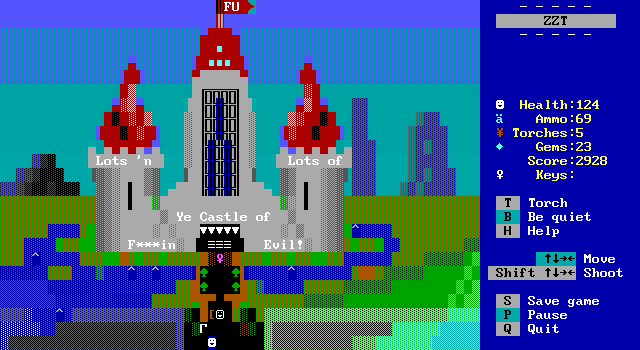
Another immediately pretty board. The new castle looks significantly fancier than the original, which admittedly was somewhat limited by its similarities to the castles of Adventure for the Atari 2600. Also the castle now has a swear in its name, a joke that I would think is a bit out of place normally, spared by fitting right in alongside some of Sweeney's other castles.
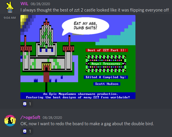
Gone are the overly-labeled bridge and moat, relegated to a joke in the castle storeroom now. Instead, we get an "FU" flag and some middle-finger like domes. A nearby sign explains the intent to represent the "fiery ardor of the Sieur's might", with the modern more profane interpretation being espoused by those who run the castle these days. At least they have a sense of humor.
Unlike the olden times, the castle is now very much intended to be a destination for tourists. The bridge troll no longer demands a bribe for crossing, but sells tickets instead. The troll will still lock you in until you obtain the sceptre, making the quest feel like something out of Monkey Island with a longstanding tradition of proving one's worth having now been hollowed out into a reason to sell novelty T-shirts. I'm kind of surprised there are no shirts for sale in this castle actually.
It's also worth noting here that this board is the only outdoor location that hints at a greater world. Every other path is enclosed the entire time, only here is there a background and vast expanse of land that's not part of the town itself. For another great detail, you can see water flowing to the moat from within the town at an angle that would reasonable suggest it's coming from the Four Lakes.
Agent Orange's Commentary
"The middle fingers on the Castle are from a joke during development that the castle on Best of ZZT II's title screen looks like it's giving us the finger."
Inside Castle IV
Original: Inside castle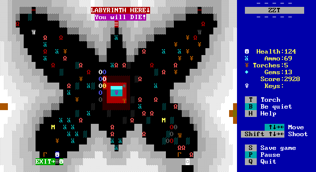
Can you believe there's still more of this castle's interior to check out?
The first room of the castle is Town's biggest unintentional joke these days, looking more like it belongs in ZZT Syndromes with its yellow borders and just piles of lions sitting around. Agent Orange ups the presentation considerably turning the Great Hall into a butterfly-shaped design with statues in three corners for tourists to admire.
It is also overloaded with lions, yet here they are worked into the game to become a part of the lore. The sign by the exit explains everything: the demand for the castle's "wings" to resemble actual wings as well as the Sieur's insistence that all stray cats on castle grounds be looked after. To add to the sense that the player's experience within the castle is a highly curated one, a few M-shaped wet floor signs are scattered about as well.
It's a definite improvement on the original. The new layout makes moving around and dealing with the lions a lot more interesting than grouping everything up. The statues all feature cats of different breeds, one of which will also introduce the player to the ghost of the Sieur of the castle who thankfully doesn't mind your clearing out of the felines here.
In the center of the room under glass is the purple key you're intended to obtain by going through the castle. There was one on the previous board, which reveals itself to be a fake with an acknowledgment that the actual key is within the castle's walls. Though with both boards being handled by the same author I'm unsure what the point of the fake one really is. Counterfeits aside, I do adore the decision for the key to be treated as a treasure of the castle to be put on display for visitors. Rather than just collecting the key, or being given it after clearing the castle's labyrinth and/or throne room, the solution here is simply "smashy smashy". Shooting the glass a few times will allow the player to steal the key for themselves and is a lot more fun than than just picking one up off the ground.
The castle sign continues the "Lots n' Lots of" branding, revealing this hall to be the "Great Hall of Lots' n' Lots of Cats" as well as telling the player about the "Throne Room of Lots n' Lots of Eccentricity" as well as the "Labyrinth of Lots n' Lots of Death". It also warns of the six dragons as well as "Bill the Whip-Tiger" seen in the first part of this article.
AZZTN Plays Dragon's Lair
Original: Dragon's Lair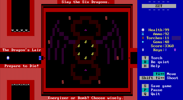
Blah blah blah labyrinth.
After acquiring the blue key the labyrinth's exit is in sight where it is again guarded by six dragons that make up ZZT's first boss fight. Loving the little winged dragon design that fills out the background.
The fight remains very true to the original with the dragons mostly milling around and taking surprisingly little interest in hunting down the player, opting to just fire when aligned and calling it a day. The number of bombs has been cut in half meaning that each one has to take out at least one foe in order to have enough. Six makes for a more interesting fight, though it's still pretty simple to get through. Of course, the signage now indicates a new method for dispatching the dragons: touching them while under the effects of an energizer. This works as an alternative method to defeat them and offers some wiggle room in case you do make a mistake with one of the bombs and miss your target(s) entirely. When I first saw the text, I wondered if there would be something that restricted the player once they collected an energizer or pushed a bomb, but you're welcome to use both methods.
The energizers also have the effect of causing the dragons to switch from bullets to stars while they're active. Because of how ZZT handles an energized player, this means the stars will run away from the player, leaving them at risk when the energizer runs out and the stars begin to converge on your location instead.
Other than that though the code for moving and attacking is effectively identical, the dragons now differentiate themselves by each having their own unique death message which differs depending on the method used. No more "The dragon is vaporized!", now we get some variety like "The dragon bursts like a piñata!", "A horrendous dragon kablooie happens!", and "The dragon is atomized at your hands!" to name a few. The messages are compelling enough to make you want to reload the fight and make sure you see all twelve them. At the same time, the juxtaposition between the treatment of dragons here and the House of Blue Dragons is wild. Such is the price paid for keeping traditions going.
Making a satisfying boss fight in ZZT is not easy, especially when having to maintain connections with a fight designed a good three decades ago. The use of energizers gives some variety to a fight that's been seen plenty of times by ZZT's audience of the years. The reduced bombs increases the challenge without going to the extreme lengths of The Game of XYZABCDE. The new messages help to make the fight feel like it's very much not intended to be a taxing challenge on the player. It all works in the board's favor, keeping the original feel without being overly dull or difficult.
The Masque of the Throne Room of Death
Original: Throne Room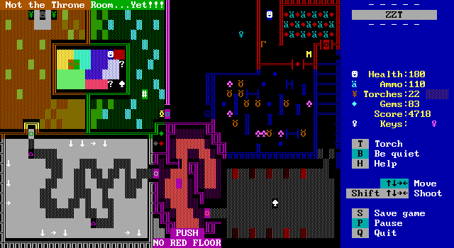
The dragon fight may stick to its roots, but Agent Orange isn't afraid to really go wild when it comes to the puzzle of the throne room. It's still a puzzle, more action-focused to be sure, but the original design is basically thrown out entirely. As somebody who's a big fan of the sceptre puzzle, I am a little let down by this after seeing what great work had been done to the Sliding Puzzle and Rube Board. Nonetheless, what's new here isn't half bad either.
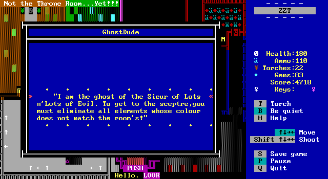
Before the player can really step inside, the ghost of the Sieur appears once more to give the premise. Eliminate that which is out of place with the decor to proceed. Each pocket on the board provides a different way of dealing with the same challenge, and there's a lot of variety on display here. The overall look of this board along with its non-conventional puzzle designs remind me a bit of Nightmare. In practice, things are a lot simpler than any puzzles in that one at least.
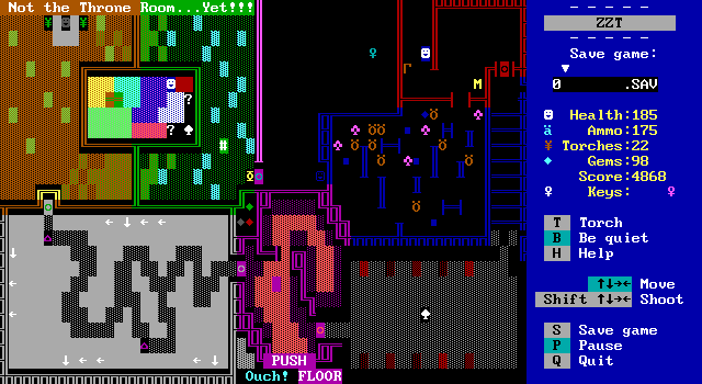
Starting with blue, there's a basic maze with a few baddies. The player will quickly find out they've been limited to just a single shot at a time. It could be worse though, the boulders inside could have mandated that you crush all the enemies with them instead. It's a stretch to call this a puzzle when it's just "defeat the monsters to continue", but we're only on the first chamber here.
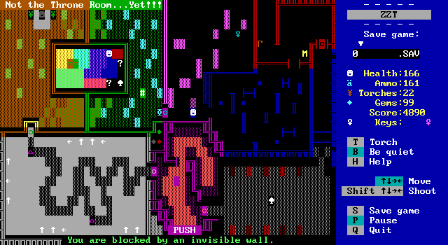
Purple comes next, and the empty chamber is in fact a short invisible wall maze with a new twist. Rather than using the stock invisible wall behavior or the common flashing-maze seen previously in the Room of X-TREME Annoyance, the walls here are actually all objects divided into small groups. Touching one will cause the flashing effect (with spoofed invisible wall sound effects and message), but only for objects of that group resulting in a maze that reveals itself on a limited portion at a time. Scale this up enough and I'd hate it. Here, it's a fairly small room with three groups of walls to discover.
Really it's just a very good gotcha when you bump your first wall, see a sparse number of walls and run into another group thinking you have a clear path. For a brief moment I thought that revealing the walls was causing the entire maze to be reconstructed!
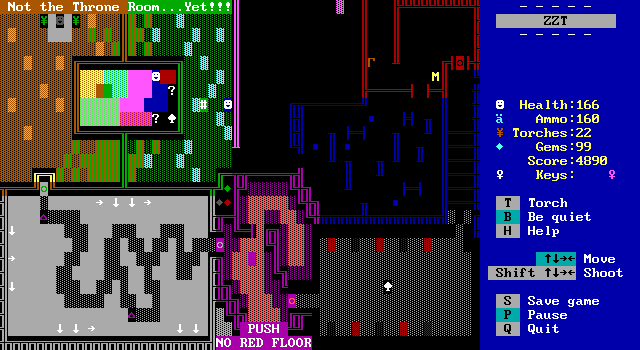
Next up, cleaning the carpets with some paint remover. A scroll explains this to be what happens when ammo sits on the floors for too long. The bucket of paint remover is an object that can be pushed away from the player when touched. As it moves, it places new fake walls over the tile it was previously on allowing the cyan fakes to be cleaned up.
One small issue here arises in that it's very difficult to deal with the tiles along the walls. The bucket simply moves away from the player when touched which makes getting it away from a wall a pain. The only way to do so is to touch the bucket, where it will endlessly try moving away from the player. By moving around the bucket it can finally move "away from the player" once that stops meaning "towards a wall". You can make this a little easier by touching the object when paused and then moving away, but it's still a bit clumsy of a mechanic. I'd even have been okay with part of the puzzle being to realize that you have to save a tile in a corner for last, but there are tiles up against three walls which make the slightly-telekinetic approach of moving the bucket from a distance mandatory.
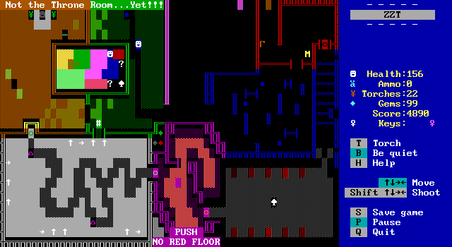
Of course, if you happen to have a spare boulder handy from the blue room, you can break things wide open as the boulders will erase anything they move over.

A long explanation about sprinkler systems, motion detectors, mold, and its removal follows. All of this is to explain the next puzzle which is somewhat derivative of the previous. This time breakable walls need to be destroyed by guiding stars into them. I'm not sure if I should interpret this as too similar to the previous puzzle making it feel redundant, or as an improvement on the previous puzzle making it feel like it should have replaced the paint remover entirely.
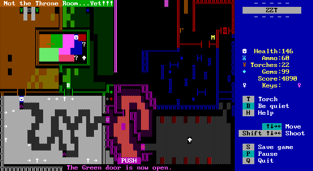
Next up, is a short race through some spinning guns with energizers along the way. The energizers offer plenty of time to get through, and they're even replenished after being picked up. It hasn't been relevant since the blue room, but being hurt on this board warps you back to the start so the reappearance of them is essential. Really though the first energizer lasts long enough to get through without touching the second so there isn't any sense of danger here.
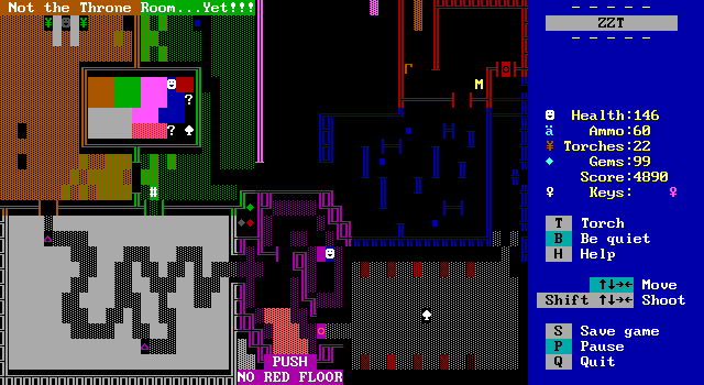
This is followed by still move fake wall removal. This time with no lore even, just some text telling you what needs to be done on the bottom of the board and a boulder to do it with.
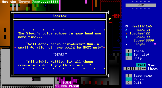
And finally, the sceptre is acquired and we are truly done with castle boards.
This isn't a bad board, it's just not really drawing the connections to the original that I'd expect to be there. The only thing this has in common with the original is the sceptre at the end and the one-way exit being made up of blinkwalls. The original puzzle is a highlight of the original, and this is a rare instance where I feel like the remixed version isn't doing enough to justify its removal. Three of these chambers feel very similar to one another with goals of erasing tiles on the ground. The energizer room doesn't actually have any obstacles with its very generous item placement. The maze is a clever trick, and could have been suited for the X-TREME Annoyance board. The creature shooting is just more creature shooting. While this board technically isn't a purple key room, it is generally treated as one as it allows the player to actually turn in their purple key. Instead it feels a bit too out of place for my tastes.
Gaurd Station [sic]
Original: Guard Station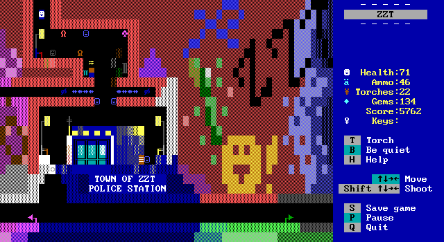
Don't worry though, if the new throne room felt lacking, things will be turning around shortly.
For just south of the starting hub, the town looks a lot more lived in, and a lot more distressed. The previously sterile white background of the area outside of the guard station has gotten far more colorful both in terms of interactions available as well as the obvious additions of some very colorful graffiti plastered on the already more colorful walls.
The atmosphere created here is great. Streetlights and benches line the paths, the police station design shows how far representations of buildings have come in ZZT, and the random street vendors along with other residents of the town make the place feel less like the entire thing is just a video game.
Some of it's just for flavor, which is welcome, but the vendor and the ruffian are of considerable interest.
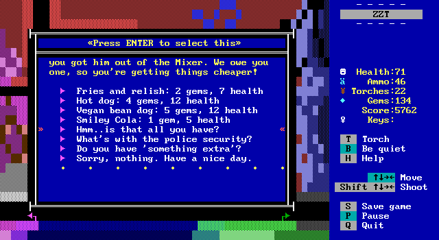
The vendor offers some typical street foods as a way to restore your health. Unlike the café above, here the health restored is a fixed amount. Discounts are applied if you've rescued the lion from the Remixer board as well to improve the pricing. Asking about the security reveals that the ZZT bandit has recently been captured and is being held prisoner after nearly discovering the combination to the bank vault. It gives a bit of justification for the player's sudden dedication to his upcoming release.
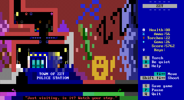
The ruffian sells ammo, which can be more useful due to the prices in the armory starting off so badly. The ruffian even comments on the rates not being as good as the typical armory rates, but this is definitely a better deal: ten ammo for five gems. That's a considerable amount extra versus the armory's three for the same price prior to getting the key to the storeroom back.
It ends up that this board is better for getting supplies than the armory itself if you aren't guessing your way through the trivia. Unfortunately, there's no telling how long it will be until a player actually reaches this board. The same could be said for the armory, though it has the benefit of players familiar with the original expecting it to be there. In my playthrough here I wound up going south as late as possible, having every other purple key except for the one found in the Starmine! board and the one in the bank whose code is acquired from the bandit in the upcoming prison section. How beneficial these shops are may vary wildly depending on the path taken through the game.
Jailbreak
Original: Prison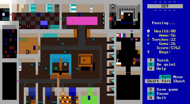
Any issues back in the castle are just water under the bridge-labeled bridge here. The jailbreak sequence is undoubtedly the best action board in the entire remix, and were it not for some exemplary puzzles, I'd be willing to place it on top overall. The original prison sequence is purely video game. You navigate ZZT obstacles and have been told you are in a prison. There are blinkwalls, spinning guns, lions, and multiple waterways. There's also a time limit which helps encourage the player to hustle.
Our new police department interior looks a lot less like an early 90s ZZT action board and more like a modern ZZT building interior. If anything it reminds me of the police station in Hotline Miami, which will be a fitting comparison. Everything starts out peacefully enough with various officers scattered throughout the building. The closet full of lions and ammo piled all over the place hint that this won't be the case for long.
As soon as the first door is opened the first cop immediately begins shooting at the player who was seconds ago invited inside by one of the other officers. So yeah, police shootout it is then.
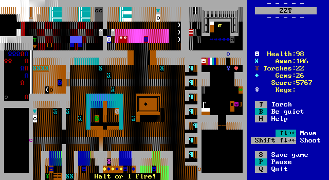
What follows is a daring breakout attempt as the player works their way through the station dealing with angry cops, trained dogs, and the drunk tank full of drunk lions that beautifully have a lower than default intelligence stat. Cops have semi-scripted actions where they move in a specific way when they first join the fight which makes for a much more impactful feeling of combat compared to the usual "waking up" where an object goes from being still to aimlessly wandering around looking for the player. As the player is going through specific choke points the reactions far more natural than what you usually get out of ZZT.
The focus is entirely on shooting your way through. Despite all kinds of decor throughout the building, none of it can be interacted with to reveal its true design. This is a fight for your life and there's no time to check the plants for hidden gems or read a note on a table. Eventually even the cops seem to realize they're outmatched, with later ones opting not to fight, but to stutter requests to not be harmed.
This specific type of action, focused on both opponents being regular people with guns, be they cops, robbers, escaped prisoners, or people pushed too far was a staple of ZZT worlds around the turn of the century. Gritty, violent, and dark were the flavors of the day, and many of these games missed the mark entirely with dull fights and cheesy stories that were already hard to take seriously then. Time has not been kind to these titles, with insult added to injury when you realize this board manages to do what they were hoping for with just a tiny little board in a purple key collect-a-thon world.

This isn't one of those serious games though. Remix has been including small bits of humor the entire way through, and even here is no exception. Just before reaching the final room, one last officer (whose never displayed name reveals them to be everyone's favorite teenage cop/priest Johnny Danger shows up to intimidate the player as a final challenge.
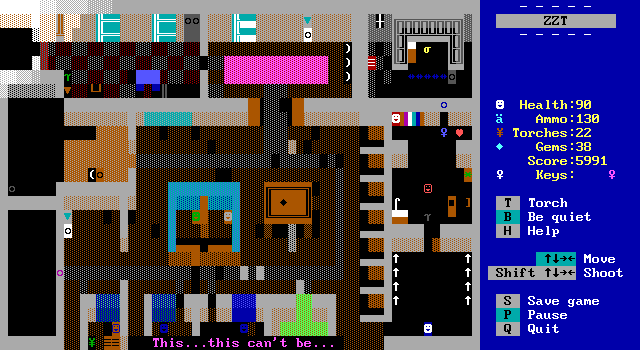
Or at least he tries to be, before his shotgun cartoonishly explodes like a more gory Elmer Fudd short.

The bandit is pleased with your daring rescue attempt and provides the necessary info to acquire the bank vault combination. Also he's wearing a rat mask.
Overall, this is the board that both surprised and stuck with me the most on my original playthrough, and was what I was most excited to revisit. The design shown here fits in with the style of Remix nicely. Even with its requisite ties to the original game, this feels unique enough that I could see myself wanting to play an entirely new ZZT action game built using this kind of design.
Agent Orange's Commentary
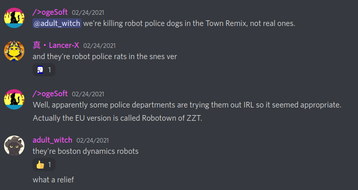
"The dogs in the police station have been retconned to robots like the Boston Dynamics ones:"
Galarian Slowpoke's Boards
Palace Int.
End Game A
End Game B
End Game C
Original: End Game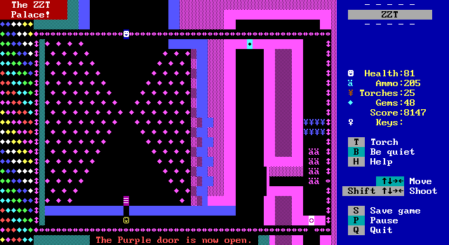
After all this we still have one new author who didn't just claim the palace interior, but redesigned it in a such a way that it's actually multiple boards! The palace interior looks similarly styled albeit with a framing of sliders, some added depth to the walls, and a less colorful series of walls to vanish as the player enters the palace properly.
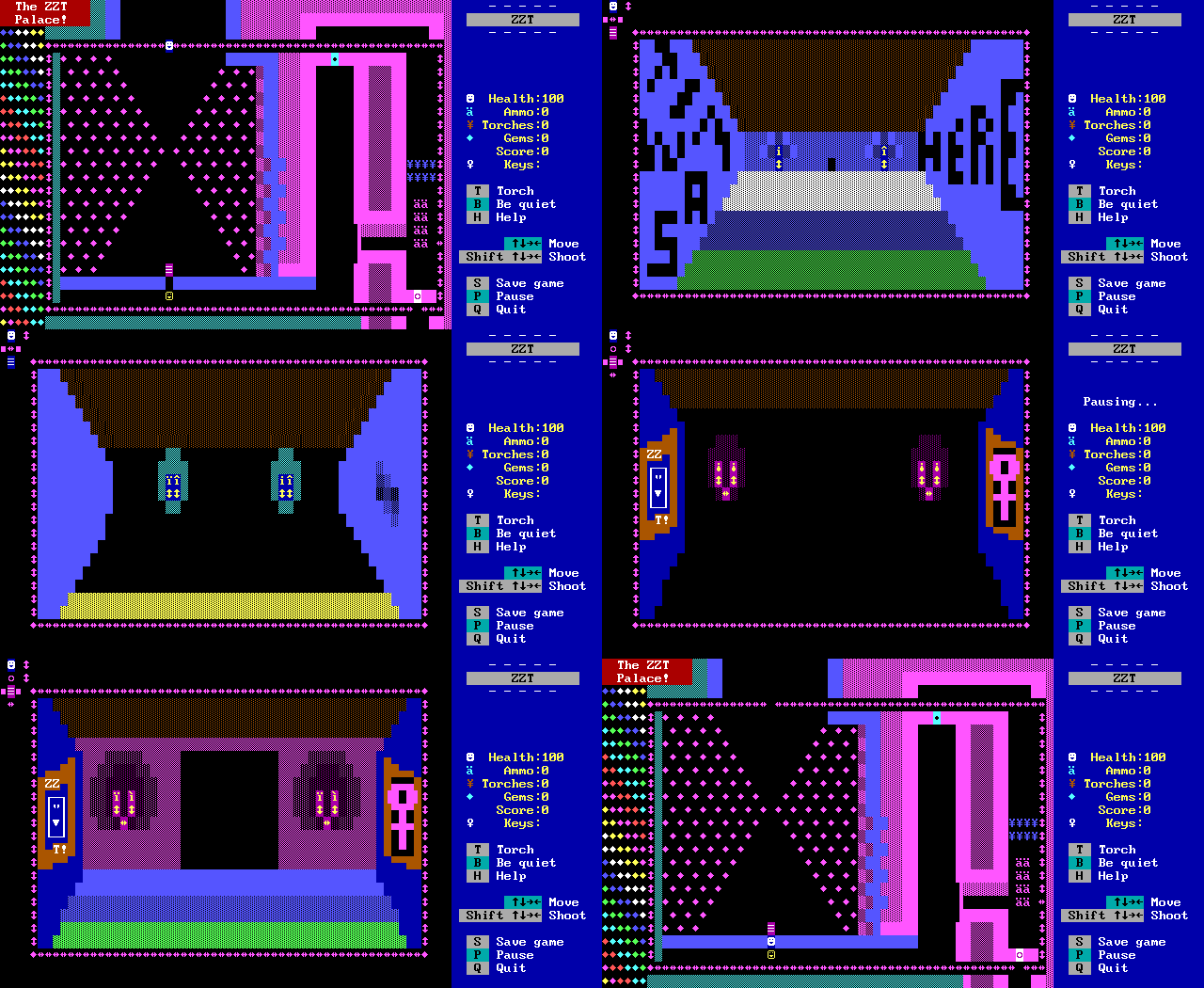
Instead, stepping past the fifth purple door leads to a short cinematic sequence showing the player moving down the hall from a first person perspective. It uses a more traditional cinema system of locking the player in the corner and requesting them to advance to the next scene rather than the ultra-modern style of automatic transitions, but things work fine regardless as perfectly smooth animation from board to board isn't really needed. This isn't the fanciest cut-scene ZZT's had in recent years, but it still does a great job of building up that anticipation of what's going to be inside the palace. The slow-walk format also gives you time to actually take in the scenery here as there are plenty of details added to the walls as you walk past that wouldn't have time to be appreciated if things were moving at a faster pace.
This scene retains the musical jingle played in the original with each section of the music played with each step of the player, perfectly keeping the mood intact as you slowly walk through.
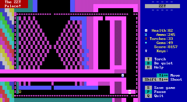
Afterwards, things play out pretty similarly. You're congratulated on making it this far, but told there's one last challenge to complete. The walls shift and a connection to the Rube Machine is made, before pivoting south back to the Micl cave to fight for the final purple key. One small change here is that the path to the ampersand is no longer made obvious. It's been promoted to being a secret room hinted at by one of the sliders being horizontal when it should be vertical. I'm going to have to say this is a fair way to hide a secret since I completely overlooked it myself, despite being well aware that this board should lead to the ampersand.
Also DarkMatt's Board
Mayortorial Estates
Original: End Game II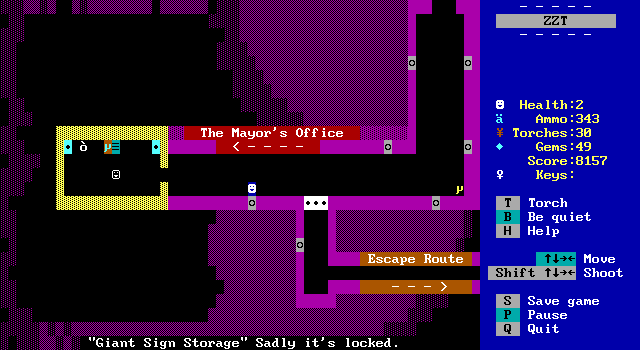
With that, we return to DarkMatt's designs with Town's ending sequence no longer just being a guy in a room. Now it's a specific guy in an office. After City of ZZT introduced children everywhere to corrupt politicians, it's only fair to get a handle of the person responsible for managing this weird town.
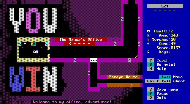
The mood of "mandatory celebration" remains intact as ever! You still get your nice giant letters, and you're still told to please leave, but this time a last of your many many crimes is included. Compared to the mayor of City, this mayor is a pushover. They're bribing us instead of the other way around! Mayors must hate adventuring types.
The crummy office and forced song and dance of the mayor here keeps the spirit of victory alive, with the added fun of getting to explore the office a bit once the mayor runs off hoping to never interact with you again.
