King Leroy's Challenges
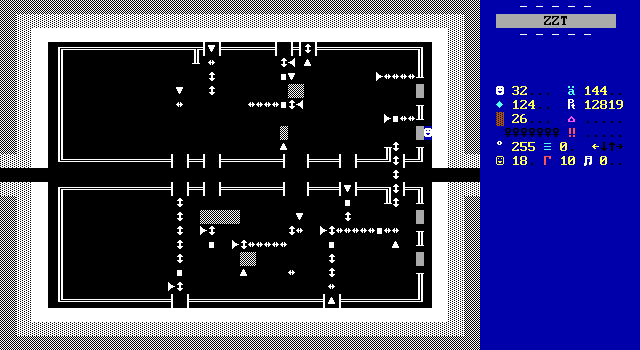
The final obstacle is to actually get through King Leroy's challenges. Firstly is this normally dark room where you need to shoot breakables from a distance. The fountain gives the solution of how many times you need to shoot. Firing blindly would still work as there's no penalty for over shooting. The fact that breakables make a distinct noise when shot means that you could totally just brute force your way through. Unfortunately for would-be speedrunners, the fountain also gives a key needed to enter the castle in the first place so knowing the solution in advance won't change anything.
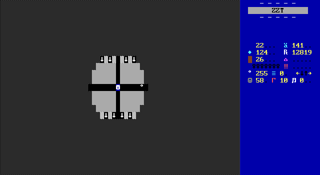
Challenge number two is a rehash of the spinning gun gauntlet in Perashku's palace. This one is honestly easier as the firing rate seems to have been toned down. Things are a little more involved here as Jake needs to hit switches on the top and bottom of the board that open up a gate in order to actually leave. It's fine.
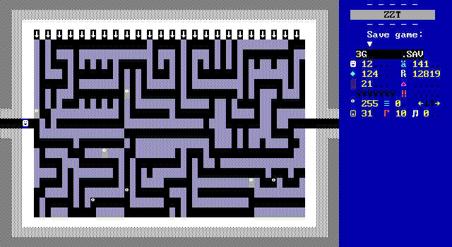
There seems to be an over reliance on spinning guns throughout Ruby. The third challenge is of course a dark maze with guns shooting over water. Carlos had enough kindness in his heart to let the player take damage without being sent back to the start for this one at least, which makes it the easiest yet.
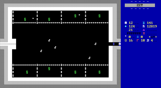
Number four returns to Town for inspiration. There are dragons and there are bombs and there will be vaporizations. Compared to town the dragons are simpler, opting to just move and shoot towards the player at a very slow speed. One addition is that touching one will have them breathe fire on Jake, killing him instantly! This only happens on touch rather than contact so it's not a big deal. The dragons insistence on moving towards the player at all costs makes them pretty easy to corral which works out considering there are five bombs for eight dragons. Contrast this with Town, which while not an unforgiving game, definitely isn't afraid to put the player in a position where they have to start over and do better. Town offers a whopping dozen bombs for just six dragons.
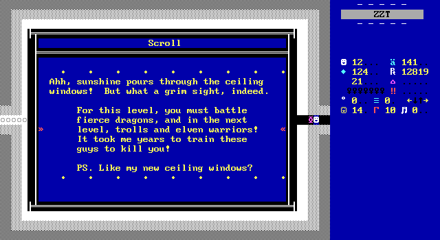
The dragon board is the first challenge that isn't dark, which I wouldn't think twice about but the scroll at the start of the room gives a great in-world explanation.
Sadly the one aspect of Town's dragon fight that wasn't borrowed is how you leave the room. Carlos just has each dragon become a white key which means you're intended to pick them up one by one and reach the exit. I just cheated my way across.
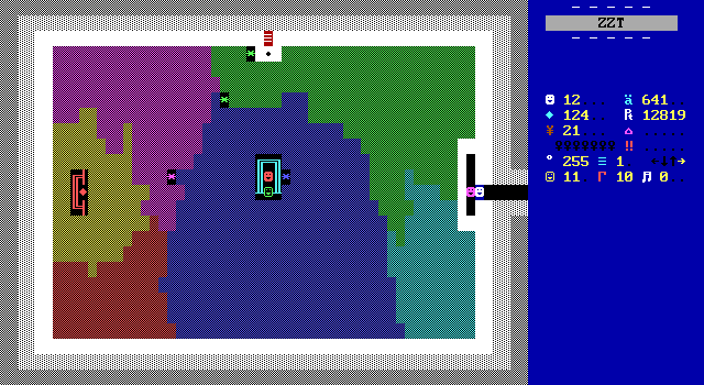
Lastly, the final challenge is to claim the ruby and revive the king. This requires blasting your way through a bunch of breakables left by slimes that quickly fill the room, and finding a way past a troll that blocks the king. This is played for a joke rather than actually being something to figure out. The troll hasn't found the gem because they're colorblind, and when you have it and want to resurrect the king you'll need to bribe them first. ...you did send in your Ed McMahon sweepstakes entry right?
The king also suffers from a small bug himself in that it's possible for his path to be blocked by breakables left from the slimes if the player doesn't sufficiently clear the area out. This won't cause any real trouble as thankfully the object doesn't lock itself so you're free to restart the resurrection process, provided that the king has enough clearance to move three spaces south when touched.
Plugs
Cross-promotion is something you'll see on occasion throughout Ruby of Resurrection. This isn't a sort of subtle nod to other releases by the ZZT Club, but just outright plastering names of things in certain places which makes it really stand out. I don't know if there's a way to do this more naturally feeling, but as it is, it just feels like ads being plastered up here and there. It's nothing frequent enough to really annoy. I'd still prefer something like this be tucked away to an in-game catalog or something rather than just dropping it into the game at random.
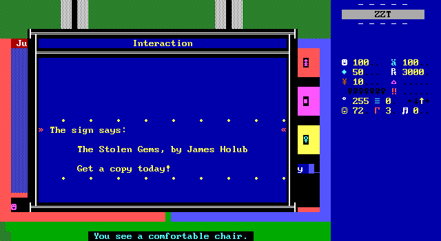
This sign in the back of the museum plugs The Stolen Gems, and serves some gameplay purpose by providing the information to access the bonus room's contents.
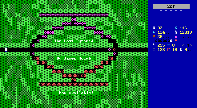
This board in England makes sure you're aware that you can play The Lost Pyramid.
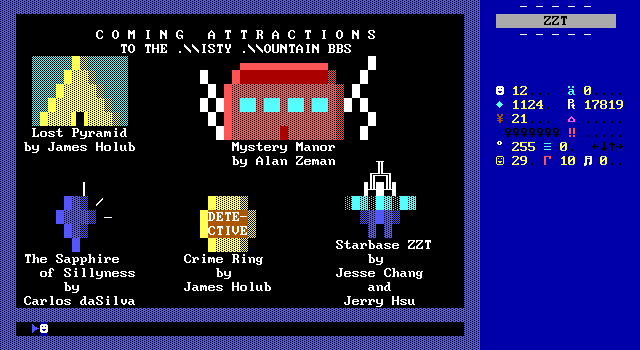
In fact, the final board of the game is a preview for upcoming ZZT Club titles and really hammers in how important the Misty Mountain BBS was for helping ZZT grow in success in its early days. I love the little icons for these games.
Visuals
When Carlos is trying, I actually quite like the classic look of Ruby. Carlos is quite capable at making fun art boards and pseudo-cinematics (a big reason why this game reminds me of The Big Leap). His more standard gameplay boards can look nice while still feeling very early ZZT. I like to use The Lost Monkeys as my example of peak pre-STK ZZT graphics, but The Lost Monkeys this ain't. Depending on the purpose of a ZZT board, the requirements for the graphics can change dramatically. A dark room with tigers has to pay attention to how the player will move through it in a way that a city street devoid of danger won't. For every instance of a pleasant looking board that communicates what it's supposed to be, there's another that's big, empty, and near monochromatic.
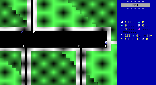
On the bad side of things we get boards like this street that connects Jake's home to the airport, museum, and a store.
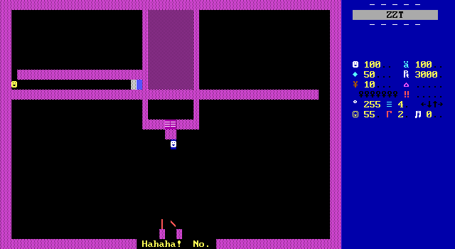
The various apartment buildings in Mexico City also do little to impress. They're huge and empty and a lot of spots you can interact with just blend in and don't make it obvious what you're looking at. It's possible to speak to the object on the other side of the counter from any "normal wall" going across the top of the lobby. The seemingly empty space that leads to an actual empty corner is a set of invisible objects telling you that you're not allowed in there. The two walls blocking the door are also objects meant to be elevator doors, but since they look like everything else nothing about this board makes me think I'm in an apartment building.
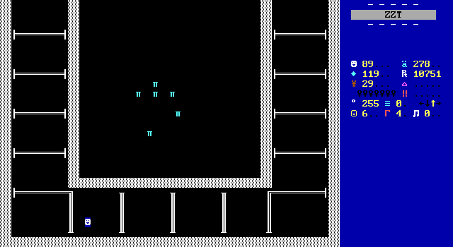
By far the weakest visuals in the entire game are to be found in the prison sequence. The dip in quality here is immense. I can get not wanting to program in extra prisoners to talk to, but even just having them be skeletons would have livened up the place (pun very much intended). City of ZZT has a simple representation of a jail, but it communicates itself so much better. (Despite all the prisoners having keys in their cells!)
There are certainly a few more ugly looking boards, but they have the luxury of having things happen on them. An invisible maze isn't pretty, but it can't be because there's an invisible maze there. You don't even fight those tigers in the prison board. Fake walls take you to the next board and out.
Enough dunking though. These more dingy boards on their own are misleading. Other boards do a great job of selling a location, and the limited artwork is pretty fantastic.
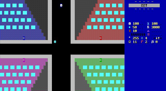
The interiors of the apartment buildings are a mess, but the exteriors are looking great. This tilted overhead perspective feels very much ahead of its time. Hunting around for something similar the closest I can come up with on short notice is this alley from Evil Sorcerers' Party drawn by Funk, though even this board seems to be more focused on providing a view for the player and not creating an upward view to show off the height of the buildings. There's bound to be plenty of better and earlier examples if you look, just don't expect to find much if you start your search in ZZT worlds from 1992!
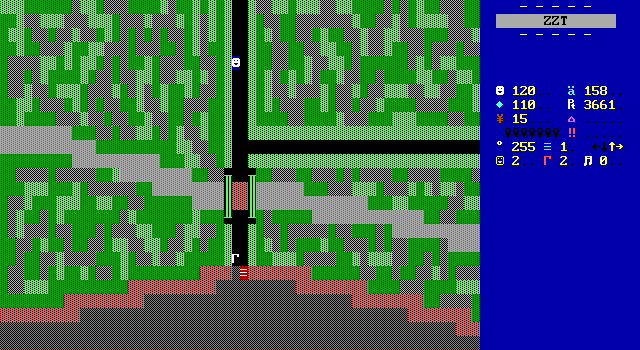
The more natural area outside of Mexico City also puts forward a great effort in early shading, conveying a jungle look with nothing more than green and forest. This kind of "messy" shading would see use for years and years as an easy way to create a mixture of color without concern for things like "light sources". Here it's notable not for wowing the player, but for the contrast it provides between the unkempt jungle and the "ugly street" shown earlier which in turn is more uniform and appears as if it were mowed grass despite being stuck with the same limited options in color.
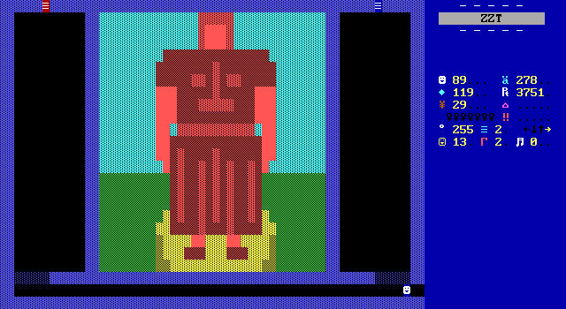
Undoubtedly the most impressive graphics come when Carlos is creating large artwork. Here the statue contained in the Aztec ruins is quite a surprise to walk into, especially after the last few boards are kept in darkness. It's big and showy, and while a simple image search for "Aztec statue" will show plenty of intricately detailed works of art, the blocky figure depicted here I think goes well with the well-known blockier pyramids of the culture.
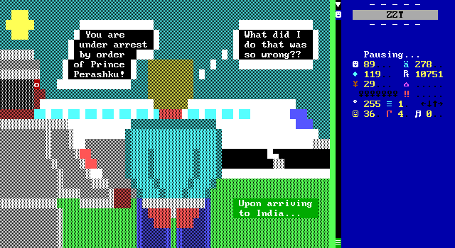
More complex scenes are also captured well with your immediate arrest in India showing off a really unusual perspective for ZZT showing people from behind. I always want to stress the difficulties of drawing people in ZZT with just seven easily accessed colors. Despite the limitation Carlos is pulling off skin tones by simply tweaking the dithering within the same color. Looking beyond skin color, the plane itself is looking pretty good too, though the wing kind of blends in a bit to the man's white garb. I love the little landing gear though. Early ZZT art seems really reluctant to use objects and tends to rely on contrast between overlapping objects to help differentiate them. Consider for a moment if the plane wasn't there how the cyan breakable sky would then be adjacent to Jake's cyan clothing. (Admittedly in this case a fix handled just by changing the color of his shirt.) Carlos is composing these scenes in such a way that the issue is better avoided.
During gameplay, this wing issue is mitigated somewhat as well as the red light on the wing actually animates by fading from solid to breakable. (As does the sun which is a bit distracting.)
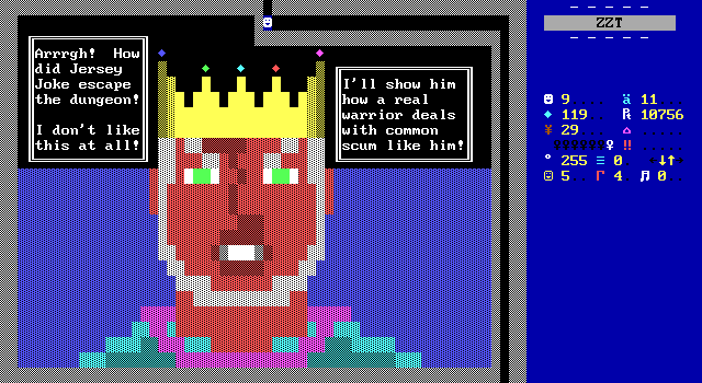
More weaving of gameplay and cinematic happens during the jail escape. Jake goes from fighting ZZT's monsters and walks directly onto this board before following the path to the next where there are more monsters to fight along with Prince Perashku. The closeup on Perashku is gorgeous both in terms of the design of his face as well as the details like the specific shading on the crown to give it a shiny appearance. He looks like a jerk, and I'm astounded at how well Carlos was able to convey it.
Also, he's animated! Nothing extensive, just the mouth opens and closes, which may make this the first recorded 3D Talk Engine as its come to be known. All in all, it's really impressive and sticks out in a good way compared to the subpar action boards that its sandwiched between.
(Oh, and because the border is breakable you can totally get away with shooting the walls and taking the gems off his crown. It feels good.)
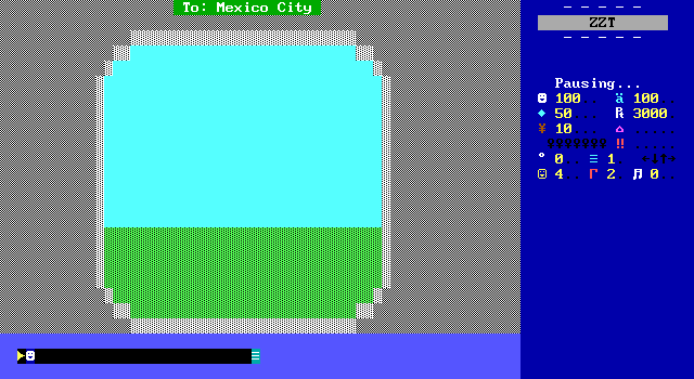
There are a handful of other fun boards to look at. Both the flights the player makes let you watch the plane take off through the plane's window by simply fading away the grass and when it's empty saying that you landed at night. It's cute if not special feeling.
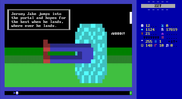
This scene of jumping into one of the time portals however, is hilarious and I love it and have to share it with everybody.
I Find It Kind of Funny. I Find It Kind of Sad
One thing that's blatantly clear throughout Ruby is that it's intended to be a very funny game. There's pretty much an attempt at a joke on every board. Whether or not I'd call this game funny or not is a difficult question. There are some genuinely entertaining moments that you'll have to at least smile at. Problem is that a lot of the jokes really don't land. In some cases it's just the age of the game. I can't fault Carlos for not knowing that thirty years later we wouldn't find the idea of jumping off a couch and thinking you could fly like Superman to be the peak of humor. Dated references like the Ed McMahon sweepstakes entries won't elicit laughs today, but I'm sure managed stronger reactions than my own of "The wrestling guy? No, wait, that's Vince."
Credit where it's due though. There's not a single Barney joke or "NOT!" in the entire game. Sometimes the little things can go a long way. (Granted this is likely because it's such an old ZZT game more than anything else.)
So let's take a peek at a few lines which did or did not work for me.
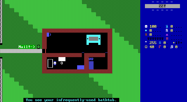
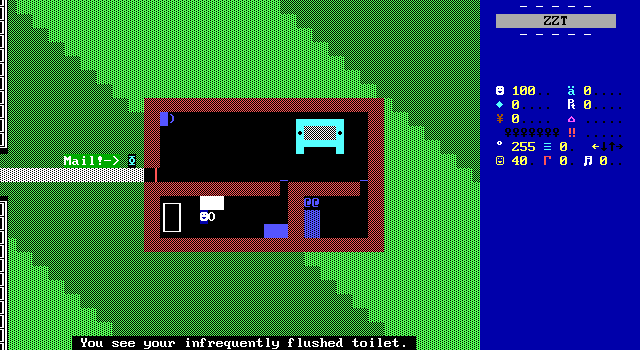
On their own these would have been nothing, but by just using the same structure going from the tub to the toilet amused me. You're gross Jake.
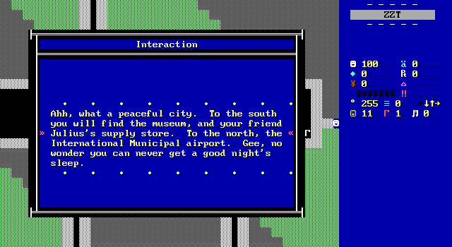
Stepping onto the street for the first time elicits this description of the area around the player. I like the tongue in cheek joke here that stems from not wanting the player to have to make a lengthy trip to the airport and what that must actually be like for him living next to it instead.
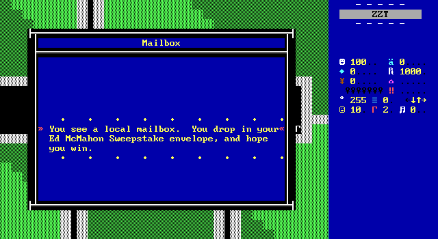
The insistence that the sweepstakes is played up on the first two boards, and for good reason. This is actually plot critical. It doesn't do much now, but I sure remember these things showing up in cartoons often enough when I was a kid.
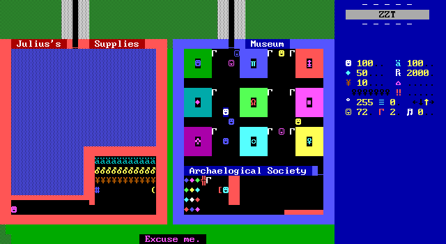
The current museum has some exhibits on display which get used to build up some lore. There's a diamond found by somebody who died to King Leroy's tests and a ring that shocks people if they lie while wearing it that once belong to Prince Perashku and I can't think of any other way to interpret that other than it being stolen.
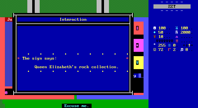
But this one is just a silly enough idea that you can't not love it. Don't get too attached though, Carlos calls back to this in the ending as the exhibit replaced by the ruby.
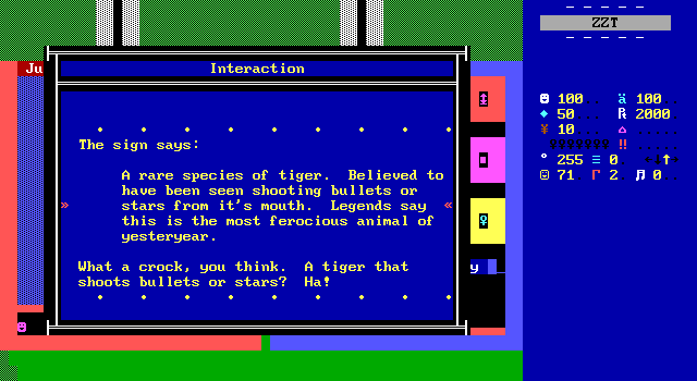
Everybody call out Tim Sweeney for making the enemy that sits in wait and then pounces "ruffian" and the enemy with a gun "tiger".
I've been notified by the Archaelogical
Society that you'd be passing by. Here's
your ticket. Just enter Gate 13, and go
to flight 5050.
The Archaelogical Society strictly stated
that you'd be flying coach, smoking seats,
near the rear.
The gas masks are located under your
seat. Now wait one second, while I open
the door for you...
• • • • • • • • •
A crushing blow to Jake's ego.
Yes it's just stolen from Airplane!, but at least he's stealing from the best.
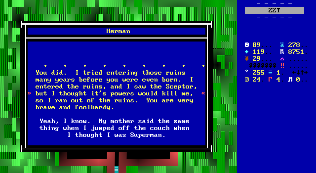
The aforementioned Superman joke.
I think that about covers it really. Looking at it now it seems that much of the comedy is front loaded with the back half of the game being a bit more to the point.
Final Thoughts
I liked Ruby of Resurrection the most when it wasn't trying to be a "game", yet even then I think that I'm liking it for the wrong reasons. Exploring the world is fun and frequently rewarding with nice looking scenery and art boards. The story is bizarre and Jake's journey makes little sense. It's stupid, but in an enjoyable way that makes me feel like this would have made fun a fun game to stream. The highlight of this adventure is the sights and early-teen writing by far. The boards that task Jersey Jake with shooting tend to be lacking in any personality which the rest of the game has resulting in an adventure where you're expected to sometimes stop and regress to poorly designed boards that could work just as well in any other ZZT adventure. The action scenes do nothing with the story or setting except put a significant strain on too-limited resources. If you skip the bonus room you are going to have to cheat for ammo.
The puzzles don't fare any better really. It's entertaining in a way to be told the riddle of the sphinx or asked what wish you want granted in the sense that the options presented are usually pretty out there. The text based prompts are okay thanks to this. The constant dark mazes though? No thanks. If I wanted to deal with invisible walls I'd replay Link's Adventure 3 and at least be numb with nostalgia. "Perplexico", the slider puzzle in Perashku's palace shows some genuine promise that the rest of the game can't keep up with.
Ultimately, I'd advise playing something other than this one. It's not entirely devoid of fun and while its challenges aren't as absurd as other ZZT worlds, there's not a whole lot to enjoy here that you can't find anywhere else. If you're playing ZZT for an audience though, then there's some genuine merit. The oddness of the text, pointless trip to Mexico, and numerous moments of "He expects me to do what?" on the more poorly designed boards can offer up some entertainment to others if you don't mind suffering a little yourself.
Still though, you can do so much worse. This is a case of a young author publishing their first game with little guidance from other games to help keep things grounded. I'd jump at the chance to play this over The Maze, Escape from BoringTown, or *shudder* The Silly World of Dan Shootwrong, all fellow 1992 releases. You can do better with Toxic Terminator or The Lost Monkeys from the same year to be sure, but Ruby of Resurrection is a legit good first try that puts in effort that just barely misses the mark. Limit yourself to a dozen or two ZZT worlds on your local BBS in 1992 and suddenly the appeal makes sense. Also if you've played other old ZZT Club titles, but not this, it's worth checking out just for its place in history. If you're looking for a ZZT simulation of super archaeology, you'll find it elsewhere.
