 Raichu's Circuitbox v6.28
By: Raichu
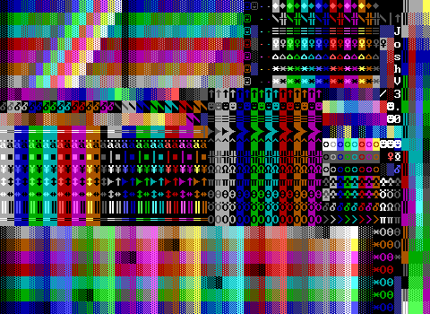
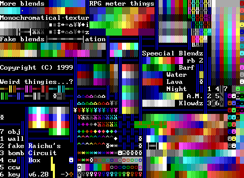
This one's pretty reasonable. The layout is average. The element coverage is average. There are a decent number of blends, but nothing about it really makes me feel like it's worth using over any other tool kit. It's got plenty of "weird thingies" and "klowdz" and other interesting wording to make you know not to take this tool kit too seriously.
I think my biggest complaint is that there are a few black items on the right side labeled with numbers, but the key is all the way on the left despite there being room just above the key.
Wait. As I wrote that sentence I realized a better idea would be to just put the invisible element next to the text saying what it is rather than having a key in the first place.
It also has a "barf" blend.
 random inc kit v.nuts
By: Moonpie
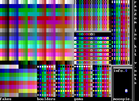
Now we haven't seen one quite like this before. It has massive amounts of walls and objects, but then I feel like it's making some more unusual choices for what to include next. Gems, boulders, and only vertical sliders. This is like somebody wanting to do something along the lines of KJKit and realizing how tedious doing so actually is after making a single board. I'm going to lose sleep thinking about the inclusion of only vertical sliders.
 Raptorian's Toolbox v2.1
By: Raptorian
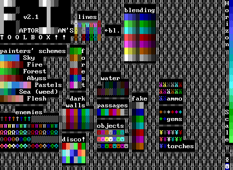
The problem with this list being alphabetical (by board name) is that we're this far into the collection and have to look at something this empty. I think this is limited to the point of near uselessness. There's just no focus here. Everything is available in such limited varieties. I mean, you don't even get walls with background colors if they're not part of a blend!
 rom v. hall of heads2k
By: ZZBlue
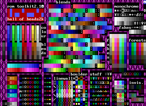
Delimination! Every blend is clear where it begins and ends here. The passage selection is excellent, and there's a nice variety of walls. This doesn't feel comprehensive, and it ends up being a little messy in its arrangement, but you can do a lot worse than this.
 Shades Toolbox
By: Chronos
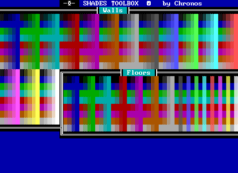
By this point, this one seems almost quaint in how all you get are walls and nothing else, but that's the point. Shades Toolbox set the standard really, and nicely arranges every combination of basic wall and floor. This board forms the basis of a lot of kits, and its inclusion in the ZZT Encyclopedia meant that anybody who was serious about making ZZT worlds in the late 90s knew it existed.
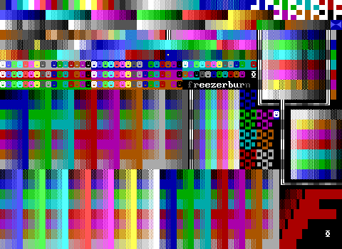 silverspectrum v.karma
By: Freezerburn
See? There's the Shades Toolbox structure neatly placed in a corner. Freezerburn's toolkit is clearly art focused above all else, consisting almost entirely of walls and objects that already have backgrounds prepared.
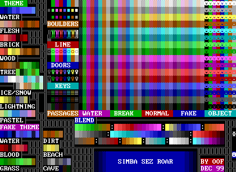 SIMBA SEZ ROAR
By: Oof
Good name. The layout of the walls being by type first rather than color makes it look really messy, but in an aesthetically pleasing way. It feels like I'm looking at one of those tech demos that manage to get more colors out of CGA graphics.
Beyond that, I think there's an okay set of extra elements, but not a lot of focus on them. The blends by this point are nothing new, but it doesn't feel like there are too many of them. I'm also realizing this tries to differentiate blends and "themes". I suppose the idea is that the order is more important to the blends, while you can kind of just grab anything in the themes and mix them around and probably still get something pleasing out of it.
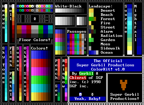 Super Gerbil Productions ColorKit v1.0
By: Gerbil and Chizrat
I think "Heaven" and "Hell" here are new! Both of them look quite nice as well with the abrupt jump from yellow solids to white solids. Snag this one for your own games.
Beyond that though, there isn't that much to this. It has the basic color gradients and fake walls, but most of its blends are extremely short. Does "Radiation" count as a blend if it's just a single tile?
The passages are also very odd choices that look kind of ugly to me. There have been a lot of ideas about what passages are worth using stats on in tool kits, but this one just seems bizarre.
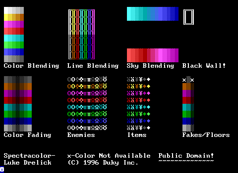 Spectracolor
By: Luke Drelick
Another oldie! Lots of creatures, but no objects whatsoever which makes for a very strange kit.
SNACK 4.0
By: Venom
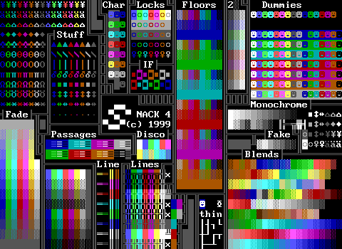
Yeah! It's SNACK! I love SNACK. I used SNACK as a child before making my own tool kit, and the reason that I made my own tool kit was because SNACK4 wasn't as good as SNACK3. SNACK, of course, is an abbreviation for "Super Neato All Color Kit", and it still holds up today. The first board is very packed, offers a wide color gradient of gray to color, to dark gray, has what I would consider to be the optimal arrangement of passage choices, and plenty of "Stuff" for ZZT's built-in items and creatures.
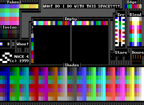
Looking at the first board of SNACK4, I'm still on board for this. A few of blends run into each other in terms of contrast, but you can pick out where most begin and end. The reason I disliked it back in the day simply comes down to the addition of a second board. Somehow the idea of just sticking with the first board or just continuing to use SNACK3 felt like it wasn't allowed or something. The second board in comparison feels like a big dip in quality.
Yeah, you get the shades toolbox, and you also actually get some practical object based doors that actually cover each possibility. (So you have a door that moves east and then north to open, as well as one that moves east and then south, etc. etc.) There's just all this empty space, both in the context of "WHAT DO I DO WITH THIS SPACE?!?!" as well as using actual STK empties. The STK empty trick was never really used all that often, and unsurprisingly is mostly just used to get dark red fakes for blood, and we've seen some earlier tool kits that made sure to include that color combination, but having the complete 256 color combinations seems incredibly excessive.
I feel like some reworking of board one to include the few useful features of board two would have been a better plan. Scale the dummies back to the basic 16 foregrounds and maybe include color-on-dark-background as well and you free up plenty of space for the extra fakes and board edges. The first board is already hitting the stat limit so to get the door and star objects something needs to go, and I think that a ZZT game being made in 1999 onward could probably get away with dropping pushers and conveyors, or even the built-in creatures entirely. Plus the passages section includes white-on-dark colors which are just normal passages and wasted stats. There's some room to tweak this.
Look at how many words I have to say about SNACK. It's important.
 StreamLineSTK versionArr
By: Unknown
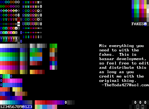
Too empty. It comes off as unfinished, which is a bit of a shame because what is there looks pretty clean. As it is though, it doesn't seem to have much of a point over the dozens of other kits already shown.
 SuburbiaTRiUMPHANT
By: Blue Magus
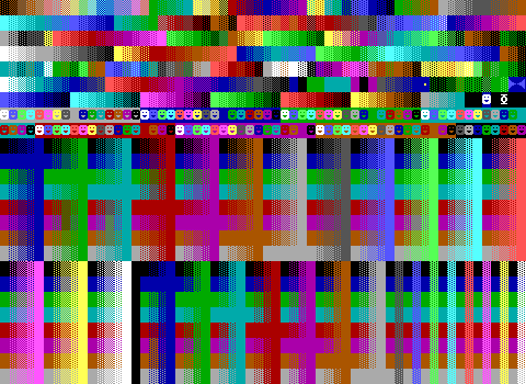
Unsurprisingly, this was another popular one. Going from bottom to top, the basic shades toolbox structure is beautifully arranged here, fitting in a perfectly rectangular region save for a single black column which is empties and not black terrains.
This region is divided by another clean arrangement of objects which fits perfectly across two rows with the sole casualty of a plain black on black object which hardly matters since you can just have a blank character of any colored object without a background to have the same appearance. Actually, there's a black object in the empty area where the player is kept.
Above that is a whole mess of fades where perhaps the only complaint is how often the grassy greens are duplicated for doing a horizon at different times of day. I could absolutely see this being somebody's main tool kit and just having to deal with grabbing passages from somewhere else. I guess the only other odd thing is the pair of blue on dark blue pushers by the player that just fill that tiny bit of space. Move the player and credits scroll there and use those last few empty tiles to tuck in a few passages and you'd have something incredibly capable here.
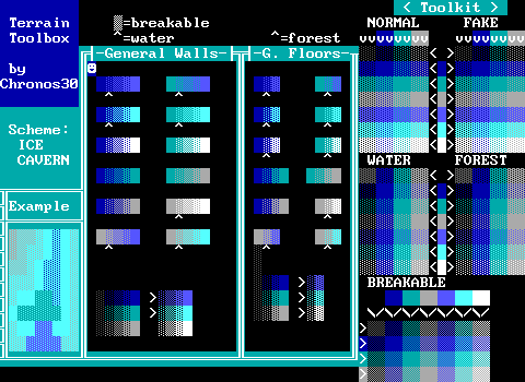 Terrain Toolbox
By: Chronos30
This is rather conceptual. Some tool kits definitely have that vibe of being made for a specific game more than being an all purpose tool, but "Terrain Toolbox" has the most narrow focus since the Pepsi one. If you're making an ice cavern though, this definitely has you covered in terms of terrain. Admittedly for the theme there's quite a bit of variety here, but at the same time everything is just a fade from color A to color B.
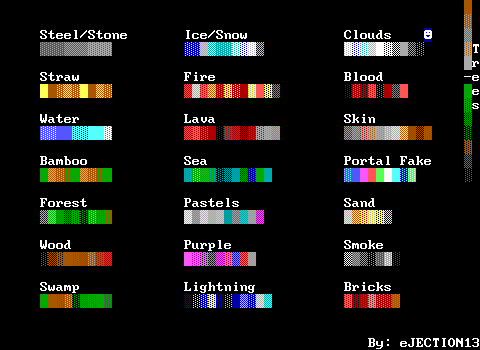 textures
By: eJECTION13
Textures. They're not bad, and some have a little complexity to them. I'm particularly fond of the bamboo one that actually loops as opposed to the standard format where you typically go from light to dark. Not bad, but easy to squish into a corner of a more thorough tool kit and save yourself an extra board.
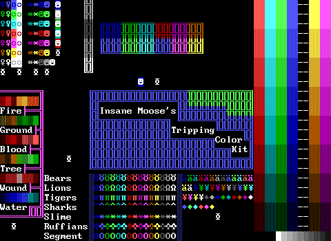 Tripping Color Kit
By: Insane Moose
Nadir specifically calls this one out as one of the few bad additions to this latest revision of Z-Files, and I mean, yeah. This one is mostly a victim of timing though, with the author's name being recognizable and dating the kit to the late 90s at the earliest. If this was anonymous I'd assume it was from 1996 and move on, but by this point there were so many better options.
The scroll says that it's shareware, but I'm guessing the author meant freeware since there's nothing indicating what the process of registering was supposed to be. To its credit though, it does provide instructions on how to export and import boards with ZZT's editor, something that while included in the editor's help files is fairly easy to miss. Truthfully, were it not for the prevalence of tool kits, I think there'd have been a lot of ZZTers that would have never even touched the import/export functions.
That same scroll also says to look forward to future "editing enhancers" including "premade board", "premade bosses", "cool objects", and "more color toolboxes". There are a few collections out there of objects to use in your games, but I think had a collection of premade boards been released it would have been the first of its kind. Years later there would be some worlds like Kyn's Vagabond's Cradle series which did offer some backgrounds to use in your games.
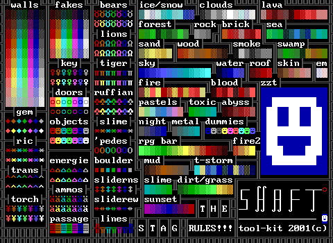 The Shaft tool kit
By: The Stag
Nice logo and some very clean arrangement. The basic elements that take up much of the left half of the board look really nice. On the right, a decent amount of blends fill out the rest of the board. I like this one! It's not the most comprehensive, but it's very easy to find what you're after if this kit has it.
Downsides include the redundant bright colored items of things like gems and keys that can already be different colors, and an accidentally erasure of light gray line walls where a second dark blue one has been placed.
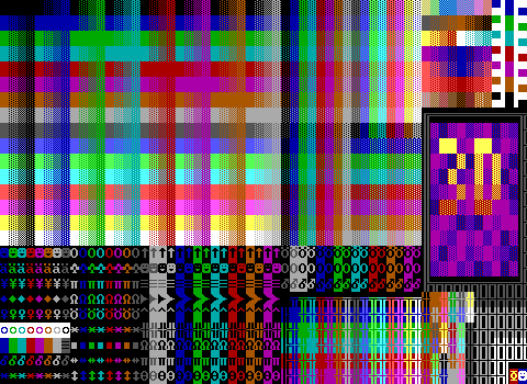 3d vFINAL
By: Microwave
Ah, this is a pleasing one to look at. For the most part, this is incredibly well packed, even going as far as to make sure the blends it includes can be placed perfectly in the area dedicated to them. You almost won't even notice the giant 3D logo kind of ruining things in the corner, or the horrible mess of linewalls that wouldn't fit neatly in the main group.
What's ruining this for me though are the included doors in the lower left that not only stick out like a sore thumb, but with the exception of the rightmost one, they're all just normal ZZT doors.
According to the credits this was made with KevEdit which renders its entire existence moot. Well, okay, back in the early days of external editors it wasn't too uncommon for 24 Hours of ZZT contests to forbid the use of them. Such rules didn't last long. It was supposed to make things "fair", but once you're into the 2000s you have to start really engineering a scenario in which somebody is able to run ZZT, not run ZZTAE/KevEdit, and be able to participate in the ZZT community for a 24HoZZT contest.
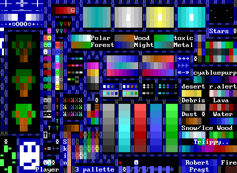 3 Palette
By: Rob P.
At first glance, this seems pretty legit, but the more I look at it the more questions I have. There are these bands of color fades which are both incredibly inconsistent with each other and also just nonexistent for several colors. You've got nine passages, all invisible, and then one that's black on brown. There's a corner that explains how ricochets work. There's a white on dark cyan player with stats. You know all those countless "dummies" we've seen? This one has a stat. The scroll helpfully explains how pointless it is, stating that it will change back to blue. This is why even with STK you're still stuck with the default player colors, since they're forcibly set in code that checks if the player should be playing the energizer animation or not.
The bottom area with the actual player includes a bunch of really bad key mashing sounding music, and a ripped off copy of the Mission Impossible theme.
Okay hang on. Up top there's a blood fade that even has a corpse at the end as part of it with the code 'ouch.. Nevermind this rules.
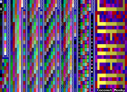 ULTIMA COLOR BOARD
By: Coconut Monky(?)
AAAAAAAAAAAAAAAAAAAAAAAAAAAAAAAAAAAAAAAAAAAAAAAAAAA
It's like ZZT is melting. It's made even more terrifying when you read the scroll which explains how things are arranged.
ANY HOW HERE IS THE LINE-UP...
FIRST WE HAVE FOREST!
THEN AFTER THAT ARE SOLIDS!
THEN NORMALS!
THEN MORE FOREST!
THEN ,OF COURSE, BREAKABLES!
THEN MORE FOREST!
THEN PLENTY OF WATER.
AND THEN FOREST!
THEN WE GOTS THE LINE WALLS
AFTER THAT IS MORE FOREST AND BELOW THE
FOREST IS... INVISIBLE'S!
THEN THERE IS PASSAGES AND BOULDERS!
FINISHING IT OF IS A SUNSET BLEND!
I EVEN GOT BLACK FOREST AND BLACK INVIS'S
OF COURSE A BLACK BOULDER!
• • • • • • • • •
I dare you to use this.
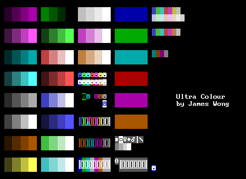 Ultra Colour
By: James Wong
Simple. Old. Stran- wait wait wait these color choices. This is a pre-STK tool kit for sure.
I'm really curious where Nadir found this one since the only James Wong files we have are related to Cyberworld, which is from 1996 and includes tool kits derived from STK.
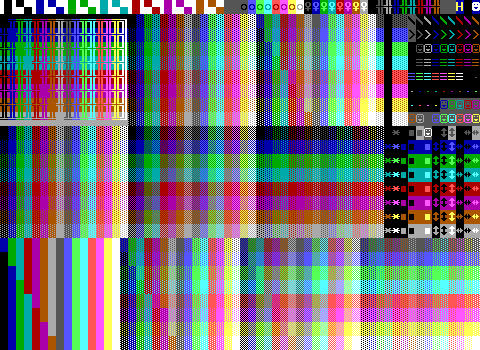 UseLESSS ReDUNDAncYYYYy
By: WiL
A mostly sensible packed board. There are a few weird looking visual discrepancies that make me suspect that there's elements missing that this kit's structure should actually have. By now we've seen a lot of options for these 16x8 grid layouts, which makes me not trust this one to be fully accurate.
That being said, it does a nice job of filling the rest of the board. The top row is smartly composed of things where you probably don't want a wide number of colors, and the right side has some good choices with objects, a set of black background passages, and a nice variety of puzzle pieces. These poor sliders especially have been done dirty being rarely included or only bothering with dark foregrounds in most kits, so it's real nice to see these sets of 24 combinations. (Yes, KJKit had full palettes of them.)
This one also has a very nice scroll that provides a really easy to read overview of what everything is.
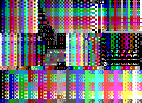 _Underscore_
By: Coward
This is strange. It's like a mix of Shades Toolbox and your choice of grid based tool kits, but then it just kind of breaks down. This isn't even the first kit that realized it didn't have enough room and just ate a chunk of terrain to put things. (You're telling me I'll never have a need for dark blue breakables with a background color?) The shades area at the bottom also seems quite mangled. I don't know. At least the far right section of boulders, sliders, and gems looks nice.
What doesn't look nice are the underscores of text towards the center left. One of them is even an object since white on gray text doesn't exist!
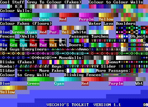 Vecchio's Toolkit
By: Vecchio
I like the softness of this background here. The kit itself feels just a little bit messy, but not half bad. There's an approach here of not including all possibilities of anything, but really putting some thought into what's likely to be useful. This is most noticeable with the fakes and linewalls.
I suspect the messiness comes from updates which is where there are sections of "more fakes" and "more passages" which were pretty added in a later revision without having to restructure the whole board. It makes this kit feel more personal, as there's a good assortment of elements arranged in a way that I'm sure is remembered by the author, but for somebody else to use this kit, you may have to hunt around to find something that you know the board contains.
Lastly, in perhaps the most wild idea of "black wall" yet, the "Cool Stuff" has what is supposed to be a black wall on the right, but it's actually a black object! This is incredibly bad since it's using a stat. Unlike the usual culprit of white text though, you'd immediately find out this isn't a wall that moment you hit enter on it and were suddenly asked to pick a character for the object.
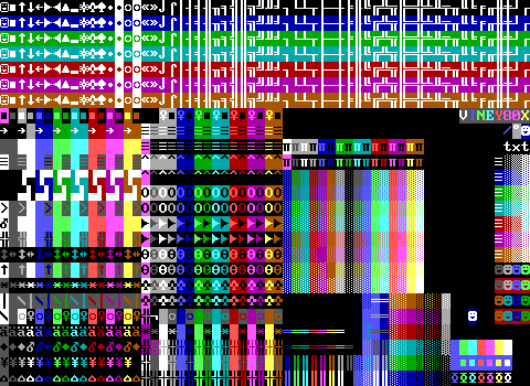 VINEY80X
By:roßovine
This one is a rather unusual looking one! The alternating pattern of colored tiled and black tiles with backgrounds gives it a rather strange look, and it has a kind of interesting set of text. Having the various bits and pieces of line characters and arrows aren't that uncommon, but some of the other choices are strange to me. We get char one smiley faces but not char two? You get clubs and spades but not hearts or diamonds? At first I thought it might be because of the ZZT convention of using those two playing card suits as trees, but with the text forcing them to be white, I don't think they're nearly as up to the task.
It also suffers a bit from making you dig around for things that are placed in more unusual spots. I almost thought it was missing arrows pointing to the right, but those are included with the sliders and boulders for some reason. The unusual choices here honestly probably make it a decent complementary 2nd board to a tool kit that's focused more on blends. Use something based off of Shades Toolbox and you'll get some decent additions that can be tough to find in other kits, but in the end I'm left asking more questions than this tool kit answers.
 vin3y $hades Toolbo><
By: roßovine
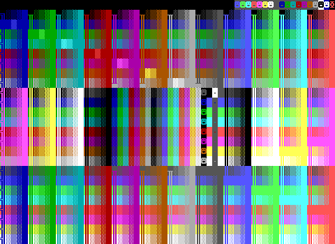
Speak of the devil. The scroll in this one, and the inconsistent names make me believe these are intended to be two separate kits and not one multi-board kit. This one is pretty smartly arranged, dividing the blinking from the non-blinking with a set of fakes and objects (and I guess duplicators, which sure, go for it).
What this kit does get bonus points for is that the scroll points out that the all solid walls do in fact have the proper background color, and will change them into boulders to prove it. This is at the very least a tool kit you can trust.
 VisuoFunctional Spectrum
By: WiL
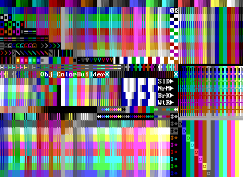
For the most part I'm on board with this one, but I still don't get the point of including a thorough arrangement of walls and then just carving out a chunk to put other things on top.
I am fond of the "Color Builder" area though. The scroll explains that you take a stat element and place it on top of one of the fakes that makes up the color builder in order to give any stat element a background color. Then, when you're done, you take the second fake wall of that color and repair the fake wall that was covered up in placing the stat element allowing you to give things background colors repeatedly as you need them.
Bad news though WiL, your black solid/normal/breakable/water section is in fact just four empties.
 Vstk v. peter gabriel
By: Tseng
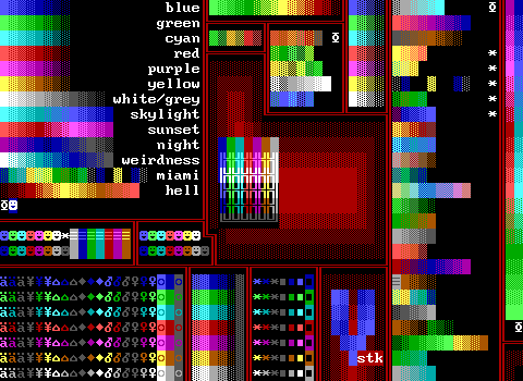
This isn't the best tool kit out there, but it is one I've definitely run across a bunch. It's not the most comprehensive by any means, but it hits a good balance for blends vs stuff, even if it's ultimately a "light" tool kit. Tseng describes this as being an ideal tool kit for a ZZTing newbie, and I can see where he'd get that idea. There are certainly fuller kits out there, but this one is simple and reasonably comprehensive. It's easier to use a pre-made blend than trying to come up with your own, and the organization here makes it easy to find everything it has to offer.
Also miami is an ocean beach grass street.
 <3\/|$|0/\/
By: Tseng
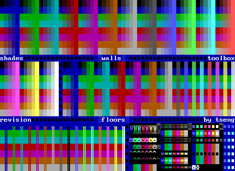
That title says "Revision".
Oh. Here's the shades. Nevermind, I guess Tseng needed these as well. It's a basic shades toolbox derivative with the unusual choice of spacing out the included linewalls.
Not a fan of the confusion in the lower right for the elements with matching foregrounds and backgrounds. The row of them between the passages and ricochets are passages. The row between the dark colored boulders and the black on various background boulders are more boulders, and then the bottom most row are ricochets. I think this area could have been untangled a little to make it more obvious what's what.
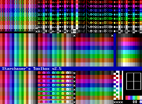 Starchaser's Toolbox v2.5
By: Starchaser
All it takes to make your tool kit look distinct is to rearrange the order of colors. Part of me looks at this and thinks "oh that's pretty", but then I think about having to know the arbitrary order of colors kits like these use in order to find things as fast as you would one that follows the usual EGA/ZZT order. In the end, I think the shades toolbox method of sorting by color and then element leads to a more usable layout than these grids of elements sorted by color.
Bonus points for the scroll at the bottom that includes transcriptions of ZZT's sound effects so they can be used in code. Having a quick reference for things like the "ouch" noise and passage transport can often come in handy.
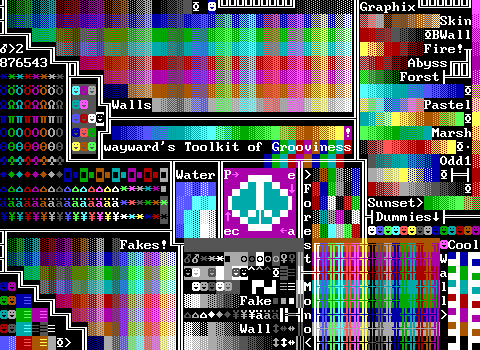 wayward's Toolkit of Grooviness
By: Wayward
More cannibalized Shades Toolbox! I think too many tiles get eaten away for me to really be a fan of this one. It's eating into a lot of this stuff while including things like a giant peace sign and surprisingly large amounts of water and forests for a hand picked selection. There's still enough here for it to be useful, covering the basic objects, some practical passages, and a good set of items and enemies if that's your thing. Ultimately though, this one doesn't really have anything in it that makes me choose this one in particular.
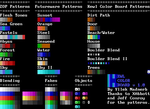 yllek's kewl color board
By: yllek
This one seems a bit too recent going by the names for a kit this basic. Actually crediting the source of the blends is something worthwhile at least! The original blends are also kind of interesting? "House" is surprisingly grim and is pretty much your standard metal or steel blend. (I mean, steel is on this board as well and is basically the same thing.) The "door" is also odd because it has a special object as part of it. Are you supposed to make a large door with that passage-looking object at the bottom? Is it meant to go in the middle of a huge door and be a handle? I'm really not sure.
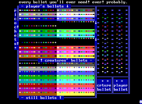 z.nadir's palace of bullet
By: Zenith Nadir
It's been awhile since we've had a very narrow-focused tool kit like this one. Palace of bullet is what it says on the tin. You get bullets in sixteen colors traveling in all four directions, divided into both creature and player bullets. The difference being that bullets shot by tigers or spinning guns can't shoot objects. In practice, even when working with bullets in this manner it rarely matters. Lastly there's a complete set of statless bullets which commonly get used as "land mines". If you're looking for bullets, Palace of Bullet is the place to be.
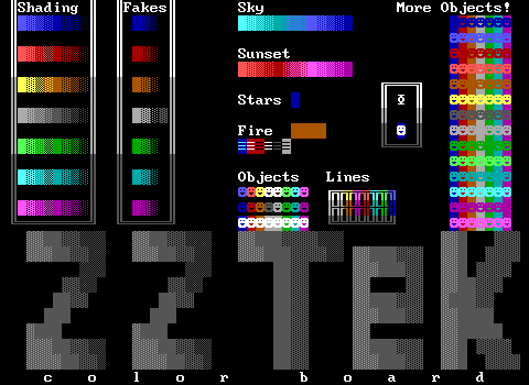 ZZTek Color Board
By: Kev Carter
What a strange one. This has some extensive object coverage, but very little outside of that. There are a few random passages including white on dark-red which is just a normal non-STK ZZT red passage. The scroll claims this is the best tool kit because you don't need to switch between it and an STK objects board, but there's so little here that you're still going to need more boards if you're planning on using this one.
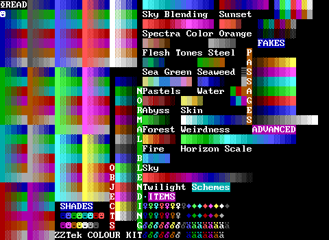 ZZTek Colour Kit
By: Masamune
A company that has two different tool kits by two different authors. Masamune makes Carter's kit look pretty obsolete. There's a nice set of the Shades Toolbox, a few blends, some objects and items. It's just a lot more thorough. You do lose the pre-made objects with backgrounds, though they can be reconstructed with the fake walls available.
Honestly, I'm not super into this one either, it just manages to be a little better than the ZZTek Color Board which invites a direct comparison.
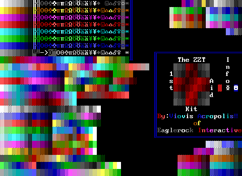 ZZT First Aid Kit
By: Viovis
At least this one has a cute theme. In the end, it's mostly just a whole lot of blends and all mashed together in a way I don't personally care for. They are generally high contrast enough to easily tell where each begins or ends, but since the kit still has a good amount of empty space I'd prefer breaking them up a little.
All the fake walls are in the top right corner where it's still really difficult to find something specific to me. I kind of see what the arrangement is going for, but it just looks like a mess until you really stare at it.
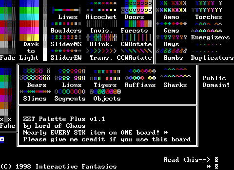 ZZT Palette Plus v1.1
By: Lord of Chaos
This is a pretty simple one, but it is clean. It's far more interested in non-terrains and does a good job of presenting them. If you're looking to make a classic ZZT adventure with some more color, this one has you covered, but again because of all the empty space, you can find other kits that contain these elements in addition to a wider variety of terrains.
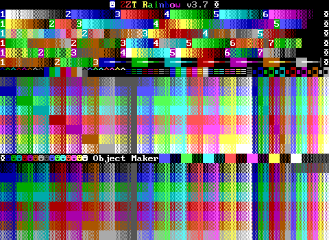 ZZT Rainbow v3.7
By: Kinesis
Here we are. The final tool kit in the collection, and it's pretty decent at least! By now you know the drill. There's a well arranged Shades Toolbox, an object maker as seen in WiL's "VisuoFunctional Spectrum", and the leftover space is used to supply a good arrangement of blends. The blends are all labeled with text to save space and have a scroll to explain them.
I enjoy the layout for the linewalls, although all the repeated dark gray ones would be enough to cram in one last blend were they removed.
The passage selection is quite good as well. This is a nice one to end on. It's not the greatest, but it's definitely well constructed.
Final Thoughts
So hopefully these weird colorful boards make a little more sense now! And perhaps some, with their strange ideas of including three special colors of objects, fake walls (except for dark cyan), and all 256 possible keys make a little less sense. Tool kits are such a unique artifact of ZZT that it's such a struggle to come up with anything to compare them to. The idea that all along a platform for making games could secretly support far more extensive graphics is really just beyond compare. To an outsider, seeing your first tool kit can be such a strange thing. Large swaths of color with massive grids of smiling faces and items. ZZT is intended to make games first, and so to create boards with it that are never intended to be played and yet have so much thought and care put into them can be quite jarring.
In the 90s in particular, common wisdom was that Alexis Janson was single-handedly responsible for keeping ZZT still going, as if the colors themselves were what made the games still worth playing. Her contribution to the ZZT community with STK was unprecedented, and while I don't think ZZT would have died off by the turn of the millennium, I do think it vastly expanded the type of games that people felt ZZT could make. Her work in playing around with ZZT files ushered in a new era, and the tool kit so compactly symbolizes the possibilities she opened up. I don't want to claim that a serious story couldn't be told with just bright colors, (after all, no matter how brooding a game may have been, the player was still smiling the entire time), but I do believe it made them far more palatable. With only those default colors, ZZT feels very cartoonish and abstract. STK gave just the slightest sense of realism to make these more complex games feel like they fit in.
Tool kits like the ones shown here, offer a rare insight into the author's thoughts as to what the essence of ZZT is. The still strict limitations mean that you can tell if an author was comfortable working on their own blends or using ones that had been created by the community. Are there a hundred objects or sixteen? Does it need built-in creatures? Do these solid walls need background colors? Each one has its own answers, and none are perfect, even for those who created them. Tool kits don't free the author from having to think about what kind of graphics they need for a specific game, but what they need to prioritize to speed up the process. Nadir's dedicated compilation over the years started even before 1999, in an era where having access to so many tool kits could let an author figure out what works best for them. The project continued for over a decade, long beyond the time in which they were essential. There's historical work here and it's a rare behind the scenes look at what went into the creation of ZZT worlds for so many years. Nadir called them a minor art form, and the work he did in compiling all of these kits makes them an incredibly accessible part of ZZT's history to this day.
I really need to update Colors R' Us.
