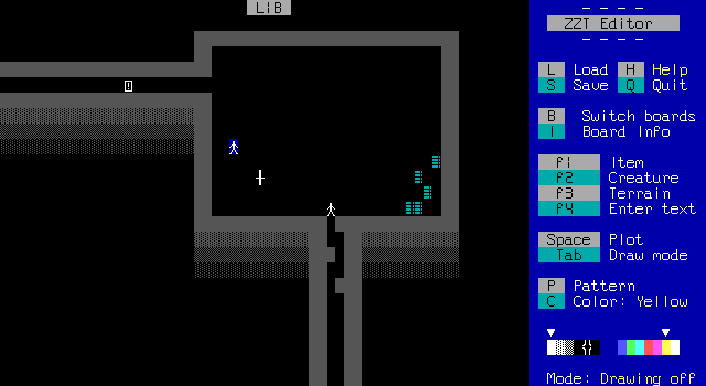
Way back in the first level, that strange creature in a cage is just removed entirely.
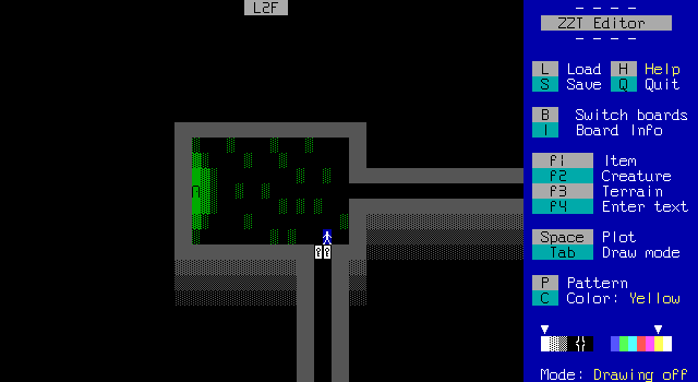
This door that you can't open on a board you never return to? Well, now it checks for a "clearance" flag and has invisible passages at the end that take the player to the ending sequence.
The player will indeed be warped back here to access the ending, even though in the context of how the game ends the sudden jump back to this point is both pointless and makes no sense.
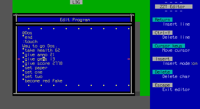
That's entirely it. ZZT isn't a medium known for revisions, so it's honestly more surprising that there are any changes at all.
True to my word though, I edited the game and added an object to adjust my stats and flags to match exactly how I had ended the demo. This might have been used as free opportunity to just give myself 100 ammo and health and be done with it, but I was feeling honest.
Plus the game's had enough ammo issues that I'd rather be able to warn about them which I might not do if I was running around with a cheated ammo count.
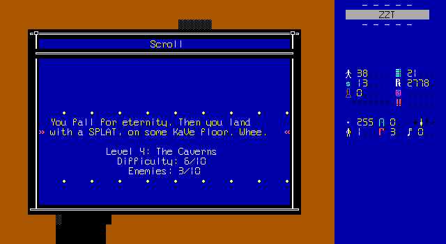
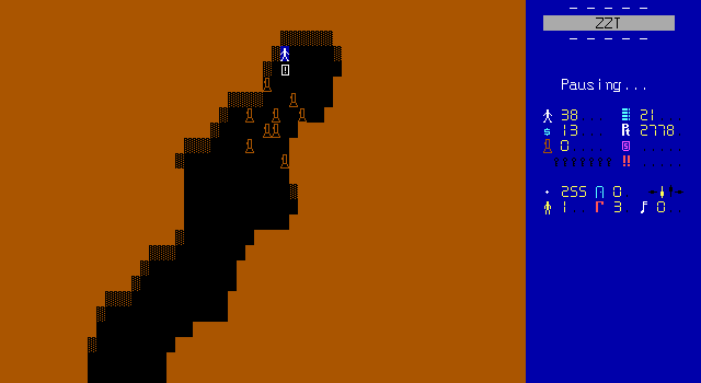
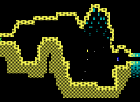
So the next level is underground and starts with a bunch of torches which have now been replaced with flashlights, or if you're British, torches. There are nine to collect which is more than enough because there are zero dark boards in this entire game.
Why? Why are there torches?
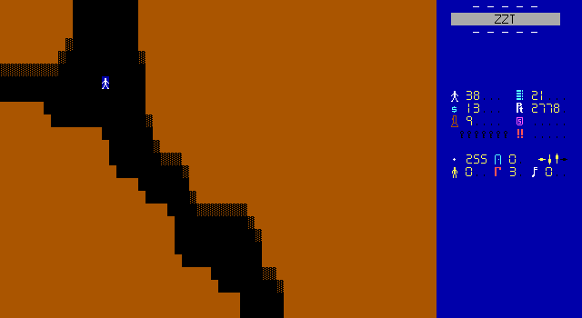
I know I complained about stark black backgrounds before, but these caves manage to look worse honestly.
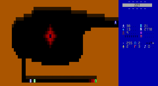
By now, the format is pretty obvious. You walk into a room, and there are some locked doors and a boss to fight.
At least, that's how it's been. Here there's another passage in the center of this perfectly boss-fight-shaped arena.
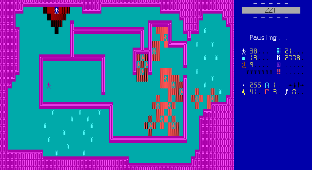
It leads to this very strange level with some rather unique colors chosen. I like this style of linewall used by the font as well. This board offers some new enemies as well on the path to the obvious boss fight with the pile of bloody corpses strewn around.

Just play spot the difference between how the enemies are positioned when I first enter the room and a few steps later and you too can figure out their AI.
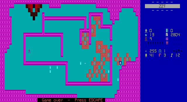
It gets really rough here since again the ammo count is low. I don't even get
the luxury of enemies shooting each other because they end up clumping together
and thus unable to shoot each other for me.
Edit: Actually I'm an idiot who was tricked by a font. These are tigers. They just have high intelligence so they focus the player. They can't shoot each other.
After a few attempts it becomes pretty clear that even if I get to the boss, I'm not going to have the ammo needed to defeat them, so I opted to try the other path instead.
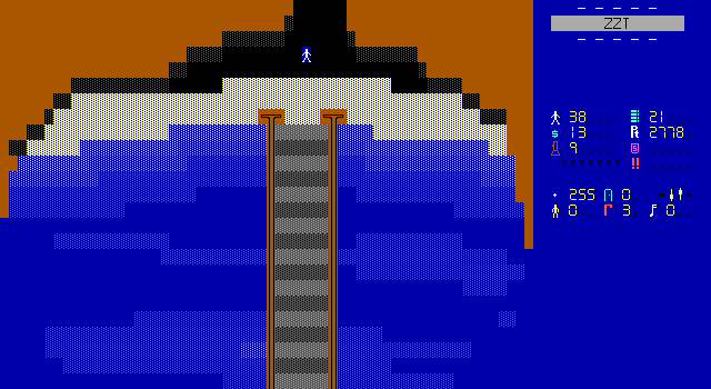
The cavern leads out from the south to this underground cove, which at the very least sounds like a cool location actually. There's a very large bridge to cross and no indication of what will be on the other side. Place your bets.
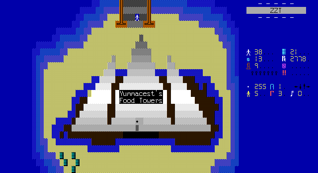
Did anybody guess "Yummacest's Food Towers"? No? Better luck next time.
The structure is pretty cool too. Visually I like these boards that really break away from the rectangular room on a black (or rarely solid) background. It feels like there's more effort put into these things even if there's actually very little to them.
Plus there's some very critically needed ammo at the bottom.
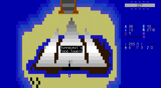
At the bottom is this breakable wall that once destroyed causes a bridge to appear letting the player inside. This is actually the same kind of wall as the ones blocking the paths to Yucka's and Grossa's lairs. With the font, it's now a lot more clear. At the same time though, it's really strange because those objects still use these characters in the font-free demo, which suggests to me that the font was there and just deliberately not included? Perhaps it was meant as a way to hype up the full version by offering custom graphics as a bullet point.
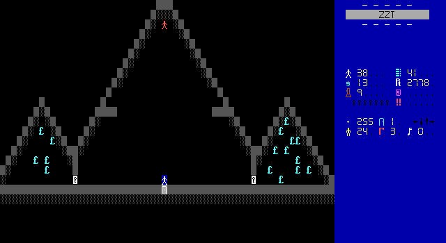
The inside quickly realizes its mistake and reverts to a black background, but the rooms are triangular if that's worth anything.
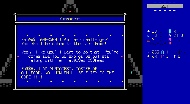
Yummacest is in charge of food and is our next boss.
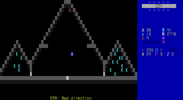
They are not a very good one. After taking a single step they run into a program error due to typing "sek" instead of "seek" and halt in place. They can still react to external stimuli like bullets though, which makes this fight a free victory as each bullet restarts the code causing them to take one step and error again.
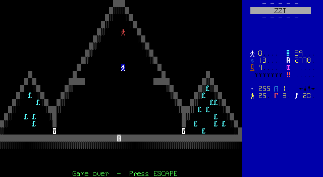
Just kidding! Despite having a boss that can't do anything, I still got a game over!
Let me tell you, I was very confused every time I took damage during this fight and my suspicious was that there were "traps" of invisible bullets or something.
Almost, but not quite. In reality there's a black-on-black blink wall, which means an invisible beam can easily cause the player to unexpectedly get hit when they're lined up with it.
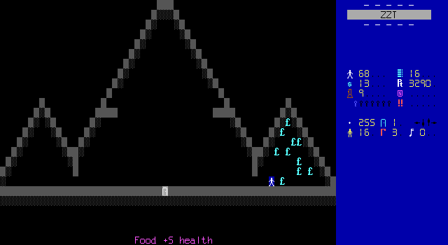
Yummacest dies easily enough once you know where the blinkwall is and drops a key that can be used to open one of the doors in the caves as well as unlock their food reserves for some much needed health.
My ammo is actually lower than what it was when I took the other path, but the food brings my health up to over 100, which hopefully will be enough to tank the enemies and get to the other boss.

Except Yummacest's board isn't actually connected back to the caves so the game is actually unwinnable, and you're stuck here.
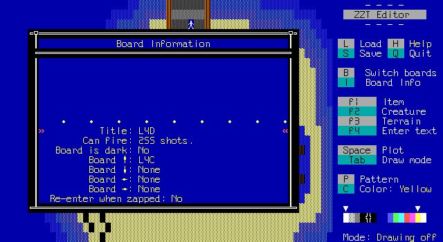
Lord knows why I didn't take the second free excuse to cheat some resources my way, but I opted to just edit the save and connect the boards myself.
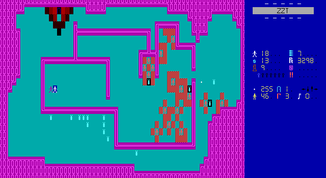
Seven bullets and 18 health. Yeah this will work out just fine.
Fat@$$: I AM YUMMACER, SECOND MASTER
OF ALL FOOD!
Fat@$$: HA HA HA HA HA HA HA HA HA
.....................<deja vu, again>
.
.
.
.
.
.
.
.
Okay so there's kind of a theme going on lately with these twin bosses. Again the dialog indicates there's an expected order but nothing in the game enforces it so it's just a coin flip as to whether or not the player went left or down from the crossroads.
Since these bosses typically drop keys that use flags, it should be pretty easy to just have the dialog branch between two versions based on whether or not a boss is fought before obtaining another boss's key. Alternatively, just have them say "I AM YUMMACER, ONE OF THE MASTERS OF ALL FOOD" and avoid the issue entirely.

There aren't any blinkwalls this time, and Yummacer actually works properly so it's a proper fight.
Except once again for the utter lack of ammo available.
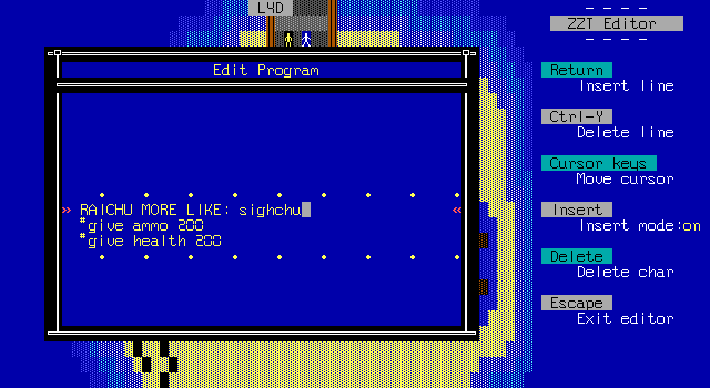
I don't even remember taking this screenshot, but this sums up the middle third of Zyla quite well.
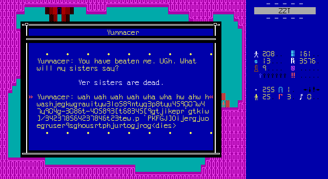
With some actual health and ammo, the fight is a lot more fair. They drop the next key and the player can proceed to the exit.
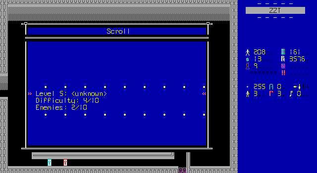
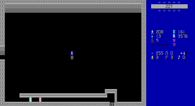
Big empty room with no theme at all. Level five isn't off to a captivating start.
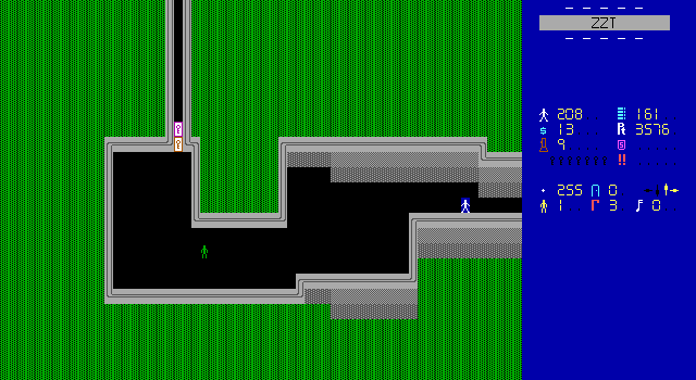
Raichu is so reluctant to do backgrounds, but every time he does, even with simple patterns like this, the boards instantly look so much better. Black on dark green mixed with dark green on black leads to this neat-looking striped pattern.
This is also the only room that can be entered and now there are four locked doors across two boards, so this next boss better really pay up.
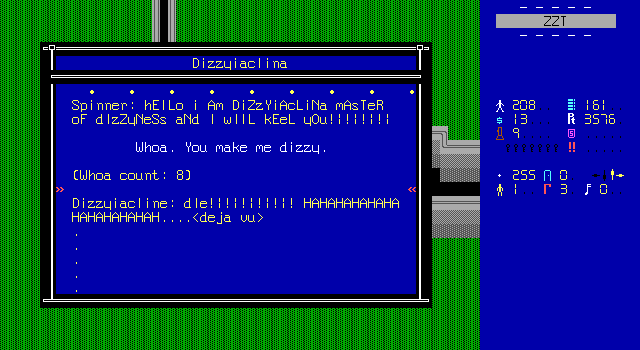
I'm just kind of tired by this point. Despite having these weird themes, the bosses are particularly lifeless feeling. It feels like Raichu is just trying to hurry the player along and get this game over with, but refuses to compromise on having 30 bosses that play out pretty much the same way every time.
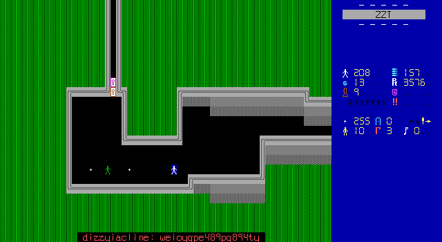
The earlier portion of the game was pretty simplistic for an action title, but it felt like there was some confidence in it. Dizzyiacline and whatever boss will doubtlessly be on the next board feel like Raichu was making an entry for a 24 Hours of ZZT competition and realized he was running out of time. Everything feels hurried.
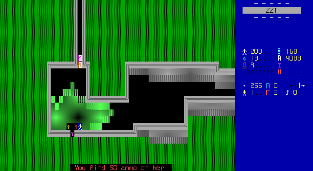
There used to be "levels" you know? I thought I'd be fighting tougher and tougher parts of Zyla's army and not just one endlessly dull hench-person after another.
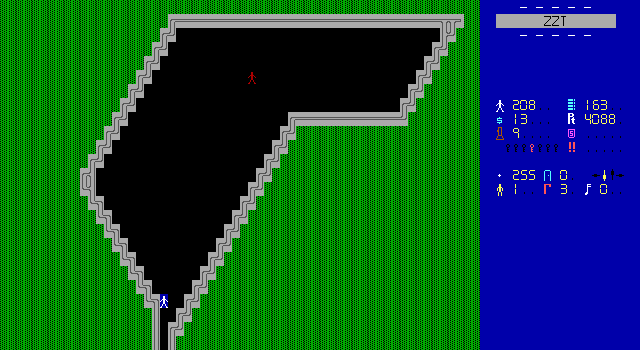
The next board is another boss.
You knew this.
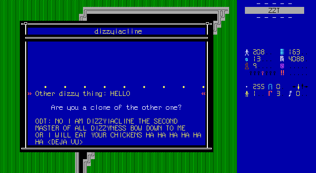
Oh my god it's even the same boss.
Well no, not really. This boss walks towards the player and only changes direction when shot or bumping into a wall. Is it bad that I'm excited to see a boss that also shoots in directions other than towards the player?
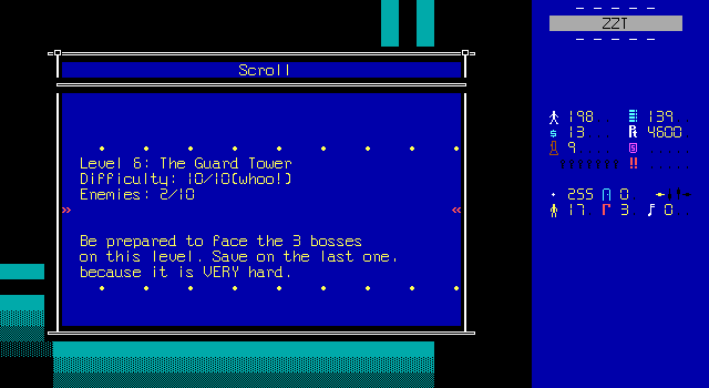
The plethora of keys dropped between the two dizzys means a trip to the next level.
I'm 100% prepared to face three bosses. That's all I've been doing this entire game.
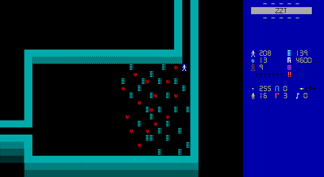
Even the slightest break from the game's established structure feels like a breath of fresh air. This room offers plenty of supplies, and I'm just excited to see them.
It's of course in another black room on a black background, and doesn't feel like a "guard tower" in any way, but so much of this game feels like it's just throwing terms you'd hear in a more standard (and better) action game.
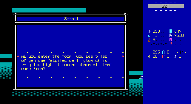
I'm not too sure what a "fatpiled" ceiling is, but this is of course where the next boss will be fought. After crossing a certain point on the board of of these objects will begin to crack apart revealing the next boss.
Fat thing: Hello.
FT: I AM FATTA, RULER OF FAT!
Fatta: I C O N T R O L A L L F A T
Fatta: grrrrrrrrrr...
I think another thing worth pointing out in how tedious these bosses feel by now is that the earliest bosses felt like they had better concepts? Not that "Destroyla" was a brilliant villain or anything, but the old bosses felt like they actually fit into this world with an evil child-tyrant bent on world domination.
I think the same complaint is leveled against Mega Man games running out of reasonable names for robot masters. Capcom at least hasn't gotten so desperate as to include "Fat Man" yet.
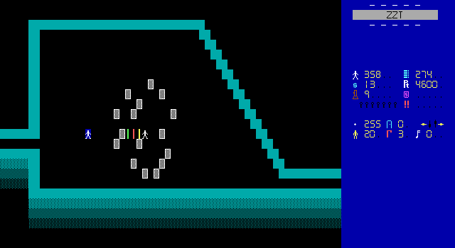
As much as I loathe stars, it does mean this fight feels different from most of the others. There's even an element of strategy in it as you want to make sure you keep Fatta in the central area so the stars can be blocked by the ceiling tiles or whatever they are.
Raichu is also kind enough to once more provide a timer object that erases the stars after a set period making them a far more acceptable thing to deal with.
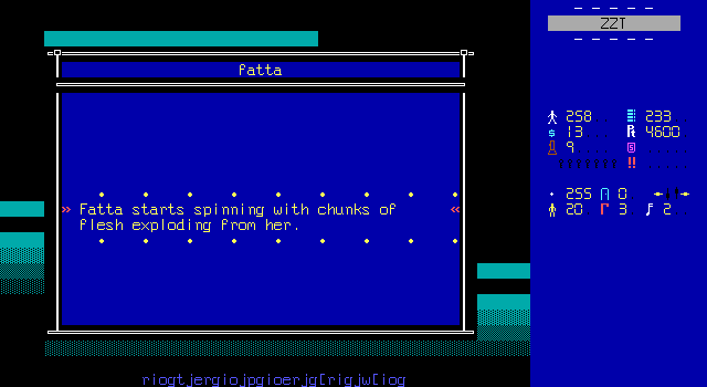
Two messages in one screenshot! Her regular dialog when she's hurt is outright key mashing. The other message is of course the general grossness this game has come to embrace as its defining characteristic. It's not a good look.
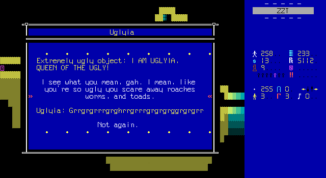
The next board doesn't even try to hide its fight and "Uglyia" promptly takes action.
She's the more traditional style "Go seek. Shoot seek. Repeat." kind of fight.
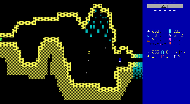
To say something nice, the room is at least fun to look at. The shift from the more rigid rooms and solid walls to this squiggly mess would make for a more fun space to fight your way through, were it not for the fact that she's just always going to rush the player.
Also more ammo. Every boss board in this game should be doing this.
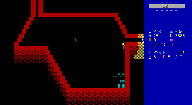
This is the third boss of the guard tower which appears to be a tower made up of horizontally connected rooms of unusual shape.
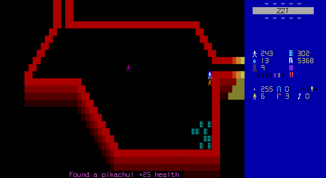
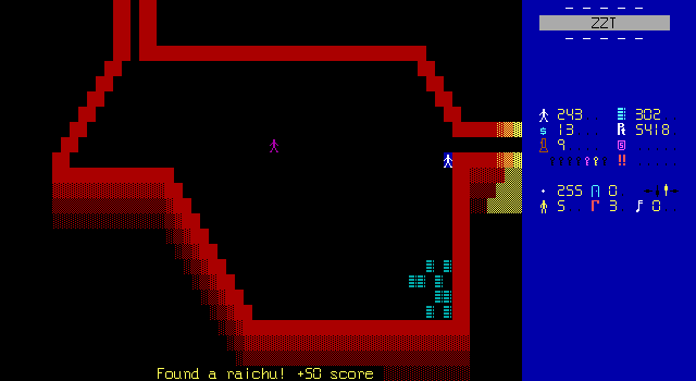
It's also the return of pikachu and raichu power-ups! They even have their own sprites this time, which given the severe challenge of portraying pokémon in a single color in an eight by fourteen rectangle, actually don't look half bad.
What a throwback. Remember these little guys? They don't exactly provide much, and I especially can't imagine caring about 50 bonus points this late into the game.
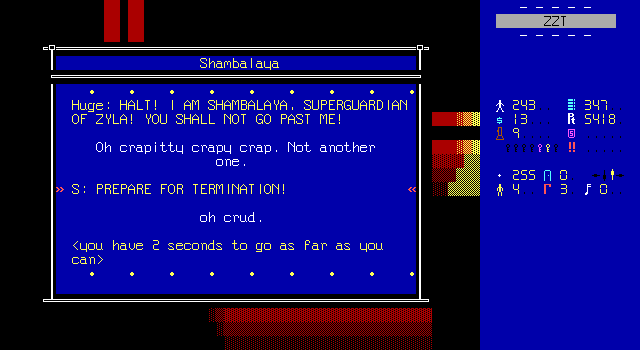
Shambalaya is next, and I'm just glad Raichu has run out of traits like "ugly" and "fat" to serve as defining characteristics for his boss battles.
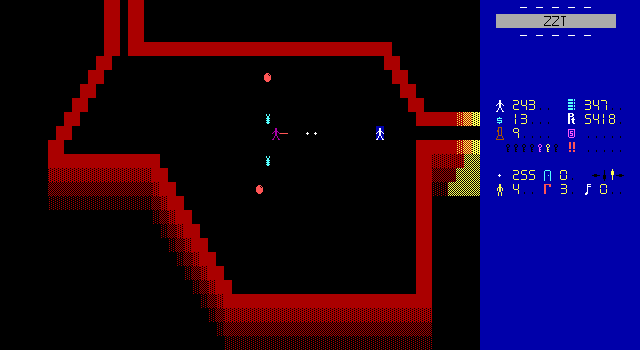
One peculiar aspect of playing ZZT games that use custom fonts is that it's very easy to not realize when some enemies are actually creatures. Shambalaya summons ZZT's iconic cyan tigers and red centipedes which appear to be weird bugs and orbs now. There was that room way back with a whole bunch of tigers that I just kind of assumed were objects like everything else.
At least in this case they were obviously threats even if I couldn't recognize them for what they were reskins of. I remember playing Village and walking right into some ruffians that looked like friendly NPCs.
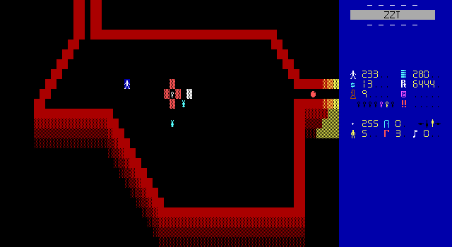
Stars are thrown. Bullets are shot. Shambalaya explodes into a pile of blood and a key. It's all par for the course here, but with the benefit of some less grotesque descriptions. I'll take a simple "ouch" when an enemy is shot over messages about shooting off chunks of fat any day.
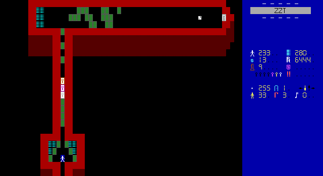
This next board has a lot more of those destroyable walls from earlier. If this was more towards the start of the game I'd probably like it more. The layout does a good job of sectioning things off and the haphazard placement of the barricades early on would make me wonder what they're keeping the player in-universe away from.
Zyla has been going on so long that I'm pretty sure the answer is a boss fight on the other end of the passage.
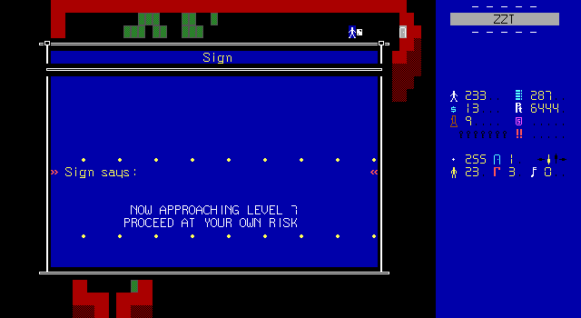
It's just not scary at this point. Raichu has run out of surprises long ago. Every board that doesn't have Zyla herself on it is just slowing me down from getting on with things.
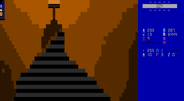
And then Raichu surprises me with this pretty solid art board and simple cut-scene.
Story will never be this game's strongest aspect.
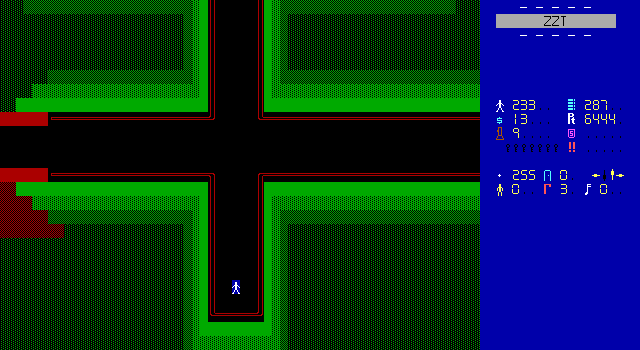
Level seven is the final level and there's very little left to explore.
It's almost entirely devoid of enemies, and the only boss fight remaining is with Zyla. It has decorations and looks and feels significantly better than the bulk of this game.
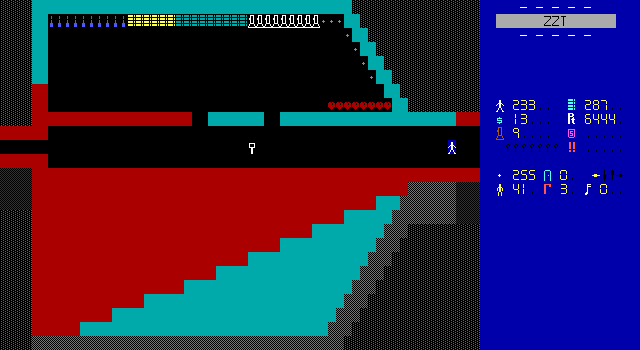
The colors here? They're really good. The changing colors and differing angles make this board one of the most visually distinct in the game!
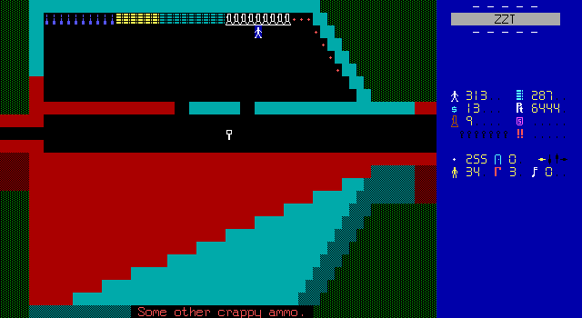
The armory itself doesn't offer as much as it seems. There are enough hearts to recover nearly 100 health, and a short row of ammo that can actually be collected. All the other objects (including the flashlights) are "crappy ammo" for guns the player doesn't have access to. From a realism standpoint this makes sense, but from a gameplay perspective, this just makes me think it would be nice if there were some different weapons to collect.
ZZT admittedly does struggle with varied gun-play, but the basic idea of letting the player use a gun that deals more damage but has less ammo, or the opposite are fairly simple to implement. Though, I don't think I could trust Raichu to implement them well, seeing as how I already had to cheat for ammo once and had a few other moments where my supply of bullets was dangerously low.
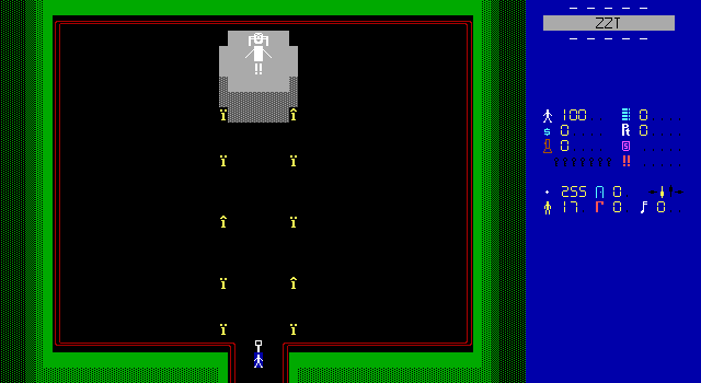
The path to the north from the level's entrance leads to the "worship room". Again, there's more creativity here than seen in ages. I love the giant statue's design and how with the exception of Zyla's expression, it's basically the same as without a custom font.
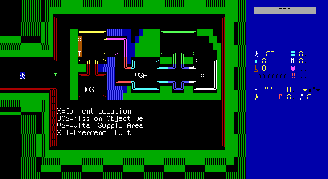
And look at this! There's a map of the palace, and again it looks awesome. It's amazing what this tiny visual detail does. Imagine if every level had a map at the start. It would really let the player explore the levels with a plan in mind, especially if it marked some things like where to find supplies, keys, bosses, etc. Imagine a map that hinted at secret rooms. There's things you can do with this, and instead it's a good idea squandered by appearing with something like five boards left in the entire game.
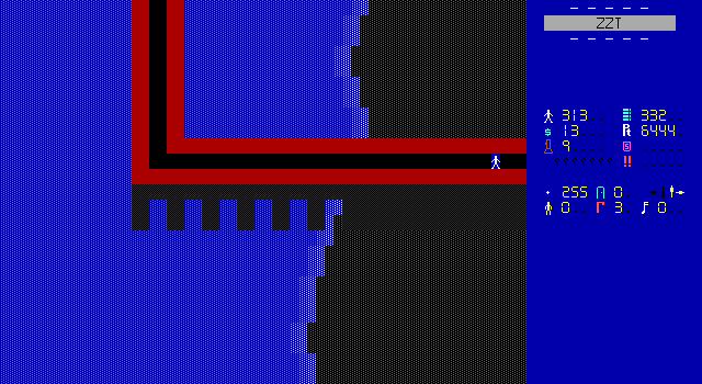
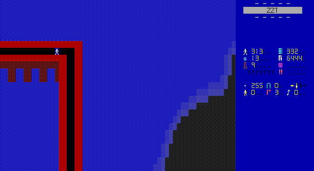
And finally, through the armory is this very bendy bridge that leads towards Zyla's lair.
This board really reminds me of a similar angled bridge we saw back in Gem Hunter: Special Edition. You don't really see angled bridges like this often, and probably for good reason. In Gem Hunter, Tseng had a game that was mostly one continuous landmass so the connection bending was necessary to just properly attach a board towards the end of the game to one from the beginning.
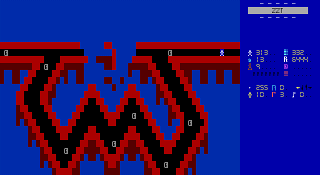
Now, you might think it's meant to build up tension or something. This is the road to Zyla herself, the ultimate villain. I could maybe accept that interpretation, until you get to this board which is just more bridge, a very jagged path to get around a collapsed section of bridge (which I admit, looks pretty good), and a lot of scrolls.
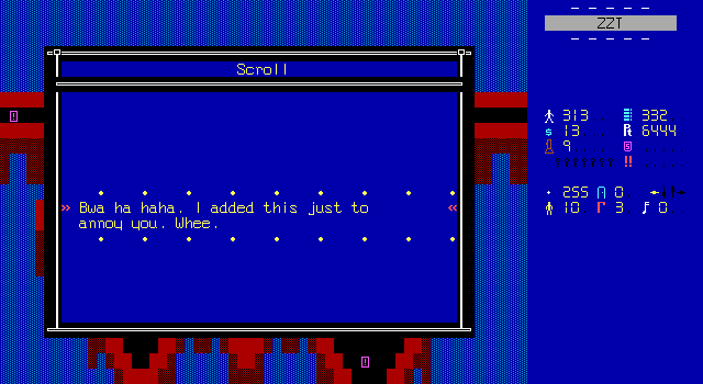
I refuse to believe Raichu was trying to have a serious moment with this bridge. This is the kind of board you make when you don't know what you want to do in your ZZT game, but want to keep editing your ZZT game.
The other scrolls slowly spell out a message saying to look at level four through the editor. Doing so reveals some invisible walls hidden in the outskirts of the level that spell out "The secret skin color is yellow breakable on dark purple". Not bad.
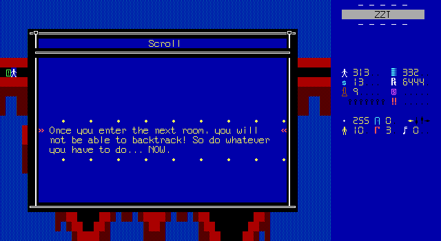
The final scroll warns you that this is the point of no return. On the one hand, it's a helpful warning to the player, but on the other if you're like me and actually took this path first, it means you now have to cross this miserable bridge backwards to see the rest of the level and then cross it a third time to actually face Zyla proper.
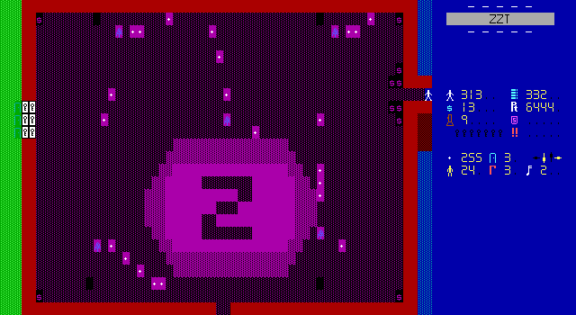
This is the final fight before reaching Zyla herself, and it's against what appear to be blue pine trees?
I have no idea what this graphic is meant to be. The objects are named "Triangle" and they follow the trend of moving and shooting towards the player endlessly.
The structure of the room gives the player a natural chokepoint to funnel enemies into. You don't even have to be clever and realize there's a benefit to not picking up the dollar sign objects, since despite looking like bonus points they're merely "decorative gems" and can't be picked up.
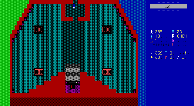
After far too long, it's time to meet Zyla. Are you ready for her backstory?
Zyla: You have escaped my dungeons? That
is impossible! But now you SHALL die!
Z: True true. But let me tell you the
WHOLE story, small one.
Z: Again, true. But I AM THE ONE WHO
BROUGHT YOU HERE. I AM THE ONE WHO
NOW CONTROLS YOU!
Z: SILENCE! Now let me tell you all about
it. In 1988, I was born. Duh. But then,
from a starting age, I loved blood...
lots of it. And I would play all those
Violent games. Then, in 1992, my parents
died in a car crash. I went into a life
of bloodthirsty crime. Then, I was taken
in by an orphanage. I went through 7
of those orphanages. In the last one,
I met up with my friends...
Z:... We hopped the wall. Then, 1 year
after we escaped, we snuck into the UN
and stole the new missile plans Russia
had. We started to build them stealing
everything we needed. Now, I was able to
do ANYTHING! ANYTHING AT ALL! I gathered
information on all the technology...
Then, I was able to build a warp. I can
transport ANYONE here to work for me!
I gathered enough workers to build what
you see before you.
Z: You are foolish as the 6 people that
tried this before you.
But Very well. You chose your own fate.
• • • • • • • • •
I love how goofy this writing is. I love Zyla turning to a life of "bloodthirsty crime" at the age of four when her parents were killed. I love that this moves the player to tears. I love that Russia keeps their missile plans at the United Nations building.
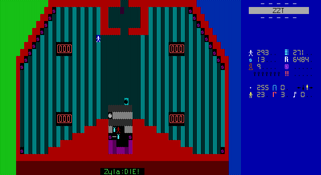
Though moved to tears, the player isn't so sympathetic to the mass-murdering, slave-owning, little girl that they won't fight. This is the last battle and I'm just relieved Zyla gets some unique attacks and doesn't move and shoot towards the player infinitely.
She leans much more towards attacking than moving, firing in random directions as well as towards the player. She'll also spawn in centipedes and tigers as well. Plus she uses stars. Although they aren't used to a frustrating degree, and there's an object that severely shortens how long they exist on the board. Similar objects exist to manage the number of tigers and centipedes as well which means the player actually can benefit from taking cover behind the four rectangular linewall barriers in the room.
Zyla takes quite a few hits, but is definitely one of the more fair and more fun bosses in the game. A little extra effort goes such a long way with these fights. I'd have a much rosier view of Escape From Zyla Island overall if this was the baseline quality for boss fights.
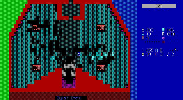
With all the objects erasing the creatures and stars during the fight, the floor really takes some heavy damage.
Zyla: Noooo! You have beaten me!
Zyla: I shall let them go... But for now,
goodbye!
<cheering is heard outside as the prisoner
s are warped back to their rightful
places.>
Zyla: If I were you, I'd ditch this place
as soon as possible! HAHAHAHAHAHAHAHAHAHAH
AHAHAHAHAHAHAHAHAHAHAHAHAHAHAHAHAHAHAHAHAH
HAHAHAHAHAHAHAHHAHA...<dies>
2048 score added!
• • • • • • • • •
She's pretty graceful in defeat at least. The player doesn't actually kill her, which is kind of surprising since nobody else got spared in this game. Zyla returns everybody back home and prepares to activate a self-destruct mechanism and blow up the island. She's not exactly remorseful, so just letting her walk away seems less than ideal, but at least the slaves are freed.
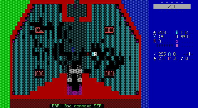
Oh come on dude. There are coding errors that slip through the cracks, and then there are coding errors that make it obvious that an game never got any proper testing.
This broken #set command prevents the player from being able to leave and see the ending without cheats.
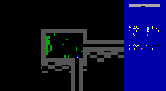
Moving up a board, cheating in the flag, and walking out of the final level takes the player way back to this branching path that was included in the demo.
I have no idea why he bothered with this connection, it's completely jarring going outside and winding up on this board. It's not even a unique copy of the board. The player can very much go in the passage and wind up in the courtyard area again where they'll be unable to turn around.
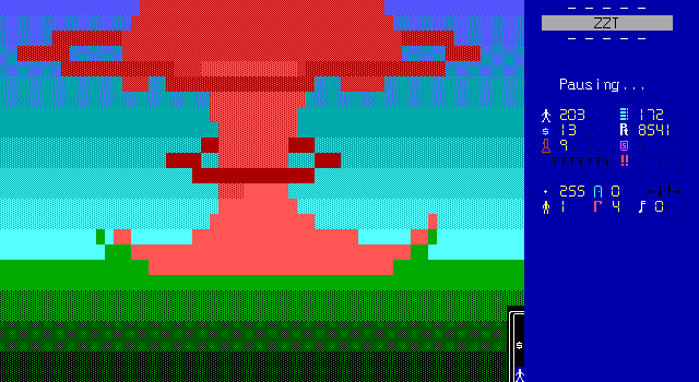
The fact that the board is then just used to enter one last passage and get some ending art as the base explodes makes it even weirder. Just go from the final level to here!
Pretty solid mushroom cloud though.
You run your butt off exiting the base.
Outside, you see nothing but ocean, for
miles and miles.
<you look back to see the base explode
into a ball of ƒire. Human body parts
fly everywhere.>
Then, without hesitation, you jump
into the ocean and swim the 576 miles
back home. Whee.
Oh yeah, GZI is looking fer members.
Email the prez(me) at xfguan@cs.com.
Bye now, hankey head.
Look for EFZI 2, coming soon from GZI!
• • • • • • • • •
And so the game ends with a bang. Apparently not everybody was teleported back home.
There is no sequel to this game, but there is a Special Edition that's a demo of the first few levels, and is completely different from this game other than in name. It also looks a lot better as it seems to have more than just boss fights.
There aren't even any credits! I suppose it was entirely Raichu's fault.
Final Thoughts
Yet another instance of a game that goes on for too long. Usually though, ZZT worlds that end up becoming a slog at least have the benefit of starting out pretty good. Escape From Zyla Island has a somewhat interesting beginning, at least interesting enough that you could expect it to be a mediocre action game, but just stops trying really early on. You could trim this game down quite a bit, but no amount of streamlining will get it to reach "average". Fighting nearly identical bosses six times instead of twelve would only benefit the game in ending it faster.
Raichu's games aren't particularly fondly remembered. His numerous titles about killing Sailor Moon gained him some infamy in the ZZT community, at least as "that weird kid who really hates Sailor Moon for some reason". I suspect that there wasn't a lot of excitement to see this game, and the lack of reviews on it, its demo, or its special edition leads me to believe this game was overlooked. This is definitely not a hidden gem like Invasion ZZT Revision. It's a sub-par action game that wants to draw the player in by having a ton of bosses to fight, yet its failure to make those bosses interesting makes it impossible to do so. It story is pretty barebones, which is perfectly fine for an action game, but could have at least been a saving grace if there was more to it there. Zyla's motivation is that her early childhood sucked so now she wants to conquer the world so everything can go her way. Then Raichu asks for a little sympathy from her at the very end when this is revealed. It just doesn't work.
Perhaps if the bosses were sympathetic towards her and the player got a bit of background during gameplay it could have gone over better. The lack of personality given to the game's characters just makes everything fall flat.
Also it doesn't give you enough ammo. Also also it has a bunch of bugs with board connections and broken bosses. The game feels like it was made as a rote exercise in ZZT action giving it no staying power whatsoever. You are not missing out at all by skipping this one.

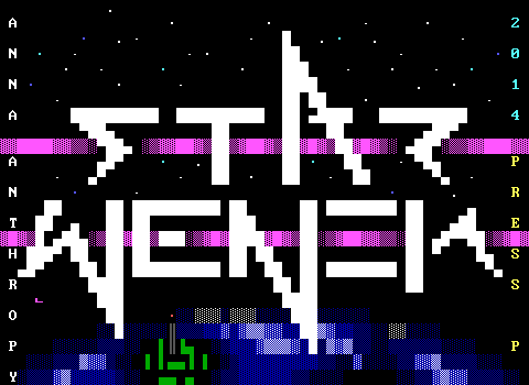
Yeah so the first thing I had to do was make sure there weren't any extensive changes from the demo to the full release. Luckily there were very few changes made.
The big one though, is that the game now used a custom font. Stick figures instead of smiley faces, and what's actually a pretty good font for the text. Most notable are the digital numbers. This is still going to be a game where you fight not-poop monsters and lots of "crazy" people who scream a lot so it's still not something that plays seriously, but it does look more serious at least.