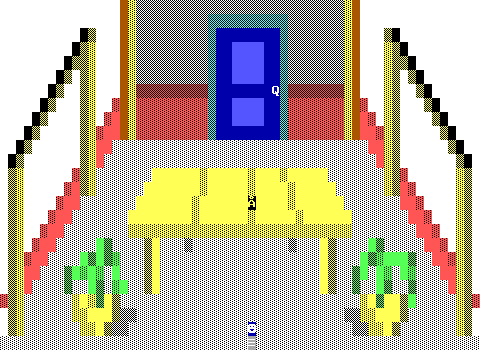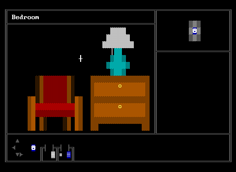
Jojoisjo's 4 was in a unique position for graphics. The game was designed around a mouse cursor engine and plays as a first person point and click adventure. This drastically limits available tiles for graphics since anything that isn't a fake wall will physically block the cursor. This leads to some desolate looking rooms, generally on a black background, but dig that chair!
2002
The HANGOUT as seen in A Community X-Mas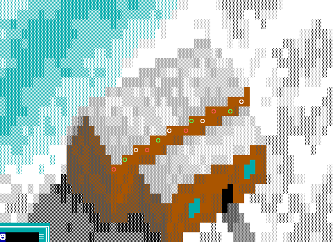
Bending the rules a little bit here, as this isn't a house, but a resort that's been booked to host various ZZTers for a Christmas celebration, but you can't really blame me when we're getting such an excellent angle for the place. Even more impressive to me, is that Leamas and Hercules managed to pull off the contrast necessary to keep the snow covered roof from blurring with the snow covered grounds of the resort! This is a fantastic looking board done almost entirely without objects.
ACT 1 - Lounge Room as seen in A Community X-Mas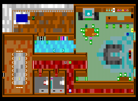
The interior itself is quite well done too! A variety of colors for the carpeting, light streaming in from the windows, and it all takes advantage of the luxury expected of a private resort to make some massive rooms that get to be creative with their furniture not having to hit the traditional checkboxes of fridge, tv, bed, toilet. The main lounge features a massive television, big enough to see what's on, a cozy fireplace, a stunning looking bar, and a hot tub!
House as seen in Virus 302 Special Edition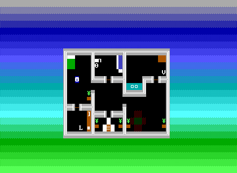
LIKE SEVERAL OTHER ZZTERS, DR. DOS WENT BACK TO ONE OF HIS EARLIER TITLES TO TAKE A SECOND PASS AT IT AND HOPEFULLY DO IT JUSTICE. Oh gosh, this is so flat and lifeless and the biggest detail is that all the plants have visible pots. No wait, it's definitely the toilet with the very large handle for flushing. If the living room looks a tad empty, the game definitely opens with the player lamenting that their couch and tv have been stolen. This is not mentioned ever again.
:;<3> as seen in Vegetable Takeover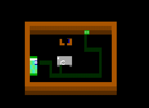
HAZARD breaks away from convention here with their interesting couch/tv seen entirely from the side. I do like the CRT tv, but it's difficult to decipher next to such a similar looking couch. The table features a creative landline phone, though I'm not sure if that's supposed to be the phone line or the handset.
your house as seen in Sim: Life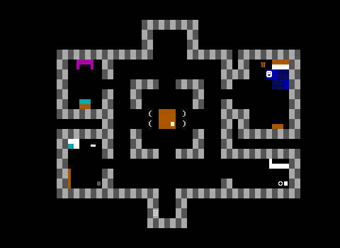
What an awful paintjob. I'm glad my life doesn't match up with this life simulation. What makes this one notable is that there's plenty to interact with, and it's full of mundane detail. Open the cupboards! Get a plate! Get a slice of bread! Make toast! Choose to "do some drugs" at the central table! Yes, this life sim lets you drop acid to increase your creativity stat. I'm beginning to suspect this game isn't being played totally straight.
house1 as seen in The Living Dead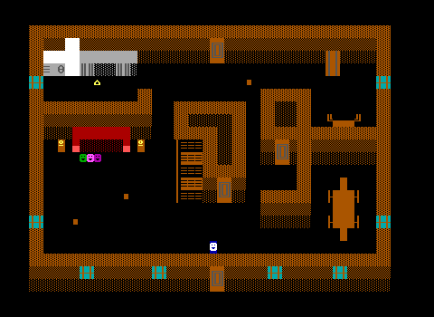
Commodore's The Living Dead quickly reaches a point where four survivors of a zombie apocalypse take shelter in an abandoned farmhouse. The furniture is mostly wooden, and the kitchen is well defined with counters and cabinets. The large doors are quite nice as well!
[ MISSION 1 - EMPTY HOUSE ] as seen in Burglar!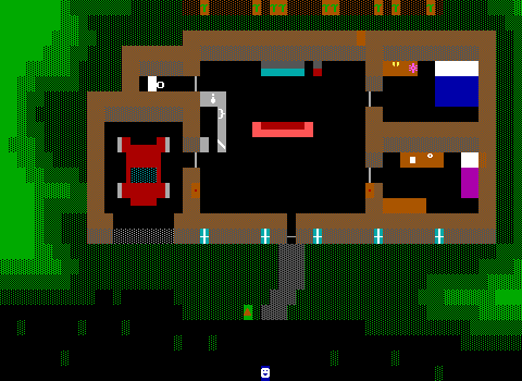
MadTom's Burglar! is full of homes not as cozy introductory boards or rooms for NPCs to give quests or hints, but are well constructed puzzles where the player must choose the right tools for the job to break in and grab anything valuable without getting caught.
MadTom thus has to find ways to signify wealth via ASCII characters. The occupants of these homes are typically upper middle class if not outright wealthy. Wet bars and jewelry boxes are there to entice.
[ MISSION 6 - BEACHHOUSE ] as seen in Burglar!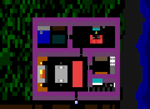
A late level consists of stealing from a beach house while its still occupied. The massive fireplace and sterling silver utensils speak to how much cash this two home owning family must have to pilfer.
House as seen in Scarlet, Green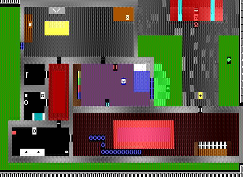
Johnathan Wellington Wells' first ZZT release shows off his mediocre graphical prowess. The large and chunky bookshelves and the TV with rabbit ears don't look like much, but there's a large piano in the centipede infested entrance!
2003
:;212b Breaker Street (ZEN) as seen in ESP (The Evil Sorcerer's Party)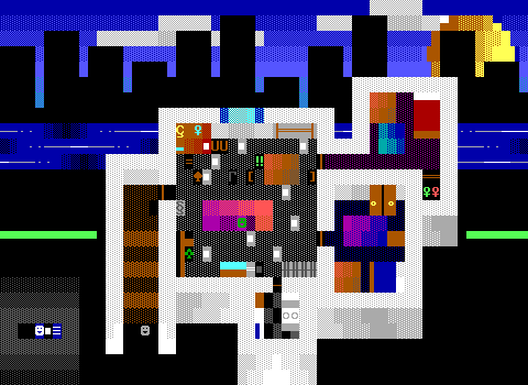
Of course, Wells was well aware of his weakness in the graphics department, and wisely outsourced it to Funk, Rob P., and none other than Zenith Nadir for his masterpiece, The Evil Sorcerer's Party. This board in particular was handled by Nadir, but of course you could tell that just by looking at the oven in the kitchen couldn't you? Plus those yellow knobbed wardrobes he's so fond of! The home here is littered with debris as one of its occupants has fallen onto hard times becoming addicted to video games. That's him there on the couch.
A massive plant hangs in the corner, some keys are used as hanging clothes in a bedroom, and that running river in the background with a city skyline lets you really see just how far Nadir's come in this series alone. There's no bathroom though. 0/10.
Apartment as seen in Smashed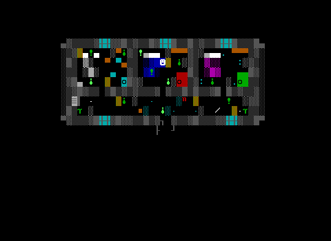
Life an be pretty rough sometimes. Perhaps when you're stuck in an apartment barely big enough for a bed, you'd want to get smashed too. As far as disheveled homes go however, this one definitely gets the atmosphere right, with empty bottles of beer and smashed glass everywhere.
dialogue - annoying but necessary as seen in Frost 1; Power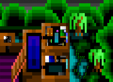
I don't want Nadir to steal the show here, but the fact is that he was a prolific ZZTer in the late 90s and early 2000s, made a lot of houses, and is regarded as one of the best artists in ZZT, so get used to him being here.
In this first Frost game, Nadir shows us a swamp home that shows off both floors at once. (And a toilet! Hooray!) There's that wardrobe yet again, and little more than the essentials for furniture as the setting isn't one that's very connected to modern society. I love the stairs actually being angled to really sell the split-floors.
2007
the last man on earth as seen in Frost 2: Ice (incomplete)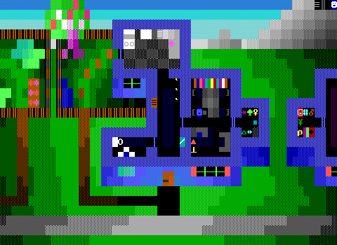
We jump ahead several years because I could not find any particularly interesting houses in the fading years of ZZT's glories, stopping to revisit Zenith Nadir yet again. Here we see quite a bit! A closet full of junk (and a neighbor with their own knick-knacks visible to the player. Frost 2: Ice is Nadir at his peak, his final and unfinished work, and the love and care in every board is so blatant. Windows, curtains, that very good lamp with a red lampshade. I love everything about it. Frost is a series that takes place in a world Nadir had definitely spent time thinking about, and it pays off here. Just that we can see two different looking gardens gives you an idea of what kind of town this is. And look! It's that damned oven again!
in my yellow jersey as seen in Frost 2: Ice (incomplete)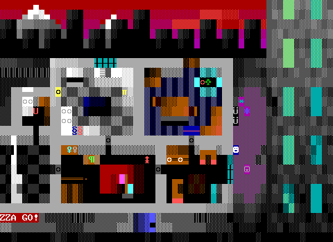
There's the oven. Here we move to a more urban life, where you can contrast furnishings. The rooms are larger, not as cozy as the cheerful suburbs depicted above. It's less welcoming (I mean, for one thing, there's a kidnapped turtle trapped in a magical forcefield in the top right of the building.) Here in the more modern world, there's definitely going to be a television. The first thing you'd run into if you entered this building from the front door? A coat rack with two coats hanging off it! I just love how cluttered is is.
And props to the city in the background, that has a massive snow-capped mountain in _its_ background. I'm willing to bet money that Nadir gave that mountain a name.
2008
Dining as seen in Eli's House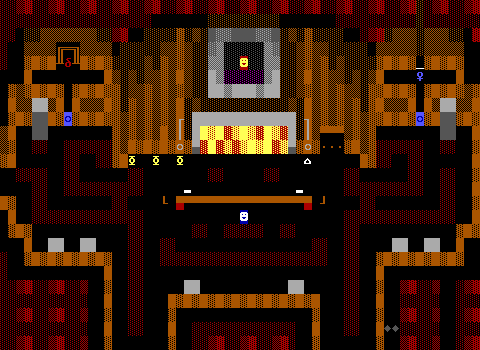
But it's not all Nadir. Gingermuffins managed to create one of the most artistic looking worlds with Eli's House, and the dining hall is no exception. A massive roaring fireplace and framed portrait hanging above the mantle capture the player's eyes right away. The dining room table is long and has empty plates waiting to be filled. It's a very grand looking home, and Eli's house is one of the best blends of gameplay and architecture.
House (of second floor?) as seen in Algorithm Part 1: Disco For Justice!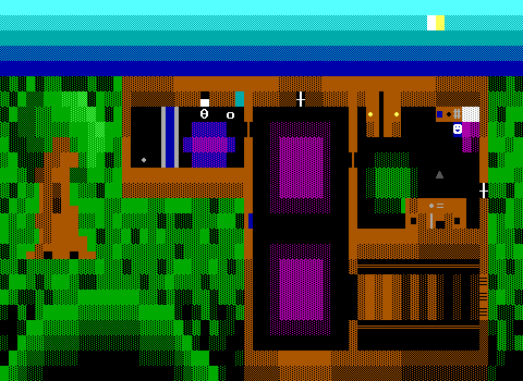
If Janson led to Nadir, then Nadir led to Aeris. Well, at least Aeris tried to learn from Nadir, but they certainly don't follow him as closely here as Nadir's early works are inspired by Alexis Janson's. The wardrobe is back, and bigger than ever. We get a new style of computer on the lower desk with a visible keyboard, mouse, and even cord!
2009
living room (start) as seen in CAT, CAT, THAT DAMN CAT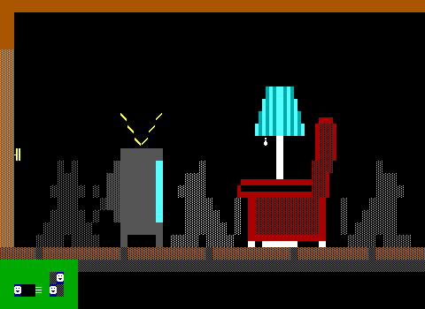 bedroom as seen in CAT, CAT, THAT DAMN CAT
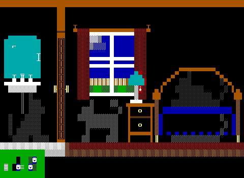
While Jojoisjo's 4 had the unique constraint of everything needing to be made of fake walls, Commodore's Cat, Cat, That Damn Cat needs lots of empty spaces to fit invisible walls to toggle on and off to draw that cat's current position. The resulting side view, and drastic change in scale by using what's basically a large sprite instead of a single tile to represent your position allows for a lot of details otherwise left undepicted.
Plus hiding under the bed is adorable.
2010
Home: Intro as seen in The Quiet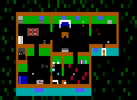
2010's The Quiet brings a very flat coloring to its walls, but puts them to good use with a lot of furniture overlapping walls to give a good appearance of depth. 19 years on and people are stilling mixing it up with how they present a home. The simple solid blue walls for windows seems more like something you'd expect in 1991, but it definitely works here still.
2011
inside house as seen in KramerVille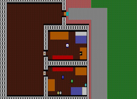
And lastly, we have this home in KramerVille. Twenty years of houses, and they're still filled with large beds and guns. Everyone starts from scratch with ZZT.
So there you have it! A whole lot of houses of all shapes and sizes, and plenty of creative furniture. The home is probably the most definitive place to discover ZZT's graphical vocabulary where loose standards of "this is what a bed looks like" or "this is how you depict a toilet" emerged. Over 20 years there's been quite a lot of ideas of what a house _needs_ in order to feel like a lived in space, or sometimes just get the essentials checked away and usher on the rest of the game.
My method of "I remember this game had a house" / "This game sounds like it will have a house in it" of finding suitable homes for this article were not the most rigorous, and I'm sure I missed some wonderful designs. Let me know if there's anything notable I passed over. I love seeing the creativity in home design since nearly every ZZTer has drawn one at some point.

