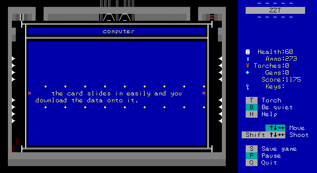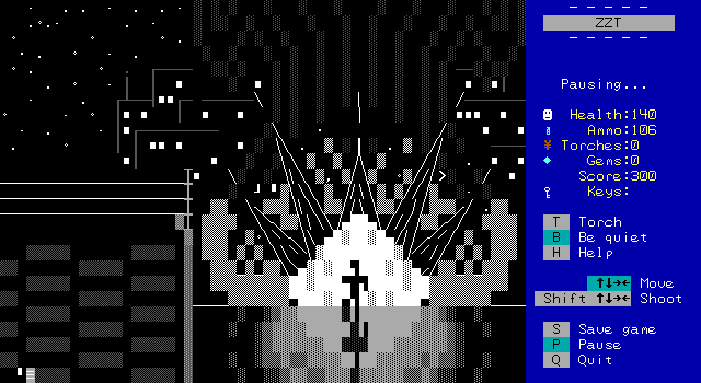
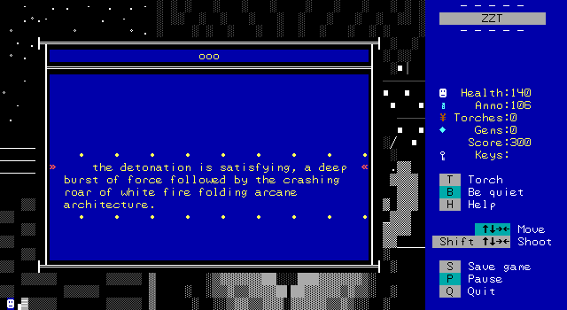
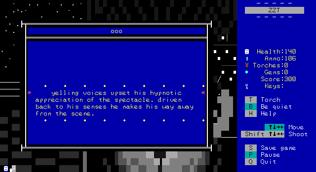
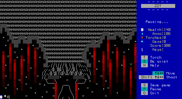
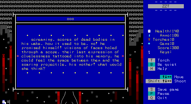
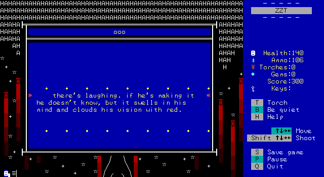
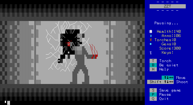
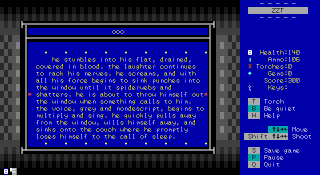
I mean, there's just so much to take in here. The explosion against the city backdrop, with our protagonist running away, his shadow drawn on the ground as he runs. There's a board dedicated to his broken psyche as he regresses back to his days working on behalf of the U.S. government. The absolutely beautiful cracks in the glass window he shatters before finally collapsing on the couch to sleep.
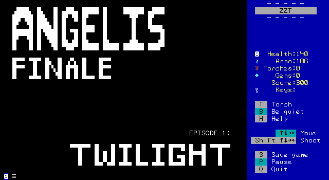
"Artistic" and "Cinematic" aren't words you get to use often when talking about ZZT games, but Commodore has done nothing but excel in crafting something to remember. This is Angelis Finale at its finest visually.
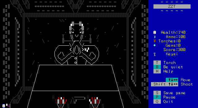
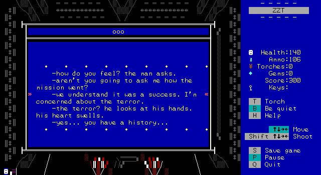
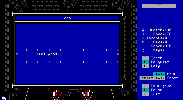
-good. very good. the drugs help?
-yes of course, they--
-that's good. do you remember the
mission?
-i entered the complex, neutralised
resistance and planted the explosives.
why wouldn't i--
-do you remember your mother?
-my mother?! i... i mean... of course
i remember my mother... she... lived in
new york. I lived in new york.
-you lived in new york...
-yeah! we... you should fucking know
this. what don't you know about me?
-we don't know when we'll lose
control.
-what?!
-we have another task for you. you
like tasks right?
-yes! i'll do what you say.
-hmm, even before we offered the drug.
the details are here.
the man places a roll of paper on the
table. the paper is rolled around a
hypodermic.
-i think you'll find this blend more
to your liking.
• • • • • • • • •
Hand still bloodied, our protagonist is eager to accept another mission, not to keep the overdosing incident quiet, or to keep fueling his drug habit, but to relive that thrill again. Though the next mission still involves plenty of running around and shooting at guards, it's presented in a way that's more than just a series of connected rooms that make up a location.
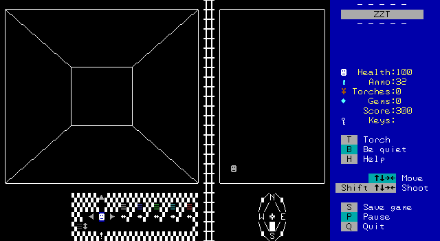
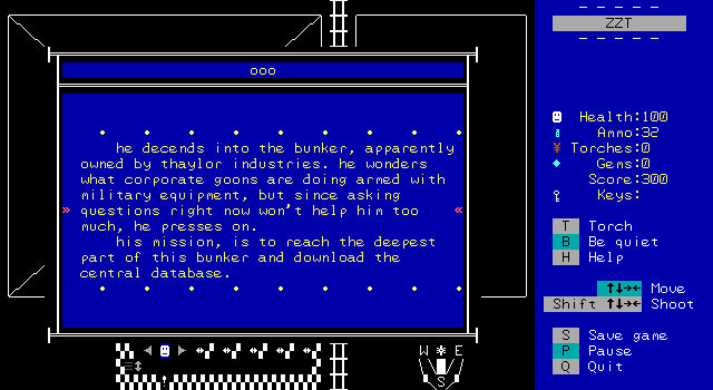
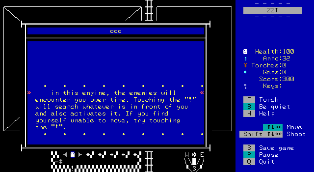
The second mission is presented as a first person exploration of an underground bunker. Now, this is far from the first such engine in ZZT's history, with games like Darkseekr where the engine is used throughout the entire game. First off, these engines are generally terrible. If there's a map, the player is going to just stare at the map instead. If there's not a map they're going to be miserable as it's pretty much impossible to make the first person view navigable with ZZT's constraits for how to texture the walls. They're also pretty slow since taking a step requires parsing the surrounding environment to be rendered in the first person view. They don't have a good reputation really.
Commodore has a few advantages to deal with these constraints and make something actually pretty enjoyable! There's a font, which helps smooth out the normally very jagged graphics. The game is running at maximum speed which lets the ZZT-OOP process at a very reasonable speed. There's reason given to look at the first person view rather than the map because the map only shows the player's position, but doesn't automatically map out the walls. As the player explores they'll come across terminals which do reveal quadrants of the map and let the player fall back to focusing on the map instead.
But the biggest feature that makes this work...
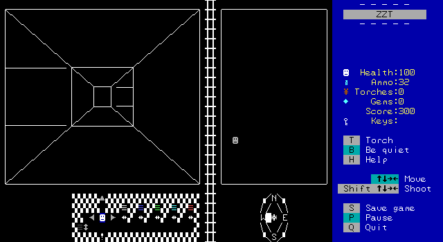
...is the fact that you can see multiple spaces ahead! By revealing more than the immediate surroundings in the first person view, you'll actually be able to fumble your way through it.
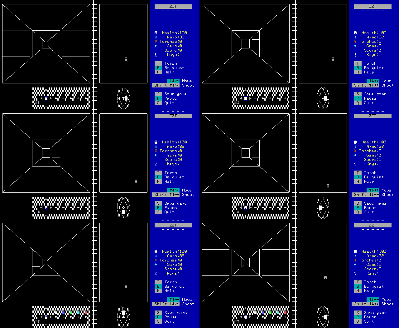
It's really cool to see it all come together like this. The graphics for the wireframe style view has to be made out of objects, but there are a few columns of invisible walls that flicker when the player is actually moving forwards which really helps make sure that you've moved as it looks as if you're actually passing something.
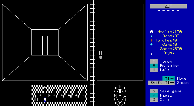
Scattered throughout the bunker are a few points of interest. Here there's a locked door which prevents the player from going forwards.
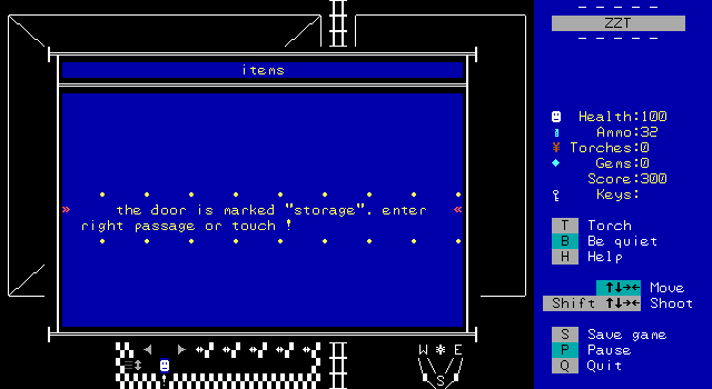
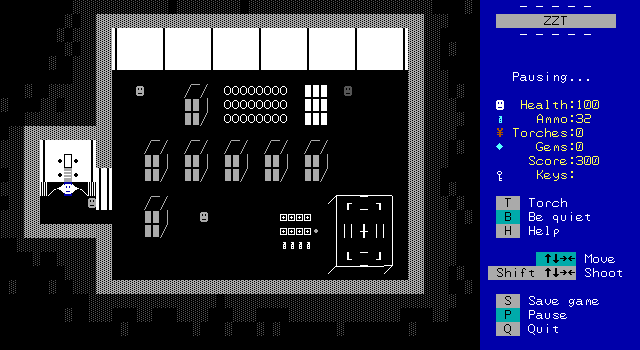
There are also some doors that can be entered, having the player leave the first person view and return to the action format seen in the factory.
Although still gated with keys, this second mission is more open ended based on how the player explores the facility and which doors they stumble across in what order.
The storage room is of course filled with crates stacked up high and with a faux 3-D effect. There are several enemies to fight, and a considerable pile of health and ammo waiting to be collected.
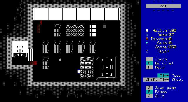
Or, protected by a forcefield. At least this time the method to disable it is simply the round button on the right side of the supplies.
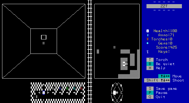
Continuing to explore I run across the first terminal on a wall which reveals part of the map permanently.

Hang on! I'm writing this part right here after having the rest of the article complete to show off something I missed. There are supposed to be random encounters here as well, but for reasons unknown to me, I did not get a single one on my playthrough. I only discovered them when looking at the game in the editor. I don't know why I didn't get any, something must have bugged out since the code for random encounters is basically just flipping a coin every so many steps. So let's take a moment to check out the game's special combat engine as well.
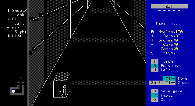
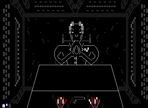
Once again, loving the visuals. The controls are posted on the board itself and there's a convenient crate for the player to take cover behind during this shootout.
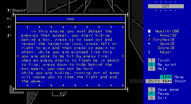
The mechanics are pretty simple. Press up/down to move out of or into cover, left/right to aim, and up again to fire. You have to be out of cover to aim or shoot. Enemies will telegraph their shots by changing characters before firing.
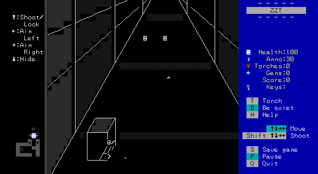
A few guards will appear in the distance and the player will have to aim their gun to line up a shot. This engine is pretty cool, and works better than a similar one seen back in Teen Priest, but it still feels a bit unresponsive and slow. The rest of the game moves at such a fast pace that these encounters really slow things down. I preferred not having any of them honestly, though there's still the usual Commodore polish.
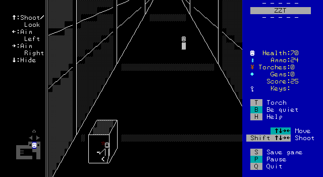
When the player is shot, they automatically move behind cover and a blood spurt animations plays.
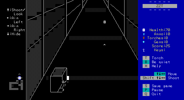
Meanwhile, while the player shoots, there's an animation of a muzzle flash and even the bullet casing falling to the ground!
It's not all that exciting, but the visuals are once again great to see. After defeating the guards the player can exit and return back to their dungeon crawler.
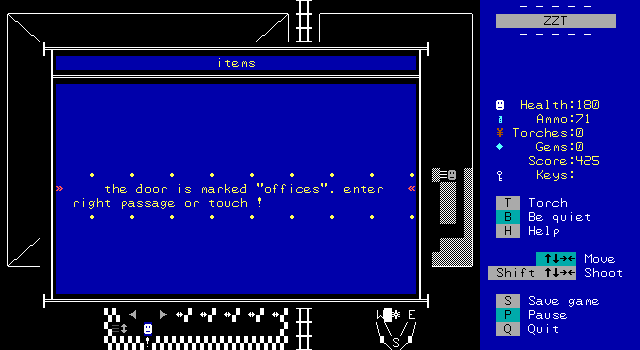
The map makes it easy to find any paths that were missed, and quickly leads me to some offices.

Once more, it's the thoughtful level design that keeps things moving smoothly. The layout keeps the enemies corralled in a way that helps minimize crossfire via props and a more congested floorplan.
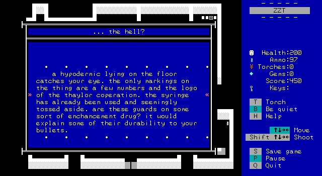
Lying on the ground is a discarded syringe which tries to add an explanation to the numerous bullets guards can survive. Although the player character is also suffering from a drug addiction, there's no mention as to whether his use would explain the numerous bullets _he_ can survive.
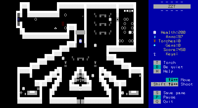
There are also these new security doors introduced. They serve as gates that activate the next area's guards to begin shooting, prevent the player from turning around to retreat out of the room, and also help lock out any enemies the player may have opted to leave alive. This again helps to reduce the potential crossfire.
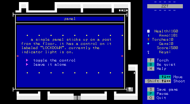
In the lower left corner is the switch to open the doors again and let the player leave. Of course, there's a reason to actually explore this room in the first place, rather than have it just be a trap for the player to fall into. In the bottom center is a small alcove with some health kits and a key. The other set of doors at the bottom is locked, but explained away as just being more boring offices up ahead and not something worth examining.
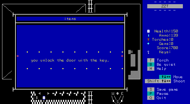
Back in the first person bunker crawl, the locked door from earlier can now be opened which opens up a large segment of the map for exploration.

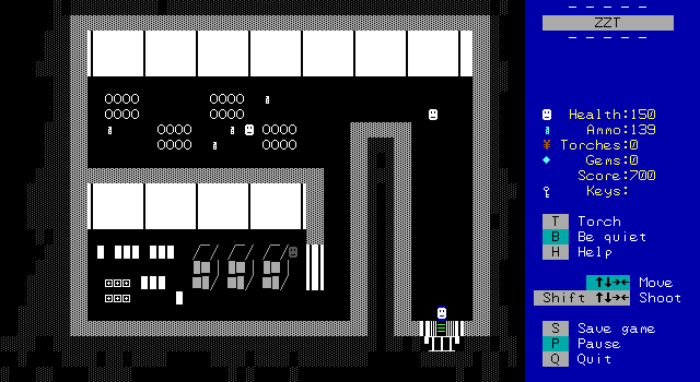
The weapons room is very straightforward, and like the supply room only serves to give the player more health and ammo should they need it.


Unsurprisingly, the security area has a bit more of interest. Firstly, check out that awesome white counter up top with various odds and ends sitting atop it. The default charset just wouldn't offer many characters that you could do anything like that with. Then, in one of my few letdowns, is that big map on the wall. I was so hoping it would match the actual layout of the bunker, but it doesn't come close.
The security area also has one of the scarier looking combat situtations. Upon entering the main room, the player is trapped by the security doors and put up against two of the elite guards and a regular one.
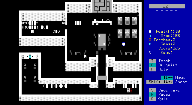
Alas, this is one case where the layout doesn't work in favor of combat, and by darting to the side I was able to get the guards to begins shooting each other quite a bit. However, I do think a player who doesn't take that opening while it's still available would find themselves in a very frightening encounter. The hall connecting the two rooms here is only three tiles wide, and if the two elites made it to that hall, they'd likely be next to each other and thus only able to shoot down towards the player. I'd kind of have liked to see an engineered fight like this.
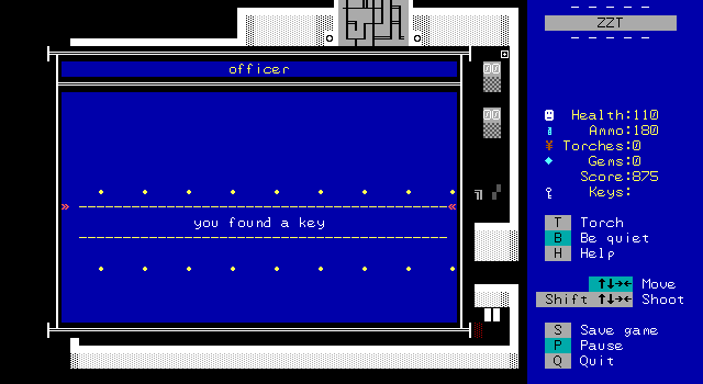
For the first time, an enemy drops a key rather than ammunition. The entire game could theoretically be played up to this point without directly killing anybody, but there's no non-violent solution here.

And that key is needed to access the final area of the bunker, the command room.
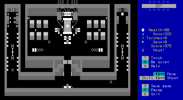
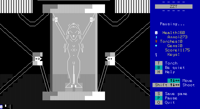
It's very anime in here. The architecture becomes hostile, with walls lined with spikes (they're just walls and are safe to bump into). The centerpiece is obviously the person(?) suspended in a tube in the center of the room hooked up to machinery with plenty of wiring all over. Your mission was just to copy a database, there was no hint of anything like this.
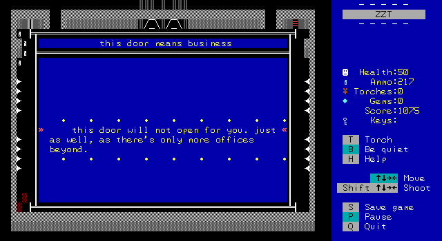
(Let's take a minute to appreciate the pun here in this object's name for the other door which can't be entered.)
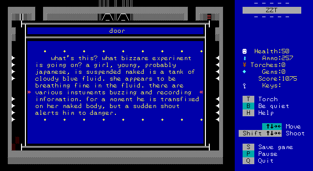
Needless to say, the woman in a tube is a bit distracting.
The final two guards attack, and one of them drops a necessary keycard used to interface with the terminal the woman is hooked up to.
