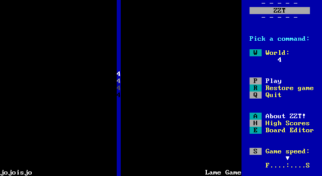
For December, the patron poll landed on jojoisjo's 4. Through dumb luck, this means that the two major ZZT titles designed to played using a mouse managed to get picked back to back like this. Gingermuffins's Plankton: Undersea Adventure was a wonderful surprise, and received a designation as a featured game on the Museum, as for 4... well, it already is one by virtue of having won a Game of the Month award back in 2001, but let's say it would not receive the same praise today.
It's not that 4 is a bad game really. It's just... desolate? There's an engine here that's a unique idea and one that while it hits a few of ZZT's limitations, overall the concept could definitely be used to make a cool experience. Instead, 4 comes off as lifeless. There's an engine, but nothing to support it.
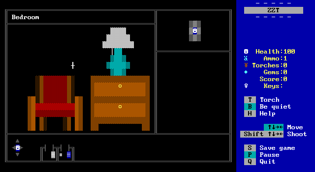
So what kind of game is 4 that it requires a mouse? Why it's a first person point and click adventure! The game opens with a menu offering the player the choice to play the game or get some help. That help is pretty straightforward. The player can get into the cursor control area and then use the mouse to move the cursor in the room they're in. Running into objects from below will cycle through four verbs (search, open, use, and get) and clicking will take that action on the highlighted object.
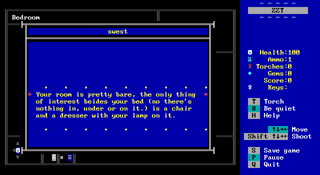
There's a little more to it, with the ability to shoot while controlling the cursor to the left or right to get a room description or map of the area, but the meat of the engine is in the interaction with objects on the screen.
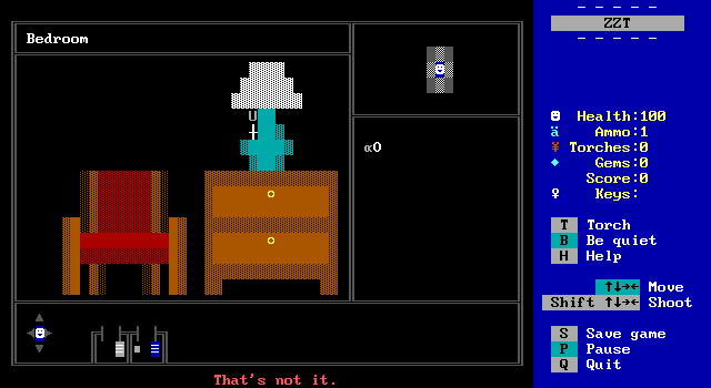
From the very first board, the constraints of the engine immediately become apparent. Since the cursor needs to be able to move as freely as possible, all the graphics are required to be made out of fake walls which limits the graphics severely. Everything is going to be a ▓ character. The only alternative appearances are those where the foreground and background character match to mimic a solid character, or where the foreground color is black, and the background color isn't to mimic a ░ instead.
ZZT's graphics are often very basic to begin with, but everything is going to be forced to be extremely blocky looking with very little room for detail.
The other limitation is that in order for there to be something to interact with, objects have to be placed on the screen, which means that there are some points the cursor can't move over as it will hit something solid. This can be an advantage, as it means there isn't really any fear of pixel hunting. Anything solid can most likely be interacted with. Anything fake, can't.
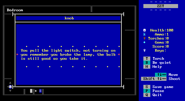
In the opening bedroom, the player can interact with a lamp and some drawers. "U"sing the lamp means getting a light bulb, and the drawers contain a knife, as well as a map of the neighborhood.
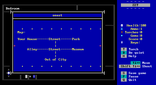
There's not a lot to the map.
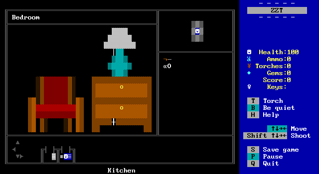
One nice feature is that the inventory is visible on screen at all times, though it can be easy to forget what something is. You can see the knife and light bulb here, and while I do like the combination of characters picked to represent these items, they can be pretty hard to recognize if the player forgets what they've picked up already.
Shooting to the south exits the cursor interface and returns control to the player. Then they get to walk way too far to the exit they wish to travel to. An object will list the name of the room on the other end of the passage which is helpful when there are several exits, but overall the structure of this means way more time in 4 than you'd hope is spent not manipulating a cursor, but walking in the bottom portion of the screen to the correct exit.
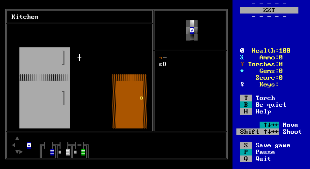
The graphical limitations make for a sparse kitchen. I joke about ZZT and perspective not getting along, but this fridge is either massive or the door is very tiny, and for once this is an easy fix.
You also see some rare decorative objects, since only the bottom part of the handles on the fridge and freeze doors can actually be interacted with as the cursor needs to be below them, an impossibility for the portions with more objects to the south.
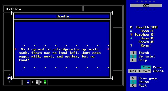
There's this classic joke. Exactly who you are and what you're doing in 4 is left unstated until the very end. It starts off pretty simple. You're in a house, and will leave the house, but as the game progresses things will get a little more unusual.
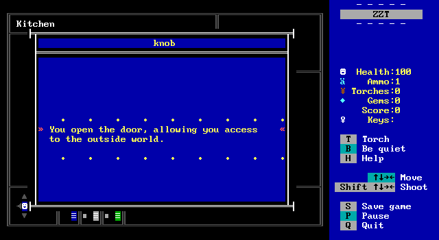
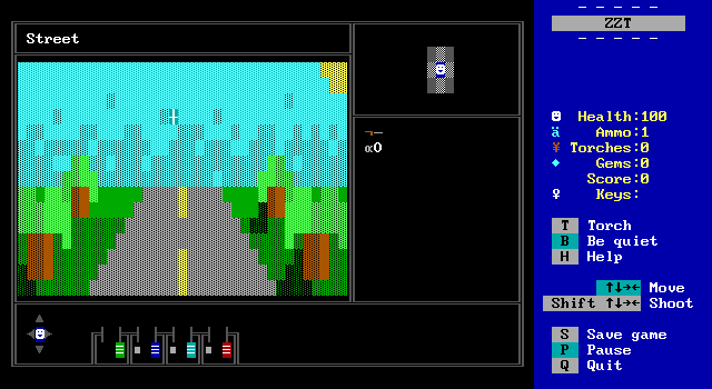
And so the player enters the outside world. This board's not half bad looking. It's a bit disappointing how even with the graphics being as restrictive as they are, that many boards still have clear room for improvement. A little paint on the walls in the house would've helped a lot. This board makes for a much nicer first impression than the bedroom.
Well, it would, if it wasn't for the fact that several boards throughout 4 have ZERO things to interact with. You get a room description here and nothing more. Entering the cursor area is an unfortunate waste of time and makes you realize how cumbersome the engine is.
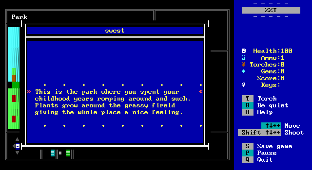
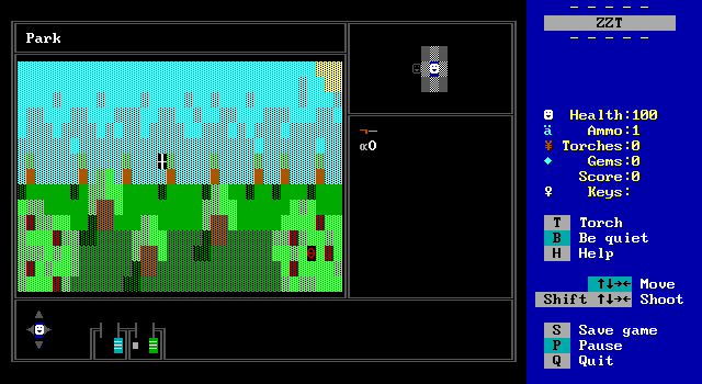
Another pretty board! This one with the advantage of there being something to interact with. One object isn't really that much better though. A lot of ZZT games will implement interfaces or mechanics from other non-ZZT games even if they make things more difficult to play than using the things ZZT offers natively, and boards like this exemplify the issues with that. So now there is something to interact with, a rose on one of the bushes, but you still have to move the cursor towards the one and only thing here. It just makes things take longer than they'd need to compared to a regular ZZT board with a rose to touch by the player.
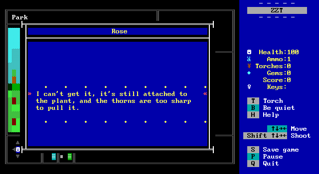
It does offer the first puzzle though.
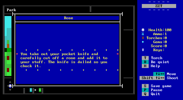
By selecting "U"se on the rose, a menu pops up listing all the player's items by name (so you'll never completely forget what's in there) and lets them select which to try on the object. In true adventure game fashion, the knife is destroyed by a single use of cutting a plant.
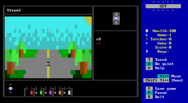
Continuing down the street leads to a crossroad with three new exits to a museum, an alley, and a forest.
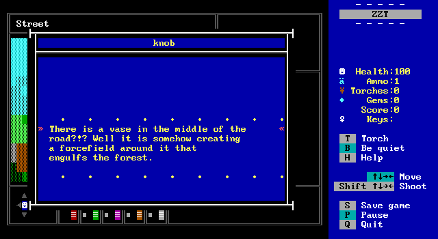
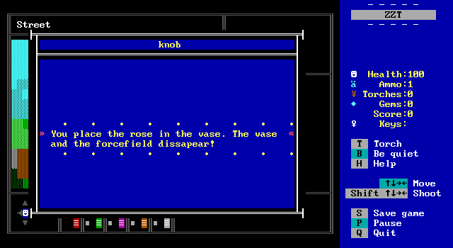
I said it was going to get weird.
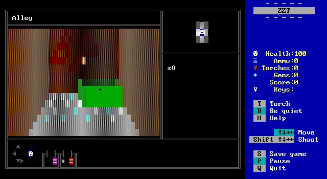
I think this board really illustrates the challenge of making graphics with such a limited set of characters available. It does an admirable job though, attempting some perspective and including broken glass on the ground, but compare it with this alley from Evil Sorcerer's Party and see what just a handful of additional characters can bring.
If there's any meaning to the BP graffiti, I don't know what it is. Lots of ZZT games will have hidden (or not so hidden) references to the ZZT community when making up random graffiti for a scene like this.
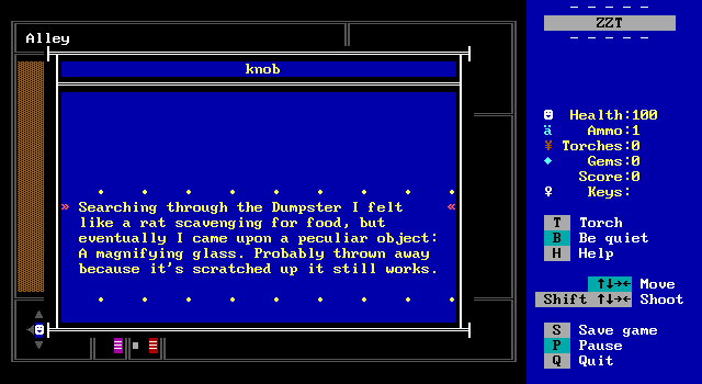
Free magnifying glass in that dumpster.
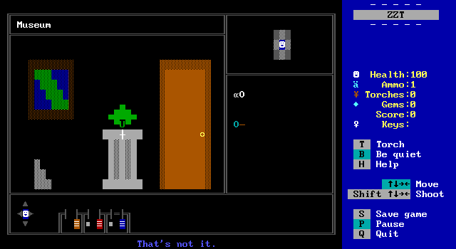
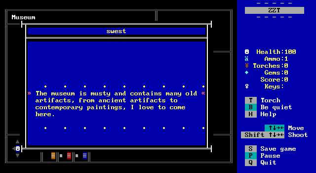
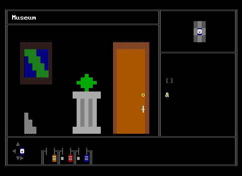
The museum contains many old artifacts including artifacts. Like the player's home it has black walls, but there's enough here that it doesn't feel as much like you're in a void.
4 has no objects to interact with that aren't mandatory at some point which I think really weakens it. There's a painting on the wall but no way to look at it. This is an adventure so barebones it puts Hugo's House of Horrors to shame. (Also Hugo is lots of fun regardless of length or depth.)
But there's still a lot here! There's a large gem on a pedestal that the player won't take since it's on a pressure plate, and the door is locked, but on the other side is a person!
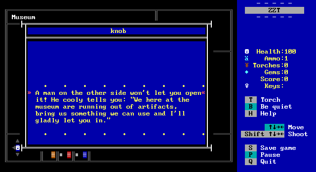
He requests something new for the museum if the player wants access to the back room. Another issue 4 has to deal with is how to have other characters. People are going to look very messy when drawn with just fake walls, and comically tiny if a traditional smiley face object is used. Placing a character on the other side of a door is a clever way to get around this issue and props to Jojoisjo for the creative solution.
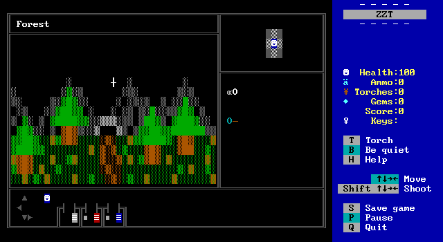
Back outside there's still the path to the forest that can be explored once the flower has been put into the vase. This is another pleasant looking board, but again exists entirely as a transition from the town to this cave. There's no need to move the cursor at all here.
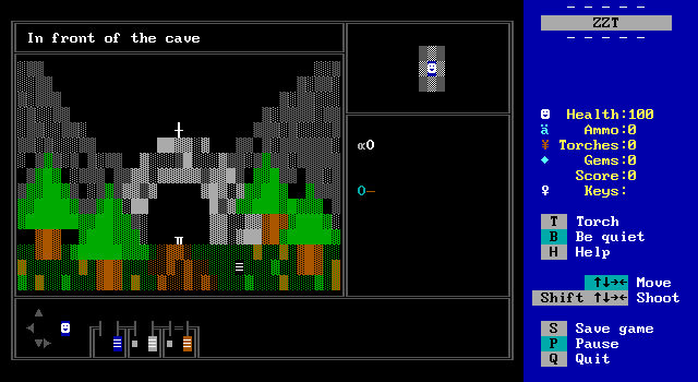
And since the next screen isn't even inside the cave, I think it would've worked just as well to have this board be immediately adjacent to the town. The player can't go inside the cave just yet because it's too dark. There's only a pedestal (there are a _lot_ of these in this game) with a clamp, and what I guessed to be a pack of matches to pick up off the ground. The only thing the player can make out inside the cave is a lot of mirrors.
I figured the gem from the museum would be needed here. Move it from one pedestal to the next and have something happen. The vase puzzle and force field already set the tone of the game to be a bit fantastic after all.
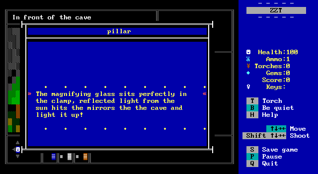
Which I guess explains an old magnifying glass and some mirrors being able to illuminate a cave being the actual solution. The town and park areas were bright and sunny with their cyan skies, but here with nothing but black I didn't even realize it was supposed to be sunny. Things look a lot more dreary here and it's enough to make this puzzle's solution not obvious. Fortunately there are so few items in 4 that you'll have at one time that the brute force approach is easy enough to try.
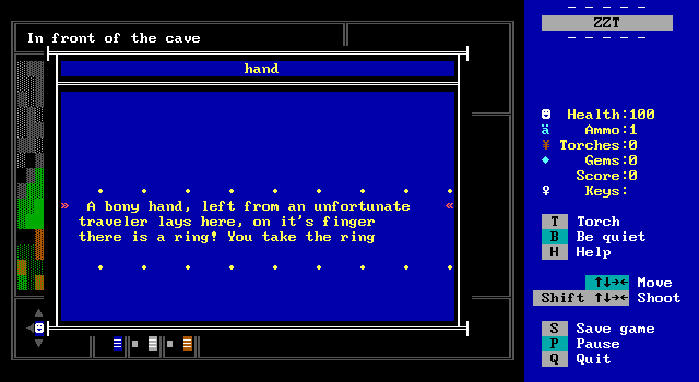
The matches are in fact a skeletal hand! This is dark, but the weather is all sunshine. I don't know how they died so close to the town. This doesn't feel like a dangerous place really.
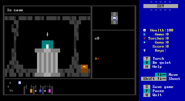
The cave has another pedestal! Also a tiny little treasure chest which I think is cutely constructed. It contains a relic, which sounds like good museum fodder. Or maybe the ring on a skeleton is good museum fodder. Either way, I'm certain we have some good museum fodder.

It's the ring. The mysterious man takes it and allows the player access to the back where they can hang out with other museum employees I suppose.
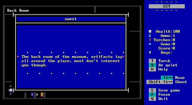
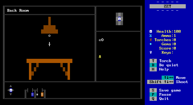
This is another good example of the room description and the picture of the room itself not really matching up. It's dark and empty, not full of cool stuff.
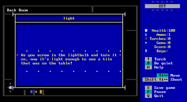
How many museum employees does it take to screw in a light bulb?
The person who let the player in is nowhere to be found, and never mentioned again, but we traded a light bulb and a ring for a piece of tile!

Unsurprisingly our hero makes the Indiana Jones switch with the relic and snags the gem. This game suffers from a common flaw of lesser adventure games where there's no real rhyme or reason for why the player is doing what they do. 4 wants to be mysterious, but there's nothing for the player to want to know more about. It's just a series of puzzles for the sake of progression.
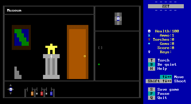
The gem does properly disappear and the relic takes its place which is a nice touch at least!
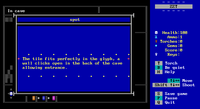
And the tile can go into the pedestal back in the cave allowing access to the back _of_ the cave.
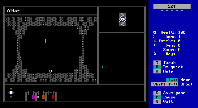
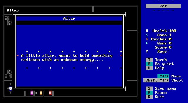
So, to summarize the player put a magnifying glass in a designated spot on a pedestal so they could see in the cave where there was a pillar with a glyph on that needed a tile in order to open up a room with an altar which will now take our gem obtained from a pedestal in a museum.
This game has a lot of pedestals. That word is going to lose all sense of meaning by the time we're done here.
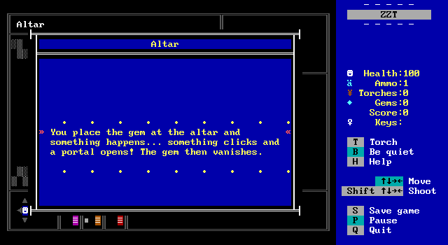
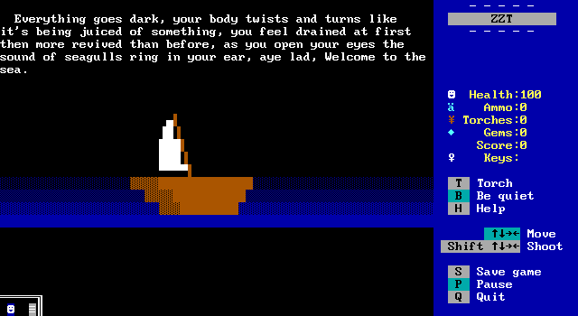
Onward to the next chapter.
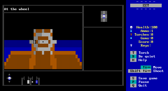
You go into 4 without any real information on the story or even setting. This sudden departure is an unexpected twist to what had been presented so far. Now we're a sea captain, and also the same person we were in that little town? It's left vague and will continue to be vague until the very end of the game, but 4 gives you plenty of time to think up an explanation for what's going on.
I don't fault it for this, but the game's weak, well, everything means you shouldn't expect it all to become clear in the ending. A strange journey through time and space (is that what we're doing?) can be a great setup for a game like this. It even lends itself well for the first person setup since the lack of an ability to really manipulate boards means that content gets exhausted. Having these clean breaks serve as new chapters makes it easy to say that what's been done so far is done and won't be revisited compared to if there had been a dock in the town and a boat to sail away on.
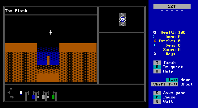
This is kind of a cool camera angle for the plank, although it certainly makes the plank itself to be very tiny. This is all just so to make it more clear where it can be interacted with, though I wouldn't be surprised if somebody didn't realize it was interactable and thought this was just a transition board.
I certainly didn't realize you could take the plank until I reached the puzzle it was necessary for.
Also we're a murderer now? The player's identity and whether we're controlling a person, or are this person is left unstated.
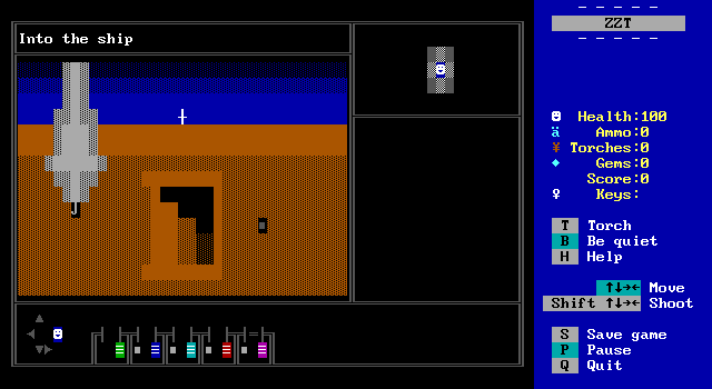
The deck has a cannon without a cannonball, some stairs show the maximum amount of shading you can do with fakes quite nicely, and a dropped eye-patch that doesn't belong to the player. If they have a crew, we don't see them.
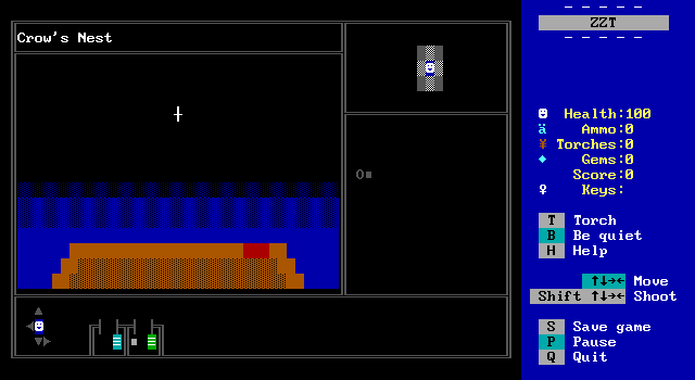
So many empty looking boards. There's a flag the player can take here which I mention only so using it later has some context.
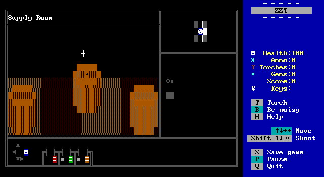
The powder room contains some barrels filled with cannonballs if we want to shoot anything.
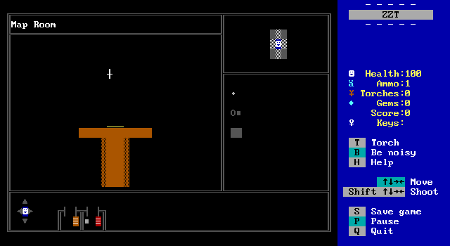
And here is the game at its most bland. Again I stress that the graphical limits imposed here are severe, but there are so many nice looking boards throughout this game that I don't get why there are also so many that just take place in a void.
You get a treasure map out of it at least.
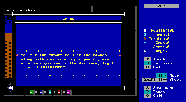
You can immediately fire the cannon at a rock. I imagine there's a puzzle later that I just solved without knowing about it.

The player is also out in the middle of the ocean and did some cannon sniping. Once they've sailed to the location of the treasure they can disembark and venture onto the island itself.
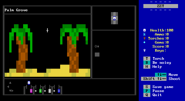
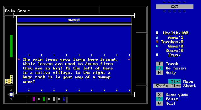
Guess what we'll be doing with those palm tree leaves?
Also who else has their fingers crossed in hopes that the native village won't be hugely racist?
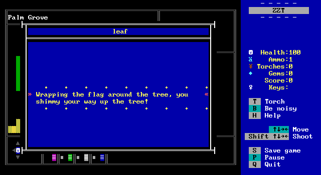
You can't just take the leaf since it's so high up. Instead the flag needs to be used to aid in climbing it.
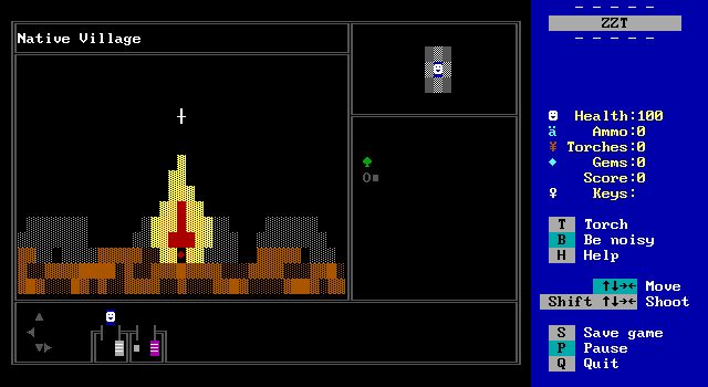
Alright, some structures and a fire. That's not bad at all.
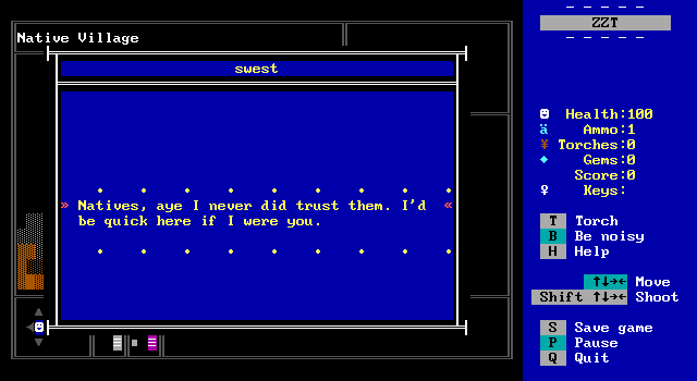
Ha ha. Well.
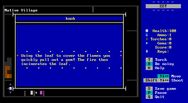
I'm trying to imagine how this works. Still, the player gets a new gem and the native village is never returned to. This is a definite improvement over Okwonkwo from Indiana Jones: The Search For King Solomon's Mines.
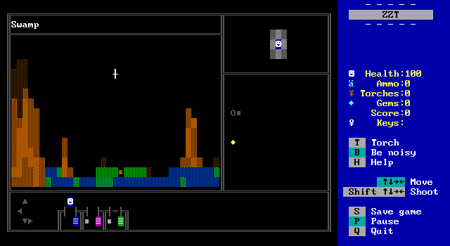
The swamp is a pretty good looking board suffering once more from being set against a black background. The ground can't be traversed all the way, and the player will need to use the plank from the ship as a makeshift bridge to cross.
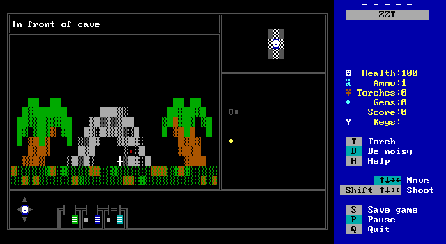
Another cave. I bet there's a pedestal inside.
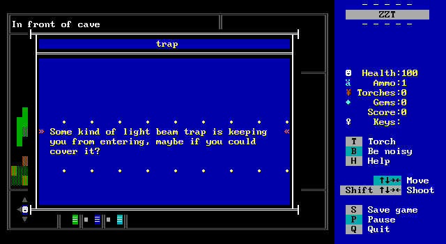
Also there's a laser tripwire in pirate times? Whether we're in pirate times or just a pirate in modern times isn't disclosed, but I will tell you now that we are in fact in pirate times. Still, if there are vase controlled force fields in the present I suppose a laser trap is okay too.
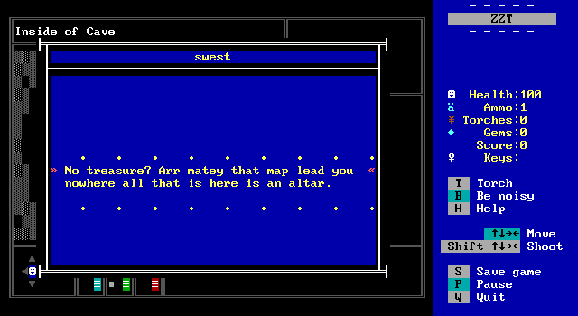
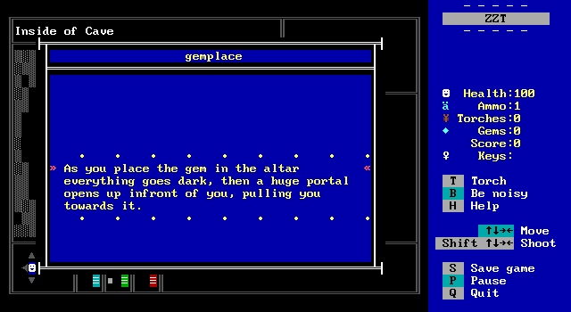
I missed grabbing a screenshot of the altar room, but it's identical to the first one. Once again it seems the player's task is to obtain a gem and put it on an altar. There's still no reason why for any of this.
