Ok, I'm exaggerating a bit when I say there aren't any improvements left. While Super Tool Kit provides vast numbers of specially colored elements, it doesn't cover everything.
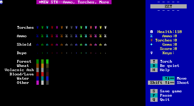
You can see here a huge lack of special colors for these items. Others would go on to fill out the rest. Starting with Chronos's More STK. This filled out the rest of the essentials, with ammo, torches, keys, doors, and all 256 possible characters of text as ZZT's text input didn't support using alt-codes. Chronos went on to release Weird STK as well, which plays around with what happens when you remove the stats from elements that normally have them. This gives you things like enemies which can't move and player clones that come in any color and can be used to make a crowd without having to use an object. Lastly was WiL's WiL STK, which introduces the previously unknown monitor element that replaces the player on the title screen and reacts to keys like world selection and viewing high scores. It also has bombs that take more or less time to explode, and well, weird stuff that doesn't have much of a point, like statless slimes that cause ZZT to crash when touched.
But with all these STKs, ZZT has hit its natural peak for graphics capabilities. To do anything else, ZZTers would have to look at modifying things that ZZT has no control over.
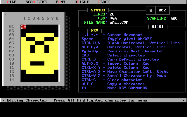
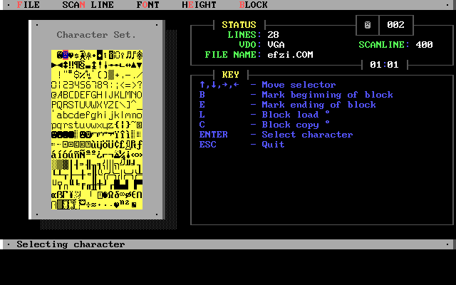
Font Mania is an MS-DOS utility which allows creating temporary replacements for the system font. The program was released in 1992, though it would be some time before the ZZT community discovered it and began to create custom fonts. Now your tough action hero didn't have to have a big smile on their face at all times. The screenshots from Font Mania are using the font created for Raichu's game Escape From Zyla Island. You can see various weapons, a flashlight instead of a torch, and some angrier looking smiley faces, including ones facing different directions.
Font Mania could be used to create an executable that could set and clear a custom font. By making a batch file to load the font, launch ZZT, and remove the font when done it was possible to easily use these fonts in ZZT.
One malicious individual in the past submitted a game that used a font, but the batch file was a "virus" (their words) which deleted all the files in C:\ZZT! What a jerk.
Ultimately though, fonts saw limited use in the ZZT community. z2 lists about 40 files with fonts, and several of those are just "you can use this font in your game!" type releases, and not worlds that actually use them such as Hyper ZZT, shown here:
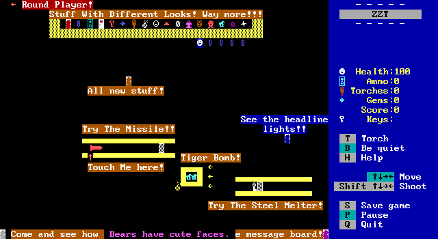
I'd wager the biggest reason for fonts not taking off in ZZT was simply that they didn't add all that much over the default tileset. An omega might not be the best representation of a lion possible, but frankly, with an 8x14 working resolution, you'll never really be able to get all that much better. Plus, you're still stuck with only one possible character for builtins. If you use the Hyper ZZT font, every passage is going to look like a cave entrance. That's fine for a cave, but falls apart when you're making an entrance to a building or a staircase to the next floor.
If you're not using a custom font, then your passage is going to be a logical equivalence character for a cave, door, or staircase. The passage character becomes abstract enough that it doesn't take too much of a leap to see it as a door or stairs, and though it might be more lacking as a cave, the limitations of ZZT are expected. Creating a font often means "fixing" the appearance of some tiles, but that comes at the expense of removing their versatility as abstract forms.
Only two worlds with fonts are particularly noteworthy. WiL's 2000 release Banana Quest, and the 2004 art compilation Ownage Triangle by aetsch and Kracken (lovingly compiled by Zenith Nadir). Here's the font used in Banana Quest:
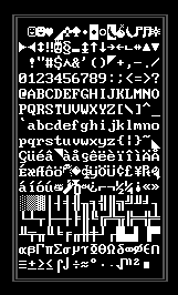
As you can see, it touches very little. There are bananas of course, and a few other oddities like a horn and what I believe is supposed to be a flank of meat. Other than that are a few triangle shapes scattered throughout the font. However the replaced characters are chosen very purposely. The diamond, asterisk, house, and lowercase A with an umlaut are used in ZZT for gems, richochets, energizers, and ammo. So why replace built in elements like this? For the art. All of those elements can be produced in any color and any quantity. By replacing these elements, it's possible to use these tiles without running into the stat limit on a board.
Meanwhile, Ownage Triangle's font is even sparser. It only changes the characters used by sliders to match some of the half-block characters for the same reason as Banana Quest. In this case the font exists solely to bend the rules of a stat limit, and looks functionally identical to a standard ZZT world.
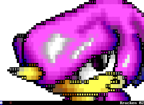
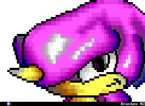
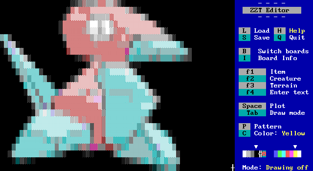
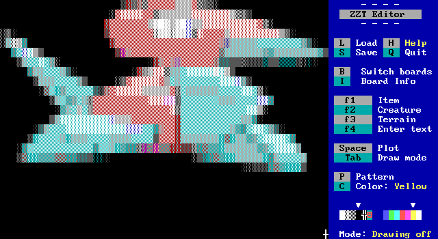
Check out this super cool drawing of Sega's Espio the Chameleon character shown without and with the font in use:
With STK and fonts, ZZT had hit its peak graphically. Yet there was still more to do. By this point in time, ZZT wasn't the friendliest program to make ZZT worlds with. Constantly switching boards to get STK colors, objects whose code would sometimes randomly delete itself. Boards that used too much memory would sometimes get corrupted when saving. It was frankly a bit of a mess for what people in the late 90s and early 2000s were trying to do with ZZT. Fortunately, a modernization was about to occur.
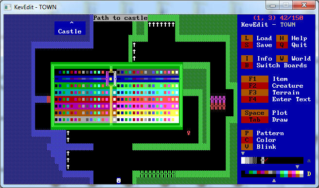
In 2000 Kevin Vance released KevEdit, the first external editor for ZZT. The most important feature, was innate support for STK colors. No more toolkits, no more running back and forth between boards. But KevEdit offered a lot more over ZZT's own editor than just a nice color selector.
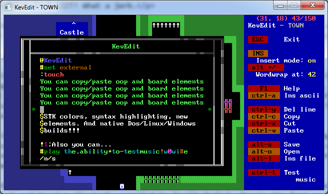
Its object editor also offered lots of convenience. Syntax highlighting, word wrap, the ability to copy and paste text (and also chunks of boards in the editor's main interface), exporting and importing code to text files, all of these helped greatly speed up the process of creating a ZZT world.
And while a nice perk at the time, KevEdit being built for Windows and Linux systems let it keep going long after new PCs stopped being capable of running ZZT without Dosbox. Going into ZZT's default editor and actually trying to make things with it today feels very sluggish and clunky. If you're making a ZZT game today, you're almost certainly going to want to make it with KevEdit.
Around the time of its release, the use of external editors was actually banned for a few 24 Hours of ZZT contests in order to prevent people from having an advantage over those who weren't using it! This wasn't something that could really be enforced and the rule quickly gave way. Most ZZTers adopted an external editor eventually, with Zenith Nadir's sticking to color kits being a noteworthy exception.
Although KevEdit was the first external editor, it wasn't the only one of its kind. 2001 saw the release of CyQ's ZZT AdvancEditor, which offered many of the features of KevEdit, with a few of its own.
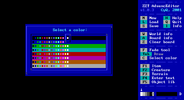
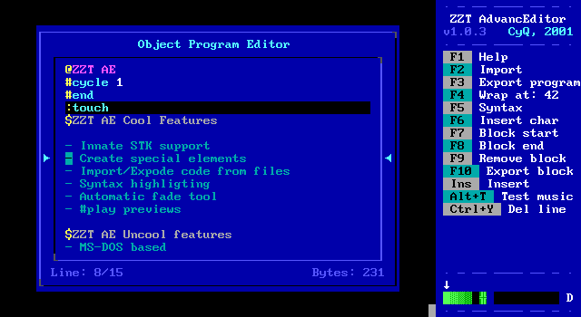
It of course had the same extend color selection that would become mandatory, as well as its own syntax highlighting and other features from KevEdit, but what made ZZTAE stand out was its built in fade tool for quickly creating graphics
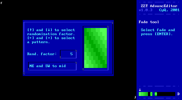
You could select a rectangular region of the board, and then select from 19 different patterns to apply over that region, with the ability to introduce random noise into them as well.
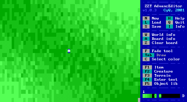
Not bad for just a few key presses. In KevEdit this sort of thing would still have to be done by hand, giving it a bit of an edge.
Although even with this very nice feature, KevEdit was generally considered the superior choice. ZZTAE was written in QBASIC and still constrained to MS-DOS, which today kills it, and back then meant sporadic crashes due to its own memory issues. To be fair to him, I was a ZZTAE user until I was no longer able to run MS-DOS programs natively and made the jump to KevEdit on Windows.
ZZTAE was also interesting in that it used some unused space in ZZT's file format to flag that the world had been edited with ZZTAE, which meant people using it in contests where it was forbidden could get caught cheating! It didn't take long before somebody made a program to erase that watermark, and again, external editors were shortly permitted in contests regardless.
Surprisingly, in 2008 when ZZT was essentially on its deathbed as far as games being made, a surprise third external editor came out, Saxxon Pike's ZAP
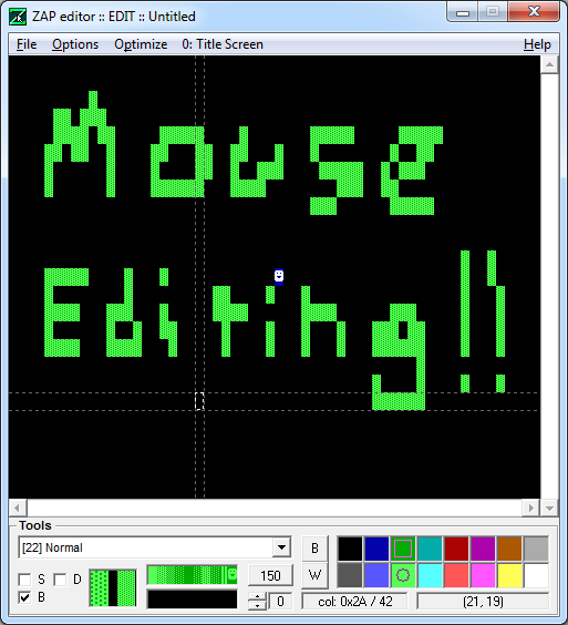
Compared to the previous two editors, ZAP wasn't as fleshed out, but that was because it was designed more to supplement other editors, and instead take advantage of its support for the mouse as a method of drawing boards. It was well received, but I don't know if anybody ever used it for a released world. Still, it stands out as something pretty unique compared to KevEdit and ZZTAE's approach of just replicating the default editor with a few more features to make things more user friendly.
One other claim to fame ZAP has, is that it doesn't just support ZZT worlds. The oft forgetton Super ZZT is also supported.
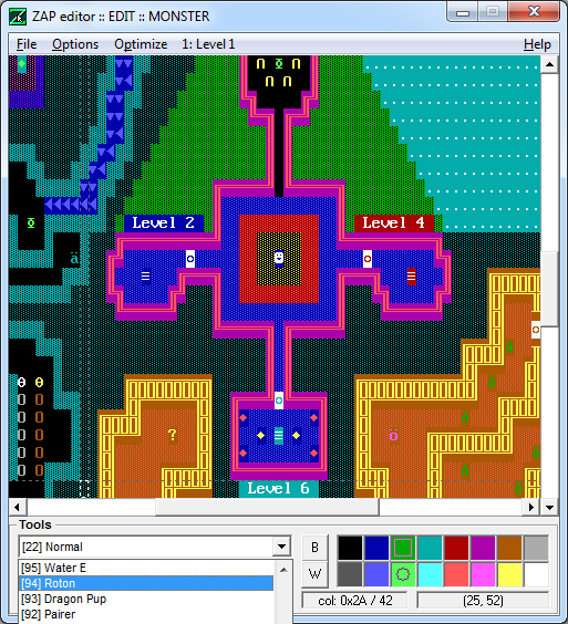
Super ZZT was Tim Sweeney's direct sequel to ZZT and needs an article on its own, but let's just say it never took off for a variety of reasons. Its editor is notoriously buggy, so if you were going to make a Super ZZT world, ZAP would definitely be the way to go!
And so that's about all there is to say about graphics in ZZT. It was an engine that was pushed beyond its limits repeatedly to squeeze out just a little bit more from an outdated medium of art. Super Tool Kit has often been credited as having added years to ZZT's lifespan, and while it's hard to say how true that is, there are certainly a lot of games where the default 7 color limit would have greatly impacted the game's atmosphere and ability to convey its story.
ZZT's rules are so bizarre and restrictive, but despite this people with or without STK created some rather stellar looking scenes. Its limits gave creativity to those who dared to push the boundaries, while also safely anchoring those who couldn't produce satisfactory pixel art in an environment where that didn't matter. In an industry where games graphics are still a selling point, there's something to be said about this program which taught people to throw that thinking away.
Addendum -- 2016-09-21
Wait a minute, wait a minute. I wrote all this and somehow missed one other bizarre tool created to get some interesting graphics into ZZT, Combuster's Z-Bitmap. Z-Bitmap is exactly what it sounds like it is, a tool which takes a user supplied bitmap file, and converts it into a ZZT board file.
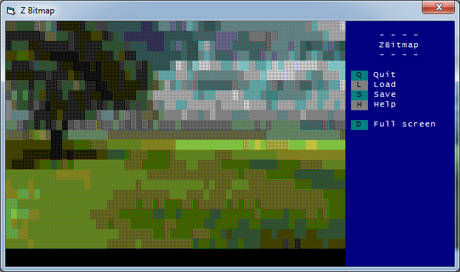
It creates a very distinct look, unlike anything created by hand in ZZT really. The provided files don't really explain the process for converting images, but you can watch the conversion happen and it appears to simply average out each 8x14 section onto a tile. Due to ZZT's limitations with objects, it sticks solely to using solid, normal, breakable, and water elements to create the boards. For obvious reasons, it's difficult to get a solid looking conversion, but the output is generally understandable enough, if very blurry and lacking in detail.
In addition to just rendering the BMP, there is built in support for where to position the image on the output board, as well as scaling the image. It's tough to figure out what sort of images work best in ZBMP, generally things that are already low resolution and limited in colors to begin with. Ideally with a flat background, as the more detailed an area is, the more the background will be mixed with the foreground when converting.
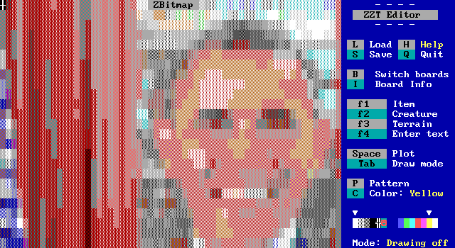
Original Image
President Obama looking less than clear. A good example of how low res images need to be. I had cropped the original photo to turn the portrait into a bust and it still only fit only his head.
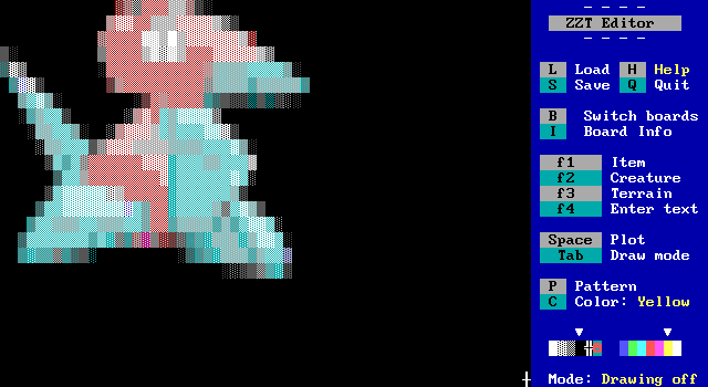
Original Image
Here's an example of the scaling, as well as an image which can better adapt to ZZT's blocky nature. I also gave the original image of Porygon a black background to fake transparency.
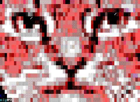
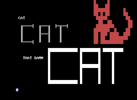
Z-Bitmap saw use here and there in ZZT worlds, probably most notably as the title screen for Commodore's CAT, CAT, THAT DAMN CAT release in 2009, one of ZZT's final releases. The game includes the original title screen before the decision to use a photo of Commodore's own cat instead.
Okay, now I think I've covered everything!
