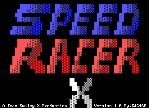
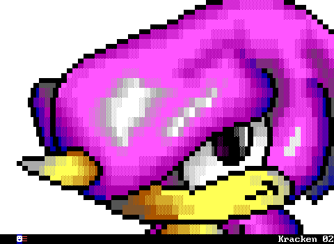
ZZT was released in 1991, and from the very beginning it was woefully outdated in terms of graphics. Contemporary PC games of 1991 included several 16 color games like id Software's Commander Keen: Goodbye Galaxy and Apogee's Crystal Caves. These games had a very restrictive palette to work with, but unlike ZZT, were running in proper graphics modes and not text.
Meanwhile, in the console world the Sega Genesis had been around and the US launch of the Super Nintendo meant that those playing games on mainstream consoles were getting the far more colorful graphics of Sonic the Hedgehog and Super Mario World. ZZT could never even hope to come close.
And yet despite its very restrictive colors and graphics, there was still quite a wide range of graphical capabilities from one ZZTer's work to the next. I'd like to go on a brief overview of the exact restrictions one has to deal with when working with ZZT as the medium, and show off some examples that really push the level of quality one would expect it to be able to produce
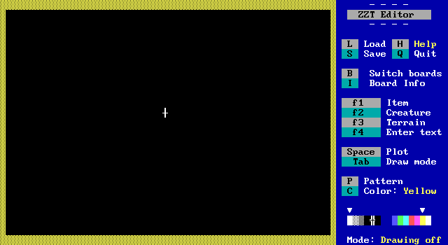
First let's look at the technical specifications. As a text mode game ZZT runs at a 640x350 resolution, much higher than that of graphical games at the time, but of course significantly more limited by not having complete pixel control. The game runs in a standard 80x25 text mode, but even then ZZT's sidebar is visible at all times, restricting the author to a 480x350 space comprised of 60x25 characters.
So that's rough, but it gets worse. Despite having the ability to display 16 colors, ZZT's editor only allows the use of seven colors. Namely the high intensity ones which you can see in the color selector in the lower right section of the editor screenshot above.
Further compounding things, not all elements in ZZT can have their colors changed in the editor. You can make things like walls and objects any of those seven colors without issue, but a lion is always red, and a tiger is always cyan.
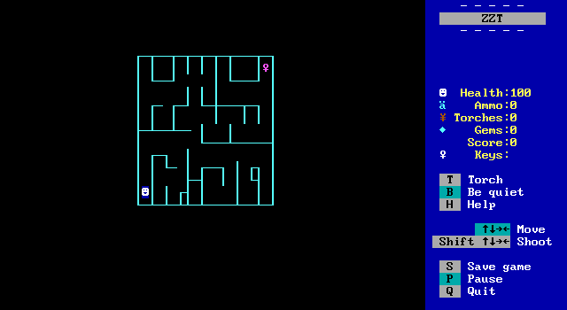
But we're not through yet. See this maze? It's made out of objects without any programming, so effectively a bunch of walls with custom characters. Here's the catch. This maze is made up of 150 objects, and objects have "stats", and thus to conserve memory ZZT has a limit of 151 stat elements permitted per board. The player is #151 here.
This board can't have any enemies added. It can't have a passage to take you to another room since that requires a stat. If the player tried to shoot, no bullet would spawn. A common criticism of modern AAA game development is that the focus is on graphics as opposed to how the game itself plays. In ZZT the tradeoff between graphics and gameplay can be very literal.
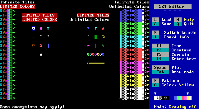
So let's take a look at which tiles can do what with the restrictions covered so far
On the left half are the elements which are the most restrictive graphically. Ammo, torches, energizers, water*, forest, and ricochets have their colors set in stone, but you can fill an entire screen with them if you wanted. The most restrictive elements are the player, ruffians, tigers, duplicators, sharks, bullets, bears, lions, stars, and scrolls, which count towards the 151 stat element limitation.
The right half is where your inner artist gets to play. The main types of walls, solid, normal, breakable, line, fake, and invisible can be used however you like. Along with boulders and sliders, gems, keys, and doors. Then there are the elements which have stats, but free color selection. These include pushers, spinning guns, transporters, passages, objects, slimes, conveyors, centipedes, and blink walls.
(*Despite only appearing in one color in the editor, ZZT-OOP can create water of different colors with commands like #put n cyan water. Also of note is that DEMO.ZZT which contains a brief introduction to all of ZZT's elements has water that's gray on dark blue, which isn't used in any of the original ZZT worlds. Most likely the switch was made as sharks in the water are much more obvious with the blue color.)
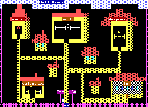
So early on, you'll find most ZZT worlds that aren't creating abstract geometry like Town, tend to come off looking very bright. This screenshot is of the main town in Adventure Part 1. The purple walls around the town are actually objects. Which means this screen uses 118 out of 151 stat elements. Even a board like this is cutting it close with ZZT's limits.
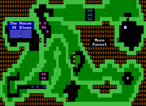
But even from day one ZZT's rules were being broken in the name of art. Consider this board from Town of ZZT, the first ZZT game. ZZT's default graphics probably handle a forest environment best of all with bright green walls and dark green, well, forests. The spade and club characters for objects are easy interpretations of a tree. Yet already, elements here are being used for something other than their intended purpose. The outer area of the board that the player is restricted from ever entering is filled with torches to give the forest some much needed brown coloring. It helps as well that the Yen symbol also makes a half decent tree trunk character as well.
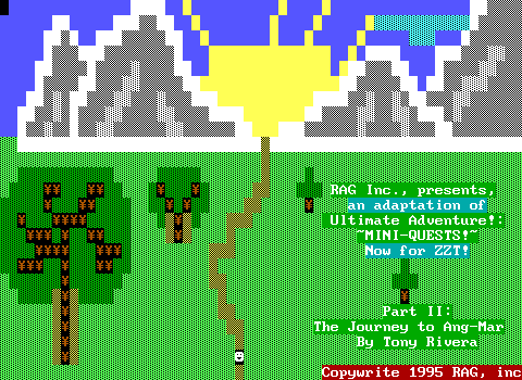
In fact, the use of torches for trees can be seen literally on the title screen for Adventure Part 2. A clever trick, but it's easy to take things one step further.
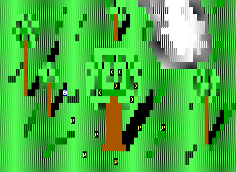
Brown! Honest to goodness brown trees! The Lost Monkeys by Chris Jong, released in 1993 already shows considerable improvements in just two years. Fake walls are used as grass, and that allows ZZT's regular empty tiles to be treated as shadows. There's a sense of depth and some rudimentary shading with brown and dark green walls.
And the secret?
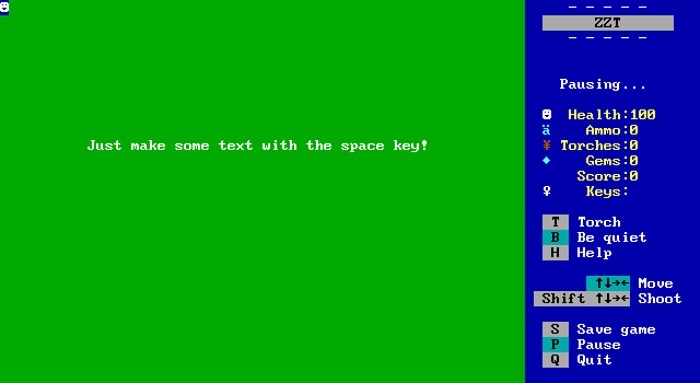
Simply using ZZT's built in text functionality! To the player, there's no difference between text and a wall. Using this trick you can produce effectively solid walls in dark blue, green, cyan, red, purple, and yellow. White text uses a black background, so unless you want an invisible wall that doesn't reveal itself, you won't get much use out of it.
Still, the darker colors offer the benefit of nice water, trees, ice, and really just add some more variety to the look of ZZT games in general. There is a downside to using this though. ZZT has zero ways to reference text in ZZT-OOP. You can #change yellow solid blue gem just fine, but text is text and always will be text.
The next innovation in ZZT graphics would come from discoveries again involving torches, and some other built in elements as well.
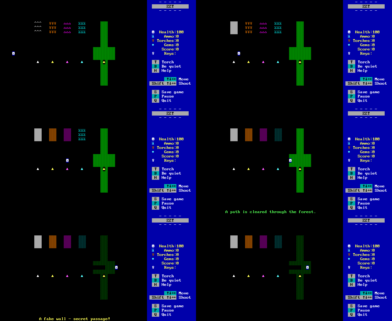
By using the #change command, and not specifying a color for the element to transform into, the current color is used. In the case of these elements, it means access to gray, dark yellow, dark purple, dark cyan, and black on dark green. This trick only really works via ZZT-OOP, so there's no real way to design a board with them in the editor normally. However, what can be done is playing the game, having the changes execute, and saving. If you then rename the file from .SAV to .ZZT, ZZT will realize you're trying to edit a saved game and reject it. Unless, you open the editor first, and use the ?+DEBUG cheat code. Then you can edit it like a regular ZZT world. From there, just export the board, load up the game that needs those colors, and import the board!
Now we're really getting somewhere. We've gone from 7 colors to 12. Of course, with foreground and background colors being independent, that's still a mere 12 out of 256 combinations, but the next discovery is arguably the most important discovery in ZZT...
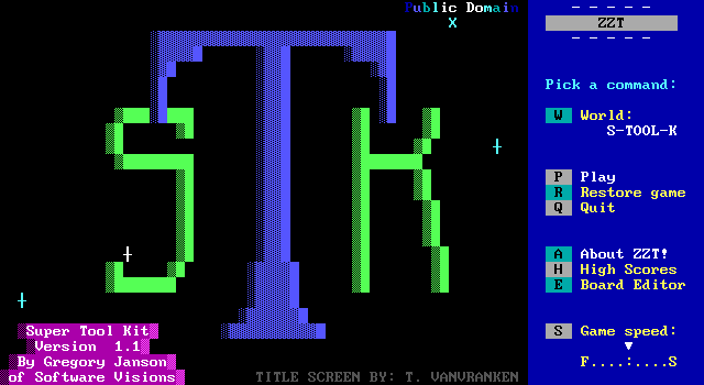
Alexis Janson's Super Tool Kit was the game changer in 1994. Alexis had been messing around with ZZT files, taking a look at its file format, where she noted that elements on a board were stored with three bytes, the quantity, the color, and the element. So ZZT's own board format explicitly stated, "One green on black object", "Four red on black solid walls", "Six dark yellow on black torches".
And so she changed those color values and saw what happened.
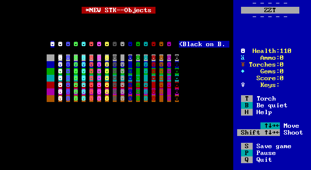
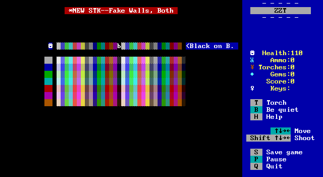
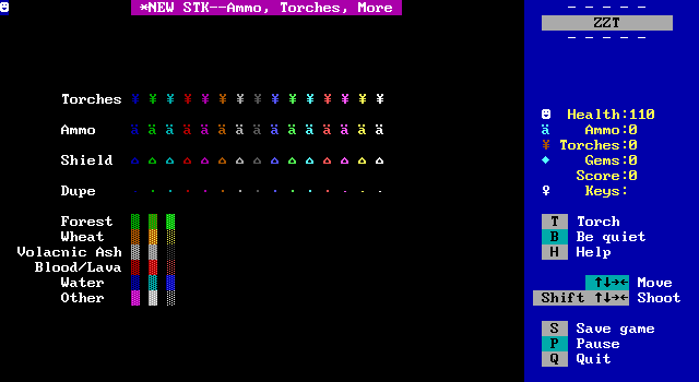
Suddenly, we had colors. We had every combination of them. Super Tool Kit had such an effect on ZZT's graphics, that using colors not possible in ZZT's editor became known as using "STK colors". Games released prior to Super Tool Kit would be referred to as Pre-STK. For ZZT, Super Tool Kit was an epoch, dividing its history into two halves.
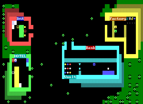
In 1991 a typical ZZT world looked like this:
By the end of 1994 you'd get something like this:
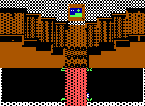
It was a huge leap! The only limit graphically was now the number of stat elements. No more issues with color when making your game. If you wanted a dark green ruffian it was yours. If you wanted to have the player walk on black on dark green fake walls as some light grass you could. If you wanted buildings in a city to be gray and not white, it was an option.

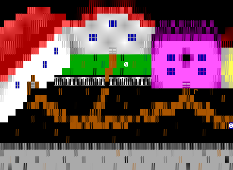
Here's that screenshot of a village in Adventure again compared to a screenshot of a village in 1998's Quest For Glory.
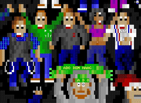
You could draw honest to god _people_ now.
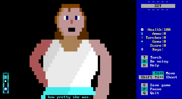
Of course, giving somebody more colors won't make them a talented artist, but for those better versed in creating artwork in ZZT, there was suddenly a huge change in what could be done. There was a cost though.
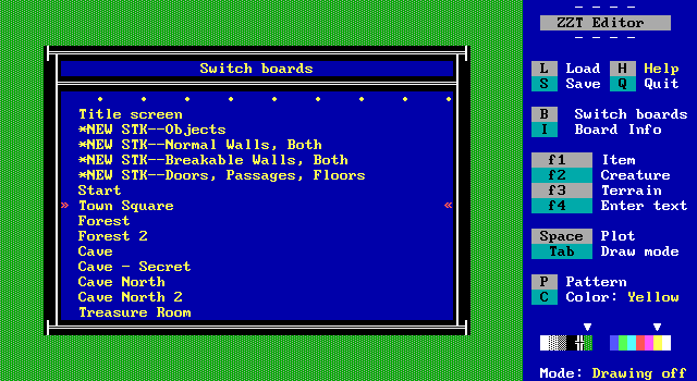
ZZT's editor wasn't built around these colors, so to get them in your own game you'd have to import boards from STK. ZZT does have a limit of 101 boards in a file, but few games would ever come close to this. The real cost was in time. Pressing enter on a tile in ZZT copies it to a single empty space on the pattern buffer. ZZTers would be working on their board, switch to an STK board, grab a specially colored element, switch back to the first board, and place the tile. For a complex board with a lot of uniquely colored elements, this greatly increased the amount of time it took to make a board.
There was also clutter in a game's board structure. A developer would import a few STK boards they'd need as soon as they started a new world, but then 10 boards in realize they also needed a dark green line wall and have to import another STK board and have it as board number eleven. There was no easy way to rearrange boards, so things could get disjointed.
The most popular way to combat this, was with the creation of a personal toolkit. Instead of STK's sparse boards with every variation of a single element on a board, toolkits (sometimes called color kits) would instead attempt to cram as much STK content on a single board based on what the author deemed most important to have quick access to.
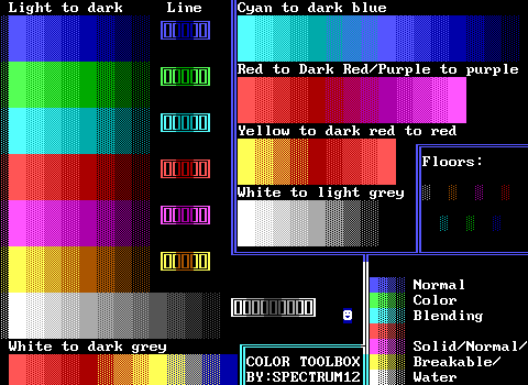
Pictured above is Spectrum12's Color Toolbox, to my knowledge this is the first toolkit. Compared to later toolkits it is extremely sparse!
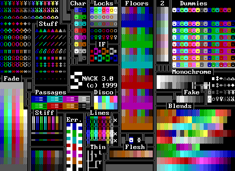
I personally was always fond of Super Neato All Color Kit (SNACK). Plenty of useful things are available along with several pre-made blends which were great for people like me who could not make a decent looking texture themselves.
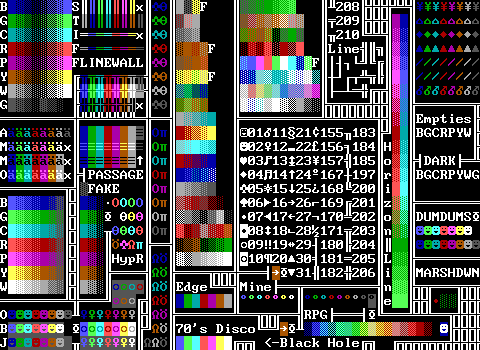
Ok, last one. This one was mine! It even has an ASCII chart shown in text and that scroll.
The world of color kits is ZZT at its most colorful. These boards are often such chaotic messes, and some people would go so far as to make toolkits that were two or three boards in size, which I always found overkill.
The age of the toolkit continued for quite a bit, as there weren't really any improvements to actually make, at least not within ZZT itself...
