Article Word Counts
AKA patting myself of the back by writing a really big number. Which I can make bigger next year by adding a bunch of filler to this subheading.
Lorem ipsum dolor sit amet...
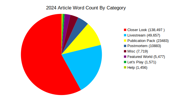
What do I write for this part? I did a bunch of Closer Looks?
Okay well, the chart last year didn't have any numbers of it, so that's a great chart.
Copying and pasting a transcript of Alice's Adventures In Wonderland to use as a word count reference is revealing to me that Lewis Carroll ain't shit. 27,162 words. How about Moby Dick? That's more like 75,000. I still don't have much of a point. Closer Looks are the lifeblood of articles here. Livestreams are almost as important but rarely get too detailed as they have to double as YouTube descriptions.
This article doesn't need to be as long as Moby Dick, so let's move on.
Closer Look Subjects By Release Year
When were games covered in Closer Looks released? Was there a focus on a particular era?
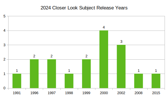
There can maybe be some actual insight this year. Namely, this year I just kind of went for it. If it won a poll or caught my eye, that was the pick, plain and simple. I don't think at any point during the year did I flip through the years of covered games to focus on spreading out the "whens" to not focus too much on one particular era of ZZT. Playing it fast and loose kind of worked out. The spread between years that did get picked is pretty narrow, with a slight bump in the early 2000s, possibly caused by the last stats article having me talk about how the 2000s aren't quite the series of landmines that are difficult to cover that I thought they were. As such, it's easier to find something that looks interesting from around that time.
Livestream Subjects By Release Year
When were games covered in livestreams released? Was there a focus on a particular era?
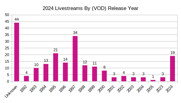
It makes sense to do the same thing with games featured on stream. Though a lot of this is just going to match up with the file uploads by year. Hence, the power of 1997.
But this one is a much cleaner range, with no gaps in representation from 1992-2005. It also lines up nicely with first era of ZZT, where the number of new releases slows to a crawl around the mid-2000s until the Museum's revitalization efforts a decade later. So actually, I'm quite happy with this spread. Everything was covered at some point, and various new titles got a solid share of time as well.
The Colors, Duke. The colors.
I wanted to see how this one would shake out so badly.
For the longest time, for simplicity's sake, I used screenshots of ZZT boards for article thumbnails, with livestreams being no different. In August 2023, I finally appeased the algorithm a bit and began putting some gosh dang text and iconography on my VODs to make them look a little less robotic (and more ZZT-OOP ha ha that's a joke). I have a little staff-only page on the site that lets me drop in a ZZT screenshot, and enter a title to overlay to create the thumbnails seen on the YouTube channel. I get my pick of blue, green, cyan, red, purple, and yellow, and have always been curious if I'd unintentionally favor one color over another.
So I sat down and counted them, this includes the 2023 uploads and goes through everything that was published in 2024, and this is what the numbers came out to:
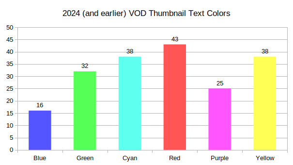
My mind is kind of blown here. Here's what I can say about the process: I don't just get to pick whatever color I'm in the mood for at the moment. The color of the background screenshot determines what looks good or not. The little extra dark opacity behind the text helps with contrast, but I still want the board to be legible. After all, more often than not the preview image is the coolest looking board of the stream.
Blue is tough. It's hard to see on a lot of backgrounds. Everything else is usually fair game, as long as the background cooperates. You won't see green titles on very green fields and forests. Cyan can get in the way of skylines, though you might get away with it if the horizon is above where the text will be. Red, purple, and yellow seem to be the most versatile. It's very rare that they don't feel like an option. So before counting I had a feeling that blue would trail, though it's not as distant as I thought.
I was tallying these manually so I can say that there's been a push towards using blue when possible lately which did have big impact in the end. Blue was trailing, but the effort to use it more at least meant it wasn't nearly as big of a blowout as it almost was.
What really surprised me though, is purple being the next lowest. If you asked before I counted, I would have said purple and red were the top two, but no, not at all. I think what it is, is that when I make these title cards, the output looks like this:
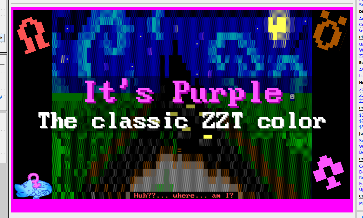
When the only skill you have is webdev, all graphic design problems look like a nail. A nail to be hit with a website.
The output is rendered below the form, and then I just take a screenshot of my screen, select that big border, crop to it, invert selection, crop again, and then I get a perfectly framed image. That border is purple though. Deliberately a different shade, but still purple, and so I suspect I subconsciously think purple text looks good because it's framed by purple. And since I'm kind of aware of this, I suppose what's actually happening is I then pivot to red, which tends to always look good anywhere purple does.
I'm gonna make that border orange right now. Let's see what happens in 2025's stats.
