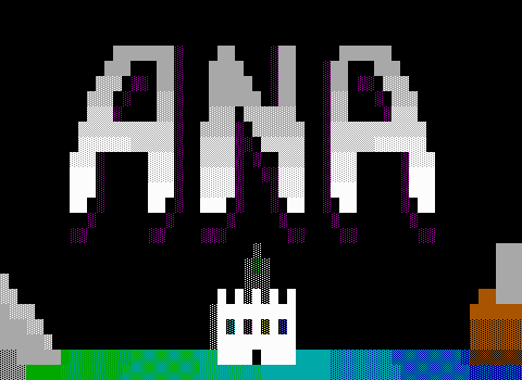
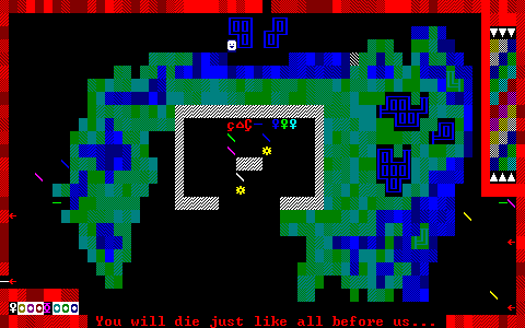
This one only entered my vision thanks to the Worlds of ZZT bot, where I queued up its title screen, and was immediately curious what I might find were I to actually play the game.
And I'm really glad that I decided to commit to it! Sure, it's no lost classic. It's hardly an overlooked gem or even an ambitious but flawed experiment. It's just one of those ZZT games that radiates with the author's excitement at creating a game.
It's the sort of game that kids love making. A world that's crystal clear in the author's mind, but filtered through an inability to really express those ideas. The result is a game that's chaotic, messy, makes little sense, and struggles to stimulate the player's imagination in the way it doubtlessly does for the author.
Tack on some weird asks for how to ensure the game is displayed properly, and you wind up with a rather peculiar game that's exactly the type I enjoy discovering the most. Legendary Series is part one of a trilogy that never happened, but you just know the author had big plans. Games like this are the sort of games that without something like ZZT to dramatically lower the barrier of entry, would almost certainly not exist at all.
It's not ZZT as a voluntary challenge of doing more with less, nor is it ZZT as a shortcut to avoid having to learn a traditional programming language. It's ZZT as a realm of limitless possibilities. A program that allows one's imagination to be experienced by others when one's skill set means that the alternative is nothing at all.
Getting to indulge in ZZT in that way, is a lot of fun, and the game's author Jag is clearly having a blast the entire way through. That's enough for me to enjoy spending time in such a world, watching the absurdities that unfold when you let someone who previously couldn't create at all suddenly create freely. It's a recipe for something pretty spectacular in its own unique way.
Why Does This Game Look Like This
A text file included with the game named DONT DO THESE!!.txt makes a very peculiar request. It tells players that 1) they should not play the game in full screen, and 2) when running the game in a window, set the font size to 8x12.
The reasoning behind the first part of the request should be clear to those who have played ZZT in a window on DOS compatible versions of Windows. For reasons unbeknownst to me, Windows has always just refused to allow for text modes that have blinking characters rather than high-intensity background colors instead.
A big part of ZZT's appeal was how much less technical knowledge you needed to make and play games with it. As with ZZT's own oddities, the community saw this change in how ZZT's colors were displayed between windowed and full screen and decided to seize the opportunity to be able to make games with bright background colors.
We didn't know about video modes, and how they might be forced. And so, the vast majority of ZZT worlds are designed with blinking in mind. Blinking lets sharks lurk in water rather than expose their fins, lets some UI elements like the "Paused..." text flash, and that's about it. It was never really all that core of a feature in general. STK allowed anything to blink, but even then blinking was still used fairly sparingly.
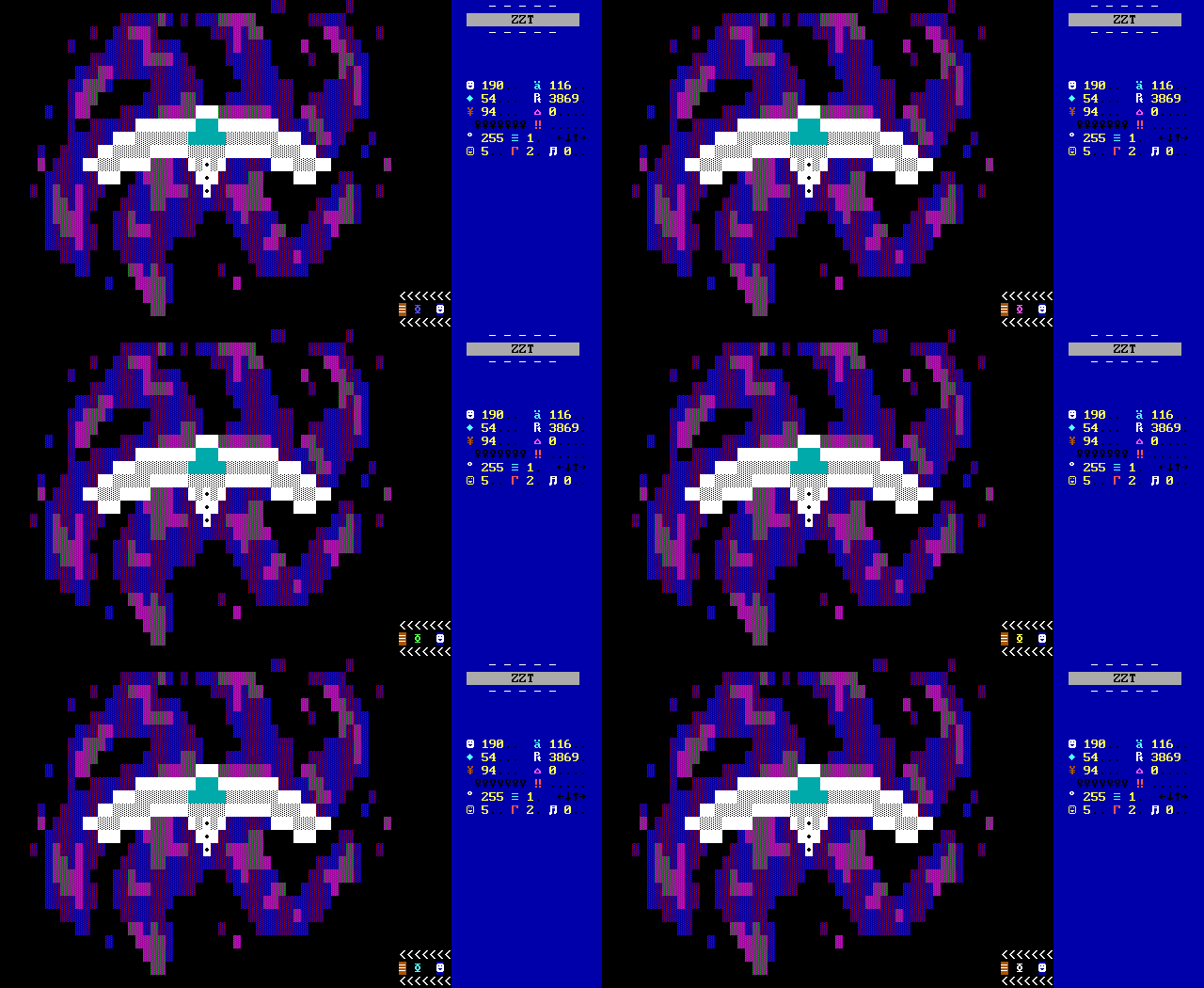
"Disco inferno" describes the more common use cases for blinking. Dance floors and fire. Beyond that, you can get some funky looking portals, be they sci-fi or fantasy, maybe some radioactive glow, and that's pretty much it.
However, the possibilities of bright background colors via STK are far more promising. You can see this extensively in more modern titles like ZoZ where blinking is now trivial to disable in both Zeta as well as Weave, which has led to some great visuals that ZZTers previously only really dreamed of.
Had the community been a little more knowledgeable, disabling blinking may have been more prominent. An MS-DOS utility called Blink X by Velt Kannegieser was created to force programs to run with high-intensity backgrounds. The program is meant for any DOS text mode programs rather than ZZT-centric, so it was unknown to the community until someone kindly uploaded it to z2, ...all the way in 2003.
It's still a little surprising to me that nobody started using it then. The mid-2000s still had lots of impressive new releases, with several games praised for featuring some of the best graphics ZZTers had yet seen. (See, Frost, ESP, Rogue Three...) Perhaps it was the need to set up a batch file to run your game with the proper settings, or perhaps it was dismissed as not being worth the hassle, similarly to games with custom fonts which had become few and far between. Getting rid of blinking might be nice, but was it going to radically change anything, or just be another gimmick like custom fonts?
The demand wasn't completely non-existent though, leaving those in a pre-Blink X world to take the more awkward solution of running ZZT in a window to achieve the same effect.

This came at the cost of the character set. Yes, all kinds of video cards back then meant that ZZT might render its characters different from PC to PC, but the way things looked under Windows was pretty universally yucky. Some authors weren't discouraged by this, asking users to run games in a window to get the proper colors. A few seemed to just run ZZT in a window at all times, unaware that there was any difference in the first place. You can sometimes stumble across worlds where random tiles blink for seemingly no reason, but appear completely solid when blinking is disabled.
Jag's instructions make it clear that blinking should be off, but the unusual specification of character resolution as well means this game has a very specific way Jag intended it to look.
So I took the bait. I loaded ZZT up on an old Windows 98 machine, took a screenshot of its character set, and then realized I had no way to convert that graphic into a custom character set for Zeta. Fearing I would have to write a tool to make the conversion, I asked the Discord of ZZT if anybody had already made such a tool, and asie helpfully piped up, with exactly what I needed. Asie not only did the conversion for me, but also pointed out that the colors in Windows would be somewhat different as well, and sent me an appropriate palette.
A lot of effort went in to making sure I got to play Legendary Series as it was intended. When I finally played it, I left realizing that it hardly mattered at all. This isn't much of a surprise.
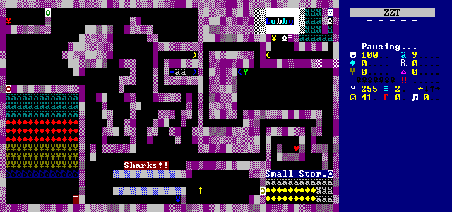
Legendary Series has a handful of tiles on boards which would blink otherwise, but that's about it. There are no fancy art boards that take advantage of the extra color combinations available. The adjusted character set makes no real difference either. The fade of solid through water doesn't look quite the same, and the tiles are overall a bit squished, more square shaped than the gold standard 8x14 used today, but I could've overlooked the text file "accidentally" and my enjoyment of the game would have been identical.
It's a little unfair to feel bitter at all. I saw that title screen. I knew going in that what I was doing to make a character set was almost certainly going to be pointless effort, but dang it, it's the principle of the thing. If a game says blinking off, I'm turning off blinking. If it says use this font, I'm using that font. If it asks me to rotate my monitor 90 degrees, I'll regret having an ultrawide. So be it.
Not to mention, that the effort involved, is only considerable today. In 2002, you just hit Alt+Enter and picked the character resolution from a selection widget. It would've taken all of two seconds on old Windows.
Well, at least if I run into another game that wants an 8x12 Windows font, I'll be ready.
Isekai? You Tell Me.
But the strange appearances are only the beginning. This is a ZZT game and it everything you'd expect, including a story to introduce our protagonist and their quest.
Our story here is somewhere on one of those Isekai alignment charts. One day, average sixteen year old "Rod Merth" was walking home after getting groceries when a "huge beam" was blasted from the sky. This beam was a bit destructive, lifting up homes and buildings, until it struck Rod.
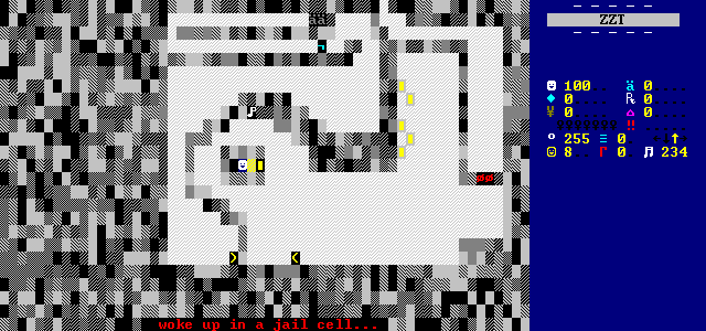
Poor Rod wakes up later in a jail cell where he has to figure out how to escape, why he was brought here, how to return to Earth, and fulfill his destiny along the way.
It's a wake up and save the other world game. Rod manages to break out of his cell, find a gun, and sneak his way out of prison before meeting up with a messenger named Ro-opal. Ro-opal explains the boy's plight. He was summoned to the planet of "Upootinur", a name so made up it's impossible to do anything other than forget it, in order to defeat the evil king Ryuthar who plans on taking over the universe.
Rod isn't so much the chosen one or anything. He just had the misfortune of having special blood that can be used to powered Ryuthar's machine which will allow Ryuthar's conquest to happen. Presumably, Ryuthar's army fired the beam, and then imprisoned Rod until they were ready to activate the machine. Once free, Rod is forced to fight for his survival against the army of Ryuthar and his ten elite henchmen that have been sent to kill him. (I guess it's okay if he dies right away after all.)
It's classic child-written fiction, a story whose events are most likely figured out as the game was written. It gets the adventure underway, provides motivation, sets up some stakes, and then whatever happens happens.
These kind of games can very much be a blast to play. Sometimes, the fun is genuine, as was the case with the Zandia games, where the creativity on display makes it hard not to enjoy yourself even when the gameplay can be a bit flawed or the story isn't exactly brilliant when you stop to think about it.
Of course, even the really messy games of this style can still appeal as well! The absurd puzzles, characters, dialog, and plot found in Secret Agent Chronicles made it one of the more incredible experiences I've had in ZZT, even if the appeal isn't at all what the author intended.
Legendary Series falls somewhere in between the two. There are times when Jag must have gotten bored, opting to add side areas that he's up front about not having any bearing on the rest of the game. When the game's creation is an act of play for the author rather than work to create something for an audience of players, you can create without any worries. Sometimes, you want Rod to fight the bad guys. Other times you think it would be funny if Rod urinated so much in a toilet that it overflowed. It's game whose author hasn't put too much thought into what strangers on the Internet would think about it two decades later. Luckily, that kind of earnest development is right up my alley.
Other times, the game is goofy when it doesn't seem like it was supposed to be. The threat is presented as real, even if the interactions between Rod and the henchmen are about as threatening as the ninja turtles facing off against Bebop and Rocksteady. It's clear from the start the Rod's adversaries have an uphill battle. How can they expect to defeat Rod when they don't even have names themselves!
Their personalities are flat, existing just to kill Rod, with no real difference between one and the next. An issue with locking objects and not unlocking them fast enough means that the majority of the fights against them can't actually be won, meaning there's plenty of generic "You killed me!" dialog that doesn't even get a chance to be read. These guys don't hold a candle to the Fearsome 5.
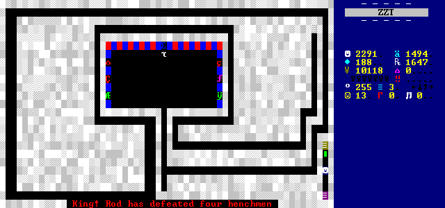
The only thing they have going for them is their rather alien appearance. The enemies Rod fights breaks away from the usual characters seen for enemies. Greek letters shared by ZZT's own creatures, playing card suits, and smiley faces just aren't alien enough for Jag, who prefers more squiggly shapes, or letters with diacritics. It's an easy way to remind the player just how far from home they are, and helps one imagine more strange creatures from outer-space than TV-ready aliens that take the human form and slap on some funny ears or whatever.
The Colors Are The Setting
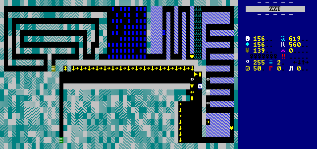
Upitoonur is unlike any other planet ZZT has taken me to. The game was released in 2002, and I imagine it was created in an external editor. It makes extensive use of smudgy chaotic blends of colors, with nearly every wall in the game looking as if it was carved out of a flood-fill of ZZTAE or KevEdit's gradient fills. (It lacks the ZZTAE watermark so I suspect KevEdit, but have nothing more than gut feelings to base this on.)
In some ways, it gives the game an almost arcade feel. Making progress in Legendary Series is akin to Ms. Pac-Man or Tetris, where the color palette changes as your level increases. This is only a visual similarity though, as the game presents itself as one discrete adventure. Any milestones, are purely being tracked by the player.
Despite the abstract look, Jag tries to differentiate between spaces to some degree. The colors are pretty much the only meaningful difference. You can tell you're in prison at the start thanks to the game telling you and having to find a way to escape your starting room, but afterwards it's anyone's guess where you are.
Board titles reveal battle zones, temples, and basements, all of which could be swapped around without anyone noticing. I guess most of the basement boards are dark.
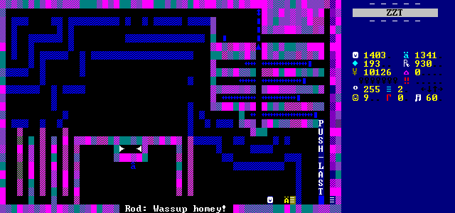
Instead, you'll more likely identify spaces by shared palettes. Dark cyan on grays, red on dark cyan, green on dark blue, and so forth. Were it not for external editors, the process of creating these boards would be immense. With them, it's a new way in which tools enabling new things somehow get those who use them to be seen as lazy. Once anyone could make boards that look like these, the luster vanishes.
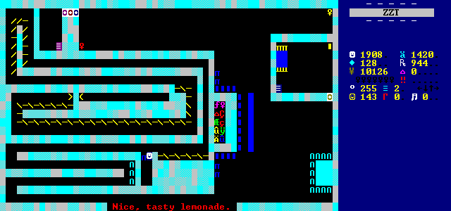
I was a teen-aged ZZTAE fade spammer myself though, so I can't actually be upset about how the game looks. If anything, some of the more unusual color combinations do help give the game its own visual style, even if it can be rough on the eyes at times.
It's a good demonstration of what happens when "good ZZT games extensively blend" meets "I can blend the entire screen in seconds". The game unfortunately lacks any feedback at all, so it's hard to tell what the reception was. I feel like there would be no real consensus a to whether or not the game looks properly alien or just plain ugly.
Run, Gun, and Have Fun
Legendary Series should be praised for how well it avoids a lot of the common tropes and issues of a first release. If this is truly the author's first ZZT world and not their first uploaded game, then I'm pretty impressed.
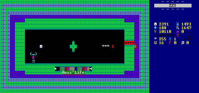
There's ambition here to be sure. Jag tries to set some high stakes for Rod through the game's story, constantly providing new updates through Ro-opal as well as a single cinema showing the Ryuthar and his henchmen discussing strategy after a few henchmen had been defeated. The boss fights give foes visible health bars on screen, while labeling them with "???'s Life" to give the henchmen a sense of importance and mystery.
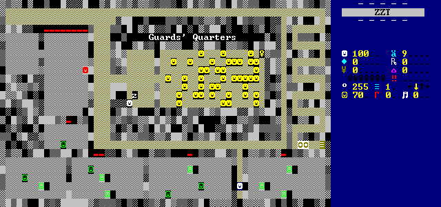
Players sneak past sleeping guards, run in guns blazing (or wait for friendly-fire to do the work) into rooms filled with hostile enemies, race past deadly rows of spinning guns, as well as wander dark mazes. For the most part, it's typical ZZT adventure stuff, with each board serving as its own distinct challenge to overcome by reaching its exit. It's entertaining, and I'd be lying to suggest otherwise. Jag rises to the challenge here of trying to leave players with a good first impression.
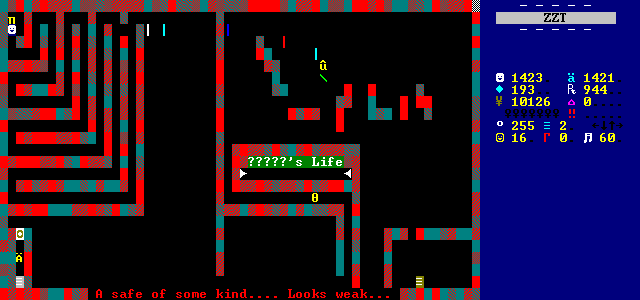
Perhaps the game's most serious issue (that isn't its bugs from being a beta) is just how winding the game's paths are. Jag hates straight lines to get from point A to point B, which would be fair enough, were there obstacles on these paths forward. Instead, expect a lot of tiny ping-pong paths and other needlessly lengthy twists and turns down empty hallways.
It's generally in short enough bursts that I was fine with begrudgingly putting up with it. However, by the end of the game, my patience was getting a little thin.

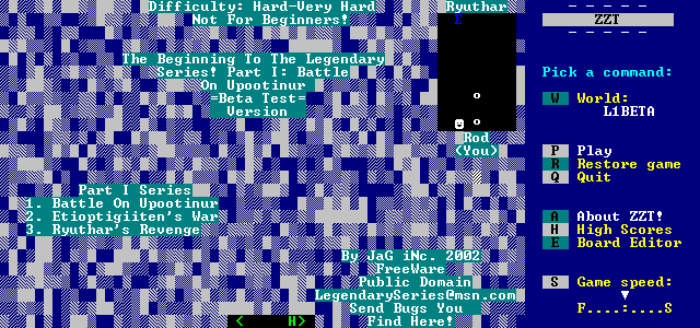
The title screen for the game makes the unusual decision to classify the game difficulty. Jag puts it in the "Hard-Very Hard" range, warning that it's not for beginners. I quite disagree.
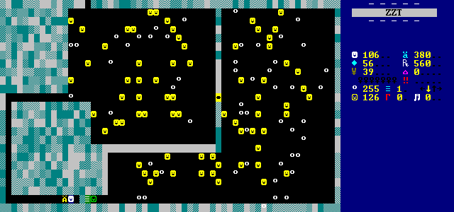
The obstacles players have to deal with are fairly standard. Modest amounts of built-in creatures, a few @guards that wander around and shoot aimlessly (killing each other mostly), and some boss fights that can get a little spicier. Aside from the bosses, I'd sooner call the game easy than hard, with most enemies appearing in smaller quantities than in Town, and backed by an incredibly generous amount of pickups to collect.
Ro-opal is a fixture of the game, often dumping supplies on players who quickly amass ammo and health counts in the high hundreds range. By the end of the adventure, it's more likely to be measured by the thousands. The only reason I don't feel like the game was trivialized, is thanks to some moments where players are expected to take hundreds of damage, running past rapid-fire spinning guns while bumping into invisible walls, or a final gauntlet with an absurd amount of stars that provides just enough energizers to get through. Just make sure you grab all the keys lest you have to run the gauntlet again without any invincibility. (I did. I was fine.)
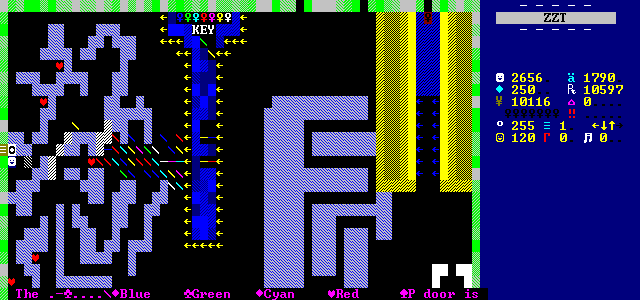
For a first game, it's appreciated that the supplies err on too many rather than too few. Usually objects deliver things in bulk, but sometimes Jag can't help themselves, and they put in some large piles of actual items to run across. On some occasions, he even opts for items behind duplicators, allowing players with some patience (and cranking up the game speed) to get as many items as they desire.
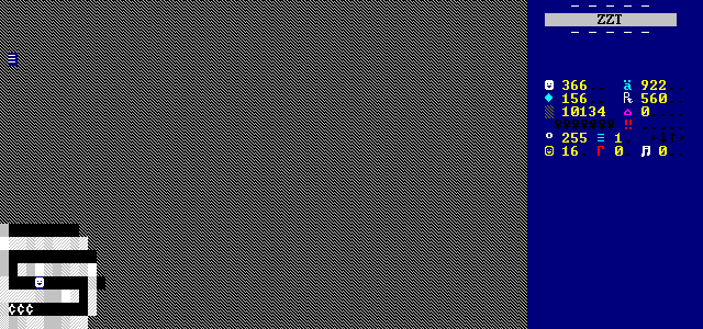
Health items sometimes even serve as an apology. There is one board that's just a dark maze with only a few zig-zagging paths to actually choose from. Needing something to put in the dead ends, Jag was kind enough to include objects that give a whopping one hundred health each, with some of the wrong turns leading to two or even three such pickups.
The bosses do a better job of providing some challenge. Still not enough to make this a particularly hard game, even if the ammo/health situation had been reduced to more reasonable levels. It's an absolute shame that nearly every last one of them suffers from the same bug rendering the fights unwinnable. These enemies won't wow you, but they are rather competent for a first release, showing a good understanding of how to do run-and-gun enemies that can trip players up without getting too out of hand to deal with.
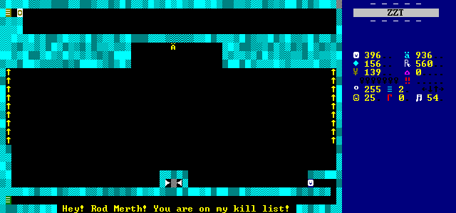
There's some noticeable creativity with the henchmen bosses. Defeating the first one drops a key, and quietly places a fake wall above themselves before dying. Players need to search out the location of the exit. Notably, this little band of possible positions for the object to be in uses non-STK cyan normals so that the placement of the fake wall blends in seamlessly.
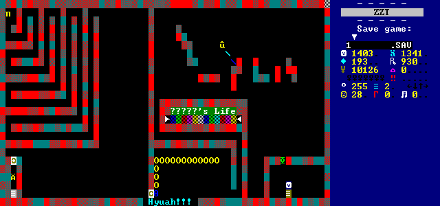
Another boss doesn't move at all, simply slowing their cycle to a reasonable number and throwing a bunch of stars. Even at low speeds, this sort of thing can get out of hand really quickly, but Jag puts some thought into how to make this enemy defeatable.
Firstly, there's a nice break after throwing the stars to give players a moment's reprieve. This lets them use the squiggly lines to their advantage, getting out of the way and then looping around to attack. Of course, this is somewhat ruined by the walls being made up of a blend of terrain. Jag thought to avoid using breakables which the stars would destroy, but forgot to consider water, which the stars can still cross. This makes some of the barricades a lot less effective than they could have been.
The barriers are just to buy players time before they notice that the stars being thrown are always thrown to the south. With the boss standing still, eventually players will notice they can position themselves above the henchman. From here, after the already thrown stars have the chance to close in, players will be completely safe, as any produced stars try and fail to go directly through the henchman.
A final nudge of the dice in the player's favor stems from the centipede placed just beyond the boss chamber. It has a habit of getting out of its room and crawling its way into the main boss area where it can act as a moving shield to help cut off the direct path the stars will try to take. I don't think this is a deliberate choice Jag made as the the centipede's stats are unmodified, making it equally likely that it turns before getting to the path to the boss.
As far as star mitigation goes though, there's a lot here to ease potential frustration, especially for a first release.
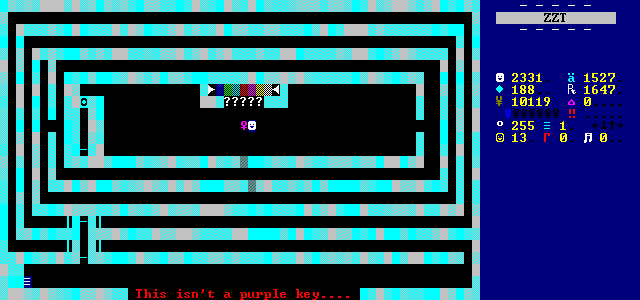
One boss takes the stealth approach, thanks to their purple key-like appearance. This one doesn't attack the player immediately, waiting for them to try and pick them up as a key first. I don't think they're going to fool anybody though.
Every boss in this game has a visible health bar, usually accompanied with a "name" (always ??? save for the fight with Ryuthar). The UI kind of gives up the game here, when it might otherwise serve as a decent ambush, if we're being generous about the lack of anything else in the board at least.
That piece of UI is also the reason why almost every boss in Legendary Series can't actually be beaten. Since the game gives players so much ammo, Jag rightly tried to mitigate the strategy of shooting dozens of bullets endlessly at the boss until they run out of health.
To do this, he correctly locks the object after they've been shot, effectively giving them invincibility frames. After a bit of a delay, the objects unlock themselves and return to their main combat loop. For objects that track their health internally by stacking :SHOT labels, this is all one needs to do.
However, locking an object isn't just some immunity to being shot. It's a flag to tell the object to ignore any and all external stimuli. No shooting, touching, bombing, or (the important one here) receiving #SEND commands from other objects. This leads to an awkward situation where when the killing blow is delivered, the object locks, and while locked, the object that recognizes the boss's demise has its message ignored, effectively refusing to die to a human.
The physicality of the health bar means that in order for a boss to die, the bullet used to clear a breakable wall/hit point needs to take more cycles to travel to the final object at the end than the number of cycles the boss object is locked for. Incredibly, almost none of them have the health to pull this off.
The health bosses have is sensible. It's the length of the invulnerability is the issue here. It's far too long, and consists entirely of idling in place so it's still possible to spam bullets at a steady rhythm and keep bosses pretty safely rooted in place. Until the final blow that is.
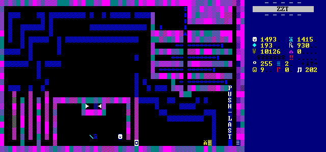
When this happened the first time, I figured it was just bad luck. That henchman is intended to only take a pitiful three shots to defeat, so even a reasonable invuln period would likely be hit by the bug.
But it really does just keep happening. The purple key henchman manages to have a workaround where the wall shading means there's a water tile that can be shot over to kill the boss immediately which is a fun oversight on its won. Excluding that exploit, only two bosses can be defeated in a fairly boss heavy game. Not even the final fight with Ryuthar, who does have a considerable health bar for a bullet to travel across, can actually be beaten as intended.
