Resource Management
Early ZZT worlds often run into issues with supplies, especially health. A lot of this stems from ZZT's only non-object source of healing being a miserable one health per gem, with gems also doubling as currency and points to be picked up for treasure. The item is so overloaded with function that authors are reluctant to give out too many as it can wind up overshadowing points from fighting monsters or allow players to overstock on items if they can use gems to buy items. I took the standard solution to the problem and incorporated health hearts as a more substantial healing item.
The game's opening hints also tell players up front that they will be awarded bonus points for unused gems at the end of the game. I don't believe going for high scores is particularly popular with ZZT worlds these days, but hoped the emphasis on them being a treasure item along with dollars and cents might make them be treated more like a potential prize for those who can hoard them successfully.
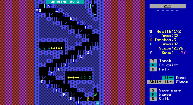
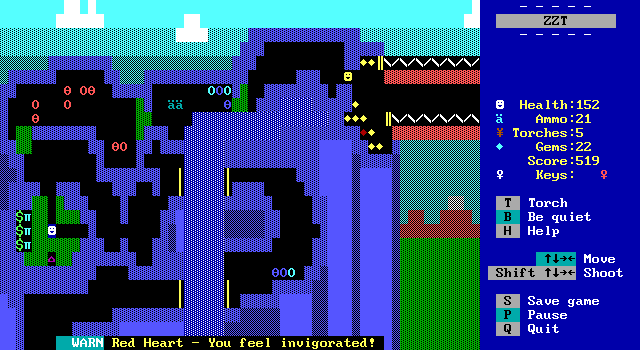
They still give health though, so I decided on a rule of fives. Every board that has any gems on it will have them in a multiple of five. This would ensure that player's health remained a multiple of five at all times as long as no gems were missed or destroyed. Where I got particularly mean though, is that the game's second board is a split path, where the fifth gem of the set is on the other road that can't be accessed until all but one of the purple keys have been collected.
This means that players will usually have a health value ending in a four or a nine, and there is no greater motivation in ZZT to pick up some gems than knowing you're so close to being able to absorb one more attack safely.
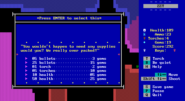
Alas, I didn't quite think things all the way through as the shop sells small quantities of ammo and individual torches for gems that aren't multiples of five. These prices and quantities were tweaked over time, and if I recall right did get adjusted to make things a little easier since the shop is intended to be the game's great equalizer for difficulty. If you're a new player, I wanted it to be able to help you, and hopefully challenge you to not spend all your money and miss out on those bonus points.
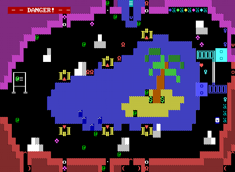
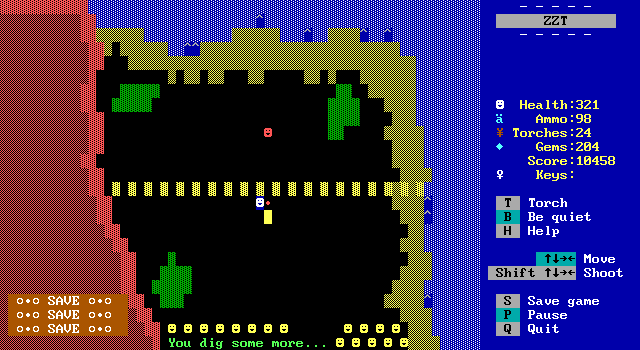
Also as I was going back to add a screenshot showing a good example I discovered the first board of the Great Northern Mountain only has thirteen gems?? How did I mess this up?
Soundful
My ZZT games have never been particularly musical. I knew I was not about to break out a keyboard given the time constraints I was putting myself under for the jam. (And I'd be lying if I said I would have had the game not been for a jam.)
Still, I wanted the game to at least have some bits and boops. At the very least the game's custom items surely needed something to keep them on par with ZZT's.
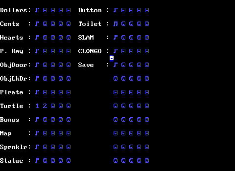
I ended up making a big sound effects board and mostly just mashing a few notes together until I got some sounds that felt acceptable enough. A few had some alternate takes that I considered worth saving before deciding which would be the best sounds, and you can even hear sound effects for doors and locked doors that are bespoke objects rather than ZZT's own!
These were used early on when the researchers of the campsite were instead found in a trailer that players entered from the hub board. Locked doors prevented players from talking to anyone else until they spoke with Ron, making sure the player wasn't a stranger walking up to a researcher and buying granola for gemstones. This board wound up being scrapped because it made the exterior board feel way too empty, functioning solely as the intersection of all the paths on the island with nothing for players to do there.
Most of the sounds in the game are fine, but the one I was quite pleased with how it came out was the purple key sound effect. It's just the "Early in the morn-ing" part of "What Do You Do With a Drunken Sailor?", but I felt it does a great job of matching the game's theme while also making purple keys feel like you acquired a really special item.
Now, purple keys already play a jingle and print a message when touched, so in order to get this to work right, I had to do some crafty object-work. Every purple key has a nearby hidden object begins playing silence once the player passes it, suppressing noise from built-in elements. As it does this, it also checks if a purple key is on the board still or not, switching to playing the jingle and handling the message once it knows players grabbed the key.
It worked great! Some earlier boards needed small layout tweaks, but I really love how seamless it all is. Players could in theory hit the trigger and then run around grabbing items and shooting in silence, but I don't think anybody would have bothered. Everyone that played the game participated in my kayfabe, thank you.
Submitted to the DOS Game Jam
Unlike the Oktrollberfest game jams where I feel a bit obligated to create something, my participation in the DOS Game Jam was far more flexible. (With Oktrollberfest, folks expect something from me, even if it wouldn't be the end of the world to them if I didn't release anything.) It was meant to motivate, and to help guide the game's development as it meant that the idea of non-ZZTers that took part in the jam or exploring its releases would make the "newcomers" more than a mere hypothetical. I had the ability here to drop out consequence free if desired. Though even just a few boards in, I was enjoying myself enough that I knew I wouldn't want to abandon the project completely.
It did give me a real deadline though. To give myself some breathing room, while my goal was always to have a complete game to release, I gave myself permission to just submit a demo and finish work on the game in less busy post-holiday months if needed. This got me through creating most of the game. However, as the deadline drew nearer, the amount of game of finished made the demo contingency a lot less appealing. It'd be one thing for my demo to have two of the four purple key paths complete. It would be another for the game to just end abruptly when those four keys could all be collected, stopping the game just short of the finale.
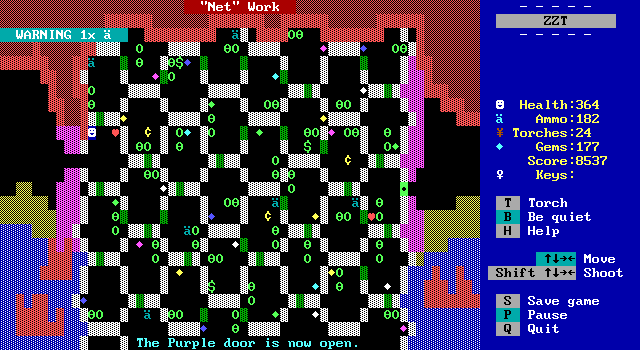
This is why the end of the game kind of sucks. It's the one thing I'm truly dissatisfied with. The lead-up to the end is fine. The "Net" Work board wound up being a good final challenge in terms of action. The Sink or Swim slider puzzle is a little rougher, looking more intimidating than it really is. Players can just work through it one piece at a time without any issue save for a single section that has to be done later in order to not block off access to other sliders. Though the flaw there stems more from slider puzzles being really difficult to make well. I doubt an extra week or two would have led to any considerable changes there.
The real finale is the part where I have my regrets. The bridge climax was an idea I had for quite some time, originally considered for the bridge in the mountains instead where players would cut the rope themselves, sending a bunch of pirates falling while they clung to the rope and climbed up to the other side. I scrapped the idea there as I didn't have a good way for players to turn back or return for any treasures they may have missed. The bridge seen leading to the final puzzle doesn't seem nearly as dramatic as I envisioned, and having to get the game out the door meant little time to refine the scene.
As for dealing with Sharktooth, I was just straight up out of ideas. I wanted to avoid the dull final boss fight of Sharktooth just running around and shooting wildly that so many other games had done before. It just wouldn't be nearly exciting enough for the final playable screen of the game. More complex boss fights can certainly be done, just take a look at the fights in games like Evilstania or Small Spaces. I wouldn't have said no to something like this, but once again time was not on my side.
Really the best I could come up with was to lets players outsmart him. The trouble with that is that it really broke away from the way the rest of the game had been. Previously every hostile enemy was defeated with your gun. Now, doing much of anything would cause the game to instantly end. In my head, the idea of a greedy pirate captain dropping his guard to grab any dug up valuables only to satisfyingly crack him the face with his own shovel seemed like it would be a solid ending. Instead, it was a mess of code to make sure players were moving exactly as needed, and dropping more and more hints after watching Geight test the game and try to figure out the solution. While he did arrive at it correctly, it took a number of game overs that slowed the game down and even when he knew what to do, executing it properly was a challenge unto itself. As a finale, it really fizzled.
I still don't have a better idea for what I should have done here, but it does bug me that the game ends at what I would say is easily its weakest point.
Avoid Deleting
I wanted to strike a balance when it came to preserving the development of the game. "Archive everything" is a cool philosophy, but trying to do that while creating a game is a great way to slow development to a halt. I personally find treating the draft to be as important as the final product to stifle experimentation. If everything is expected to be released at some point, then everything gets designed with around the idea that people will see it.
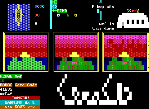
That said, obviously I think it's important to have some record of the dev process! I opted to avoid deleting any boards, leaving a few earlier designs in the file to be perused later. This leaves something behind whenever I opted to try some major restructuring of a board, or just as a temporary backup when I liked what I had, but wasn't sure if I wanted to continue in that direction or not.
So the file ends up containing an alternate Pirate's Fortress with some walled off spinning guns that were at one time active. (Then I tried actually playing the board.) I wasn't sure at the time if I wanted to reduce the guns to just the horizontal, just vertical, or a mix of both.
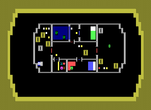
The most interesting of left behind material is the old trailer for Ron and the other researchers. I kept the board order in the game accurate to when boards were added, so this one shows up pretty early. Sadly it's also where my lack of perfect archiving resulted in an object that I thought I cut and past elsewhere before removing hadn't actually been put anywhere else.
Poor Ron is now MIA, originally having been seen pacing around a large map of the island. This is where the object doors that went unused also appeared. The blue were kept locked until Ron was talked to to ensure players knew what was going on first.
In the final game, I had to kind of awkwardly have Ron confirm the player wasn't a pirate to justify the now immediate access to all the NPCs. At some point they were hiding in their tents until Ron called them out, but I felt that just added more delay.
Because this was intended as an early board, I was also taking advantage of it in order to cram as many teachable moments in a harmless room as I could. You get a good introduction to pushing things here, and can even crush a gem! (Rude.)
I scrapped the board because of the substantial delay it added to interacting with any of the NPCs. At one point I was considering basically pasting this trailer onto the outside board, but even then I could tell having to deal with multiple doors to buy supplies or rest in a bed would deter players from bothering unless they absolutely had to.
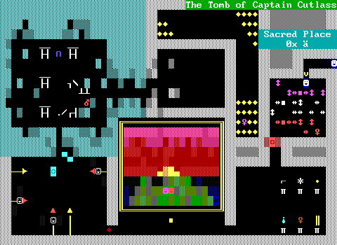
Cutlass's tomb also has an older version lingering around. The copy/paste of the board happened here as I was figuring out what I wanted the boss fight to be like. The original layout had its pillars in the middle of the burial chamber rather than the edges, which wasn't working for the design of the fight, offering too much cover.
At the same time, I wasn't completely sold yet on there actually being a fight or not, and I liked my pretty arrangement of pillars.
And hey, as long as we're both looking at the tomb, here are some more fun tomb facts:
The slider puzzle here uses lesbian pride flag colors to the best of ZZT's ability.
The slider puzzle was originally intended for the previous cave board. It was only when I started testing that I remembered that the board was dark and that a slider puzzle in the dark would be overly intimidating. I still almost kept it there, only backing out because the puzzle was one row too tall for players to be able to see the key immediately in the torch light. When the puzzle was moved, the cave board's SAVE text was overlooked, leading to its appearance on a board where players can't soft-lock.
Originally there was going to be another puzzle here rather than the slider one, though I never settled on what that would be beyond being related to the handful of items displayed on pedestals. Those items were chosen first not to be puzzle pieces, but to try and give Cutlass some more personality without having to write a bunch of text. Each item is intended to represent something that was important to her: a pistol, a compass, a ship in a glass bottle (presumably she had a bigger one), a wilted rose (Coracle), and a spyglass (uh I needed another item).
One pedestal is empty in the final version of the tomb. This one still has it: a Spanish doubloon. You'd never know it playing the game alone, but the implication here is that Sharktooth and his men robbed the tomb of anything valuable they found. Not only did they take a lone coin, but they also deemed the other artifacts here to be worthless.
Thinking now, perhaps there could have been something to the fight against Cutlass's ghost where players could find and return the coin to calm her.
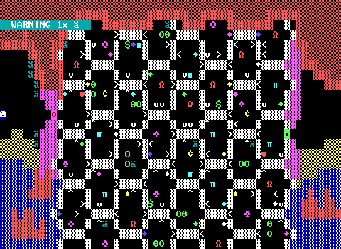
Lastly, a draft version of the "Net" Work board. It began as a transporter maze with a wide variety of creatures populating it rather than just centipedes. I had to admit it just wasn't working when I started playing it myself, constantly taking transporters face-first into enemies, as well as requiring some annoying backtracking to reach any missed gems. That's still present in the final version to a lesser extent. Here, missing a gem can mean it takes some time to find the proper path back to it, which is a lot easier when the connections are all direct.
Teachable Moments
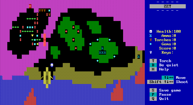
The starting coast, at least once visited by players with the key to the cavern, gives them free reign to experiment with some boulders, sliders, and pushers, all carefully positioned in a way that you can't actually get stuck. Ironically, making such a thing ends up looking like the kind of thing you could get stuck. Testers approached with caution, which is a wise thing to do when sliders are around. (Technically if you leave the initial forest intact and push basically every last boulder and slider out to the right you can trap yourself in the left region, but that pretty much requires you to be trying to sabotage yourself.)
This practice is hopefully enough for players to unravel the puzzle in Cutlass's tomb!
Players are also forced to learn about breakable walls and how to shoot their gun in order to get past the sand. Early on, the sand was originally fake walls before I decided I didn't want that secret passage message showing up for something that wasn't a secret passage. Sand you can't walk on is still a bit of a contrivance, but the breakable walls are at least still intended to be shot and not just decoration. Planting some ammo inside was also done to make sure players were aware there must be some way to collect it. Otherwise they may turn their attention to finding the key. With no background, who knows, they might start stepping on every forest tile hoping to find something hidden underneath.
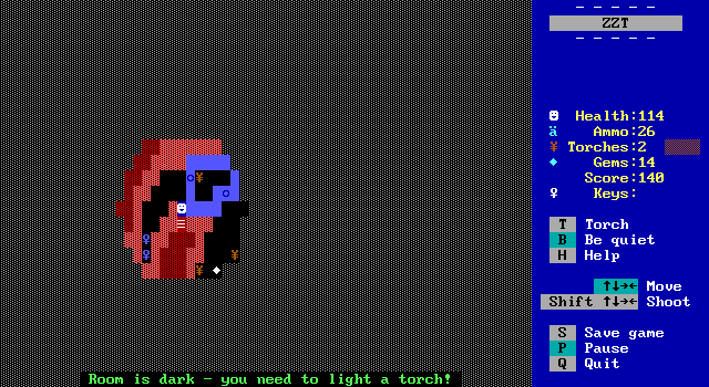
The cove contains what is probably the pinnacle of teaching players organically in Captain Cutlass. By putting two identical keys next to each other, new players were bound to try to collect both of them. Not only does this quickly teach the one key limit, it also makes sure players are aware that keys are consumed upon unlocking a door. All that in such a tiny space that the board could even be dark!
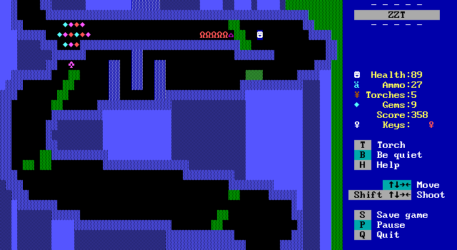
When climbing the mountain, the first board ends with an energizer placed in such a way that players can grab it and not have to worry about any lions adjacent to them. They get to discover what the item does in a pretty low stakes scenario. If they decide to shoot at the lions before grabbing the energizer, they'll likely also end up learning that gems can be destroyed by bullets. Win win. (Well, not for them.)
On the next board, a second energizer allows players to get around a Sweeney's gambit, using it to grab the cash without any risk to their health. The energizer last long enough to get through all the centipedes ahead as well if the player is bold enough to go for it.
This is also where players get to learn that when you see a pirate, you shoot a pirate. I'm not sure if having this one dude get shot unprovoked was the best way to teach it, but it does say something about the protagonist at least! In hindsight, I hope nobody climbed down the mountain the long way...
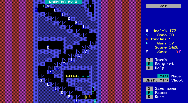
And not that it really came up anywhere else, but the slide at least means that in future games players may be aware that bears can destroy breakable walls, and themselves in the process!
I guess that's about it really. Everything else is introduced to players live. ZZT isn't exactly the most complex when it comes to its basic elements.
Listen To The Testers
My beautiful vision for the game RUINED by NEWBIES who were BAD at VIDEO GAMES.
Multiple testers of the game were new to actually playing ZZT. For a game designed for them, I swallowed my pride and tried to accommodate any complaints they had. I mean, I wanted my game to be enjoyed right?
A lot of the challenge of the game comes down to testing players' reflexes. I am big and powerful in that regard, but I am also the person that's been playing several hours of ZZT on stream each week for years now. This was pretty much the main takeaway with what changes would be needed to make the game something that any player could get through in a reasonable amount of attempts.
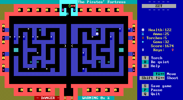
The Pirates' Fortress was the first sticking point. The spinning guns that remained may have been easier than the original design with vertical ones as well, but they still fired rather fast. These got toned down, and then almost toned down even more, getting dangerously close to being non-threatening in my eyes. The inconsistent firing of the guns was seen as frustrating to ZZT newcomers that couldn't just wait for a good cycle before crossing the bullets' path. They had to wait for a non-guaranteed arrangement of bullets that could be crossed without a high likelihood of being booted back to the entrance.
I felt like slowing them down even more would have defeated the purpose of the board outright, and opted for a different adjustment. Originally, the six switches were instead four cyan keys, which meant four trips into the maze unscathed. I had a nice little door system too! Just like the current implementation, an object would count down whenever the player opened a door, while a second object above the entrance to the purple key room shoved players out immediately after they opened a door. I really liked the way this looked compared to the usual approach of just making a long line of doors. Hopefully I can work that into another game sometimes.
Though it wasn't perfect, since the game uses STK doors for readability. The replacement doors had to use the stock white on dark cyan color due to being produced during run-time. It might not be the worst problem, as players already knew what keys they were getting here and it was the only key color around, but it was visually distracting to me.
Testers also got relief with the addition of the transporters leading out of the maze. Originally, they had to escape from the deep end the long way.
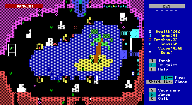
Turtle Lake also needed a lot of tweaking, even before the game was released to testers. Duplicators are really difficult to balance a board around since eventually players are going to be overwhelmed with enemies. The extra challenge here of not shooting the turtles didn't help. It's technically optional of course, you only lose points. (Although if you don't have points to lose the turtle becomes a star instead!) It seems like nobody wants to sell their soul and shoot at innocent animals these days.
Earlier versions of the board lacked the pushers that block off the duplicators. The duplicators were faster. The turtles behind the duplicators didn't have a space to move either, which led to a board that could fill up very fast if players found themselves getting hit multiple times without getting a key. There was at least some help here in that if a key was grabbed, getting hit would bring you close to the door for said key, but it was a tough sell.
When one tester told me the only way they got through Turtle Lake was by purposely standing in front of duplicators and then running back to the hub to heal, I toned the duplication down further. This is a challenging board, perhaps too much for a board directly next to the hub. An extra screen of build-up might have helped. I'm overall still happy with it, though I think the possibility of it being the first board players choose to visit may have been a bit too drastic.
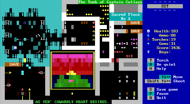
Surprisingly, there was little in the way of complaint when it came to the cave and Cutlass's tomb. There was one instance of somebody flubbing the fight so badly that they basically ate all the stars and had the fight end ASAP, which is regrettable, but they didn't die! All the adjustments I can recall making here, were changes made for me pre-pre-release like adding the pusher to block most of the guns in the green room, and adding red objects to highlight the cyan key in its room.
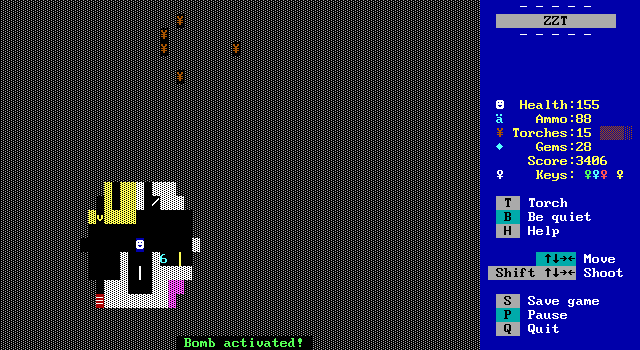
Testers did find one hilarious oversight though! The original layout meant that it was extremely possible for players to shove a bomb through a transporter, and then keep pushing it directly into the path of a conveyor. The literal easiest way around to destroy the player element and soft-lock the game irreparably. I'm glad this got caught before the jam release. I would hate for anybody's first foray into ZZT to come to a stop that way.
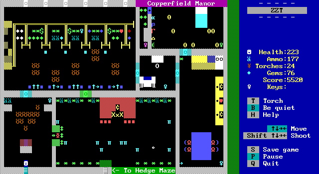
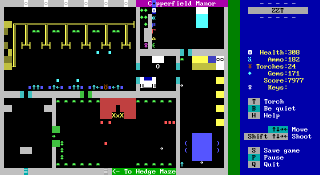
Where the testers were their most vocal, was Copperfield Manor and its accompanying hedge maze. Both these boards were way too frustrating to get through in their beta incarnations. The manor had more spinning guns placed where the boulders are now. You had to cross a real gauntlet originally, and stand in the way of a gun when opening the green door.
The room with the tigers and fireplace was somehow even more brutal, with more enemies and a lack of invisible walls used to corral them until players entered it. It was very much possible to have to shoot immediately after opening the green door and have to contend with bullets from the spinning gun up above. Absolutely brutal.
Multiple testers did say they really liked the lions sitting at the table that got up when players went into the kitchen. I'm glad.
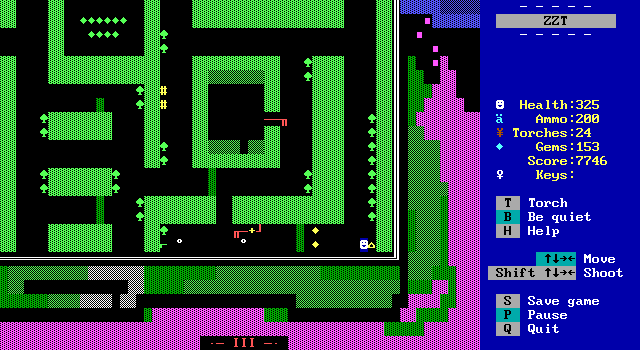
The hedge maze though, hoo boy.
On the one hand, I absolutely love it. I cannot believe that I made a maze that I like. More than anything else in the game, it captures the feel of early ZZT adventure that I was going for. Running all over the place, dodging bullets, bumping into unexpected dead ends, finding clues to the manor's safe, even opening up new portions of the maze by shutting off water valves! (Valves that I still keep calling sprinklers despite them very much not being that.)
There's a map on each board depicting the entire maze so players could plan their route better and hopefully remember where some of the invisible walls were located. The maze was made before the map, and it's only through sheer luck that I was able to represent it fully, as a few columns were identical and could be compressed into one for the map itself. I was so happy when I got all assembled, which had the misfortune of making me rather reluctant to make any changes to the maze as those changes would need to be reflected across all the map objects as well.
But for players, it was just absolutely brutal. A number of the trees with machine guns (aka Rata-Tat-Tats) offered little recourse for players if they weren't anticipating them. Dead ends could lead to escape routes from bullets being a fake-out, leading to lots of damage. Players entering with little ammo could actually run out in the maze and be unable to fire back against the trees. It's the most impressive and least appealing part of the game by far, and I swear by everything about it in its current form.
Four boards with seemingly no threats, only to actually be the most dangerous place in the entire game.
To concede to testers, who here were not saying "This part is hard" but "This part is where I stopped playing", work needed to be done. Some of it was the easier concessions, throwing in some extra hearts and ammo. I added the poor pirate that enters the maze, shoots back against a tree's assault, runs out of ammo, and succumbs to their attack as a warning for players. A few of the trees can be seen activating from the outside of the walls when players first head to the manor also offer some hint that there's danger inside.
To me, this is what a ZZT game inspired by Town and meant for experienced players should be like. A game where you have to keep an eye on your resources, and may have to start over. Yet even I know that the odds are good if I ran into a game like that now, I'd be more inclined to cheat rather than truly begin again, throwing all previous progress in the trash. And if that's what it was for me, it was clear that the testers were not having a good time here.
So the layout did get adjusted a bit. Mostly a few invisible walls shuffled around to place them where bumping into one wouldn't be accompanied by losing ten, twenty, even thirty health. The delay between shots was slightly increased as well, making it safer to cross, or to test the waters without having to consult a map to find out which trees were dangerous. Fact is, it's still not an easy set of boards. Stay away from the manor, and have some trail mix before you visit.
Actually, at one point I really did consider having Dot hanging out outside the mansion as a second store just for this part. It just felt kind of funny to duplicate her presence and to have the store show up before players even got to the real obstacles of the path.
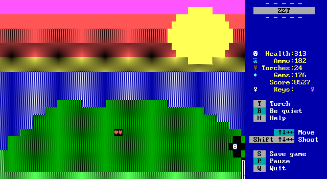
I wouldn't call this part of balancing of the manor, but while we're on the subject, you all did find the cape west of the gate to the manor? When making the game I realized I had one tiny spot where players could try to walk off the board but be unable to do so, and rather than patch it up opted to make a little bonus board. Look closely and you'll realize this is the location where Coracle painted her and Cutlass watching the sunset together. Here, they're represented by two healing hearts which are certainly helpful for the mansion, though I made sure not to consider them as something players would have collected when it came to actually balancing everything.
Final Thoughts
I had fun!
I had fun making the game. I had fun testing the game. I had fun seeing others play the game. I had fun revisiting it for the first time in months to get screenshots. (Although I found like a dozen missed typos.)
There's no correct way to make something in ZZT. It's all about finding a process and game-style that works for you. I'm not exactly in a hurry to do another old-fashioned ZZT adventure like this, yet already enough time has passed that I miss those evenings of kicking back and just working on a board or two for an hour between the sun setting (okay it was December and dark at like 4:00pm) and dinner time. Captain Cutlass is a ZZT game I am proud of. Playing it again I can think of a few other changes I might like to have made, but as it stands, I think this might be the best ZZT game I've made. Thank goodness I didn't peak with Aura.
After its release, a few others found themselves tempted to make a little adventure like this, and I think that's honestly a wonderful way to return to ZZT's big appeal of just how easy it is to create a game of this nature. The game is so bereft of objects compared to pretty much anything else I've made. ZZT gives you so many tools out of the box, and of what it doesn't provide, most of what else you might need is pretty simple stuff. Not every game needs to try and redefine ZZT's limitations. As someone that got involved in the community when there was always a big push to do just that, I'm really happy to see that a game like this can be a joy to create and a joy to share with others.
Now what to make next...
