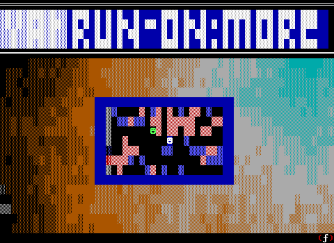
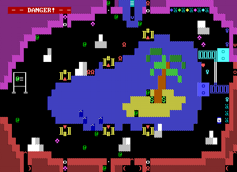
I kind of wanted to do this back in January or February, and still haven't gotten around it. My end of year release for 2023, Tales of Adventure: The Treasure of Captain Cutlass is a game that I'm still rather proud of how it came out. It also had, at least by my standards, a more unusual development process than most ZZT games I've made over the past years. I wanted to give the game a proper postmortem discussing my goals for the game, how they were implemented, where I messed up, and what lessons I hope to heed for the next game.
This one doesn't really need all that much of a spoiler warning. Though I would still appreciate it if you tried the game out yourself. The assumption here is that readers have either already completed, or don't intend on completing the game anytime soon. That being said, the game is a purple key adventure, with little in the way of plot development. There's not really much of anything to "spoil".
Captain Cutlass is a pirate themed ZZT adventure set on a small island. The player is the grandchild of a treasure hunter who always believed their grandfather's stories were fiction. Until the discovery of a diary in the attic which revealed all his tales to be true. Upon finding a map and a regret of never having been able to acquire the lost treasure of pirate-queen Captain Cutlass, the player sets sail to the island to fulfill their grandfather's dream of acquiring the treasure and/or get rich from it.
The island is a dangerous enough place already, filled with your usual sorts of ZZT creatures roaming its caves, mountains, and lake. Making things worse, a band of vicious (albeit fairly stupid) pirates are also well aware of the treasure and searching it out for themselves, and they'll stop at nothing to get what they want. On their hunt, players will have a few run ins with pirates and perform a daring raid of their mountaintop fortress where they've successfully found one of the purple keys. Can you succeed where your grandfather couldn't? Claim the treasure as your own, and put a stop to the rather disrespectful Captain Sharktooth and his men.
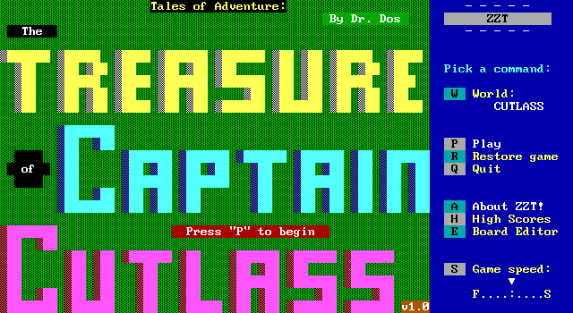
Pretty good huh?
Okay, no, really though it's a pretty straightforward ZZT adventure developed in December 2023 with the intent of releasing a finished game in time for the DOS Games End of Year Jam 2023. With a deadline as motivation (it's been working for Oktrollberfest), and little more of an idea than "old fashioned adventure with pirates set on an island", I sat down and begin chiseling away at the blank slate that was to become my creation.
I took a different approach than I usually do when making Tales of Adventure. For the past few years now, my ZZTing would usually be done at my primary computer, a reasonable desktop that was loaded up with distractions: Discord, social media, Twitch, my Steam Library, you name it. It's always made it difficult to stay focused. Usually, I'd start whatever idea I had on, which was more often just a "hey is this a way to do a weird thing in ZZT" as seen in Wordles of ZZT and Zee!, open KevEdit and just begin coding things with little idea of a greater game wrapped around the engine/exploit. These projects tended to get moved over to a retro desktop PC running Windows 98 where I still had access to ZZT and KevEdit (natively, no less) without an Internet connection to tempt me away. This time however, I tried to work on the game in a different atmosphere.
With Cutlass, neither of those machines were used. From the first board all the way up until the game had betas that needed to be uploaded and sent out to testers, development was instead done on a tablet with connected keyboard. On the couch no less. The cushiest place to make ZZT games imaginable. (It's also how I'm writing this right now.) Some of the distractions were still technically there, but not nearly as prevalent. This poor thing isn't the best at multitasking. Merely having Discord open is enough to make an appreciable difference in battery life, so when I'm focusing on doing work with it, distractions come at a high cost that make it easier to keep other programs closed.
This wound up working great. I would do my usual work throughout the day, where I have a rule of thumb to stop working in the traditional sense at 6pm. Making the game, while still technically work, ended up being a way to relax starting at that time, something only possible thanks to the game not being a technical showcase of ZZT programming. I could create my game through the evening long enough that my partner Geight would often come home from work finding my still working on the game. was the most focused, invested, and eager I was to get back into the editor I had been in ages. I think the comfort of it all helped immensely. ZZT not as a responsibility or obligation, but just making a game because making a game can be a fun process, just as it was when I was a child.
It wasn't the perfect environment. The tablet's condensed keyboard meant that the function keys used by KevEdit would normally require holding an Fn key. Fn lock would have solved this, however the row of function keys also included Page Up/Down keys used for cycling through boards, so I would still need to regularly switch modes, and would constantly hit incorrect keys. Luckily, I had come up with an extreme solution for this years ago when I knew I'd want to make something in ZZT while flying cross country: a bespoke fork of KevEdit that doesn't use function keys. I still had this personal fork, dubbed KevEdit Laptop Edition where the main menus were instead opened with Shift+1/2/3/4. This was easier on my brain.
That too still caused some trouble. It was built from a now dated version of KevEdit, one where you could crash and lose a file by deleting and rearranging boards. At least being aware of the issue made it easy to avoid. There was also a weird issue with audio though, where testing #play commands would produce what at best could be described as a tiny pop of audio and then silence. I wound up putting off adding in any sound effects because of this, relying on flipping between KevEdit and ZZT itself to test and tweak sounds, and then giving myself the busywork of replacing every existing heart/treasure/whatever would make noise with updated versions that had the sound added.
Really, I should have figured out the sounds early on. While I believe everything that needed to be updated got updated for sound effects eventually, a few were missed at first, and when you're grabbing a bunch of treasure, you might not even realize at first that one of the items didn't make any noise.
Despite some extra hurdles, the ease of development here was unmatched. I don't think I've put so many hours in a single month in ZZT since, I don't know, Aura? And I was barely even in high school then! It had been awhile since everything clicked like this, something I really hope wasn't a one-off.
The Goals
As work began, I began to slowly get a better idea of what I wanted to do with Cutlass, a game that would simply be known as jam.zzt until days before release. Some of these goals were fairly intuitive, realized early in development. Others, took until the last minute and required some significant changes, scrapping material that had already been done only to realize that it didn't match the personality I wanted the game to have. I never had an actual list, just keeping these things in mind once I realized to. Compiling it all now, these are the sort of decisions that made Cutlass what it is.
- No references - No in jokes, memes, or subtle nods to anything outside of the game.
- Accessible to new players - The game had to be approachable.
- Non-linear structure - The game should allow players to go where they please, so they can try other options if they get a game over
- Brisk Dialog - Players should be able to get right into the game and trusted to learn through experimentation rather than a lecture
- Town-Replacement - The game should be treated as if it were ZZT's first game, focused on making use of specific elements rather than a considerable number of unique objects.
- Limited Color Choices - Visuals had to be closer to pre-STK games, without outright banning them if they could serve a meaningful purpose
- ZZT as Intended - Torches are torches. Lions are lions. Fake walls are not floors.
- Resource Management - Players should receive adequate supplies and be able to purchase more to make up for skill disparity between players when balancing difficulty.
- Soundful - Items and objects should make noise when things happen.
- Submitted to the DOS Game Jam - The game needed to be done by the end of the year, or at least a substantial demo.
- Avoid Deleting Things Outright - I am going to write a postmortem, so it would be nice to have some in-development material to look back on.
- Teachable Moments - Create boards that allow players to learn how ZZT works without.
- Listen To The Testers - This game is made to be played by others, by me.
Every one of these (save the first) I gave myself flexibility on. My ultimate goal was to create something for 2023 that wasn't an Oktrollberfest game. A finished release was the most important thing of all to me.
No References
The ZZT community has always been pretty niche. Though modern experiences (in particular Weave games) have done a better job reaching a wider audience via sites like Itch, traditionally ZZT games have been pretty insular. The people making the games were the same audience playing them, which had tremendous impact on the way the games were designed. References to other ZZTers and their games are extremely common. You've got small nods to other worlds (Sivion), games with dozen of cameos of varying degrees of relevance to the game in November Eve, and even entire games with ZZTers as main characters (Death Gate). These days it's not uncommon in the least to continue including these little nods.
For Captain Cutlass, I made a rule for myself that I would not make any references. Not to ZZTers, not to my other games, not to pop culture. None of it. This wasn't a rejection of them or anything, they're typically a lot of fun to write. A little too fun to write actually.
My reasoning to avoid them completely was to eliminate outside distractions from development. I didn't want to waste time combing through ZZT worlds to come up with the perfect name for the lake or worse, alter the design of something meaningful to match something I've seen elsewhere. I've had all the opportunities to do so in the past. My Oktrollberfest games are pretty much nothing but. There would be nothing gained by including references, so I axed them completely.
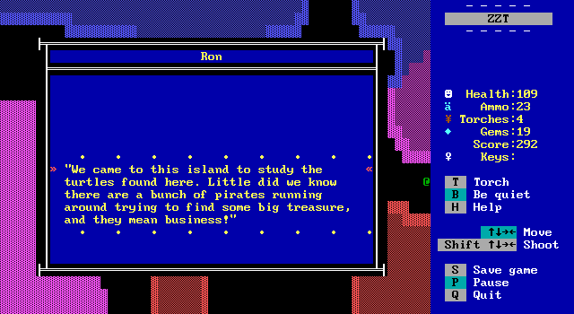
You wouldn't think this would be all that difficult to do, but the urge was strong. I nearly faltered at one point, with the names of two of the friendly researchers, Ron and Dot originally being named after a friend and his wife that have themselves a pet turtle. Even knowing not a single ZZTer would be able to make the connection, I eventually went back and renamed them. They're now Ron and Dot because the original names were both also three letters and also both had an "o" in the middle. Hooray for less typing when editing text.
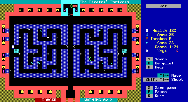
A few boards still have obvious inspiration from classic ZZT worlds. The Pirate's fortress (especially in its original form) is a play on City's atrium. Turtle Lake meanwhile was my own take on Whirlpool from Dungeons, though after the fact I had the realization that what I designed was actually closer to "Forest N" from Caves. I'd be hesitant to call those references, and more working with known good concepts for boards.
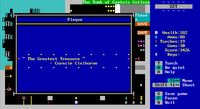
There is an accidental reference though! When trying to come up with a name for Captain Cutlass's romantic partner, I found myself looking up nautical terminology and historic ships hoping to find something that would be a suitable name there. Coracle won me over quickly. It was months after release that I was going through ZOZ screenshots to add some entries to !Scroll, only to be reminded of that game's own Father Coracle. Sorry WiL, didn't mean to turn your man of the cloth into a lass of the sea.
Accessible To New Players
A big reason I wanted to make the game was due to the lack of ZZT output I had for the year, with my only release being the Oktrollberfest entry Snoozefest. With Snoozefest, I embraced the fact that you wouldn't want to recommend an Oktrollberfest world to someone new to ZZT and let myself run on the assumption that nobody outside of the Discord of ZZT was likely to touch the game, so why bother with the niceties of "Here's how to save! Here's how to cheat if you get stuck!"
At the same time, I had made a few ZZT games intended for outsiders as part of Ludum Dare jams. The first of these, Ruins of ZZT was beginner friendly (well, if you can get around the gun being a sword). Then came QuickHack which tried to include extra information for new players. The last of these was Doug Tudeap, an engine based game that in hindsight was a terrible terrible thing to unleash on an audience with no knowledge of what ZZT can and more importantly cannot do.
This time, I would focus on the game doing what Town did, having to introduce every element to players who have no idea what's going to happen if they touch something.
To that end, I did my best
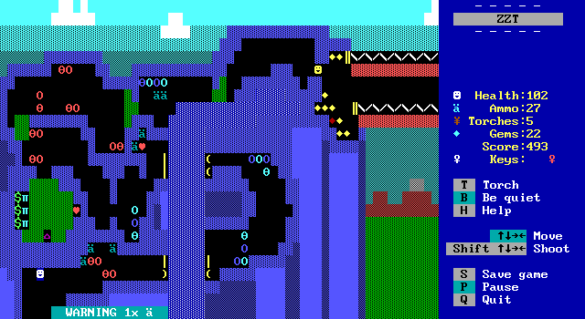
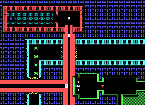
One thing I am proud of, was communicating information that ZZT hides from the player normally. When I play games on stream or for Closer Looks, I use SolidHUD to give me information that's usually hidden behind experimentation. In vanilla ZZT, if you can reach the edge of a board, the only way to know whether or not there's a board connected is to attempt to walk off the edge. It's easy to communicate to players when they can move to another board, usually by having a border that is only open where crossings can occur. Plenty of less well-designed games can make it difficult to tell, but this wasn't the kind of hidden information I was worried about.
There are far bigger surprises in store for players, in particular those who are unfamiliar with the board properties authors can adjust. The maximum number of shots allowed on screen can only be discovered by shooting. On boards with a shot limit of zero or one, the way you approach creatures is dramatically different from the normally unlimited amount. This particular board from Dungeons gets me every time. The blue key is protected by a trap with ricochets and bullets, and so shooting is disabled to keep players from destroying the projectiles with their own.
The board can be entered from an alternate entrance that brings players into an encounter with some centipedes rather than to the ricochet trap. It's very common for me to suddenly realize my gun isn't working and take plenty of damage. Players made aware right away that they can't shoot on a board are players that won't be caught off guard when ol' reliable suddenly fails on them.
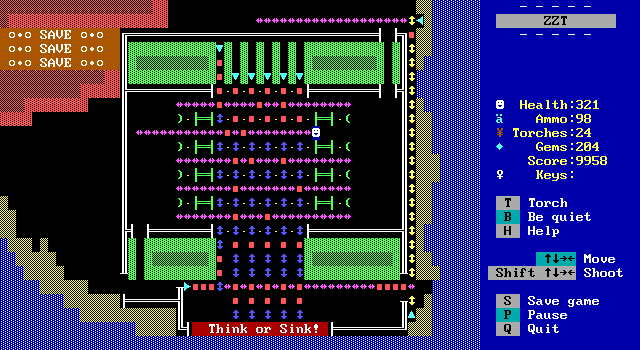
With Cutlass, I decided that any board with a non-standard shot limit would include text telling players that limit up front. I also added text to indicate whenever "re-enter when zapped" was active as well, so players would be aware that any damage taken would send them back to their starting point. Lastly, "SAVE" text was also added to any board where it was possible to soft-lock the game with failed attempts at solving slider puzzles.
Text on gameplay boards like this became a bit of a faux pas at some point, usually arguing that over-labeling what things on a board were was unnecessary and ugly. These days, it's often seen more as a charming relic of older titles, and something that can be used to give new games a feeling of being from the past. In the 2000s though, these labels in Cutlass would have ran the risk of being criticized for not being presented to players via a sign they could touch to read or something similar.
I'm really happy with the system developed. The benefits far outweigh any imagined ugliness, and frankly games which change these properties on a per-board basis are more likely than not trying to be old-fashioned anyway where the inclusion of text aimed at the actual player rather than the player character would have been more acceptable. If I do other boards like these in the future, I imagine I'll continue using this technique of not pranking the player.
Non-Linear Structure
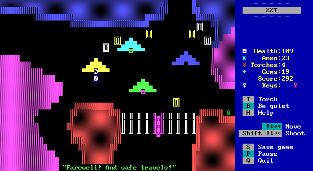
In keeping with the tradition of Town and other purple key collecting games, I knew I wanted the game to be non-linear. Taking this approach immediately adds a lot more complexity to creating the game. Every area had to be fine-tuned to be easy enough for players to begin their adventure on, without becoming trivial if players entered later with greater supplies. Each path also needed to be clear-able by players that did find themselves in dire straits. The worst part of Town is when you hit a point of running around with seven health, now having to handle all combat flawlessly.
To address this, I went and took the nuclear option of allowing players to reset their health in the central hub to a specific value. I was worried that a true reset back to 100 health on demand would spoil the experience, or at the very least the need to spend gems on trail mix for supplemental healing. Over the course of development, I played with the specific amount of health players were allowed to freely restore a number of times. One hundred, thirty, fifty, all of which was based on intuition more than anything else. I knew my own difficulty in completing the game was going to be considerably less than somebody picking up ZZT for the first time.
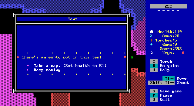
Ultimately, I settled on fifty-one. Giving players that one extra hit, while still keeping health low enough that it anyone that used the tent would probably buy more healing immediately afterwards. One tester that managed to finish the game commented on needing to rest after each section, so I think I got the numbers and approach to healing correct.
Even with health covered though, I still had to do a considerable number of runs through the game in testing to make sure that each section could be beaten first. As long as enough supplies were provided, I figured this would cover my bases. Yet when testing began, it became clear that the western path leading to the mansion and hedge maze was undoubtedly the most difficult section of the game. I went so far as to decide to prevent it from being the first path explored, adding in the slimes that fill the path so players would have to have acquired more ammo elsewhere. This eventually got scrapped in favor of just continuing work toning down the area's overall difficulty. The slimes remained as a soft deterrent, they soak up a considerable portion of starting ammo to make players think twice about if they have the supplies to get through.
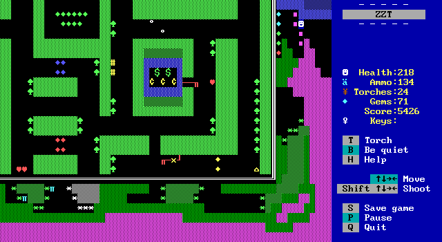
Really, you don't need much ammo to get by, but watching the walls appear before you eyes makes it easy to overlook the fact that you can just shoot your way to some forest and continue moving normally from there. Sometimes you can't see the forests for the slimes.
If a player decides they'll risk it with their limited ammo regardless, they soon receive a giant pile of ammunition to make up for any that was lost and then some. I have no idea how well this worked as it wasn't implemented until testing had already started and testers were well aware of what the western path had in store for them.
Having all roads extend from a central hub also meant that when each area had its purple key claimed, players would need to re-tread boards they had already completed. I focused on making sure there was a decent way to get back quickly afterwards, ...for the most part. Cutlass's cave and tomb include some dedicated exit-only transporters and the Great Northern Mountain has its slide. Turtle Lake is only two screens to begin with, and even then still has some transporters to let players get back without having to deal with any remaining enemies. These ones handled the return trip eloquently.
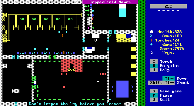
The loathsome mansion continues to lack a good exit, an issue I never could solve satisfactorily. Really I should have at least tossed in some transporters here as well instead of shrugging and considering the fairly straight lines to be good enough. At the time I considered having a locked gate in the hedge maze that could be opened from the inside, maybe letting players out from the top right, but I don't think anybody wanted to be in that maze for a second longer than necessary. Given the choice between walking across some cleared-out screens or having to enter the hedge maze a second time with its indestructible obstacles to get a shortcut out, I suspect most would still have opted to take the scenic route.
Brisk Dialog
ZZT games can become heavily bogged down with lore and explanation if you make the mistake of trying to justify everything. Why is there a jazz club at the end of this forest? I don't know, and it doesn't matter. Yet when we build worlds (or at least when I do), I can't help but want to have a reason for everything. I didn't want the game to be a mess of random boards with no connection to one another, and found myself falling into the trap of coming up with facts about the spaces within the game that had absolutely no bearing on what players did there.
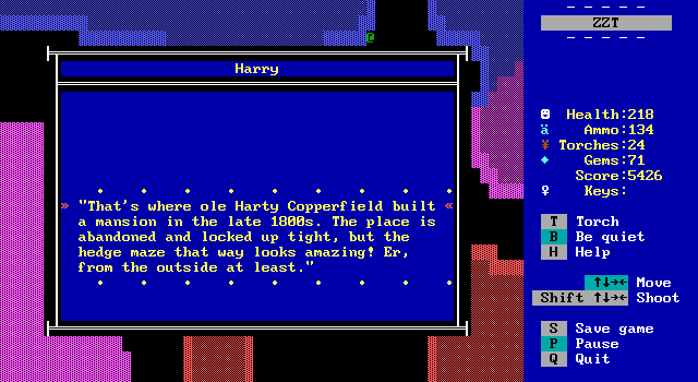
The third NPC at the campsite, Harry, gives players information on what each of the five regions contains. In Town, players just pick a path with no real consideration as the contents of each is a complete mystery. It was important to me that players were actually able to decide on a path rather than just mentally roll a die and head that way. Harry's information is purposely sparse, sticking more to geography than anything else. I felt it would be better if Harry's descriptions served to entice players. Turtle lake? Abandoned mansion? Pirate fortress? Cutlass's Tomb? All of these locations hopefully sounded cool to investigate, letting players choose whatever they found most appealing.
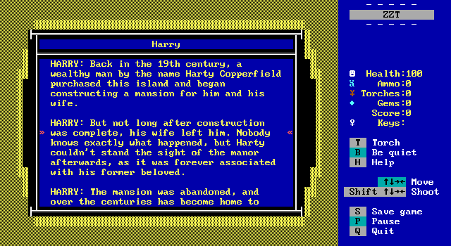
Originally though, I wrote far too much text. Earlier versions of the game had far too much information that may have made these places feel more real, at the cost of dumping paragraphs of reading on players who wanted to play the game. None of the information contributed to the experience of actually traversing these locations, and while I spent plenty of time writing it, I take it as a good sign that when I was through I recognized how much of a delay it would add between players reaching camp and getting started on their adventure.
It also snowballed a little into making me waste time! The mansion had some elaborate backstory about it being built for some rich dude's wife that left him when she began working in Hollywood as a silent film actress. That's cool. That gives the mansion some personality. Except that mansion just has lions sitting at the kitchen table so why on Earth am I dwelling on this sort of thing?
It also meant trying to give the game a "when". The manor has a sign saying it was built in 1873, and I was wasting time coming up with a revised year for the silent film angle to make sense. In my game where you shoot pirates and talk to ghosts about how you're going to shoot more pirates. It would raise questions about how old the player is, how old their grandfather was when he was treasure hunting, and just bog the game time from its core premise of "It's fun to shoot Greek letters and push square boulders".
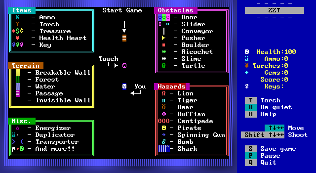
I also wanted to like, not treat the player as if they were a moron? A special starting board was added at the end of development to list off the various things players would encounter, and I found myself again tempted to add descriptions to everything. That would've just meant more of a delay before players began to play, plus making the game seem far more complicated than it actually is. You don't need to explain how lions work in ZZT. Show them a red omega and say "Lion" to give them a name to vaguely remember when they run into one, and that's plenty. How they move, how they attack, how many shots they take, how much damage they deal, all these properties can be best learned not by consulting the manual, but by just putting the player in a room with a lion. (Er, the player in ZZT that is.)
Not to mention, if you don't give all the details in advance, everybody gets that great moment of discovering that tigers have guns. Don't take that away from people.
Harry wasn't the only one who had dialog removed. Everybody originally had far more to say. Ron just went on and on about turtle research, pirates, Harry's coffee drinking habits... Had this been a game with a stronger narrative element, maybe that all would have been okay. It would be nice for players to form a connection with these friendly NPCs. Cutlass is not a game played for its story, and was never meant to be. The NPCs are smiling faces that are either directly aiding the player or should be out of sight, out of mind.
Town-Replacement
ZZT's been getting retro throwbacks since at least 2000. It's seen games intended to be follow-ups to the original worlds as well as creations with no direct connections to the past (The Challenge).
For Cutlass, I wanted my take on retro-ZZT to be a sort of alternate history. The Tales of Adventure titling was meant to suggest that the game was the first of a series (without being foolish enough to include a number and commit to ever making a sequel of any sort). I wanted the game to be designed as if it was ZZT's first world rather than Town.
There was a moment where I considered going all the way with the idea, and using Weave to create objects that could better act as built-ins. Making the game for a jam, I figured it might not be the best time to start learning Weave as well.
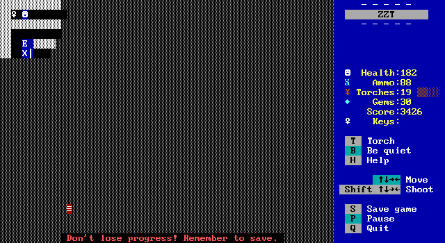
This decision let me do a few things I might not have done otherwise. The "Cooler Water" from Demo was used throughout. Some special gems dubbed "Save Gems" use dark red in order to entice players the first time they see one, which are identical to normal gems (as much as objects can be) with an additional reminder to players that maybe they should save their game, not because of an upcoming challenge, but just to make sure they don't lose progress if they aren't saving compulsively like I tend to.
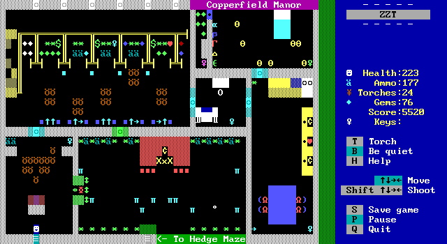
It provided a good reason to address some of ZZT's usual shortcomings. Players can find hearts across the island to restore health rather than having to pick up eleven gems to be able to survive one more attack. It give me the idea of making purple keys have a unique jingle. It also made sense to include treasure items that just provided points instead of only rewarding players with score for completing tasks. All of these items to me, are simple enough that they could have been built-ins for ZZT, and just happened not to be.
Limited Color Choices
Another arbitrary limitation I gave myself was to not use STK colors. Sort of. As part of the "alternate ZZT" vibe I didn't actually have any rules for what color things could be. For the most part, I stuck with the classic seven colors, allowing myself special colors under the logic that ZZT itself has elements in colors that can't be selected normally. This was my logic in making turtles dark green. Turtles are an official element of Captain Cutlass.
The next exception was doors, though I don't even consider this to be an exception. I have yelled about ZZT's doors often enough. The legibility of having the foreground match the key color far outweighs any imagined loss of "purity" for games with a retro aesthetic.
I also allowed myself use of the cooler water seen in Demo. I just think it looks better. Other early pre-STK tricks were permitted as well, hence a few trees with solid brown tree trunks made out of yellow text.
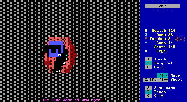
The only other special colors appear in the backgrounds of dark rooms. I half-decided that I would do this as a darkness specific thing, filling boards with dark walls and having the inner-edge appear bright under torch light. Little did I know at the time that there would only be two more dark rooms in the entire game. The cove is the only part where it's noticeable. The secret passage board doesn't even employ it, and the cave that leads to Cutlass's tomb actually uses it incorrectly.
Like the cove, this board was to have its shape match the outside world, except since it was already in a corner, there wasn't much outside world to render in dark colors. Eventually the cave's exterior was changed with the interior never getting updated to match. The bits of dark purple which mostly can't even be seen were supposed to line up with the exterior. Whoops.
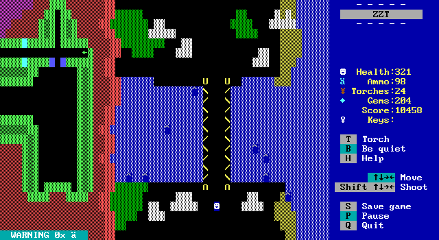
One issue here though, is that the bridge leading to the finale looks really rough to me. The bridge on the mountaintop works fine as it's set atop a background sky. The one at the end though is seen from overhead, weirdly dividing the water.
The limited STK has one very special exception, the painting of Cutlass and Coracle watching the sunset. I wanted the painting to look unlike anything else in the game, and this seemed like a fun way to do it. I've never been one for detailed graphics, but I sure as heck have been dropping the sunset blend into anything and everything for the past twenty five or so years.
ZZT as Intended
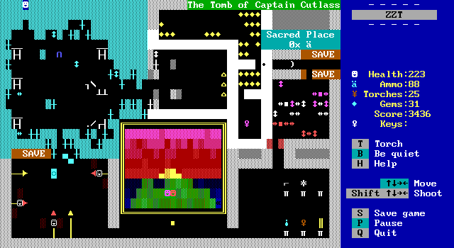
Designing the game to be somebody's possible first time playing ZZT, I wanted to use fake walls for their intended purpose. I knew if I didn't do this, and had yellow fake sand that almost immediately after starting the game players would get a message about discovering a secret passage. Decades of disregarding this message mean experienced ZZTers hardly even notice its appearance. Same thing with water when used for shading. I wanted my game to avoid any confusion with elements being used for in ways they weren't originally intended to. While I don't doubt that newcomers wouldn't figure out what was going on immediately, I did worry that it might make it more difficult to introduce actual fake walls.
The dual-purpose of fakes didn't take long to develop. You can see it in games released when ZZT was yet a full year old., and the oversight in flooring is even addressed in Super ZZT where it's a brand new element unrelated to fake walls intended for hidden passages. It's one of those of things like a more dedicated health pickup that ZZT just happens to lack, which in turn leads to something else getting the role.
With the general reluctance to use STK colors, I didn't have to worry about water that wasn't water. The rest of ZZT's elements usually do as they say unless they're being used as like statless walls or are abstractions for the sake of counters like torches as magic point. Again, nothing a classic adventure had to deal with. Everything got to be just what it said on the tin, with plenty of advice to just touch things that aren't moving and shoot things that are.
